As someone who designs typefaces and thinks about brand systems, I’ve spent most of my career looking at letters, and wondering what lies beyond Inter, Helvetica, or any other font choice. The emotional connection that anchors any brand is routinely overlooked in the long form texts we read. More so at a terminal, where reading becomes a chore—another item on an endless task list—set in a monospace typeface. Boring.
That curiosity led me to turn my personal blog, tudowrites.com, into a playground for text-based experiments. I’m a big fan of concrete poetry, and specifically the work of Ana Hatherly, a Portuguese academic, poet, visual artist, essayist, filmmaker, painter, and writer. The notion we’re familiar with: text to image, image to text, text to speech, speech to text—is inherently siloed. Hatherly’s experimental poetry considered text as image.
Most of us lose this sense of design-as-writing in a digital environment. We tend to forget: typography is inherently a layer of abstraction—more often than not, one size fits all. If you’re a designer you’re familiar with prioritizing legibility for long-form text and leaving emotional choices to the headlines. Bigger text gives you room for more personality. If it’s smaller, don’t add friction—make it readable. We’re all too busy worrying about what comes next..
Writing alienates us from our emotions less when we pick up a pen and paper. Even more with a pencil, brush or charcoal. The act of writing itself becomes emotionally alive—each tool shifts your thinking differently.
Go one dimension higher
Some years ago I attended a workshop with Bas Jacobs of Underware. At the time they were working on Gramatto—still the most advanced type engineering I know.. Through high-order interpolation, they built a typeface validating their claim that The Future is writing. And by reading it, you understand how that text is meant to be written. You become less conscious about letters as contours and more aware of rhythm, pace, contrast, and other fundamental elements that Gerrit Noordzij captured so well in The Stroke.
We were puzzled with how Gramatto was made, and everyone wanted to know the secret. He didn’t disclose it, but he encouraged us to go one dimension higher. From the conversations afterward, everyone was still confused. Even more so after he went from talking about Edwin A. Abbott’s 1884 novella Flatland to a video of Carl Sagan explaining the fourth dimension.
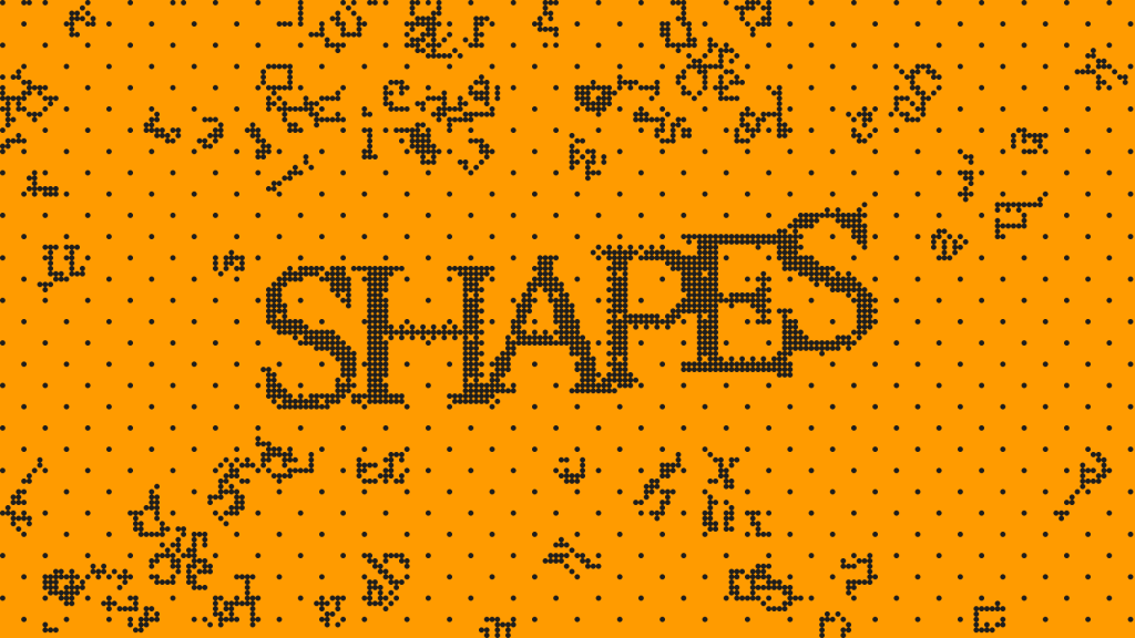
That idea—going one dimension higher—has shaped my approach to design ever since. And in my personal blog, the shapes you read in every post become a chance to push the relationship between reading and seeing a little further.
Some posts use typographic scale to create rhythm. Others glitch, stutter, or force you to slow down. The writing and the form are the same thing. And the typeface itself, counterintuitively, becomes less important.
Most of these experiments were built with Telex, and came a few weeks—sometimes, days—before the popular Pretext experiment. I used a tool the Automattic AI team released in September 2025: one that turns natural-language prompts into working WordPress blocks. You describe what you want. It generates the block. Then install it as a plugin and paste the block into your post.
What I was after
Not in the obvious sense—we all know that a headline hits differently than body copy. Can a subtle disruption in how letters render make someone pause? Can I force people to read what’s in front of them rather than skipping a few lines below? Can typographic motion add emotional texture to a sentence that, on its own, reads flat?
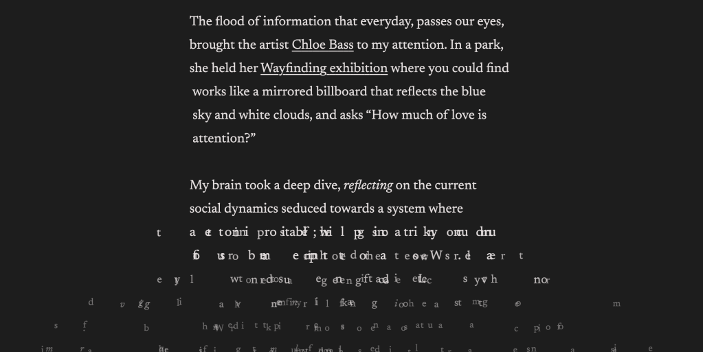
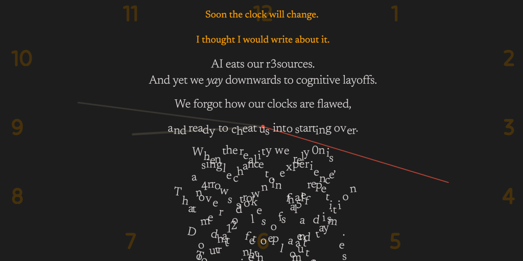
The posts on tudowrites explore this in different ways. “Time and time again” uses numerical glitches embedded in the words themselves: characters replaced by digits, as if the text is aware of its own artificiality. “How much of love is attention?” was written to slow the reader down, where the effect isn’t visual trickery but pacing—the text itself resists the speed we’ve been trained to consume content at.
And then there’s the footer of the site: “I LIKE THE SHAPES YOU READ” —a line that works as a tagline and an Easter egg. Go find it!
Telex as a design tool
What I find interesting about Telex from a designer’s perspective is that it doesn’t require me to think like a developer. It allows me to think as a designer who is aware that you have to lose a little control sometimes in order to have a breakthrough moment. That said, the intent is key.
When I prompted Telex, I wasn’t writing code specifications. I was describing behavior: “I want the text to feel like it’s breathing.” “I want characters to resolve into legibility as the reader scrolls.” That kind of language. It’s a familiar process if you work with AI—but in this instance Telex turned my prompts into functional WordPress blocks that you can quickly add to your website.
Occasionally I referenced P5.js, alongside other AI tools, to get closer to what I had in mind. You can work at a level of abstraction, but you still need to know your tools and their limits. For instance: I write with a pen because I want to have my mistakes registered. If I wrote with a pencil I could always erase what I wrote. And in turn, I would miss the process and the hesitations that didn’t make it to the final edit—but made that edit what it is.
As a designer who has always needed a developer to bring interactive ideas to life, I can now build them myself.
I’m not maintaining these blocks as production-ready code. They’re experiments. But with the open source spirit in mind, I’m sharing them on GitHub so anyone can fork them, fix them, break them further, or take the ideas somewhere I haven’t.
Let the idea define the output
There’s a phrase I’ve been carrying around for years: let the idea define the output. It’s how I approach brand design. It’s how I approach type design. And it’s how I approached these experiments.
Telex didn’t define the ideas, it reduced the gap between having them and seeing them live on a WordPress site. And that distinction matters. The tool is powerful precisely because it stays out of the way. It let me focus on the what and the why instead of getting stuck on the how. The struggle I found was to go one dimension higher. Because now I can! But it also means the blank page now has another axis to be dealt with.
I think there’s something worth paying attention to here. Not just for designers, but for anyone who writes on the web. Text is not neutral. The container shapes the content. And now the barrier to shaping that container just got significantly lower. And having your own website, where you have control of your output is arguably the most democratic and ownable way to build your digital you. Social media platforms are just places where your digital you needs to adapt in order to be seen and heard.
When choosing how to present text, think of someone else’s handwriting and how much you’d resist being told to copy it exactly. Typography is personal. Someone else’s choices, however considered, are still someone else’s.
If you’re curious, go to tudowrites.com and read something. Slowly.
João Miranda is a Brand Designer at Automattic and designs typefaces at Tudotype. He likes the shapes you read.


