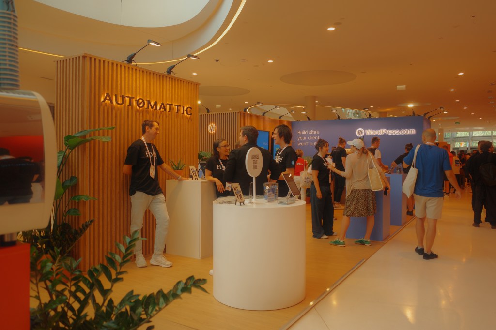
Automattic sponsored two booth spaces at the event, representing WordPress.com, Jetpack, Pressable, WooCommerce, and Automattic for Agencies. Following the thread behind our Celebrating Creators series, the Events and Design teams researched Kraków’s culture and connected with four polish artists: Ola Niepsuj, Patryk Hardziej, Michalina Rolnik, and Marta Przeciszewska from Automattic.
Each brought their own reading of the city to tote bags, travel pouches, a custom espresso blend, and art prints.
Here is what they made.
Ola Niepsuj
Ola Niepsuj is an internationally acclaimed Polish designer, illustrator, art director, and storyteller, with a career spanning more than 220 exhibitions in 35 countries. For the event, she made the Jetpack tote bags and pouches, drawing on the Lajkonik, the bearded rider with a wooden horse at his waist who counts among Kraków’s unofficial symbols.
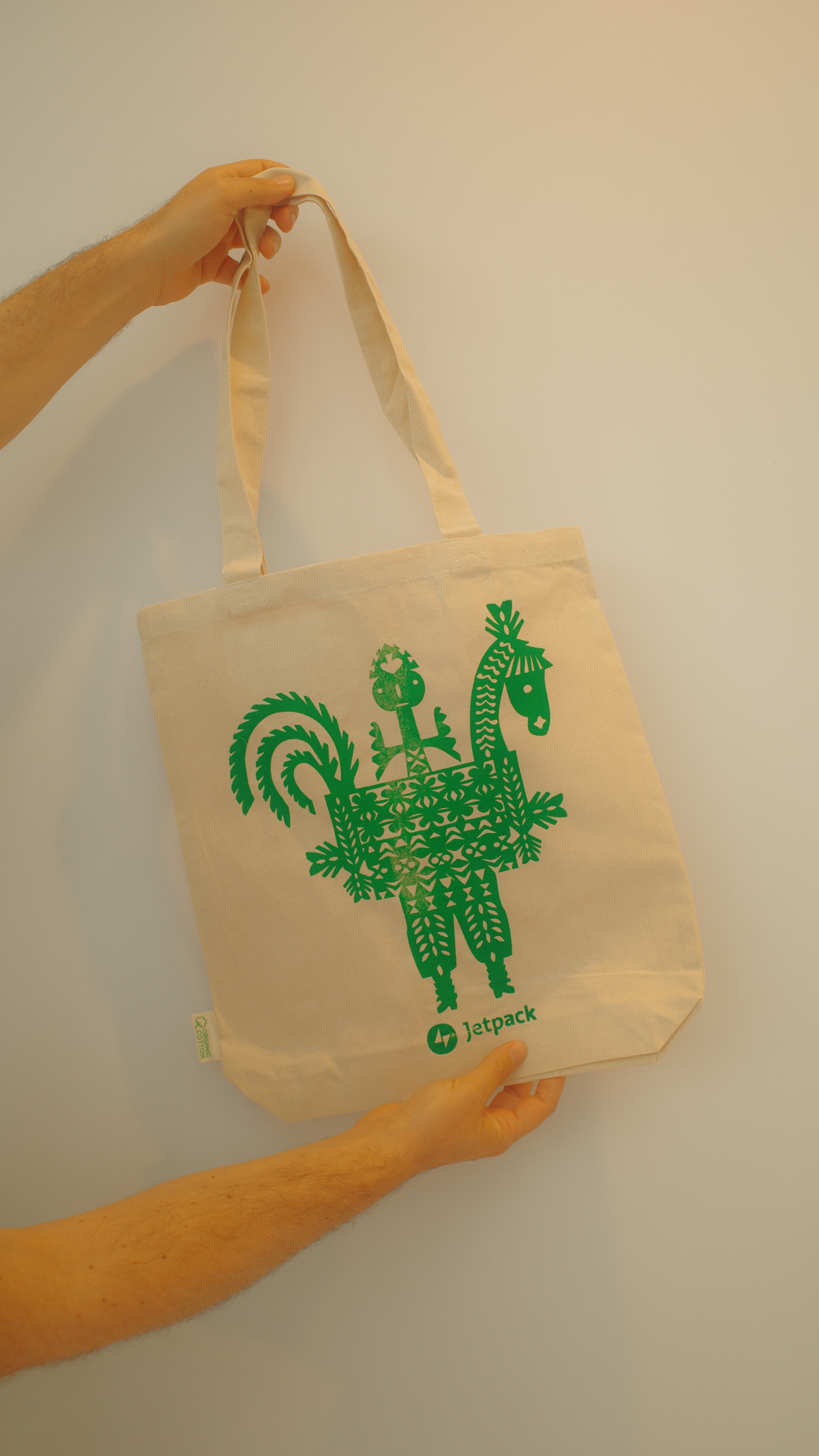
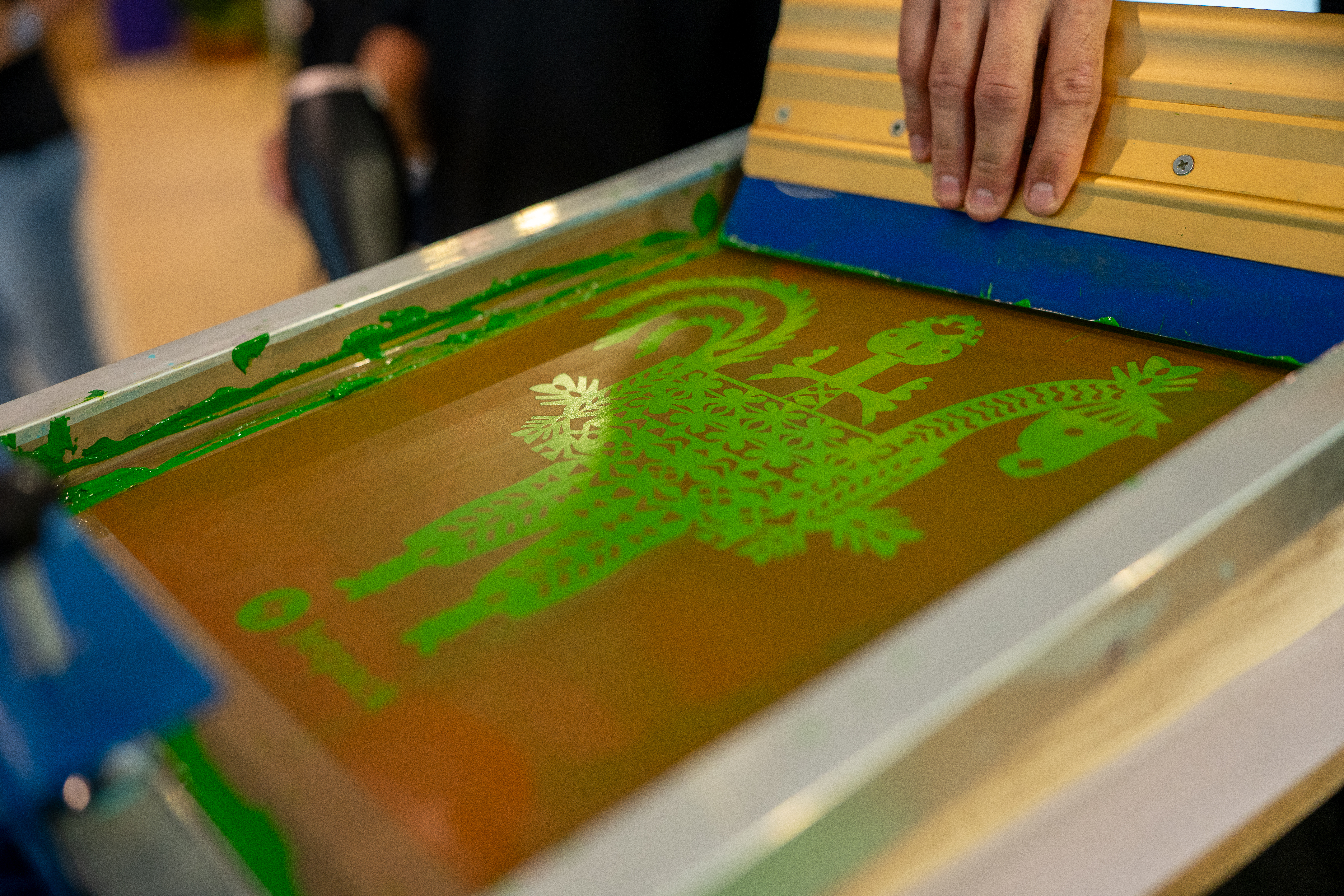


Her starting point was wycinanka, a traditional Polish folk art based on symmetrical papercutting. She wanted to see how the Lajkonik’s traditional costume could break down into the playful, geometric shapes that papercutting naturally offers. The result is a symmetrical “double Lajkonik,” two figures facing each other with small differences to find, reworked to feel more gender-neutral.
I desperately wanted to avoid making just another piece of corporate event clutter with a logo stamped on it. I approached it as a piece of standalone graphic art. I wanted it to be something someone genuinely wants to keep.
That instinct, to make something specific rather than generic, is also why she reached for folklore. She traces it back to the Polish Poster School and a tradition of illustration she carries everywhere: a love for metaphor, humor, sharp visual shorthand, and the slightly off-kilter energy of things made by hand. “Even these massive, global open-source networks are ultimately sustained by very small, deeply caring, international groups of creative people working closely together,” she argues: they are “the ones who make everything happen, from the very first sketch to the final physical object.”
Check more on @olaniepsuj · olaniepsuj.com
Michalina Rolnik
Michalina Rolnik is a Kraków-based graphic designer whose work spans photography, illustration, brand identity, and digital products, always grounded in conceptual thinking. For Pressable, she designed a coffee label, and she found her subject close to home: Leonardo da Vinci’s Lady with an Ermine, which hangs in the Czartoryski Museum in Kraków.

She had made Kraków-themed swag before and worked through the obvious options long ago, so the painting felt both quick and right. Plenty of people never realize the Lady lives in the city at all, the way the Mona Lisa’s address is common knowledge, and Michalina saw the same potential in Leonardo’s other famous portrait. She drew it by hand, and she is clear about why that matters.
I like this manual technique, especially in such a strongly technological environment. I feel it brings a personal touch and feels more human. I think we might observe more manual work in digital design soon, as a response to the rise of instant-generated creations.
That conviction has roots in where she comes from. The scale of WordCamp Europe caught her off guard, since most of her contact with WordPress had been through developers, but the sensibility she brought to it is firmly local. She considers herself “a huge fan of Polish design from the 1960s–80s,” whether it’s posters, books, albums, or daily-use objects: “I love colors and boldness, but combined with simplicity.”
A vintage enthusiast who hunts down old Polish book covers, she points others toward the painter Tomasz Kręcicki and Alicja Kobza‘s “Graficzki” project.
Check more on @stare_dobre
Patryk Hardziej
Patryk Hardziej is an illustrator, graphic designer, creator of film posters, researcher, and author of books on the history of graphic symbols. He lectures at the Academy of Fine Arts in Gdańsk, and his work has won repeatedly at the KTR awards, the Polish Graphic Design Awards, and the European Design Awards. He has been a member of the Alliance Graphique Internationale (AGI) since 2025. For WordCamp Europe he took on the Dragon and the Lajkonik.


His approach is stripped back: simplified forms, clean geometry, symbols distilled to their graphic essentials. He describes the two characters as motifs he felt he could make interesting precisely because they are so widely recognized. No need to explain what they are. The shorthand does the rest.
Especially in the age of the internet, where everyone has instant access to digital versions of everything, physical objects mean even more. They create a tangible connection that I find very valuable.
That attention to form comes from a specific lineage. The broad tradition of Polish poster art runs through his background, but what pulled him in was a narrower discipline: graphic symbols and logo design. Three names in particular — Karol Śliwka, Roman Duszek, and Ryszard Bojar — changed how he understood the craft. Of those three, one matters most. Śliwka was not just an influence but a mentor and a friend, and Patryk founded the Karol Śliwka Foundation to keep his legacy visible: “I owe him a great deal, and his work continues to inspire me to this day.”
Check more on @patrykhardziej
Marta Przeciszewska
The first three artworks were commissioned for the occasion, but Marta Przeciszewska was already on the Automattic Design team. She is a Brand/Creative Designer in Woo, working on brand language and visual communication every day. She is also a graduate of the Academy of Art and Design in Wrocław, where she now teaches graphic design principles. For WordCamp Europe, she designed a key visual and a set of supporting assets for a Woo partner event built around the Polish phrase “zabawa na 102,” which means something like celebrating to the absolute fullest, no limits.

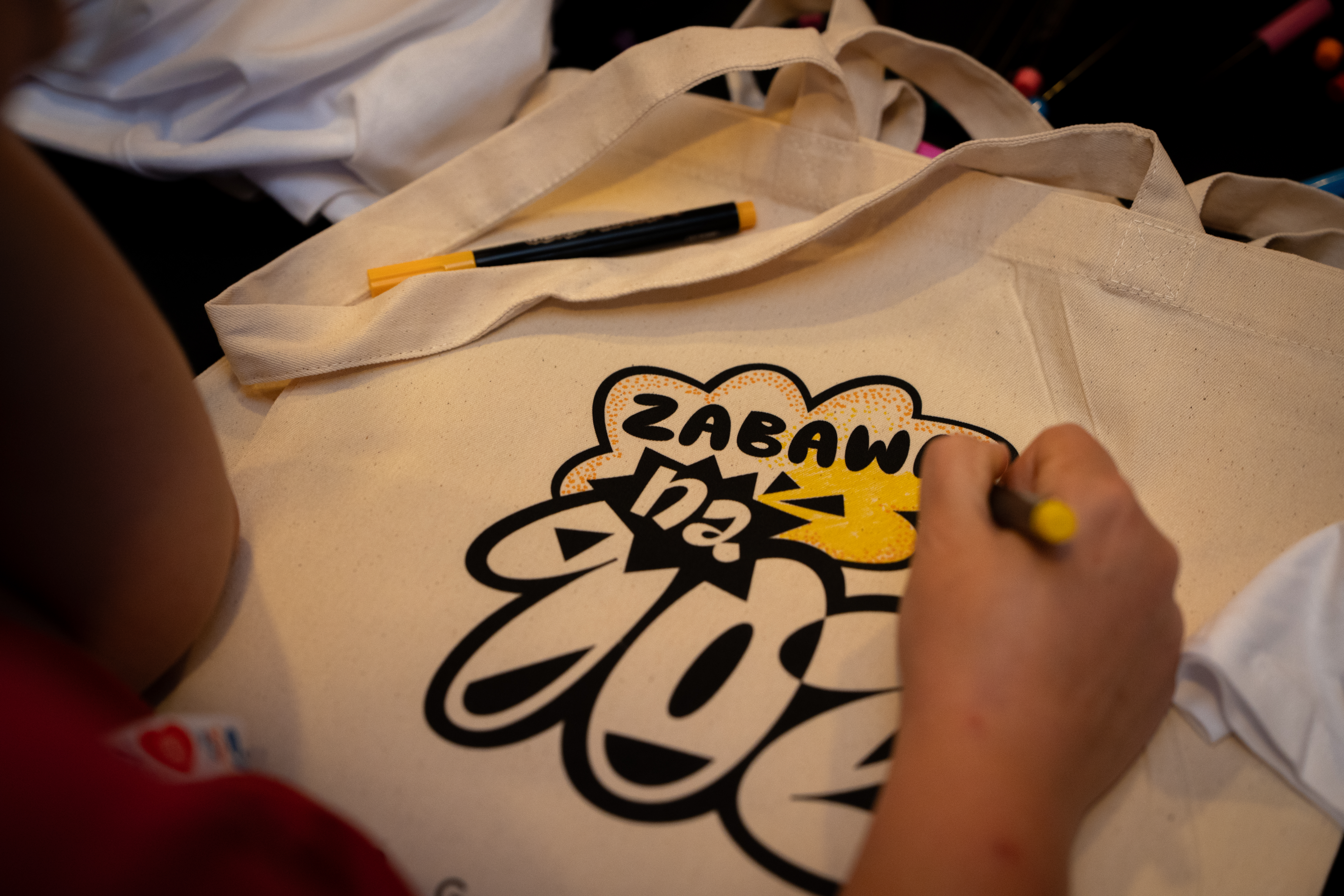
The design brief gave her room to step outside normal brand constraints. She drew on the playful lettering and handcrafted compositions of Polish poster history and pushed the typography into something more experimental, giving the letterforms a dynamic, party-like character.
For many years, due to our location behind the Iron Curtain, designers had limited access to global influences and conventional design development, which created a space for building a distinctive visual language rooted in craft, metaphor, experimentation, and unexpected solutions.
She grew up surrounded by books illustrated by the Themersons and later discovered Henryk Tomaszewski, Hubert Hilscher, and Liliana Baczewska. What she took from them is a way of working where structure supports rather than constraints. “I am drawn to visual expressions,” she says, “where geometry serves as a supporting tool rather than a strict rule, allowing space for intuition, playfulness, and human touch.”
Her list of Polish names to follow is generous: Grupa Projektor for books and branding with exceptional typographic quality, Karolina Pietrzyk for a graphic language full of tension and character, Jakub Zasada for posters that draw on PRL-era aesthetics with a fresh eye, Nika Langosz and Radek Łukasiewicz for type design, and Susie Hammer for something charming, playful, and warm.
Check more on @martaprzeciszewska
Every WordCamp lands somewhere. A city with its own mysteries, its own craft traditions, its own designers. We want to keep finding those people and giving them a brief. Not just because it makes better swag, though it does, but because the WordPress community grows every time a local creator walks into it for the first time.


Leave a comment