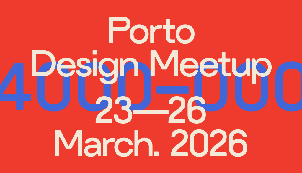
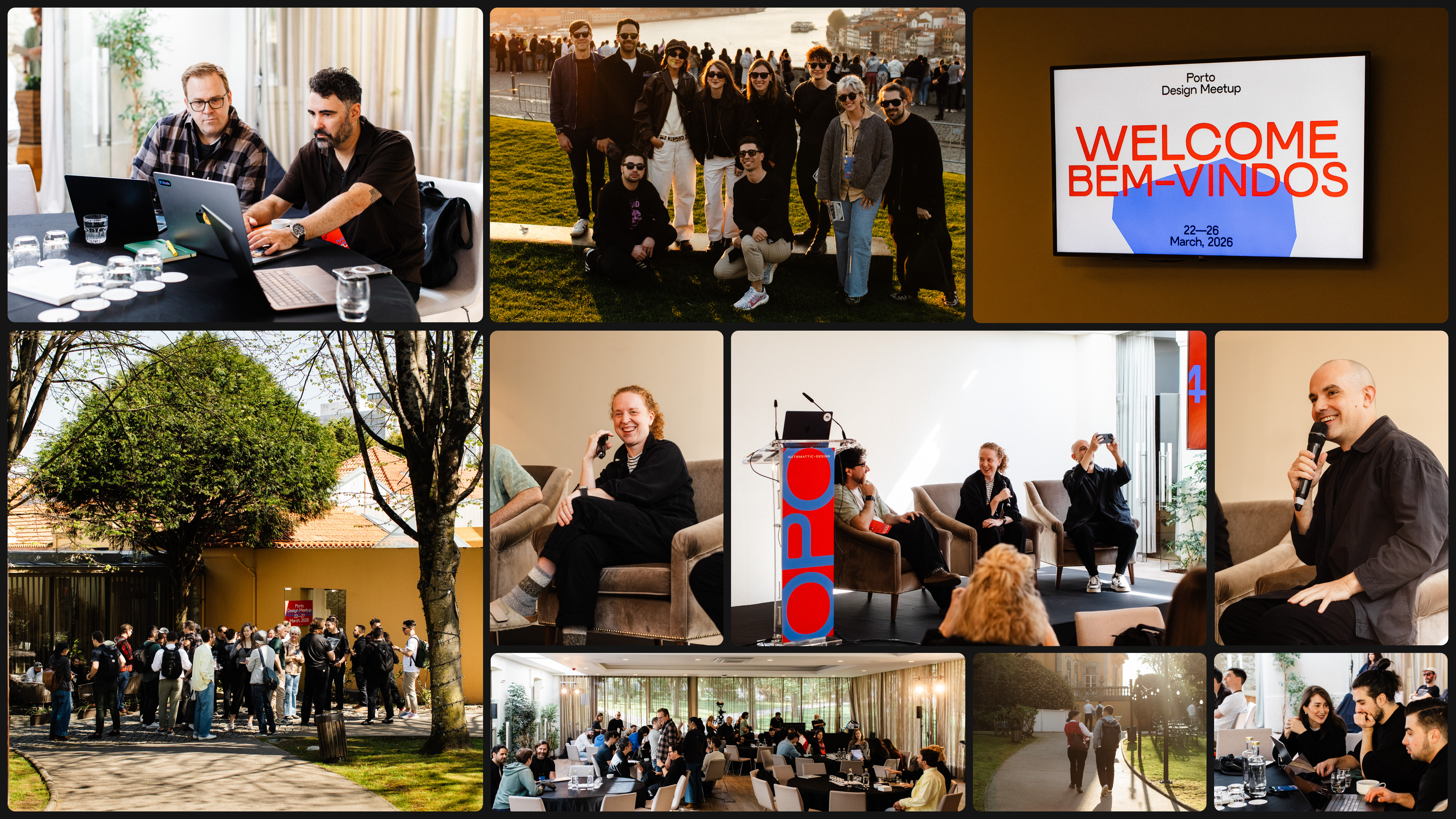
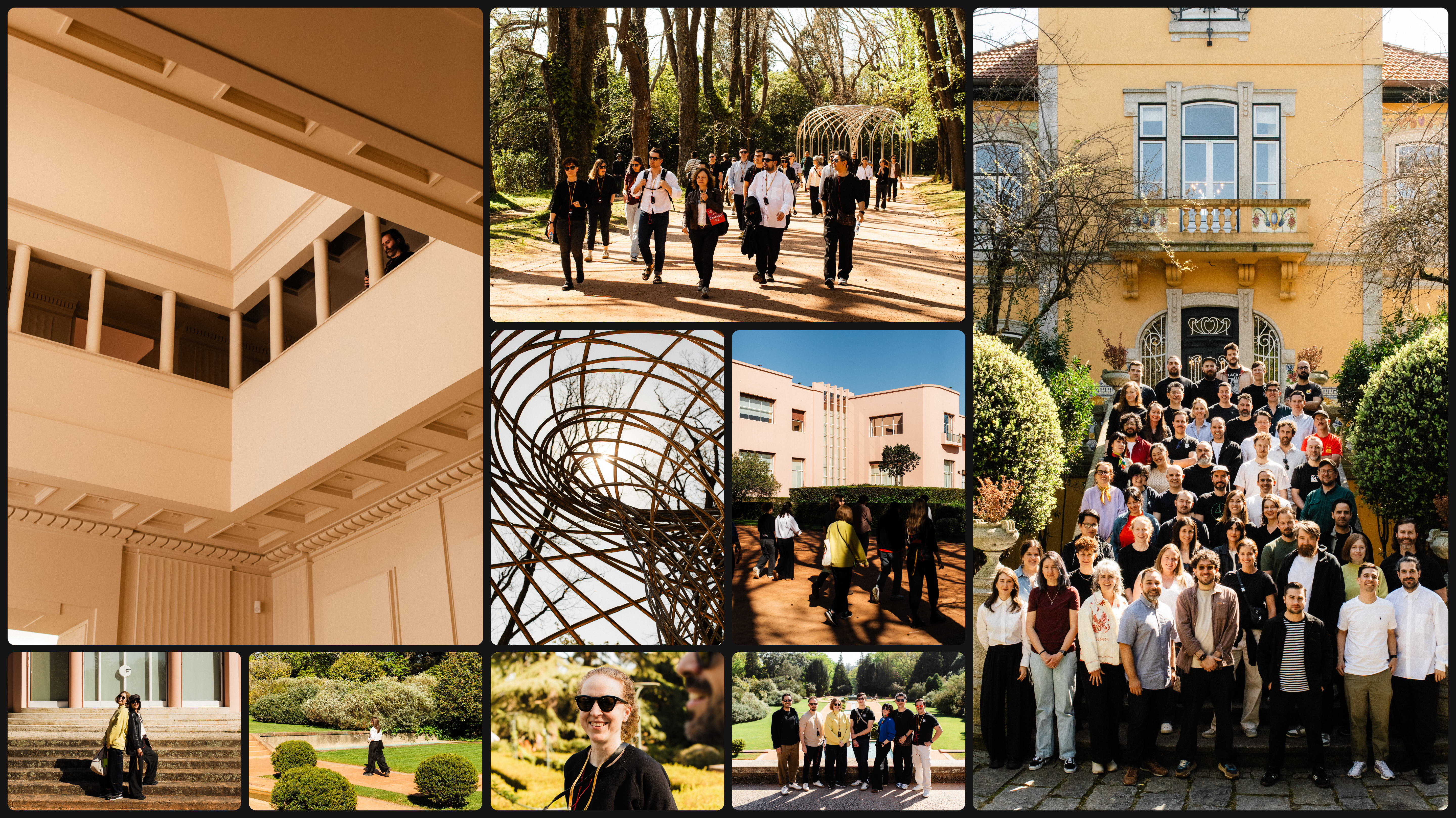
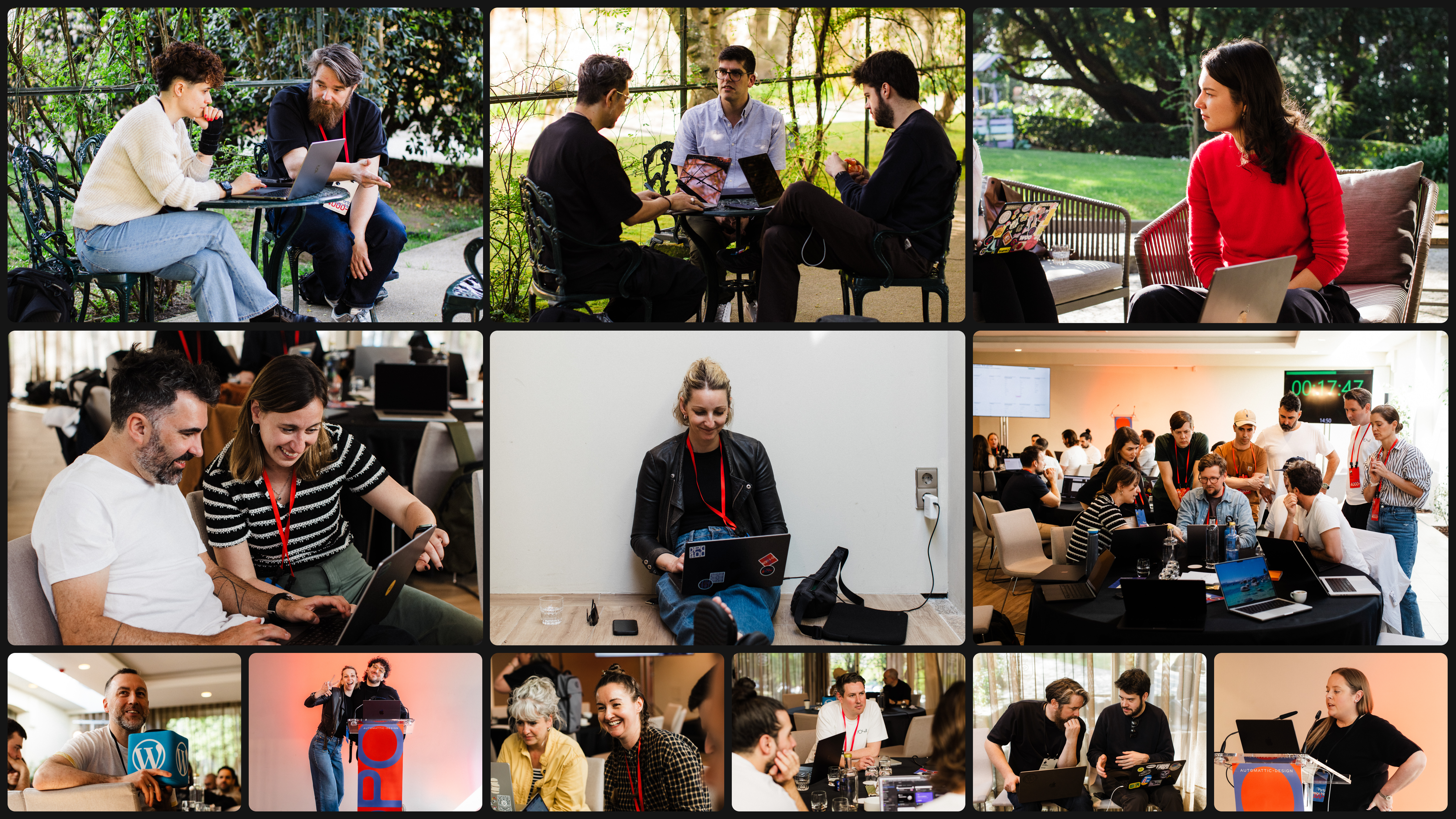
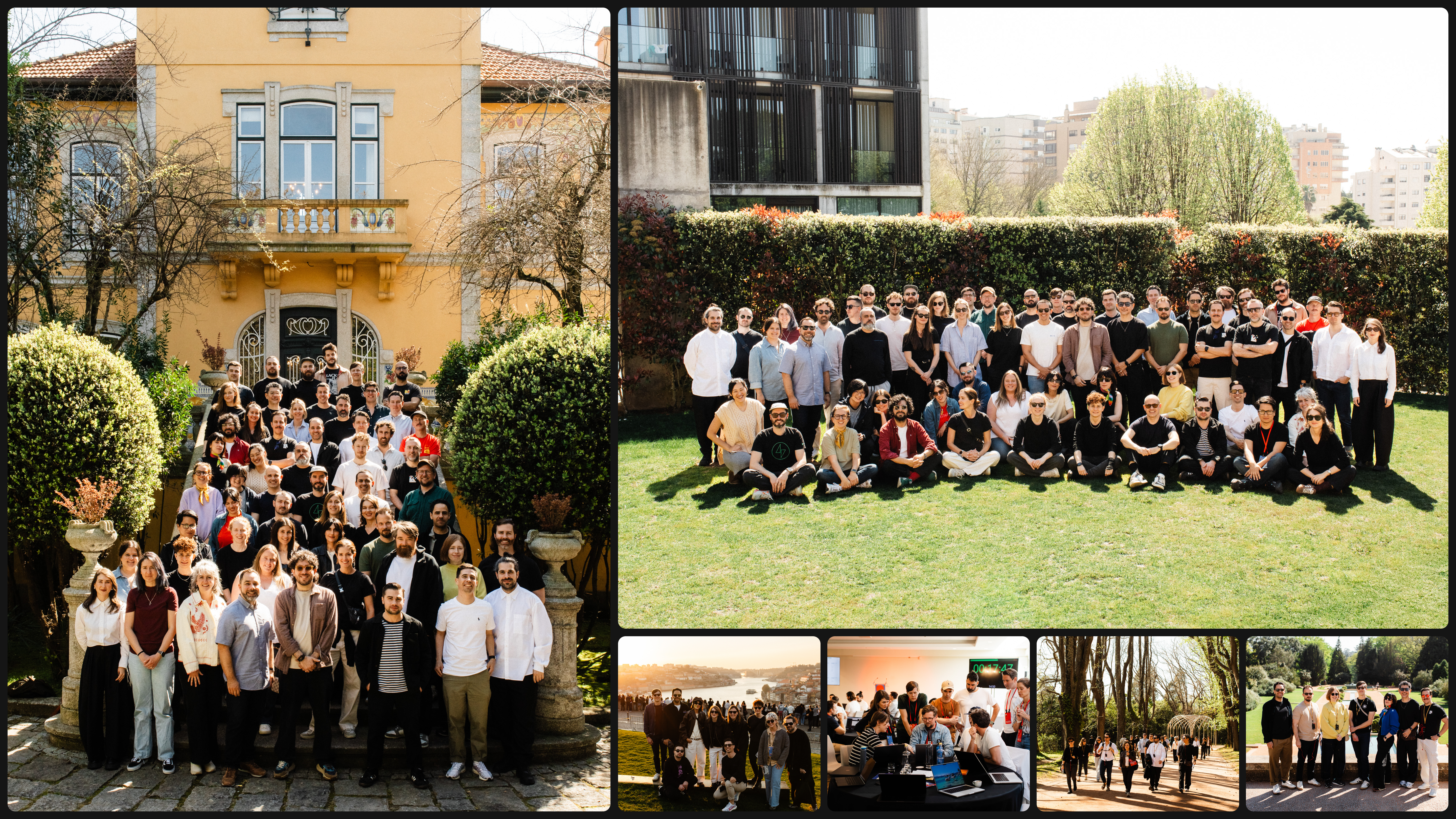
Once a year, our entire design team gathers in person. It’s a rare and deliberate thing—a few days of workshops, talks, shared meals, and the kind of conversations that only happen when you’re in the same room. This year, we were in Porto. And this time, the Creative Lab team built the event’s visual identity from scratch.
Here’s the story of how we got there.
Concept: every place, one system
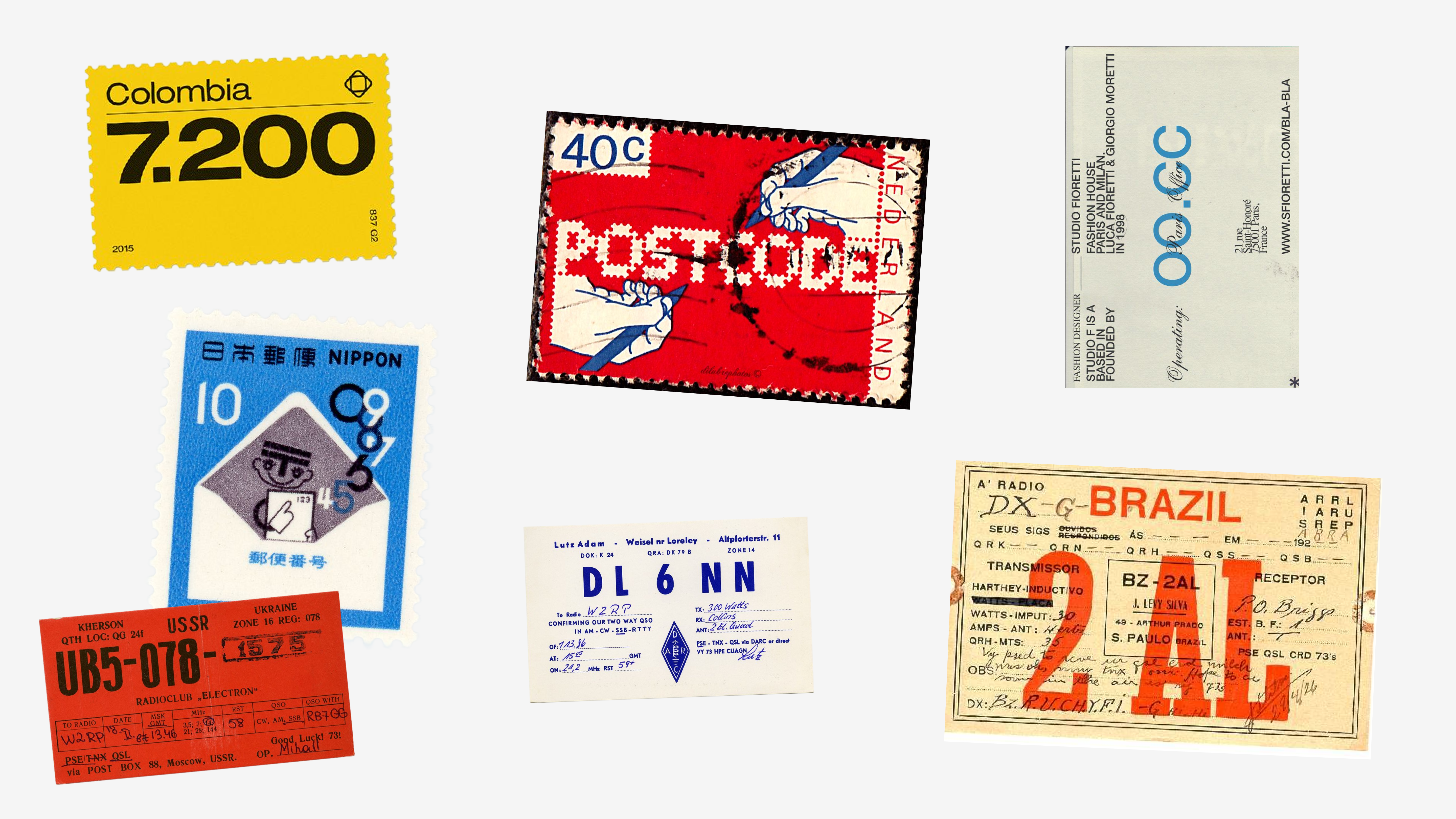
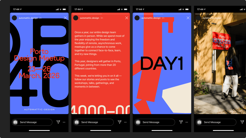
The starting point was deceptively simple: what if the identity was built from postal codes? Not as abstract decoration, but as a genuine signal—each code a shorthand for a real place, a real person, a real story. Our team is distributed across dozens of cities and countries, and a postal code captures that perfectly: specific enough to be meaningful, abstract enough to be universal.
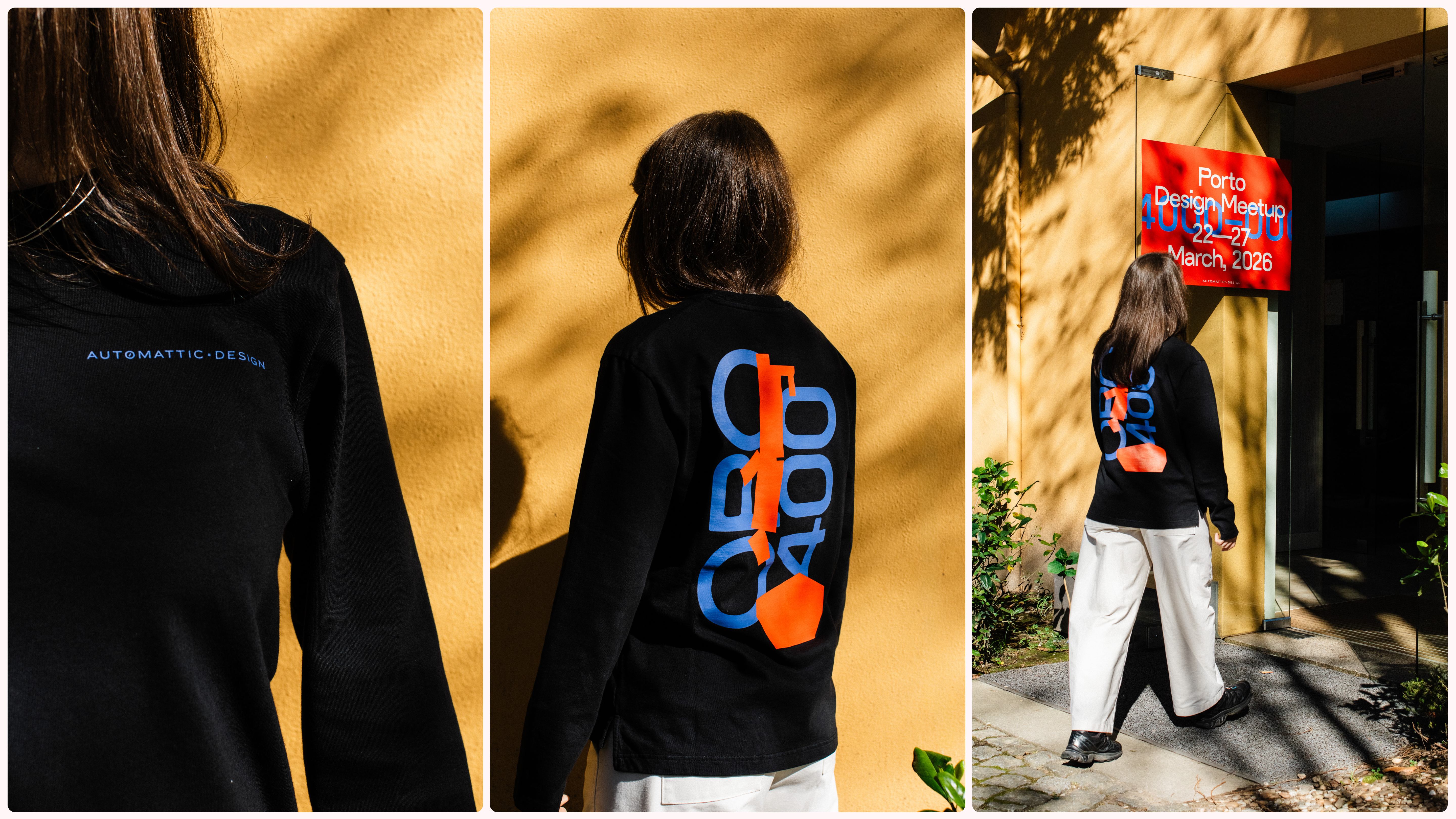
Porto’s own code—4000-000—became the primary visual anchor. Set large, cropped aggressively, layered, and collaged, it stopped being an address and started becoming a graphic element. The hyphen between the digits even became a compositional device, a dash of space that gave the layouts rhythm and breath.
Visual direction
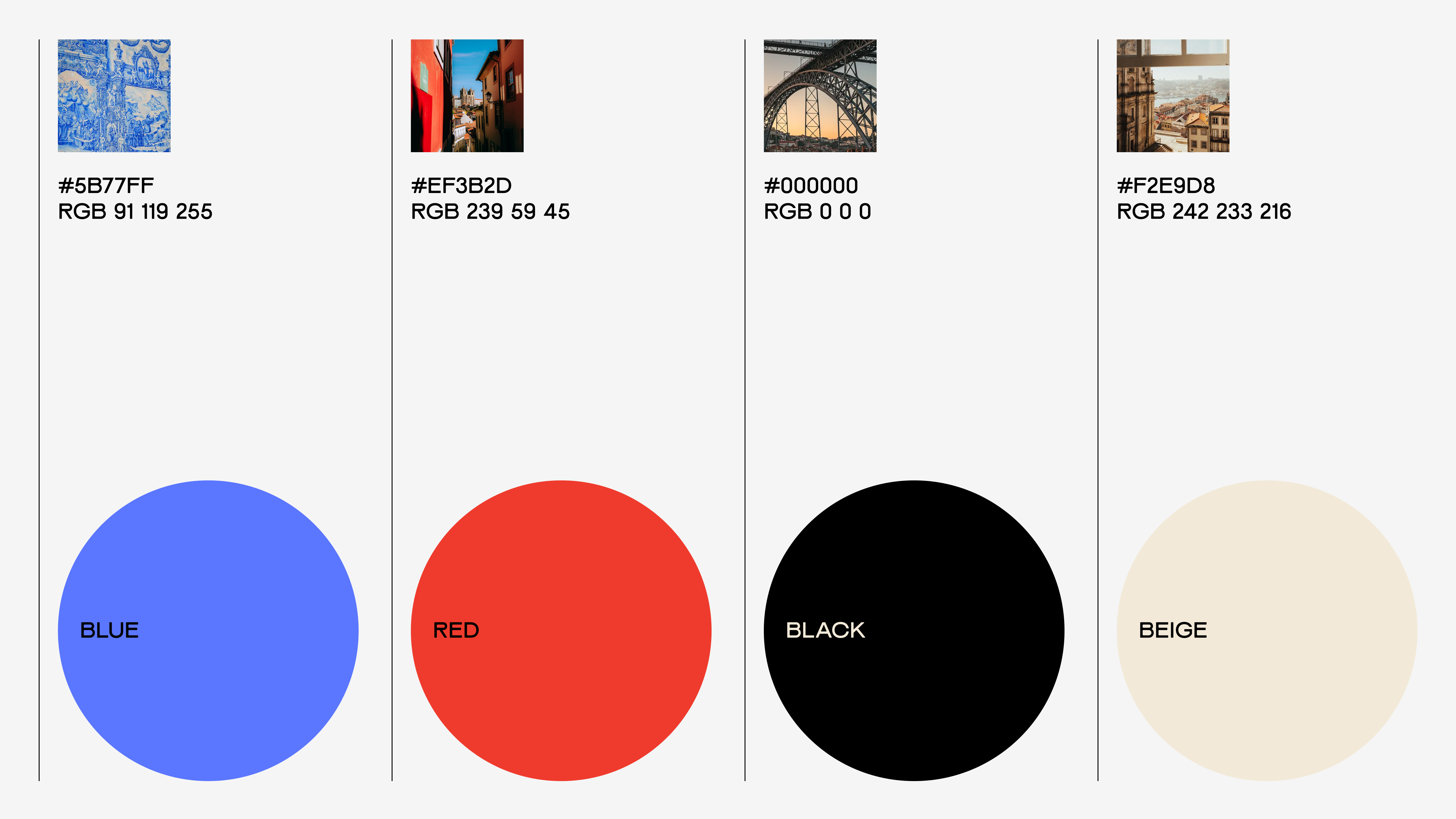
The palette was chosen to match Porto’s energy: warm, saturated, and confident. A bold red that recalls the azulejo tiles and the city‘s architectural character. A cool, almost electric blue that feels contemporary. Off-white for type, and black for contrast. Nothing timid.
Typography was treated not as a support layer but as the primary visual material. For that to work, the typeface itself had to carry real weight—and ALT Picaro, designed by Ellen Jonsson at ALT.tf, was exactly the right tool. It’s a bold, geometric grotesque with uniform stroke weights and subtly rounded terminals that give it warmth without softening its impact. Set at a scale where the numerals and letterforms became texture—cropped, overlapping, sometimes barely readable—it stopped being a font choice and became a material decision.
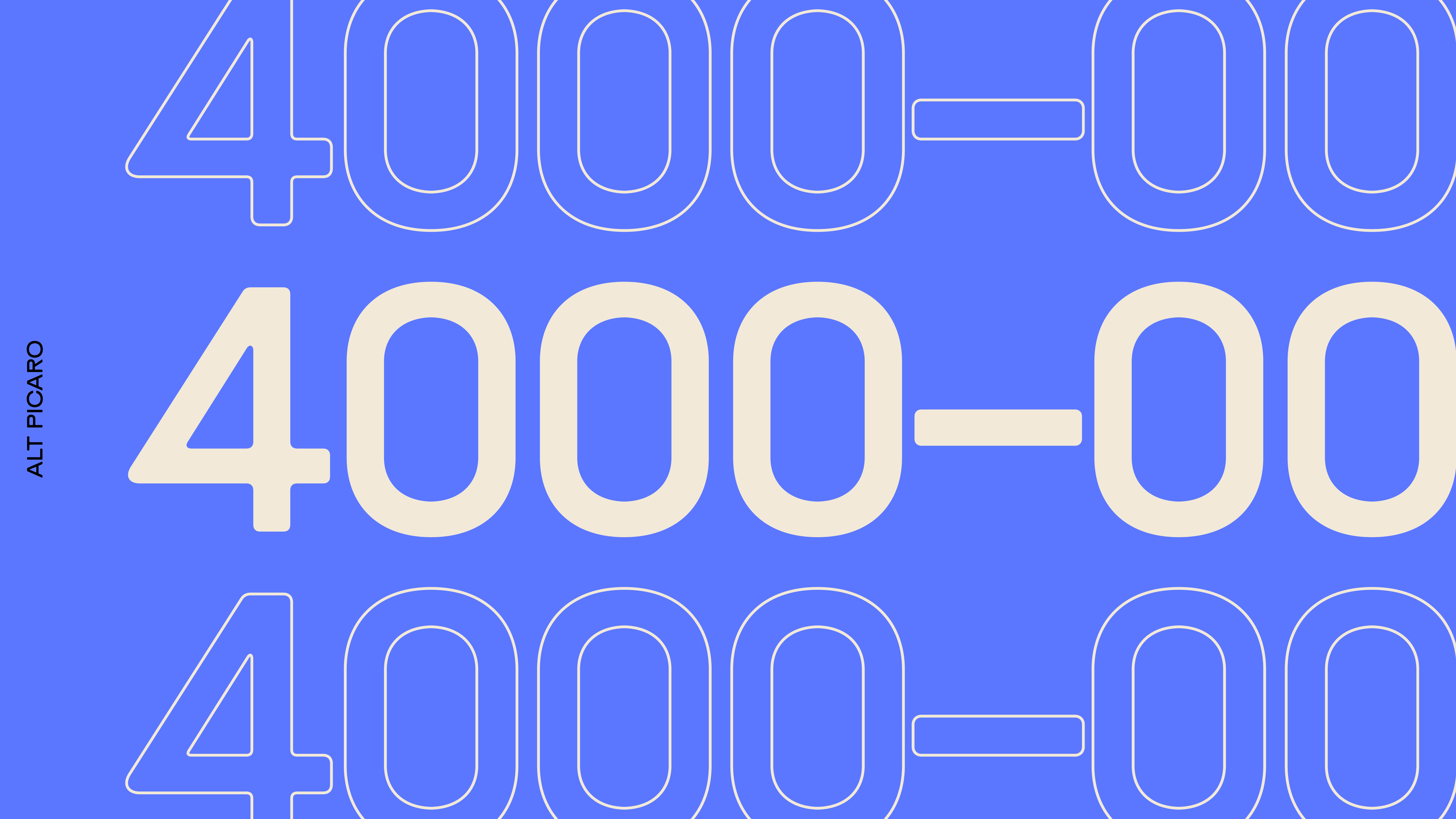
The wide stance and elevated crossbar gave the numerals a particular rhythm that turned out to be crucial: when the postal code fragments were layered and cropped across formats, the individual characters held their personality even at partial visibility.
From screen to surface
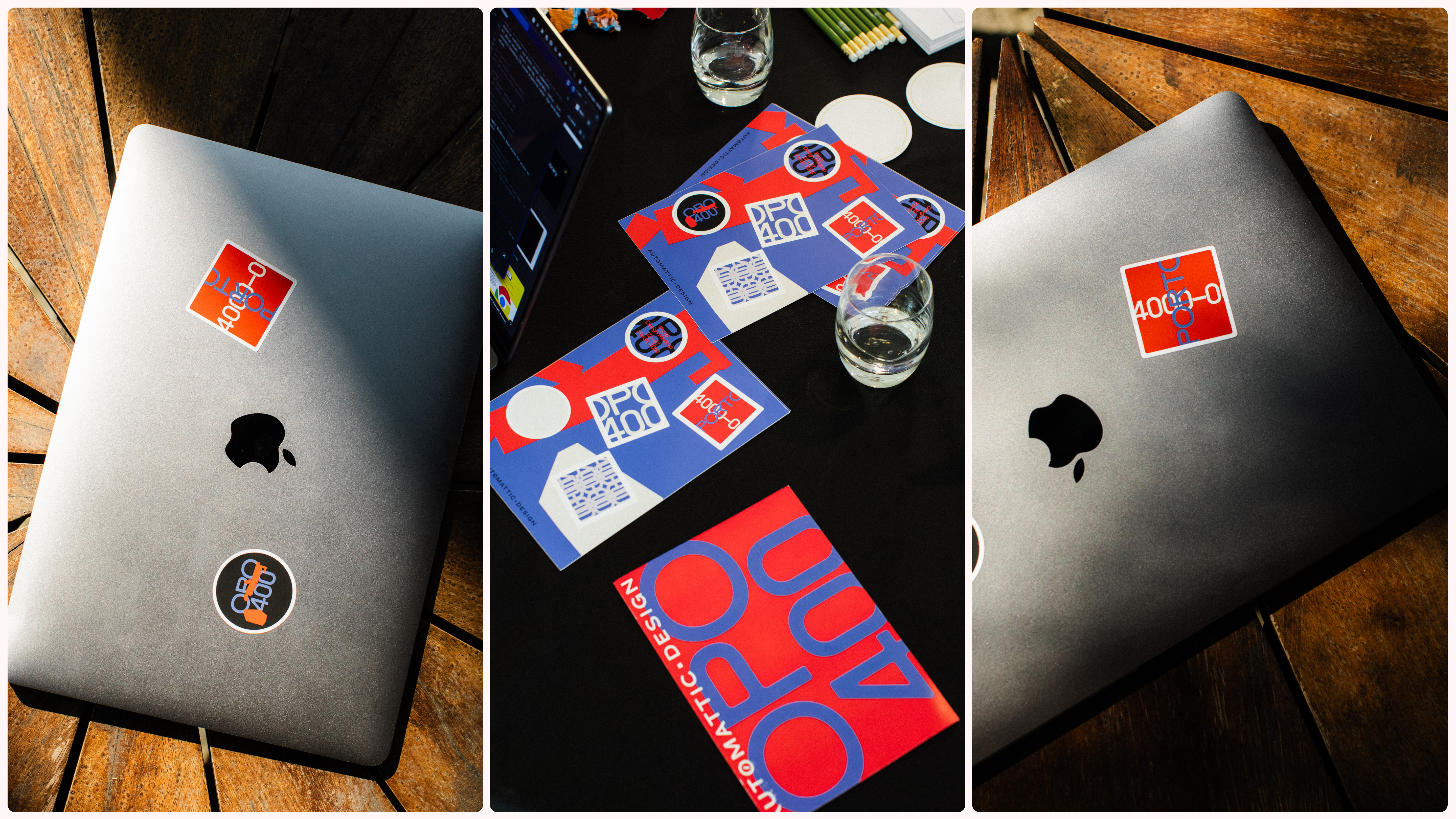
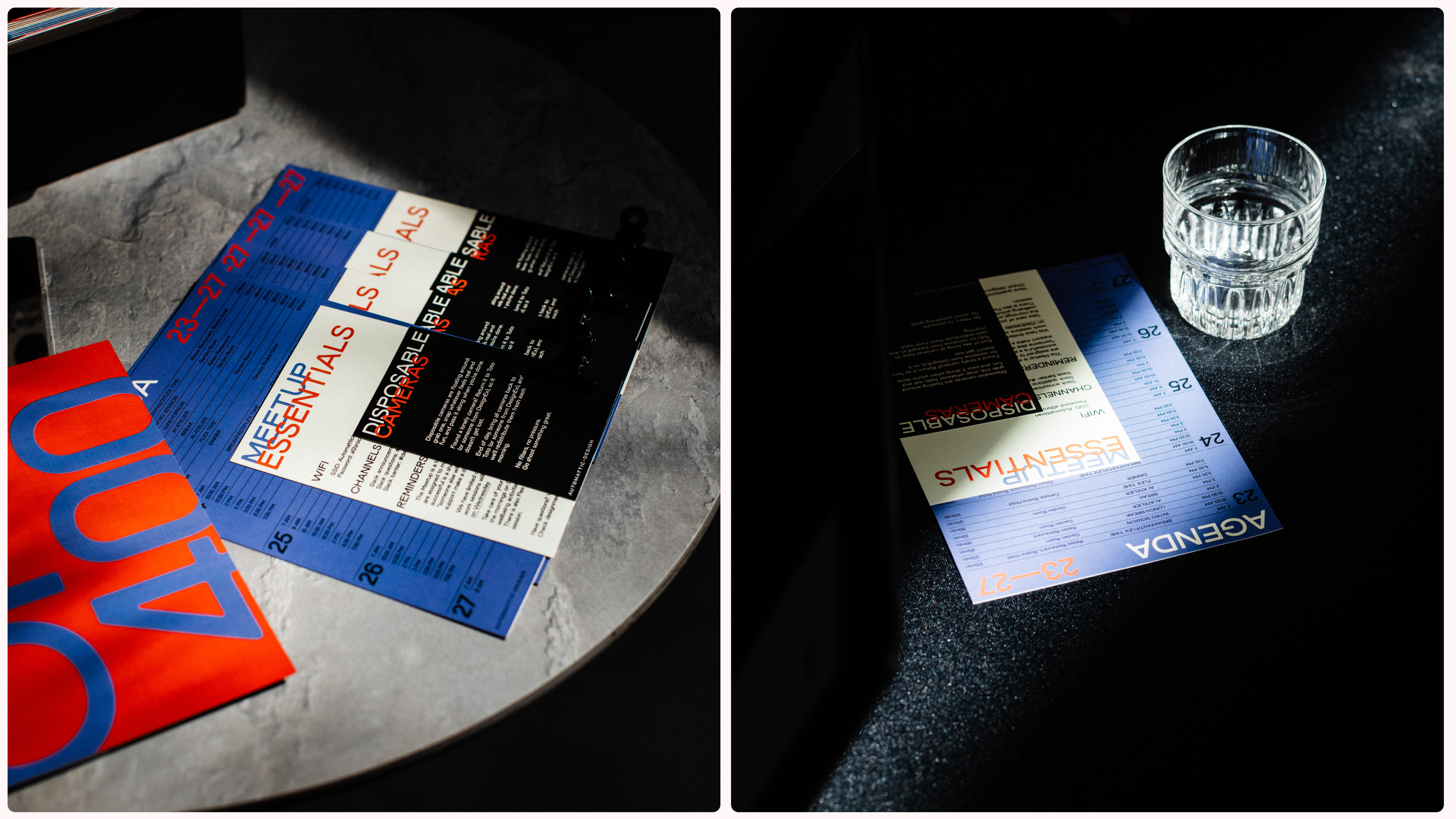
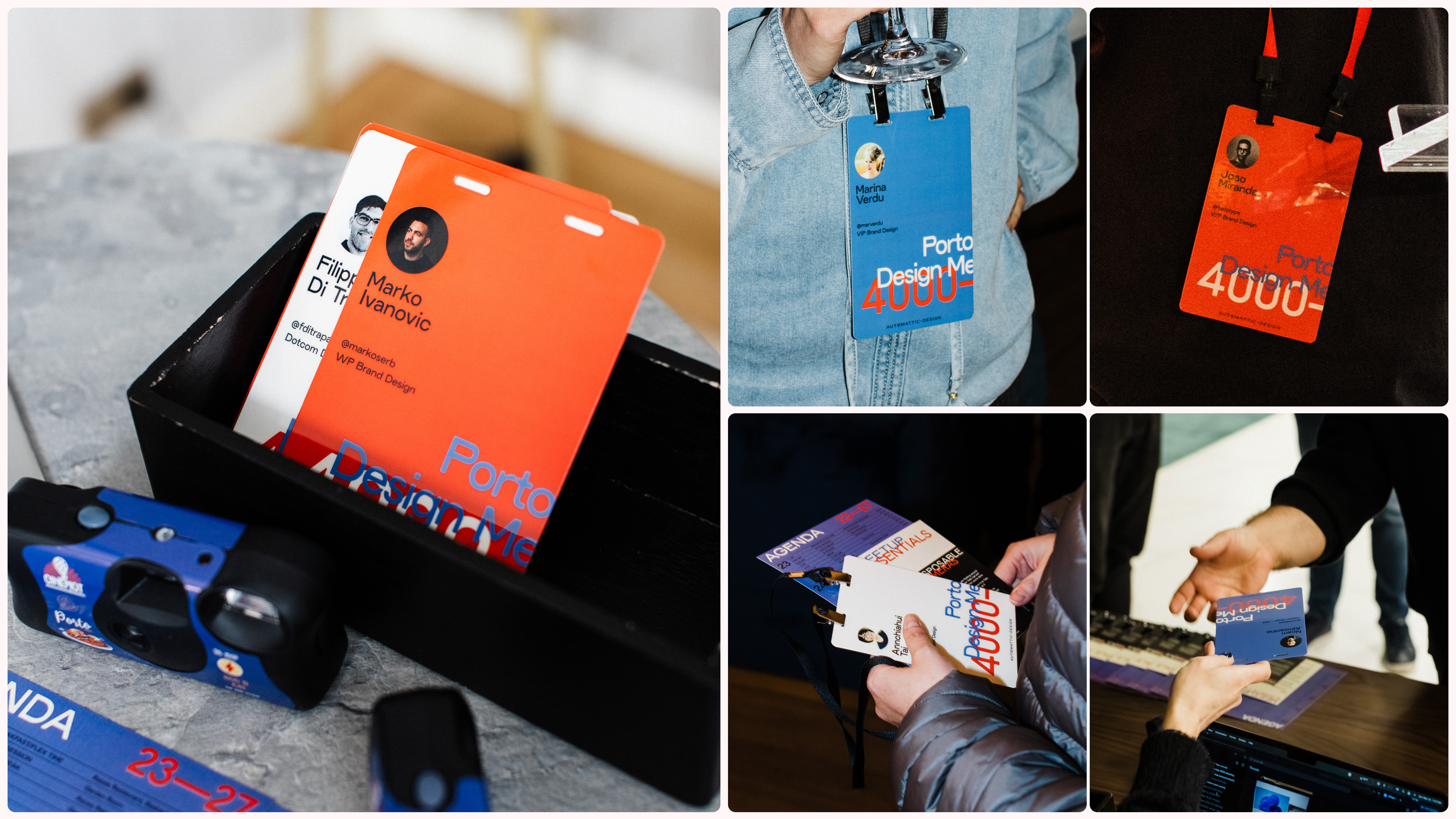
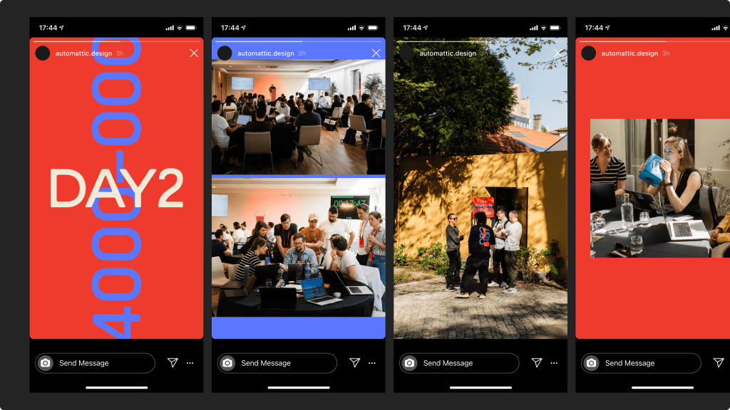
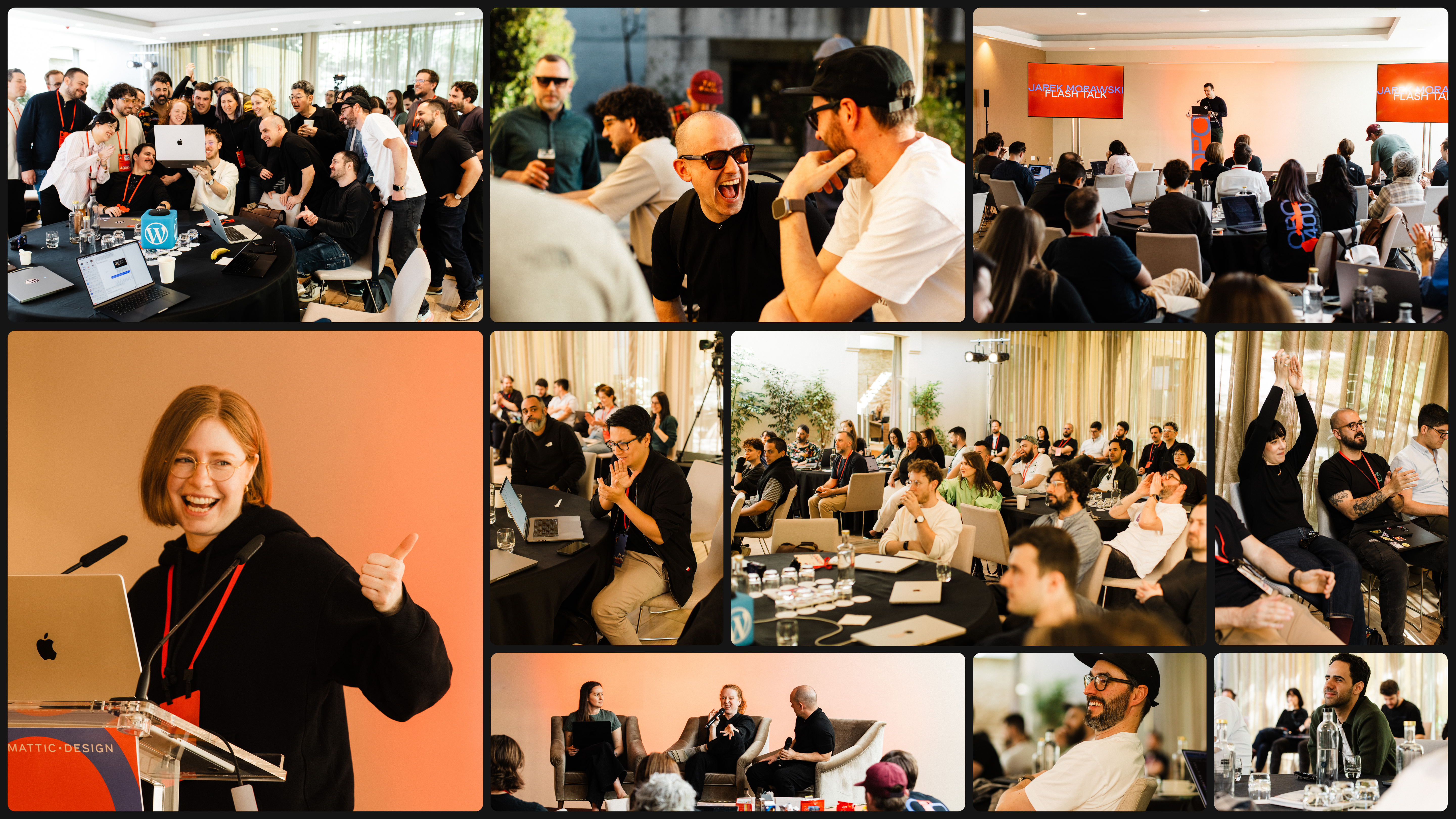
The system was applied across every touchpoint of the event: welcome screens, day-by-day agenda slides, name badges, lanyards, printed booklets, and—most visibly—a run of long-sleeve shirts carried the identity on their backs, literally. Seeing the same numerals that started life as a Figma frame show up stitched into fabric and pinned to someone’s laptop is one of those small, satisfying moments that make this kind of work worthwhile.
Stickers were scattered throughout the venue. Signage framed the spaces. The agenda slides brought the same visual logic into motion. By the end of day one, the identity was genuinely everywhere—not as wallpaper, but as something participants wore and carried.
On designing for the physical world
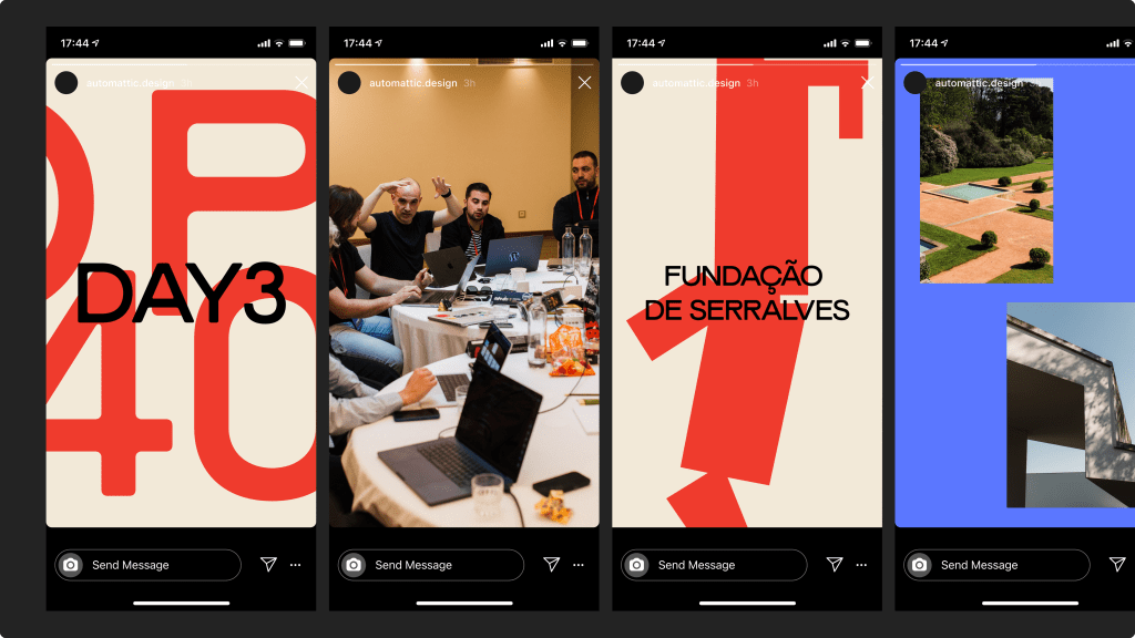
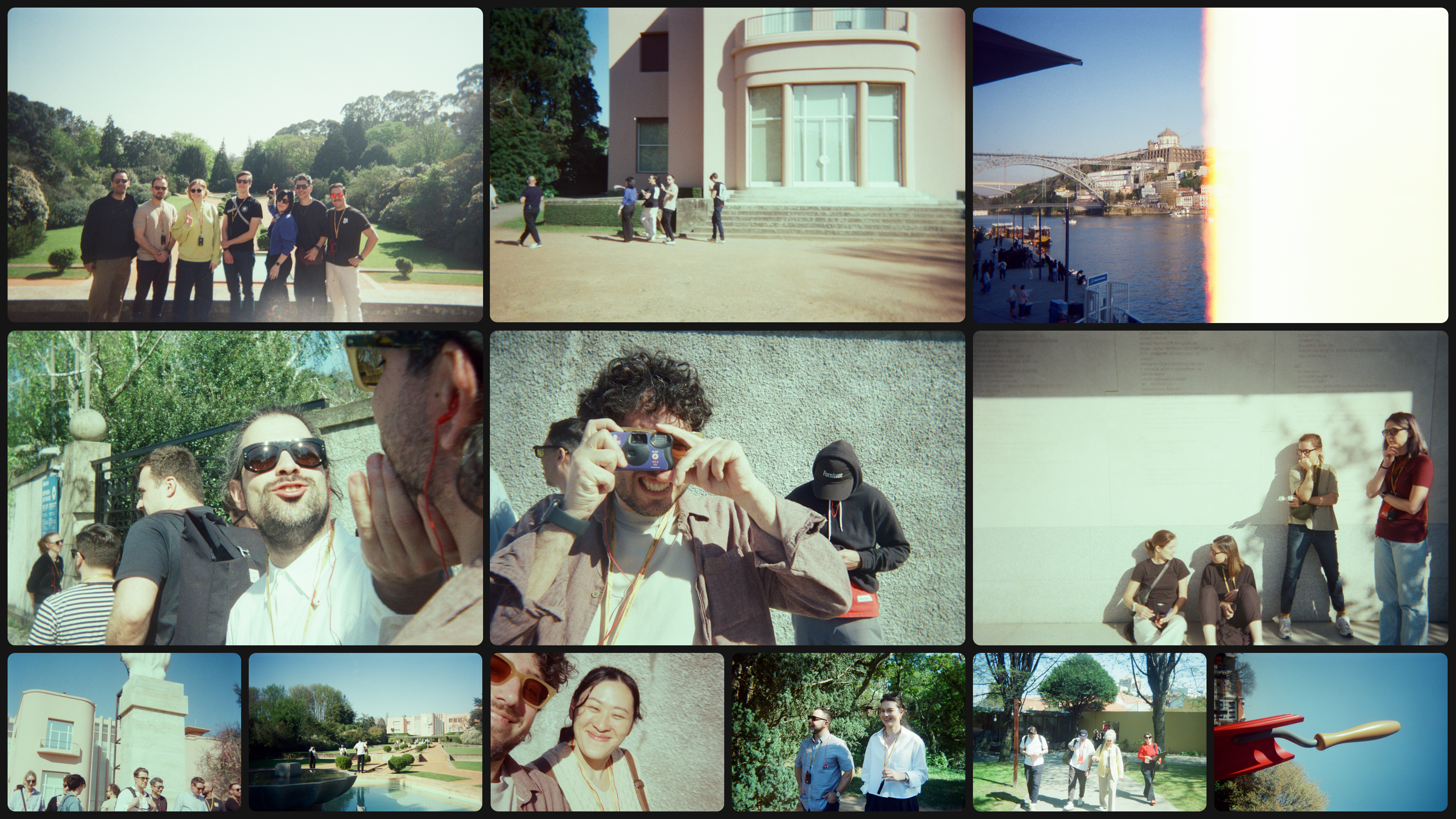
There’s something that happens when a design leaves the screen and enters the room with people. It stops being a proposal and starts being an experience. A badge isn’t just a credential, it’s something you reach for on your first morning, something you glance at when you shake someone’s hand, something that quietly says: we thought about this.
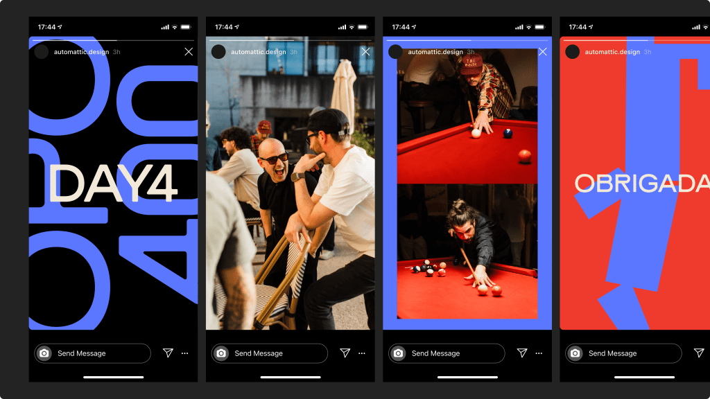
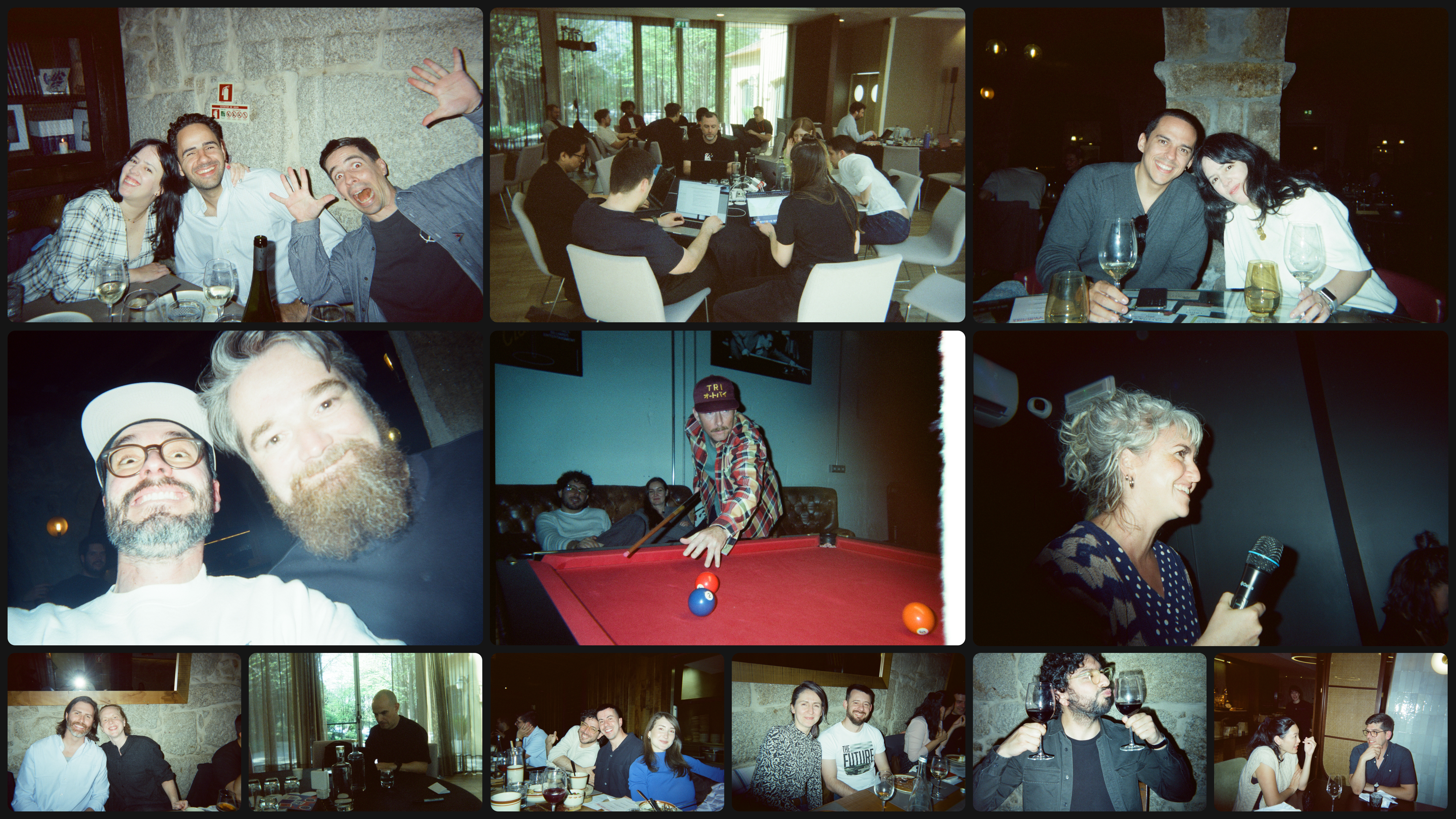
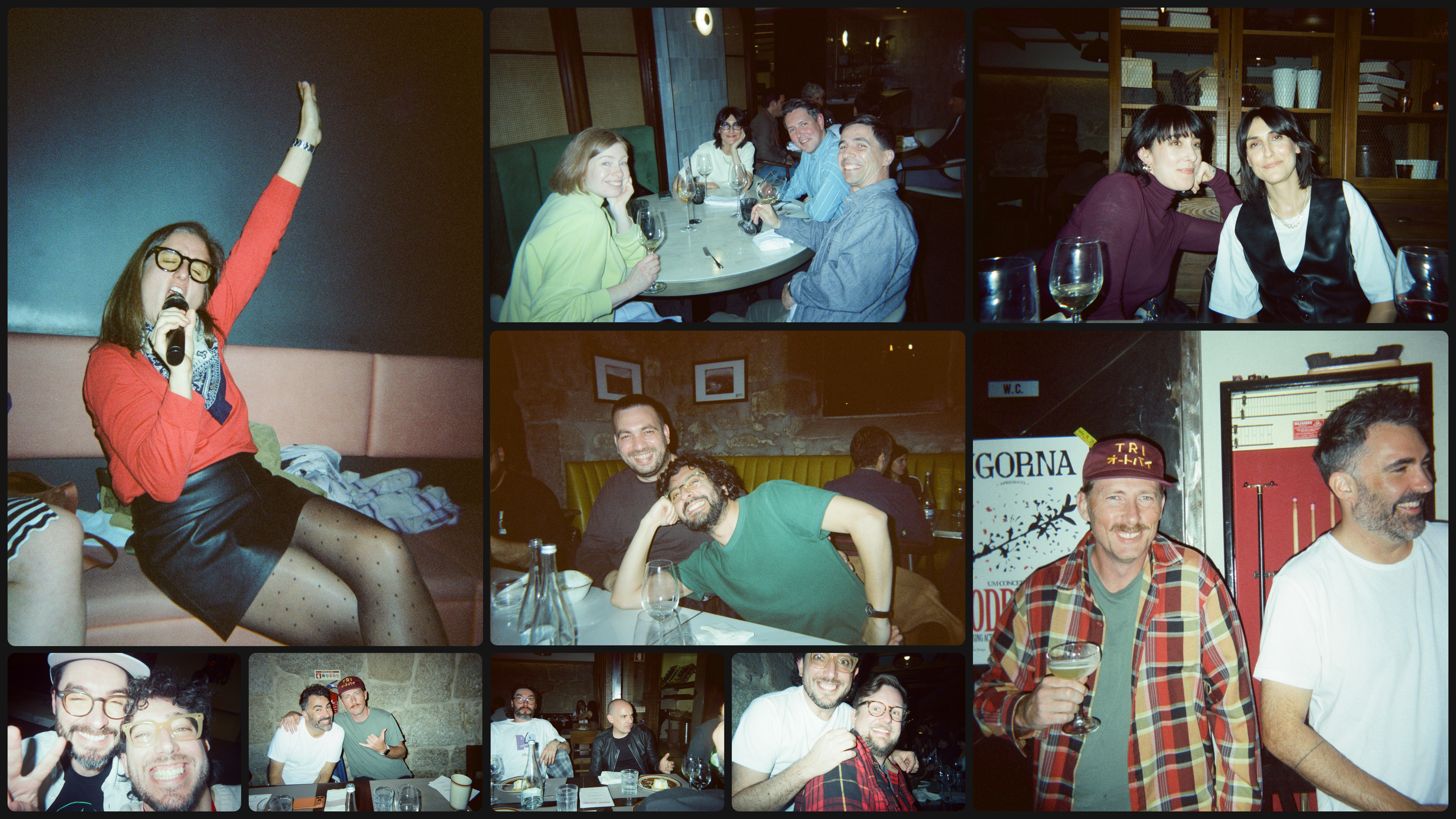
The best part wasn’t seeing the finished prints or the final shirt mockup; it was watching people in Porto pick up the stickers, hold the badges, wear the shirts. Design that gets experienced in space, with other people, over the course of days, does something that a pixel-perfect file never quite can. It accumulates meaning. It becomes, however briefly, part of a shared memory.
That’s the privilege of this kind of work. And it’s a good reason to keep making things that exist in the world.
Photos by ©Luís Moreira.


Comments
Beautiful concept and execution!
Wow, wirklich inspirierend zu sehen, wie aus einer simplen Idee wie einem Postleitzahlen-Code eine komplette, lebendige Event-Identität entsteht! Die Verbindung von Typografie, Farbe und physischen Elementen macht deutlich, wie Design Menschen im Raum berühren kann – absolut beeindruckend.
Porto is an amazing place.