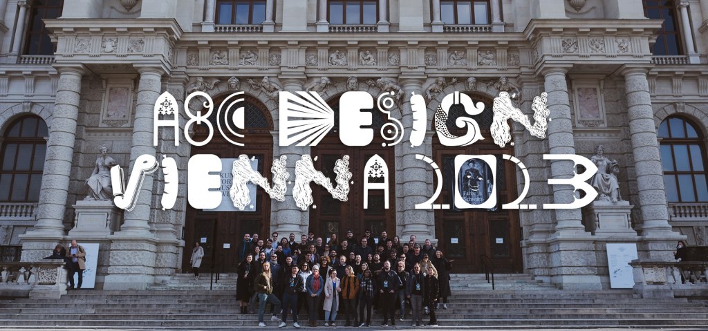
If you haven’t tasted a fresh krapfen from Groissböck Bakery in Vienna, it’s like biting into a yeasty cumulus cloud that’s about to rain powdered sugar. Each bite of the billowy pastry yields a burst of exquisite filling. I shared my first krapfen experience with designers from across Automattic’s portfolio of products during our Design Meetup in Vienna, Austria in February. Meetups take place in various cities around the world and usually include a day dedicated to experiencing the local culture. This year, I facilitated a group typography activity inspired by Vienna, fueled by, of course, apricot krapfen.

The Brief
The goal of our meetups is to foster a collaborative community that sustains our distributed work model. With that in mind, I aimed to create something together that would allow for diverse individual contributions and culminate in something more substantial. To me, a typeface is a perfect example. As a brand designer, I often personify typefaces and letterforms and consider them a cast of characters with diverse personalities. However, reflecting on the purpose of this activity made me think of the designers in our group as a collection of unique letterforms. Therefore, my brief for the activity was summed up with the absurd question: “What would it look like if Vienna and you, as a designer, had a letter-shaped baby?”

The Activity
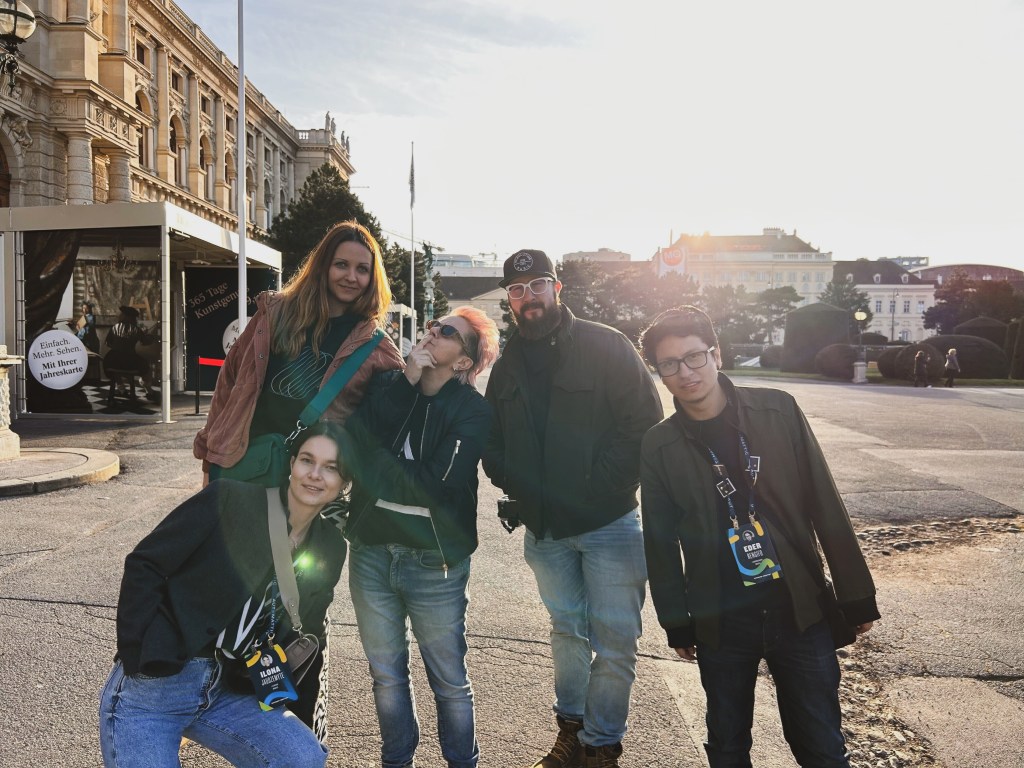
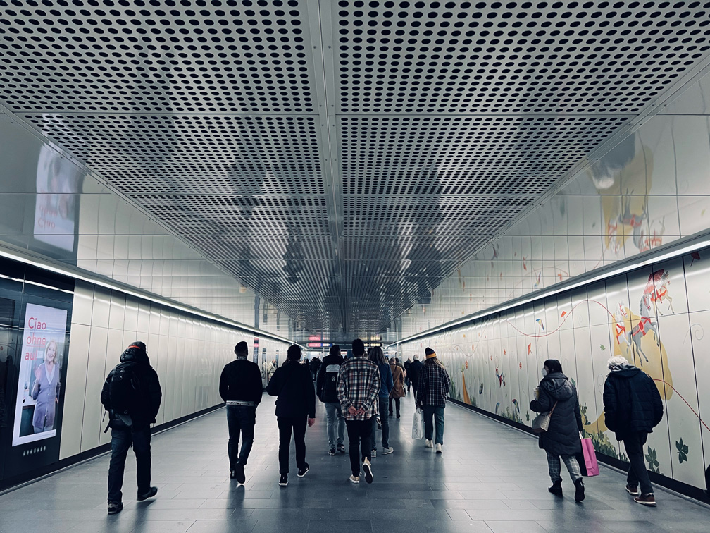
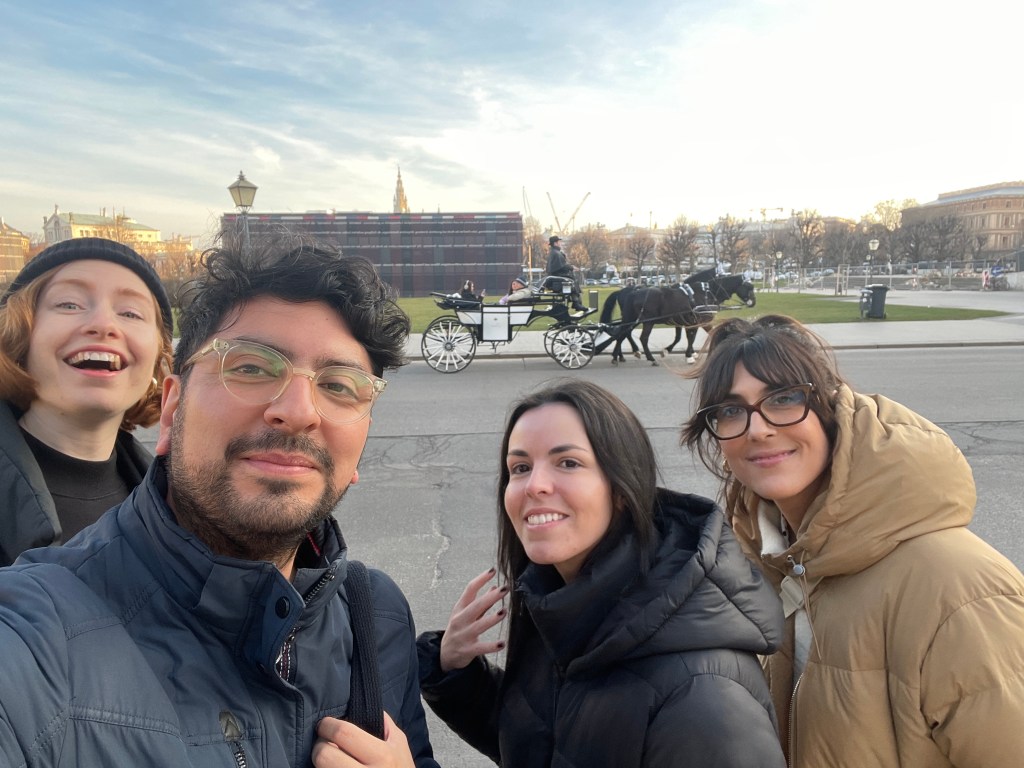
We had about 60 attendees—a mix of product and brand designers from different countries around the world. Each person selected a capital letter or number from 0–9 (from the Latin alphabet) and set out in groups to explore the city together. We spent approximately three hours wandering around downtown Vienna. We bonded over shared work challenges, cracked jokes, and took selfies. I observed groups ducking in secluded alleyways to get a picture of faded Victorian lettering, stopping into modernist museum cafes, and marveling at flawless gothic inscriptions—practically within the same block. Fortunately for us, the weather was perfect.


The Result
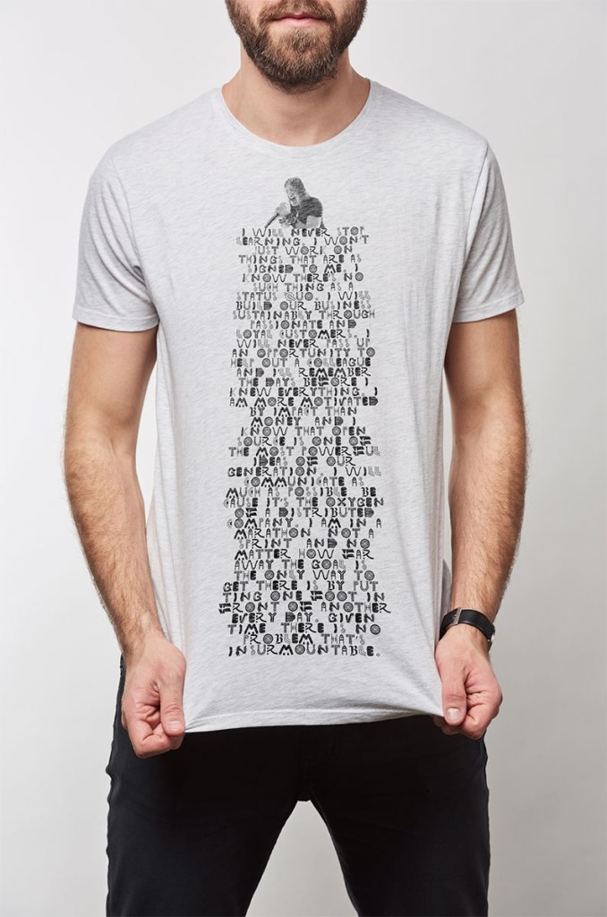
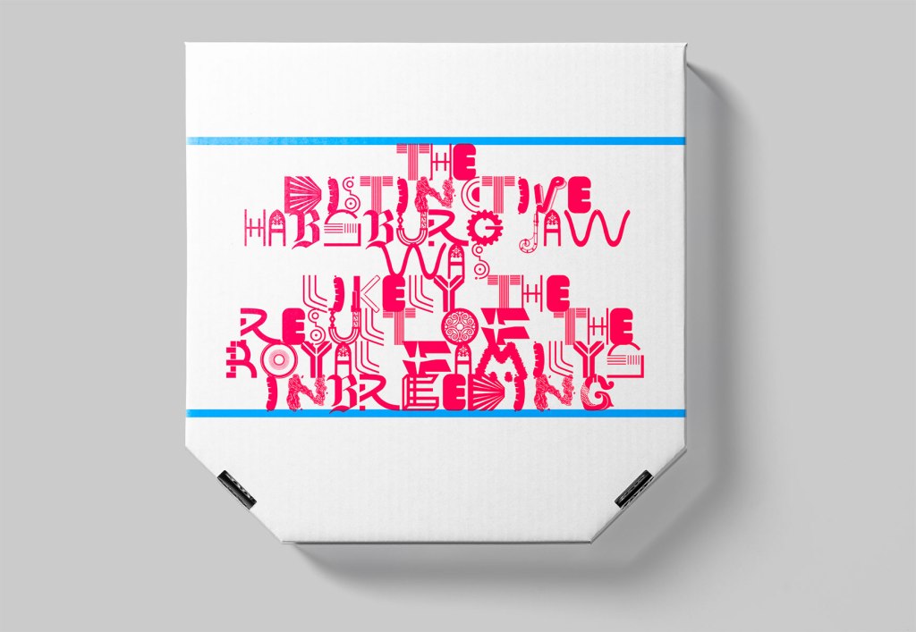
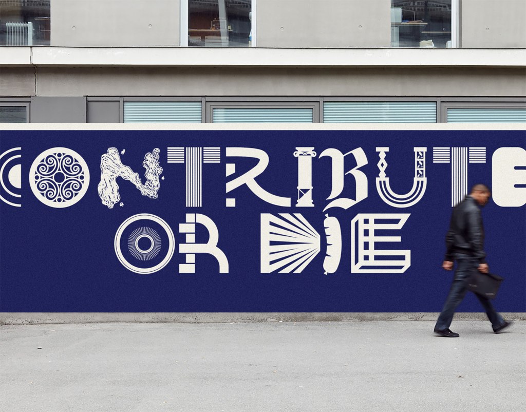
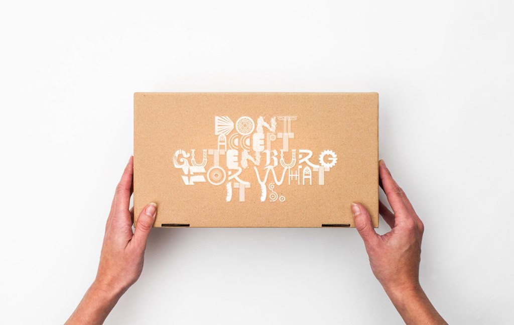
It is said that a typeface is a “beautiful group of letters, not a group of beautiful letters,” but this exercise was intended to be a low-stakes lettering collaboration, and the result was experimental rather than functional. Beauty was not our target. Nevertheless, back in our meeting space, people worked with focused intent to realize their letterforms. The amount of skill and talent in the room was humbling. I should have allocated more time for drawing, but we still managed to come up with some fun results in the hour or so we had.


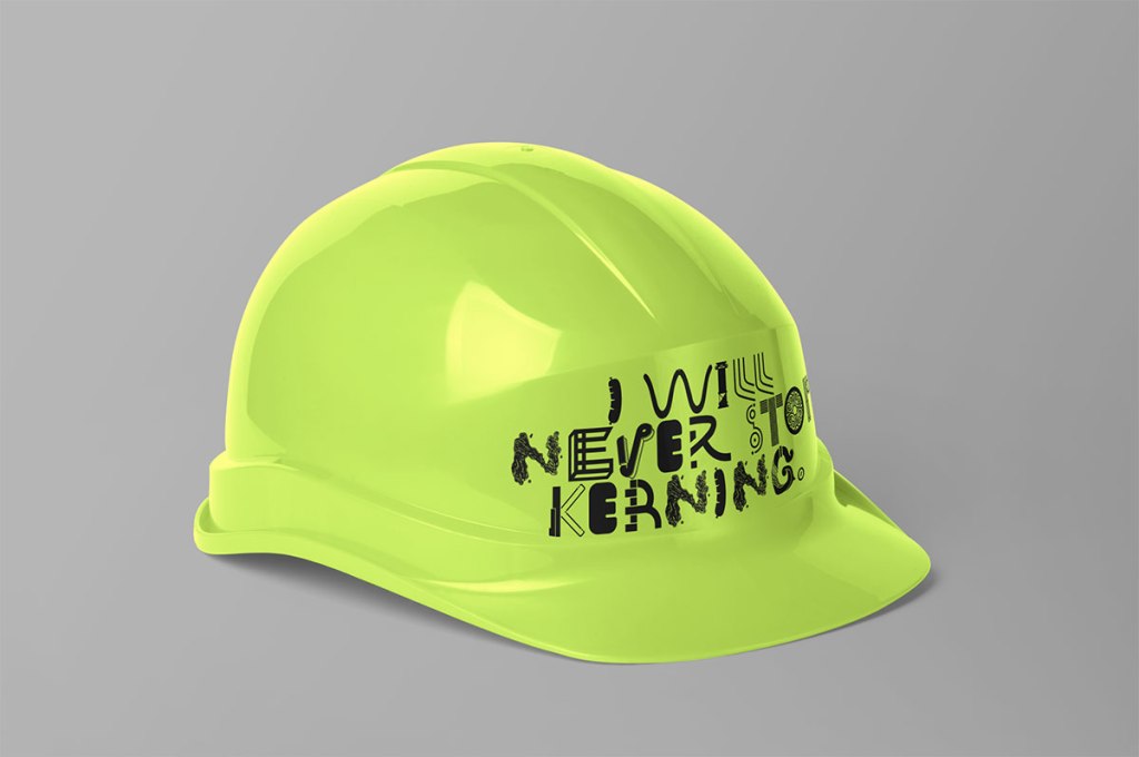
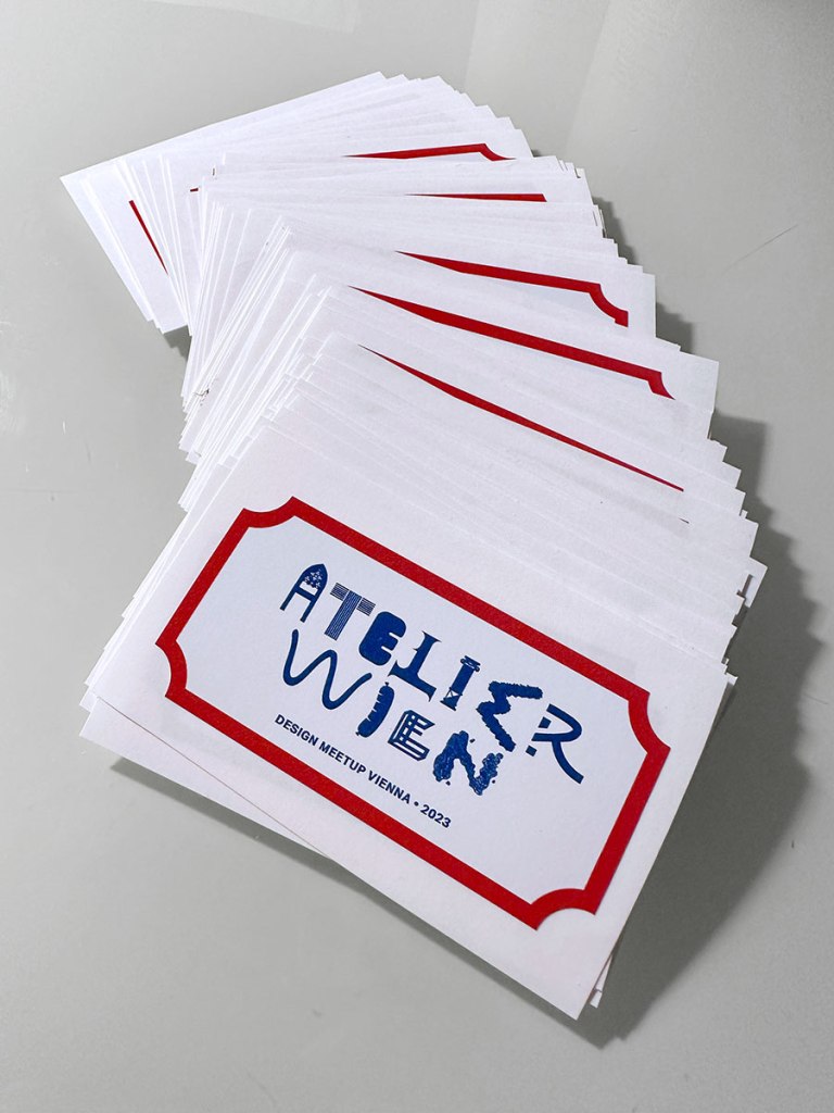
I collected everyone’s letters and created a rough-and-ready font. I’ve had some fun testing it out in the typical brand-design mode: concept mockups. We even got a local printer to help us quickly turn around some commemorative stickers for everyone to take home.


Looking ahead
The role our surroundings play in our creative output is fascinating to consider. It would be a fun experiment to repeat this activity at future design meetups in different locales. Though it might be hard to arrange for the krapfen, I’d love to see what a Tokyo, or Buenos Aires, or Atlanta-inspired activity would produce.
Though I’m fairly new at Automattic, I felt completely supported in leading this activity. I want to say thank you to everyone that entrusted me to run the show and to all that participated. I had a great time getting to know everyone in person at such an inspiring location.
Like what you see? Then maybe you’d love working here. We’re looking for great designers to work on products within the WordPress ecosystem and beyond. We’re a fully distributed company with a huge footprint, helping people express themselves and earn a living—and our mission is more vital than ever. Join our team of diverse, global perspectives building a better, more open web.


