From fragmentation to cohesion
Illustrations can do a lot for a brand: add clarity to the product, bring personality to communications, or make empty states more enjoyable and engaging for customers. At Woo, we’ve tried different approaches over the years, but without a unifying system, the result was a patchwork of visuals spread across different touchpoints. It was time-consuming to create, difficult to evaluate, and harder to maintain.
The challenge is that each touchpoint has different needs. A small notification, a complex empty state, and a full-bleed campaign graphic all call for different approaches. Without a shared style, it was hard to make Woo feel consistent across these vectors.
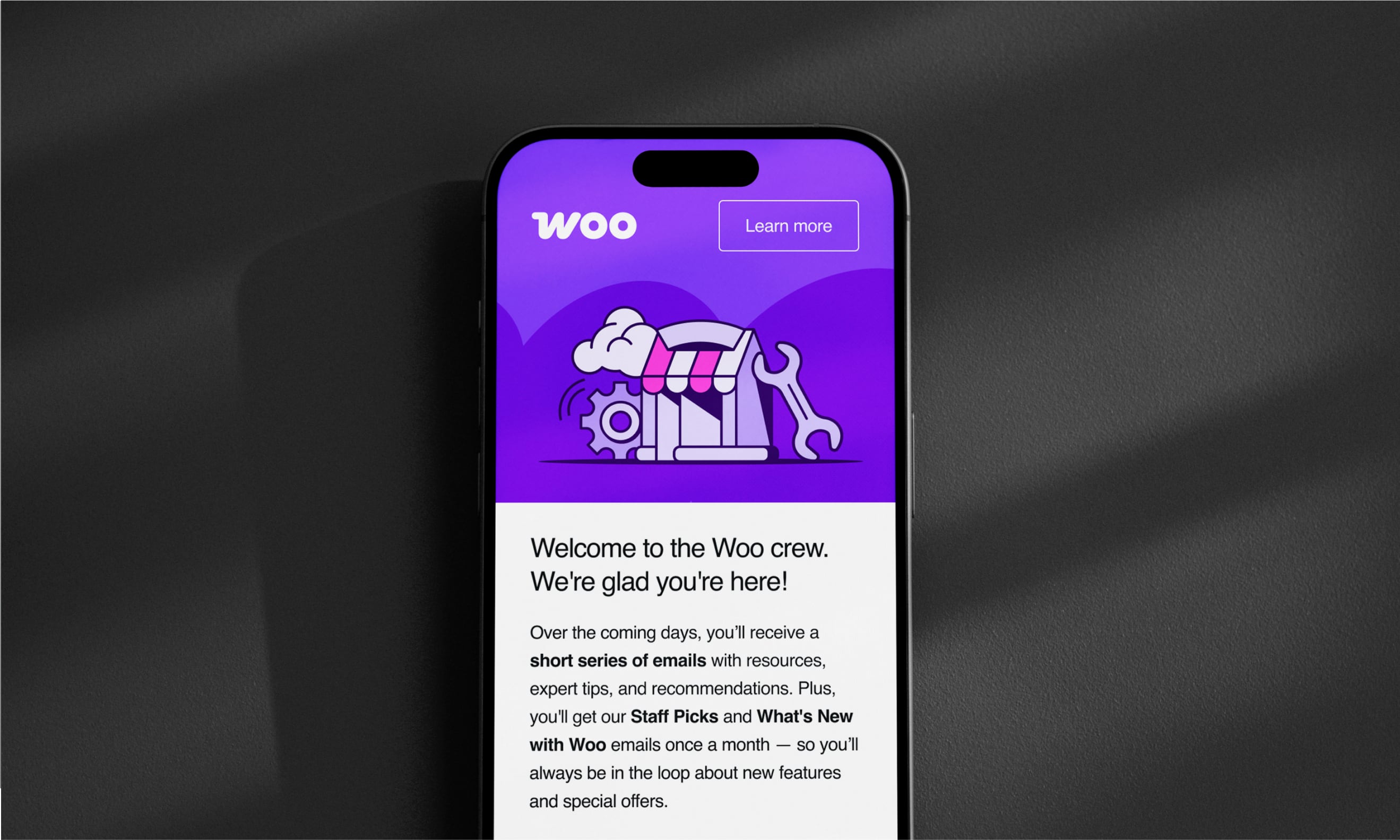
Then, recently, we refreshed our onboarding emails with a small set of illustrations aligned to Woo’s updated brand. The positive response gave us the confidence to build something bigger: a unified illustration style. So let’s dive in.
Our goal: A system that doesn’t slow us down
We set out to design an illustration style that could stretch across the full Woo experience while keeping a single, recognizable look. When shaping the system, we carefully considered our needs and processes, aiming for something our team could build and maintain without depending on outside illustrators. At the same time, our system had to stay simple, with clear rules that make it easy to expand, and practical, with a shared Figma library to reduce duplicated work.
In short, the goal was a style—with enough personality to feel like Woo, yet streamlined enough to scale—designed, built, and maintained by our in-house team.
One style, many uses
We developed our system in collaboration with Marek Rybicki, whose illustration work helped transform the framework into a cohesive language. His contributions gave us the foundation to take the system further.
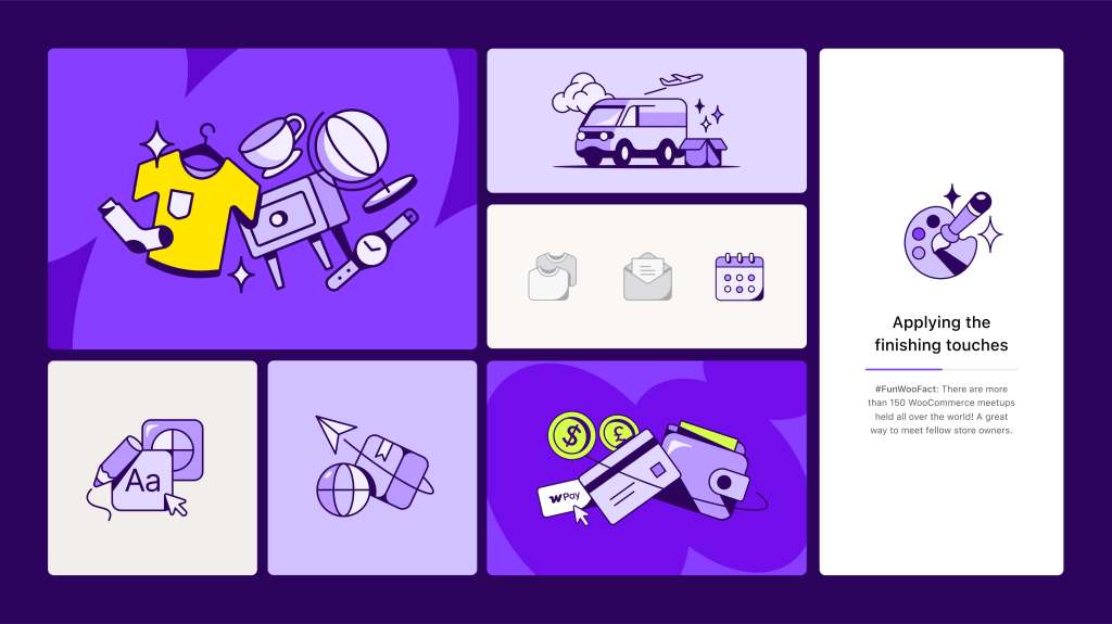
From there, we defined three levels of illustrations. Each has a clear role, ranging from the most functional to the most expressive, so we can cover everything from quick UI moments to larger brand stories without needing separate styles.
- Stickers: Small and functional visuals that support clarity in product UI, like notification banners or empty states.
- Modules: Medium and versatile compositions that combine elements to add a touch of delight when more storytelling is needed.
- Landscapes: Large and expressive scenes that bring personality to life, especially useful in marketing or onboarding flows.
This spectrum—from small to large, functional to expressive—gives us the flexibility to work across any touchpoint while always staying consistent in our visual language. Every new illustration adds back into the shared system, strengthening it over time, and making design work move faster.
The impact so far
The new system is already changing the way we work. Designers can move faster by pulling from the shared library instead of starting from scratch. Clear guidelines mean less back-and-forth and a smoother handoff to development. And with product and marketing teams now drawing from the same source, Woo feels more unified and recognizable than ever.
What began as an effort to tidy up our illustration library has become something bigger: a shared visual language that saves time, strengthens collaboration, and amplifies Woo’s personality wherever people encounter it.


