Long-held beliefs about simplicity, realism, and the role of emotion in digital design have evolved. Here’s a look at what’s new—and why it matters.
Usability Gets a Makeover: Bold, Emotional, and Research-Backed
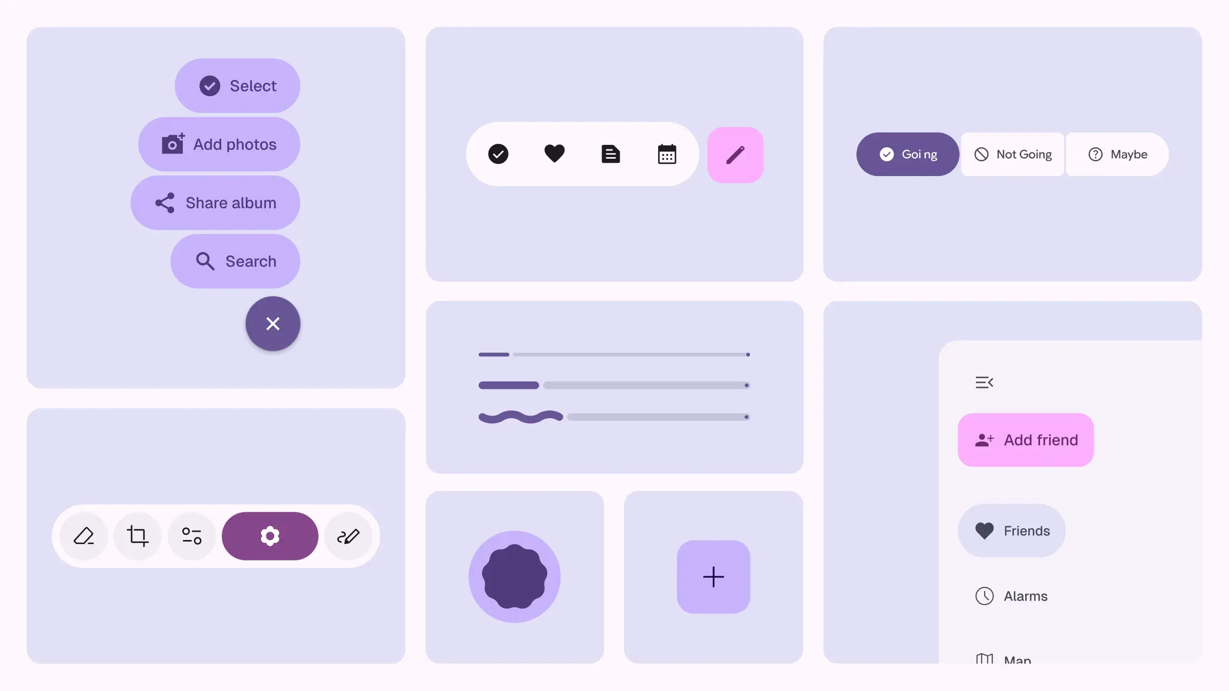
On May 13, Google unveiled Material Design Expressive, a new design direction built around movement, emotion, and visual personality. This isn’t just a cosmetic refresh—it’s a profound philosophical shift. It features playful animations, emotionally resonant interactions, and a bold embrace of vibrancy.
What’s especially striking is that this warmer, more humanist approach isn’t intuition-based design—it’s research-backed. Google spent three years studying how emotive and expressive design affects usability, and their data shows that emotion isn’t fluff—it actually enhances function.
This opens up some big questions:
Is emotional design the new usability?
Are joy, play, and humor legitimate tools in making products more usable?
Is this style targeted at a specific audience or a broader one?
And crucially: how long before this expressive approach is reduced again in the name of “clean/minimal” design?
There’s a paradox at play. We want interfaces that feel alive and human, but we also crave clarity and simplicity. Expressive design invites us to rethink that balance. Could “fun” be a UX principle, not just a visual style?
■
Nostalgia with Depth: Why Realism Is Reappearing in UI
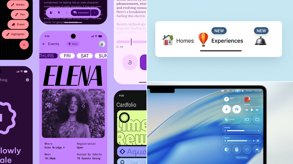
Meanwhile, Airbnb quietly launched a new visual direction for its experiences and services, accompanied by a new skeuomorphic icon set. Yes, skeuomorphism—that richly detailed, almost tangible style we once thought was dead.
This is especially surprising in an era where flat design and minimalism have dominated. Suddenly, we’re seeing realistic icons that evoke physical forms. It’s nostalgic—but also oddly refreshing.
What was stopping us from designing this way before?
Perhaps the reason we’re feeling drawn to a more textured, tactile design language is because of how deeply embedded smartphones have become in our lives. With so much of our time spent in clean, minimalist digital spaces, it’s only natural that we begin to crave designs that feel more grounded—ones that evoke not just nostalgia, but also a sense of the physical world from which we’ve grown distant.
■
Liquid Glass: Apple’s Dazzling Leap from Clarity to Immersion
With iOS 26, Apple didn’t just redesign its interface—it introduced a new material. “Liquid Glass” isn’t a metaphor; it’s a deliberate visual and tactile language, engineered to feel like you’re holding a melted gem in your hand. The interface glows, refracts, and dances with light. Shadows shift subtly. Reflections are hyper-realistic, and elements seem to react not just to your touch, but to their surroundings. It’s software designed to feel like sculpture.
At its best, Liquid Glass is mesmerizing. It represents Apple’s most ambitious attempt yet to blend hardware and software into one seamless, luxurious experience. Tiny details—like how a button reflects the dominant color of a photo next to it—create moments of micro-delight. The UI feels alive. The device no longer feels like a passive screen, but a responsive surface.
But this beauty comes at a cost.
When everything is semi-transparent, animated, and layered with visual effects, the interface risks becoming noisy and inaccessible. The glass metaphor introduces visual complexity where clarity is needed most. Hierarchy suffers. Buttons compete with backdrops. Light becomes a distraction.
This isn’t just a contrast ratio issue—though that’s part of it. It’s about perceptual load. The more the interface tries to dazzle, the harder it becomes to navigate effortlessly. Apple’s historical strength has always been clarity through reduction. With Liquid Glass, it’s taking the opposite route: clarity through immersion.
This design shift reflects a bold philosophical move. Apple is asking us to feel our way through the interface, not just use it. It’’s seductive, sensory, and undeniably premium—but it also raises questions about focus, usability, and the line between visual art and functional design.
Whether Liquid Glass becomes a new standard or a beautiful experiment will depend not just on aesthetics, but on whether it can deliver delight without disorientation.
■
It’s rare to witness the design giants diverge so radically at the same moment. Yet Apple, Google, and Airbnb are each pushing into distinct, deeply considered visual philosophies—each one revealing not just a new aesthetic, but a different belief about how we should experience the digital world.
Apple’s Liquid Glass, is the most visually ambitious of the three. It’s hyper-material—dripping with realism, movement, and light. The metaphor is literal: an interface that looks and feels like polished, melted sapphire. It’’s stunning. But it’s also polarizing. The constant play of light and transparency can create a kind of visual haze, where clarity is sacrificed for sensation. It’s a bet that delight and luxury will outweigh the loss in legibility.
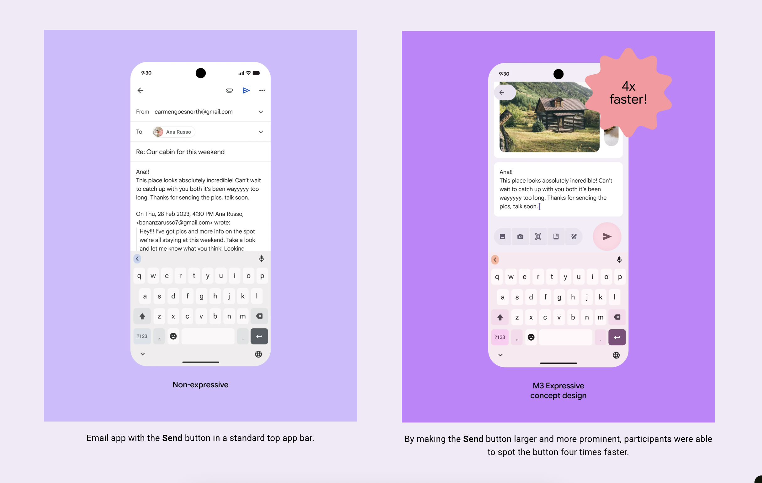
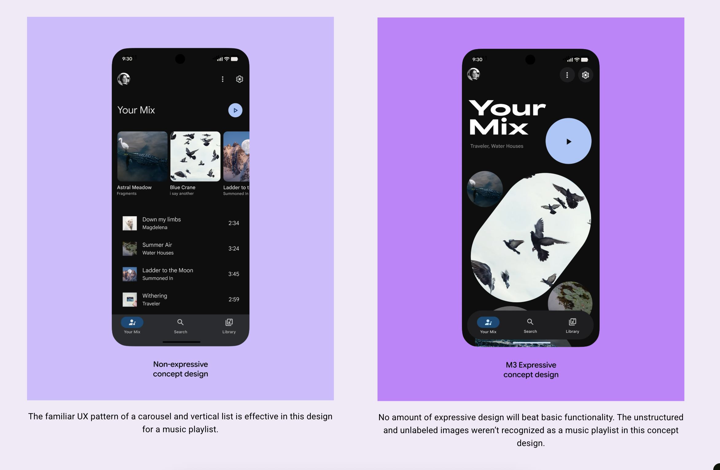
Google’s Expressive Material, by contrast, opts for emotional resonance over realism. Where Apple emphasizes physics, Google emphasizes feeling. Playful animations, joyful feedback, and vibrant motion create a sense of digital warmth. The experience is still structured and systematic, but the system now has a pulse.
Where Apple emphasizes physics, Google emphasizes feeling.
Airbnb’s skeuomorphic pivot sits somewhere in- between. It doesn’t rely on full-screen immersion or full-body animation, but it does reintroduce texture and tactility in the details. In a world dominated by flatness, these icons feel like small acts of rebellion—glimpses of the physical peeking into the digital.
Taken together, these three approaches raise a critical question: What should digital design feel like today?
■
A New Era of Divergent Design
Design is no longer moving in one unified direction. Instead, we’re entering an era of intentional divergence, where leaders aren’t following trends—they’re authoring them.
Apple bets on spectacle and sensation. Google bets on emotion and research-backed delight. Airbnb bets on grounded familiarity.
The question isn’t just how things look, but why they look that way. And each company has chosen an approach to design that delivers the brand experience and feeling that aligns best with their product vision and roadmaps.
Inspired by these leaders, expect other brands to also depart from the flat/material orthodoxy of the past.
In the end, it’s not about which aesthetic “wins,” but about which philosophies resonate with our evolving relationship to screens, tools, and the increasingly blurred boundaries between digital and physical life.
We’re looking for great designers to work on products within the WordPress ecosystem and beyond. Join
our team of diverse, global perspectives building a better, more open web.