
As a part of our empathy challenge, designers at Automattic were tasked with recreating an existing article using Gutenberg, WordPress’ upcoming editor. Most of us took the challenge, and so did I.
This was my very first time using Gutenberg, so approaching this exercise with the mindset of a WordPress user was much more relatable to me. I decided to replicate Coachella, Underground, and these are the notes I took while doing that.
Overall
- As a designer, I’ve built a lot of landing pages. Most of them were static, but Gutenberg is exactly how I always imagined they should be edited with. The concept of blocks may feel limiting at first, but its predefined formatting options are what makes it powerful at the same time.
- Gutenberg heavily relies on these individual content blocks, but from a user’s perspective, some blocks might not seem like the other. Some groups of paragraphs, especially the article’s credits, didn’t feel like they were separate units. Credits was the block.
- The longer I was using the new editor, the better I became at it. I can imagine our users feeling the same over time—hopefully for both Gutenberg and WordPress.com.
The editing experience
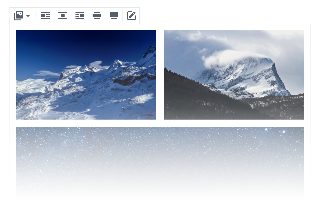
- Being able to insert full-width images always makes me happy, because the results immediately look so beautiful and modern. Though, I wish I could drop an image without inserting a new block beforehand.
- Gutenberg handles pasting extremely well. Exceptions include separators and
[shortcodes], but they didn’t feel like a big deal once I saw that quotes had been formatted correctly. I guess if you do one thing very well, your shortcomings will be forgiven. - These seemingly simple bars were impossible for me to recreate without involving CSS. I really missed a way of nesting blocks, which—I imagine—would have done the job there.
- While I think I understand the decisions behind those, I also missed having more formatting options for titles and quotes.
- Hitting
⌘Ainside a focused block was confusing, because the entire post got selected instead of the individual block I was editing.
Other
- Something I hadn’t realized before I started was that I’d need a theme that supports Gutenberg’s features (like full-width images). The screencast below was recorded once I had properly set up my site.
- I want to able to put together themes and entire websites—not just posts. Gutenberg feels like a natural UI for doing that.
- There are minor glitches here and there, but I realize that will probably be solved as the project matures. Nevertheless, I’m excited about Gutenberg and its future.
Cover illustration by Kate Gavino.


Comments
[…] went to see what some of my peers had managed to do, and actually found someone who had used the exact same post as I had chosen, and they were successful – now I was SUPER […]