
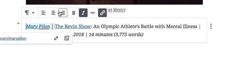
Like so many of my colleagues, I thought I’d test Gutenberg by answering the call to an empathy challenge. We were asked to recreate an existing post with the new Gutenberg plugin (soon to be in Core). Among recording our screen session, we’re also to list our struggles and accomplishments using Gutenberg.
I spent about 20 minutes copying over the content and working within the confines of Gutenberg to get the new post as close to the original in design and layout. It appears I could have gotten closer but Gutenberg didn’t reflect my own theme’s styles in the editor, nor did it allow me to overwrite Gutenberg’s styles from within Gutenberg itself. Those were two very big challenges for me when trying to style my own content.
Gutenberg is no doubt beautiful! I really enjoyed the interface as I jumped in to begin. But my experience was not without struggles.
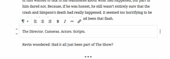
Adding a block – the grey bar?
The grey border at the bottom of blocks. I didn’t realize what that was for until I was almost done with my post. I guess it’s something that can be clicked to produce a new block below. It doesn’t follow the standard of the + icon used elsewhere, so is super confusing. I knew there was a way to get another block below, and sometimes it appeared as though one just happened to be, but other times I was clicking all over trying to get a new block.
Block doesn’t come into view
When working in a block at the bottom of the page, the block doesn’t move itself up into view so I’m left having to scroll further down to bring it into view, then I jump back in and edit more.
No way to center title in Gutenberg
I’m able to center most items (even added H1s) within Gutenberg, but I can’t center the title. This limitation didn’t make sense to me.
Grey background on italicized text
I get that this ‘feature’ helps identify the bounds of the formatting, but it caused me more confusion because I wasn’t sure if that background was going to be visible in my end product or not. It didn’t feel comfortable and jarred my workflow every time I saw it.
No full width images?
Maybe it’s because I remember there being a full width option in Gutenberg, but now I didn’t see it. The editor had plenty of whitespace on either side, but the option was no longer there.
After copying text over, cursor is in a weird position
This project consisted of a lot of copying over content from one post to another. This worked great except that when I would copy over text at times, the cursor would be positioned at the beginning of what I copied instead of the end. Why? In both of my examples below, I began copying the text at the beginning, but when I pasted, the cursor remained at the beginning instead of at the end.
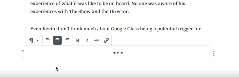
Gutenberg HRs (separators)
It appears the HRs in Gutenberg inherit Gutenberg styles. This is fine, except I’m expecting them to look that way in the frontend as well, which they don’t. This is confusing. ALSO, why are they styled to be short, and not a typical full width? Maybe we can add a full width HR option? We have options around the blockquotes, so it seems like this is possible.
Blockquotes
As seen in the video, my blockquotes on the frontend were formatted differently than in Gutenberg. Another disconnect between the frontend and the editor. Because Gutenberg pushes styling on these elements, and that’s what I’m seeing when writing my post, I’m expecting these styles to carry over into the frontend too.
In-the-way UI
My last struggle was the UI. Although it’s quite beautiful as mentioned above, there were so many times I wanted to just leave my cursor where it was and view the document as a whole. But because my cursor was inside a block, that block was highlighted with borders and a tool bar which laid on top of other content. If I wanted to view the page as a whole with my recent change, I was forced to click somewhere outside the block to make it disappear. I didn’t like that experience and began reminiscing about the old editor and how the toolbar was always out of the way. I understand this might be an integral piece of Gutenberg, but does it need to be? It’s almost as if the UI is forcing its way into my view instead of disappearing to the background of what I’m trying to do.
Overall I continually tried to understand where the styles of Gutenberg ended and the theme styles began. Some Gutenberg styles made their way into the editor even though they didn’t show up like that in the frontend, while some styles from the theme were in Gutenberg with no way to edit them. I was confused by this unclear separation of styles.
But I’m not without optimism! Gutenberg is new and exciting. The possibilities here could be amazing! Thanks to the Gutenberg contributors for making this happen!


Comments
“Because Gutenberg pushes styling on these elements, and that’s what I’m seeing when writing my post, I’m expecting these styles to carry over into the frontend too.” > this is something I cannot really explain to the people I give WorPress training too either.
This is a great piece, Mark. I think it’s important to get feedback like yours, even as an Automattician, you are a designer and blogger — that’s a HUGE portion of WordPressers I would think.
Just to clarify one item: you don’t see the full-width image option because your theme has to declare support for that. The assumption is that if they declare that support then they’ll have a way to show it correctly on the front-end as well. We’ll see how well Themes adapt to a post-Gutenberg world though.
Thanks for sharing your experiences!
[…] Testing Gutenberg: An Empathy Challenge: Mark Uraine decided to recreate an existing post with Gutenberg. His results: It wasn’t easy. And it was confusing. But he’s optimistic about the possibilities for the future. […]
[…] https://automattic.design/2018/03/25/testing-gutenberg-an-empathy-challenge/ […]
[…] Testing Gutenberg: An Empathy Challenge […]
[…] Testing Gutenberg: An Empathy Challenge […]
Thanks for taking the time to do this challenge. I see you say that on copy and pasting there was italic and grey background. Could you give me more details on this please?