

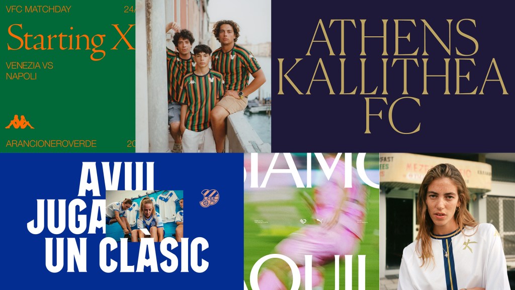
What did land was the profession I ended up in: design. Those two things—a sport I never fully loved and a discipline I do—started overlapping in a way I couldn’t leave alone. Football crests are inherited: a badge passed from grandfather to grandson, a color a city builds its identity around, a symbol that can mean something entirely different across a river. This is a revealing place to watch design intervene. When an industry redesigns what people inherit rather than choose, you see what design can do to culture, and what it flattens when everyone reaches for the same toolkit.
Lately, I keep seeing the same moves: a monogram in a circle, a quieter version of the club’s colors, a typeface meant to feel authentic, campaign photos that look more like fashion…
Here’s the question I want to sit with: once an entire industry starts making the same “disruptive” move, has anyone actually disrupted anything—or just performed it well enough to go first?
My question isn’t a criticism of any single project. A lot of the work behind this pattern is genuinely excellent: with some of the best identity design happening right now is happening in football and sport overall. What I’m interested in is the pattern itself, and how quickly it became one. What felt disruptive a few years ago has already become the sector’s default language. And when everyone uses the same gestures to prove they’re different, those gestures stop proving anything at all. This is something we’ve seen across industries, and ours is no exception.
The paradigm shift
For most of football’s modern history, a “rebrand” meant maintenance, not disruption. Clubs cleaned up their crests for digital use, flattened a gradient, removed a drop shadow, or fixed a badge that had slowly lost its shape across decades of shirts, stickers, and merchandise. But the core stayed the same. It was identity work, but mostly in service of preservation. Nobody expected a crest to explain where a club was going. It just had to still feel like itself.
Two moves broke that pattern, four years apart, and neither on its own would have been enough to change the paradigm.
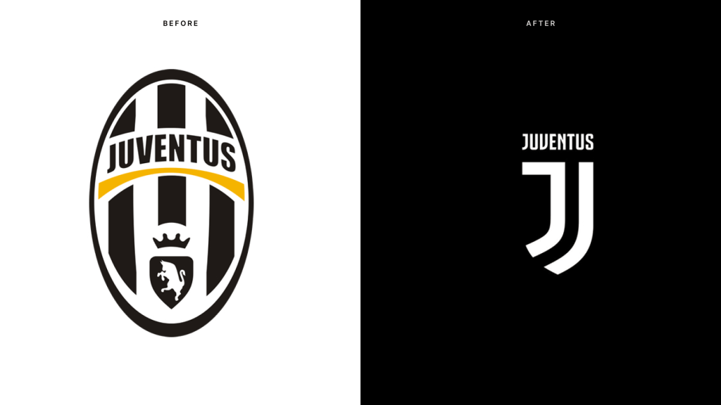
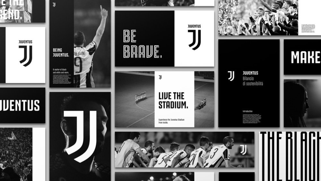
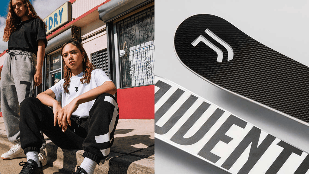
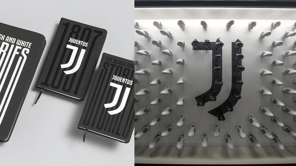
The first was Interbrand’s 2017 Juventus rebrand—the one that deleted the club’s zebra and shield entirely in favor of a flat “J” and the word JUVENTUS in a bold custom face. It was framed, correctly, as a bet that a football club could behave like a lifestyle brand first and a sports institution second. Fans hated it. “The new logo tells me this is the Juventus brand and we are customers, not fans,” one wrote — a line that has aged into a kind of prophecy. A contemporary commentary on the redesign predicted, almost offhandedly, that “many other clubs are going to follow soon.” It was right about the direction and wrong about the mechanism: what actually spread wasn’t Juventus’s flat corporate minimalism, it was the more digestible version of the same instinct that Bureau Borsche worked out four years later. Juventus proved a crest could be treated as a brand system rather than a badge. Bureau Borsche proved that the system could survive contact with fans — the second move, and the one the rest of the industry actually learned from.
Where Interbrand had subtracted heritage, Mirko Borsche’s studio compressed it. That’s the whole difference, and it’s why Bureau Borsche’s 2021 identity for FC Internazionale Milano is the version of this idea that actually stuck. The new crest keeps Giorgio Muggiani’s 1908 concentric-circle structure but resolves it into an I/M monogram, reportedly preserving something like 90 percent of the original’s spatial relationships. Nothing sacred was removed; it was just redrawn to be legible at nine millimeters on a phone screen.
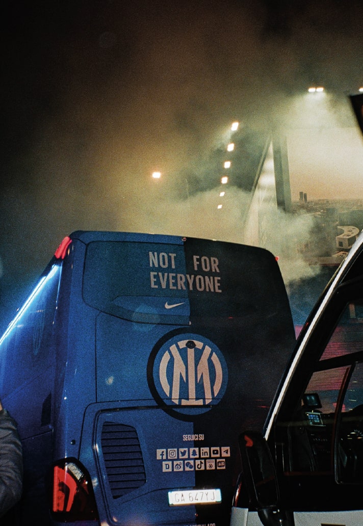
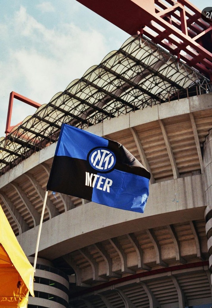
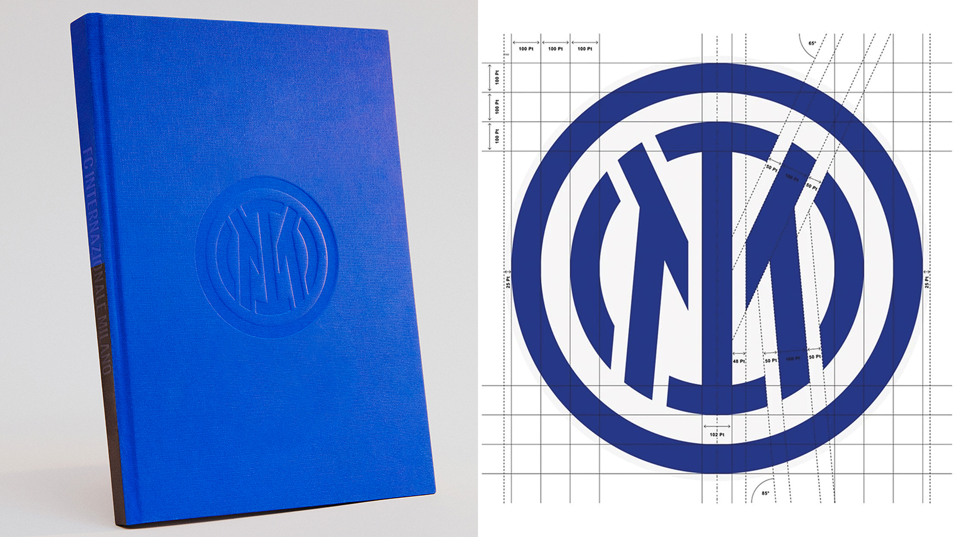
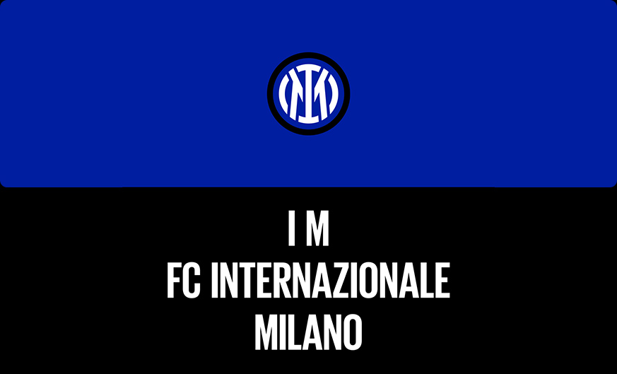
It landed harder than the “slick” headlines suggested. Borsche has since described Inter’s launch as triggering intense criticism on Italian television and personal threats that lasted around two weeks—quieted less by any design consensus than by Inter winning the league that same season.
None of this was planned. Borsche has said he never expected football to become part of the studio’s work; it came through existing fashion and sportswear relationships. Nike remembered their LeBron James work, while Balenciaga and Supreme had already shaped the studio’s reputation. Inter and Venezia, he said, happened “coincidentally… at the same time, but quite separately.”
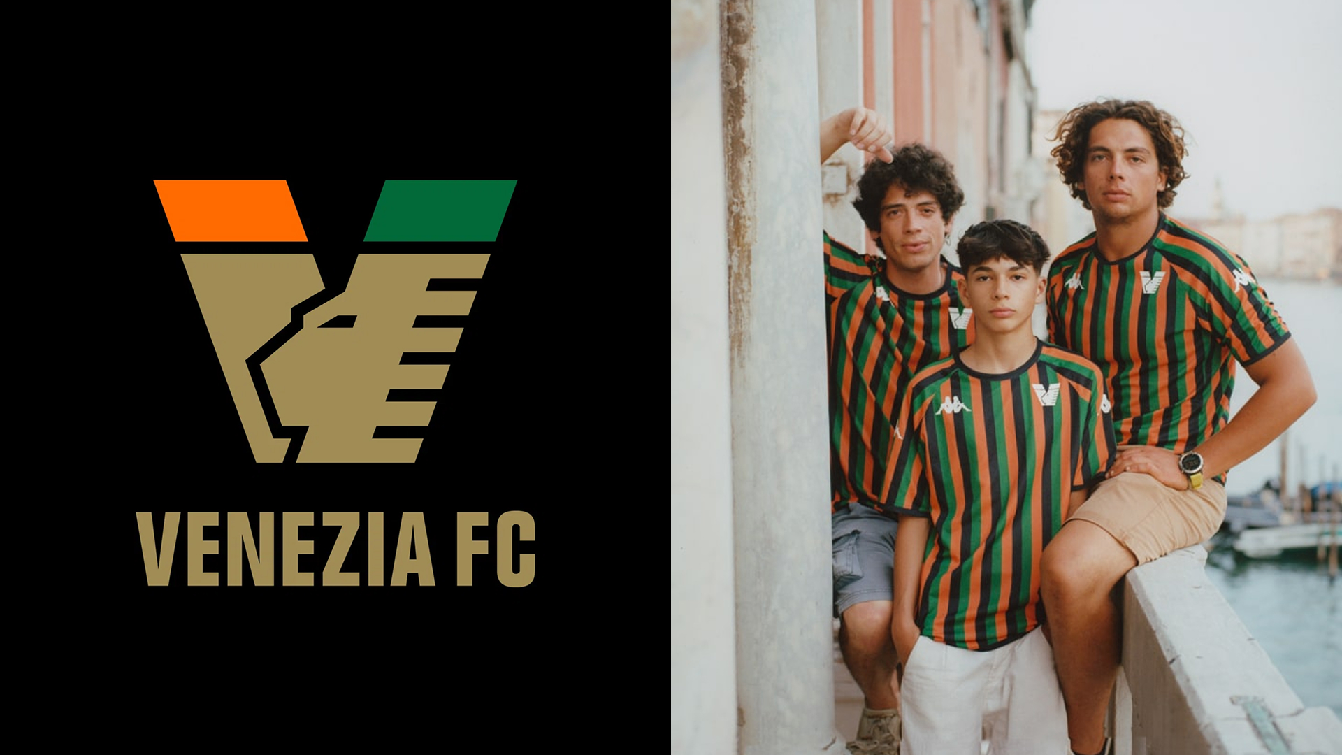
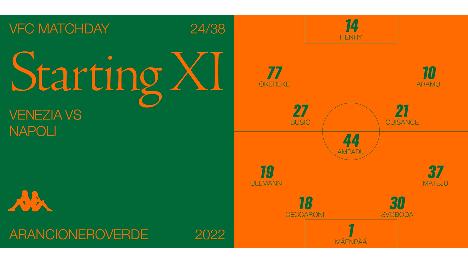
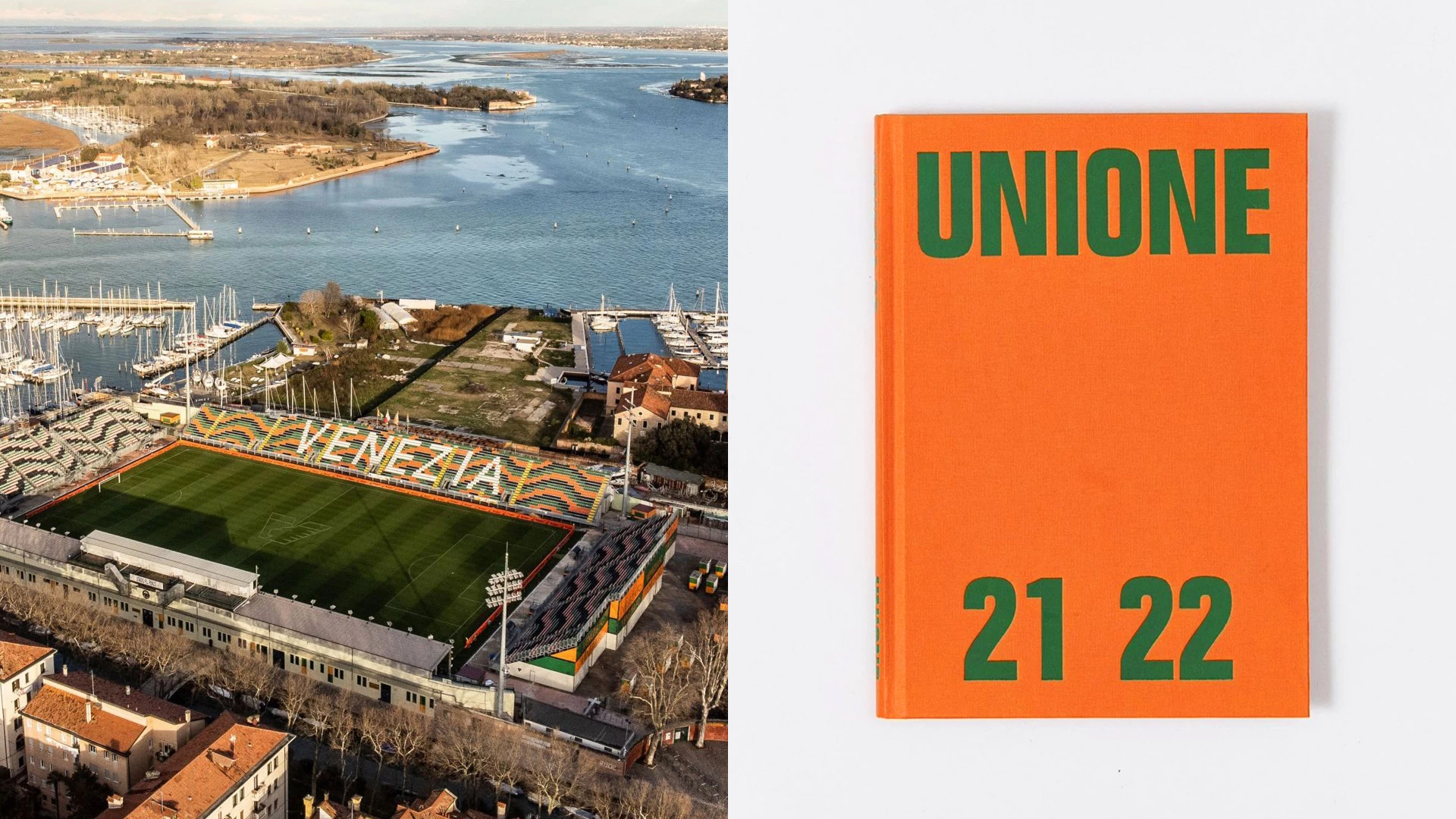
Venice, though, wasn’t new territory. The studio had already reimagined the Lion of Saint Mark for the city’s Biennale pavilion in 2019, then built Venezia FC’s website and webshop in 2021. The full club identity arrived in 2022: a neo-grotesque wordmark, a V-crest using that modernized lion, and the return of orange and gold after two decades of white. Borsche’s line about the brief says everything about the studio’s instinct: “let’s do almost nothing.” Philipakos, Venezia’s brand lead at the time, is the link to what comes next.
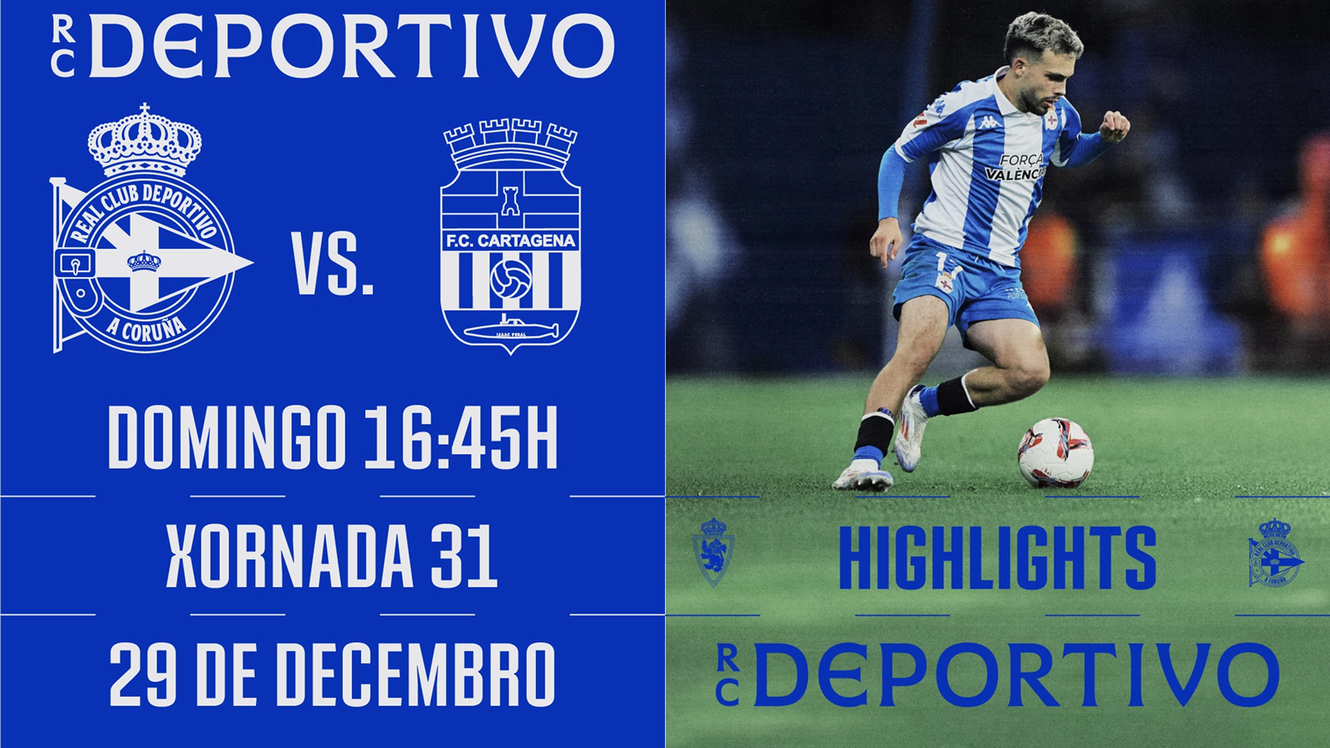
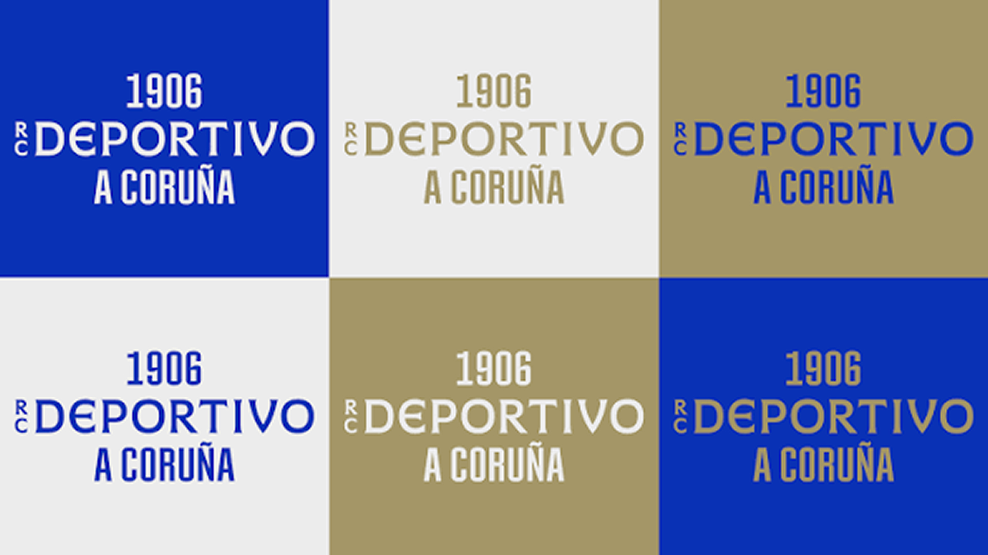
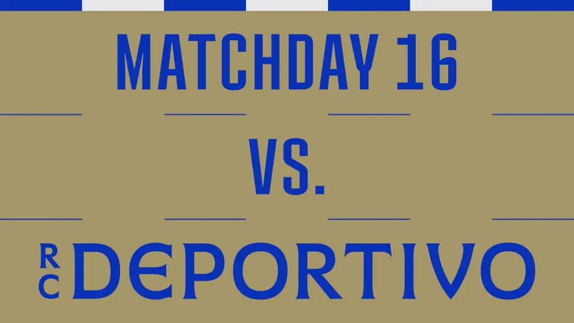
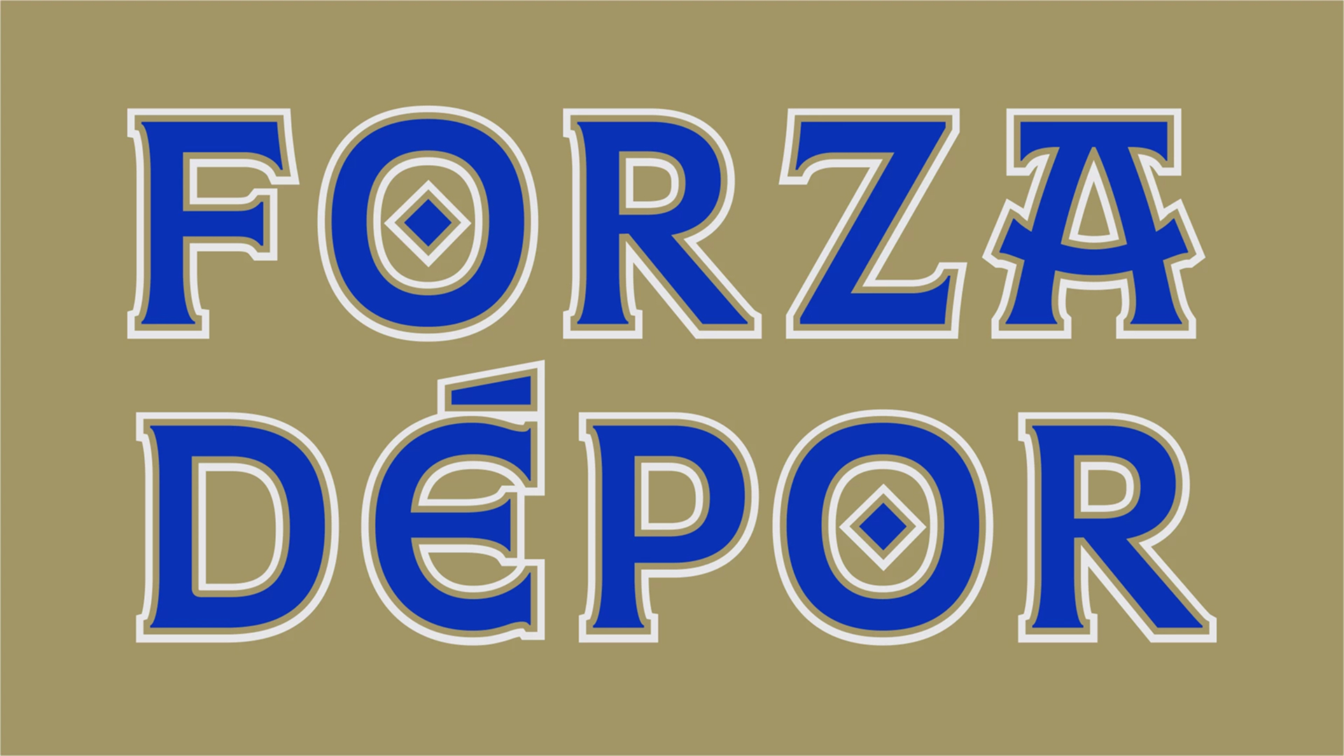
Somewhere in the same run of work sits Bureau Borsche’s identity for RC Deportivo,with an historic Spanish crest given the same monogram-and-restraint treatment, undated in any independent design coverage I could find. That silence is itself worth noting: the same studio was already applying its own new grammar to a second and third historic badge before the industry had caught up enough to notice, let alone name what it was looking at.
Athens Kallithea, and whether the swerve was real
If Inter is where the new vocabulary got mainstream approval, Athens Kallithea FC is where it got interesting. In August 2021 — while still leading the brand for Venezia, ahead of that club’s own 2022 relaunch — Philipakos took over a modest Greek club that had spent nearly two decades outside the top flight. Kallithea’s own identity landed in September 2022, the same year as Venezia’s, with a Bureau Borsche system Borsche himself has called “a perfect spiritual sequel” to Venezia: with the same restraint, pushed into an entirely different typographic register.
Fun fact: as much as I don’t like football, I ended up buying the Athens Kallithea FC t-shirt because I really loved the design.
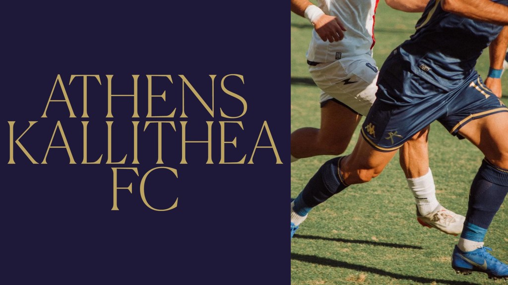
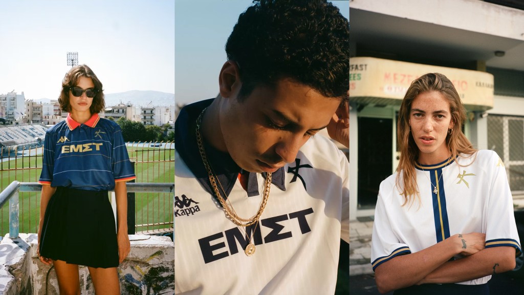
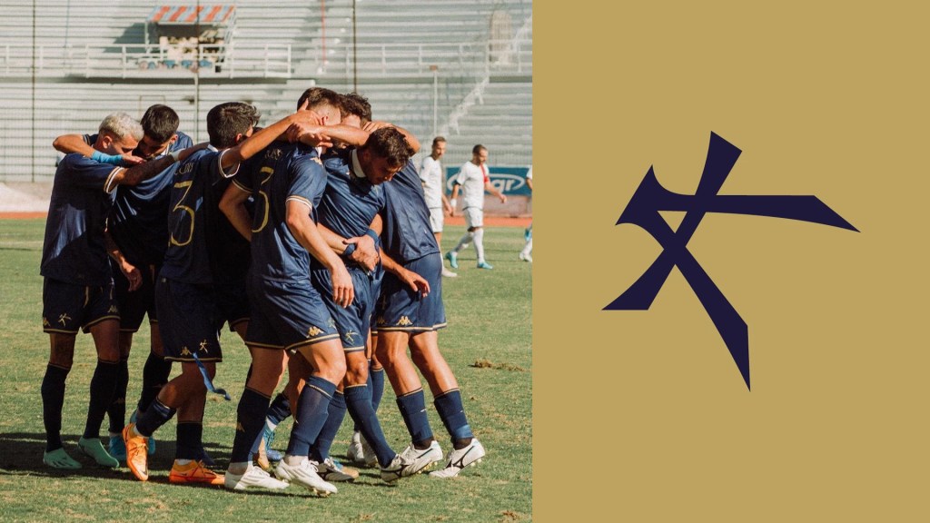
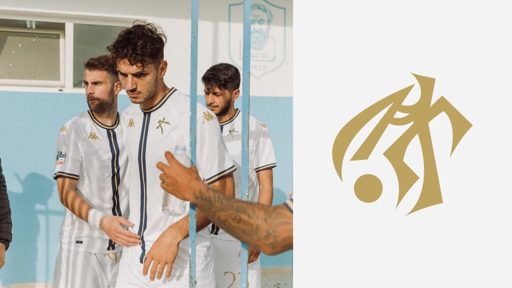
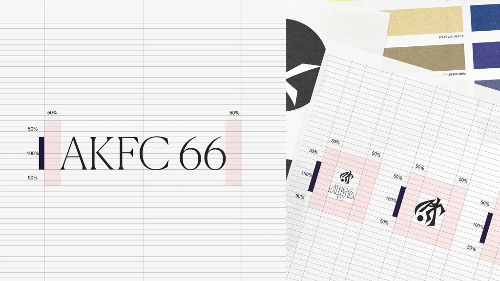
Versus called it “one of the cleanest football rebrands ever.”
Was any of this a real impact, or just a good story? Here the record is genuinely on Kallithea’s side, with the honest caveat that correlation isn’t proof: since the rebrand, the club has finished second in Super League 2 in back-to-back seasons, then won the division outright in 2023–24, returning to Greece’s top flight for the first time in eighteen years. Design didn’t score the goals. But a club that rebuilt its entire public identity around being taken seriously as a cultural project, and was then taken seriously enough to be promoted while building a genuine cultural following, is a stronger case study than most rebrands ever get to make.
When the disruption becomes the brief
Borsche has basically admitted this himself. In a 2024 interview, when asked whether Bureau Borsche had changed football culture, he first said, “Not really!” Then, after a pause: “It’s starting to work on me.”
He could see the shift: football moving toward “much cleaner aesthetics,” with “brands across Europe” adopting the same “clean, fashion-forward” language his studio brought to Inter and Venezia. His client list has since grown to include Bayern Munich, BSC Young Boys, and TSV 1860 Munich.
But he doesn’t sound especially proud of it. What he says he wants now is “more variety between the clubs” — the disruptor watching his own disruption harden into the new house style, and not entirely liking what he sees. 😂
That 2017 prediction about Juventus, that “many other clubs are going to follow soon,” was right, just not in the way its author expected. Football didn’t copy Juventus’s corporate minimalism. It copied Bureau Borsche’s softer version: keep the heritage shape, simplify the mark, tighten the palette, add custom type, shoot it like fashion, and insist it was never really a redesign.
By 2025–26, the trade press had a name for it. Creative Bloq called it a “sea of sans-serif sameness.” Even the exceptions proved the point: Sporting CP returned to its 1945 crest with a custom “Sporting Sans,” Werder Bremen built around a serif drawn from its 1924 “W,” and Newcastle’s leaked crests drew Juventus-level backlash for the same reason: heritage handled carelessly.
The line that made Bureau Borsche feel disruptive in 2021 — we didn’t impose a vision, we distilled what was already there—is now the most common sentence in football-identity press releases. That’s not dishonest on its own. But when every ambitious club follows the same playbook—protect the crest, commission a heritage serif, shoot the campaign like a fashion editorial—sincerity and performance get hard to tell apart. The move worked because it wasn’t what everyone else was doing. Now it is.
Palermo and CE Europa: the current test case
Two projects surfaced in design coverage the first week of september 2026 put this tension under real pressure, and I think both are worth taking seriously precisely because they’re good enough to make the critique harder, not easier.
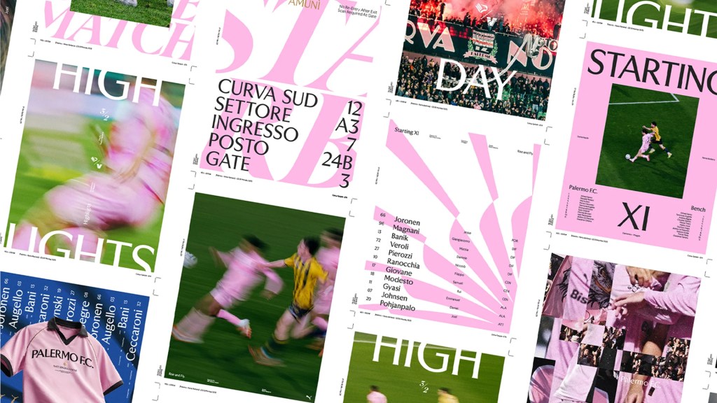
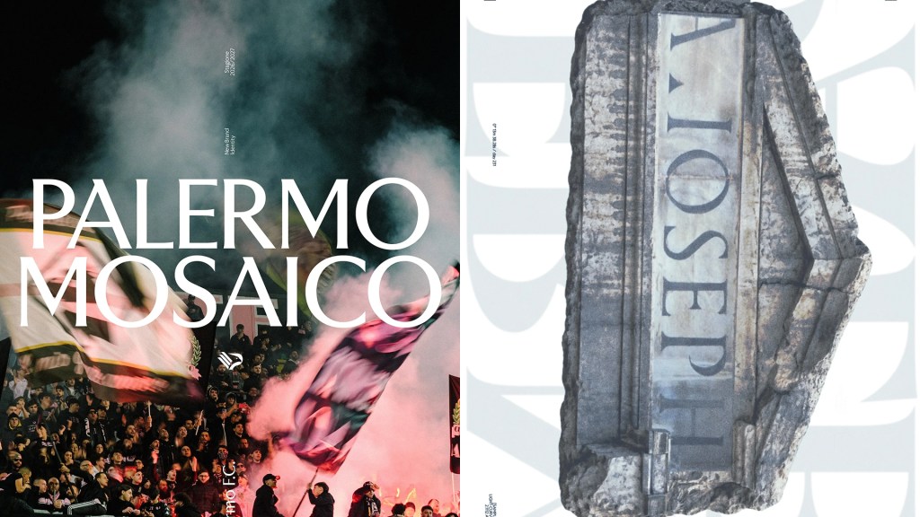
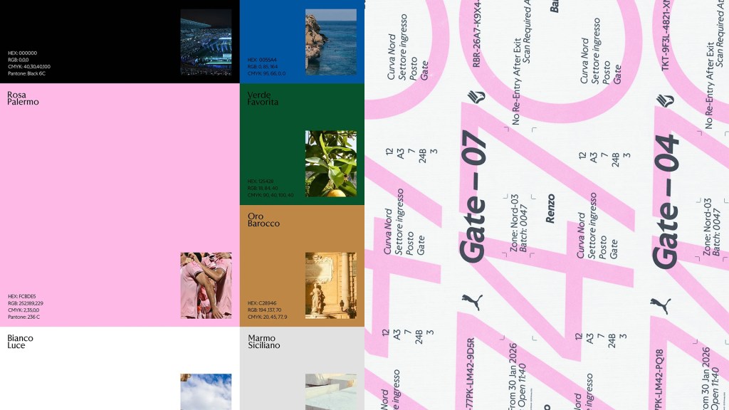
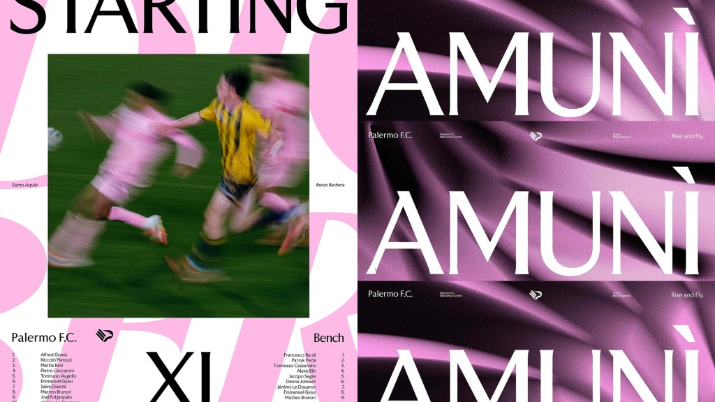
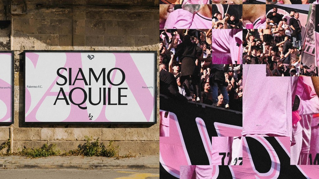
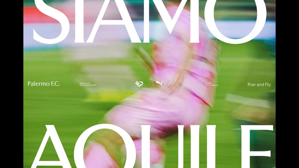
Alkemy+’s identity for Palermo FC is the more maximal of the two. The brief, per the club’s CMO, was “not to redesign Palermo FC, but to give shape, language and consistency to what Palermo FC already is”: a year of listening distilled into four pillars (Mosaic, Pink and Black, Rise and Fly, Global Family).
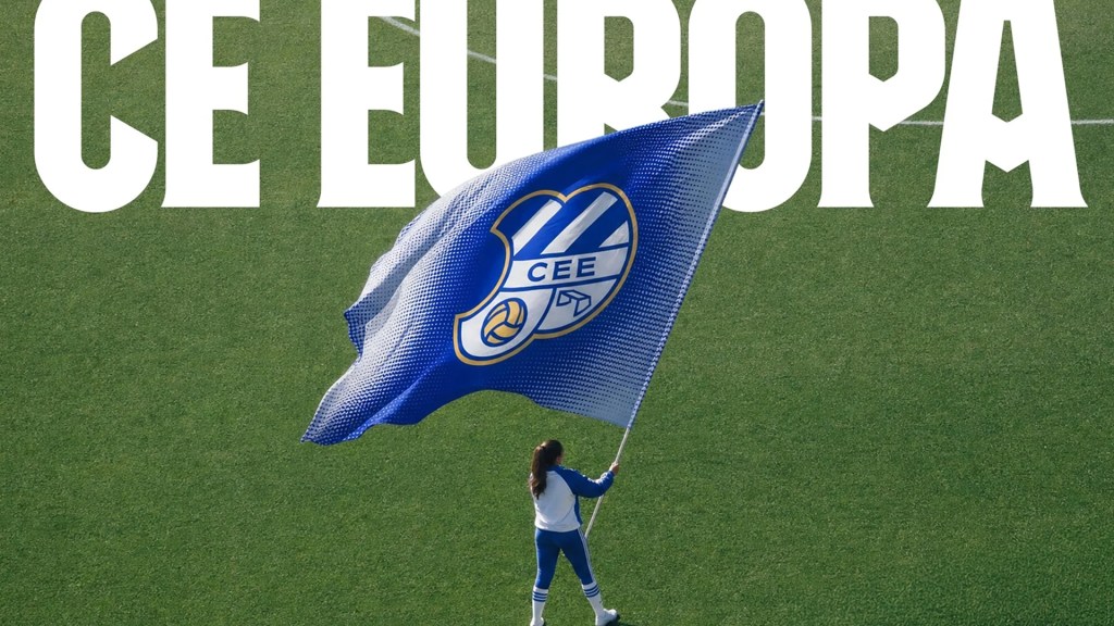
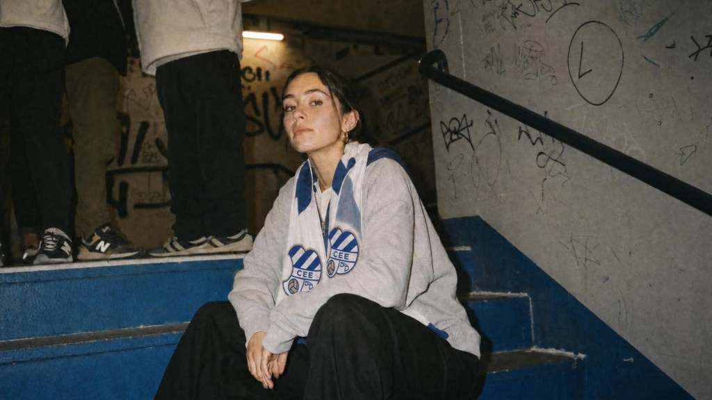
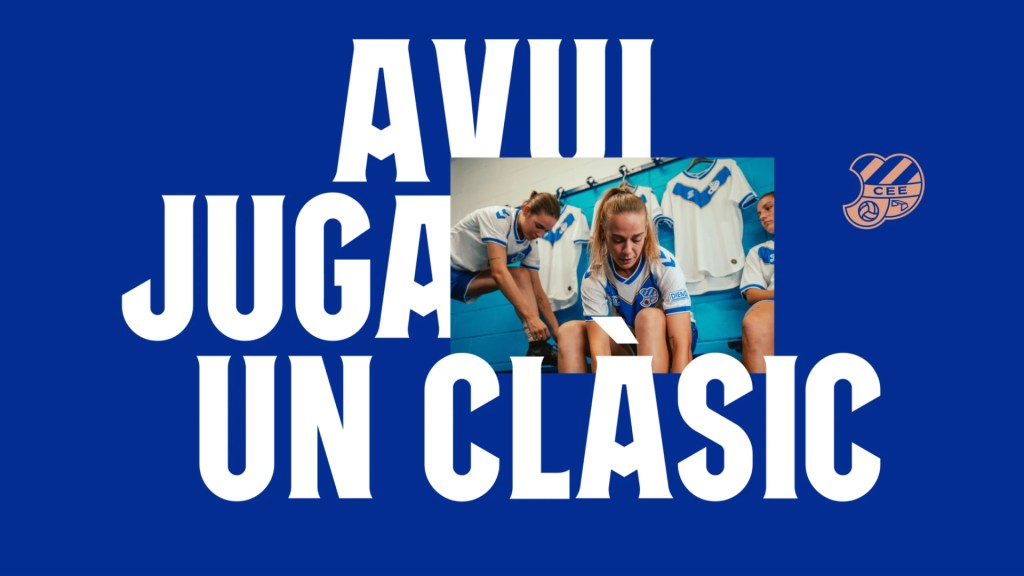
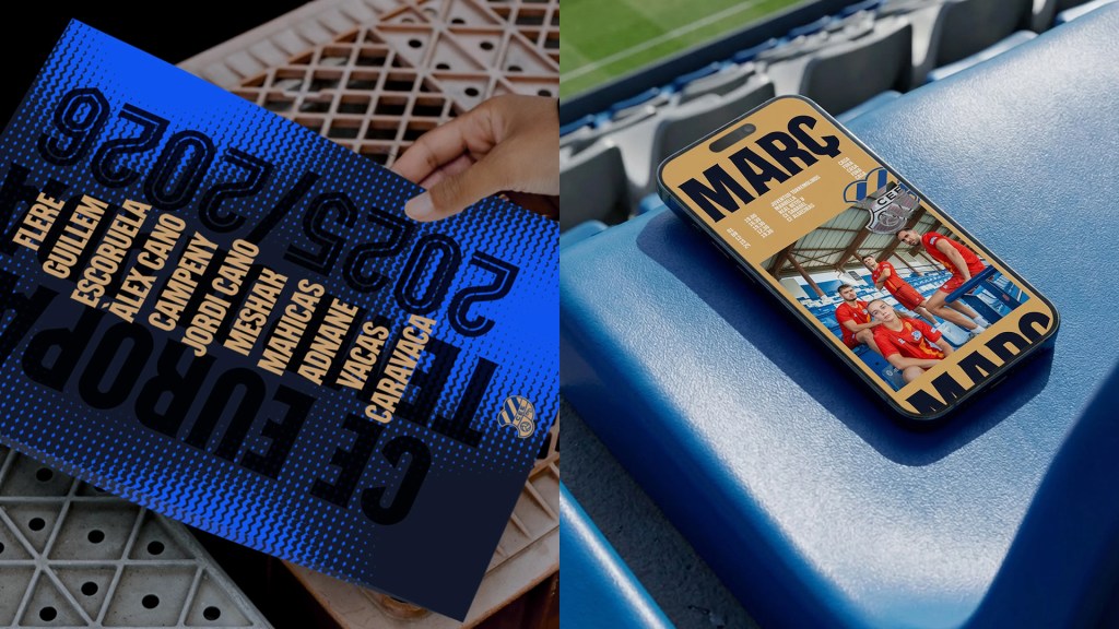
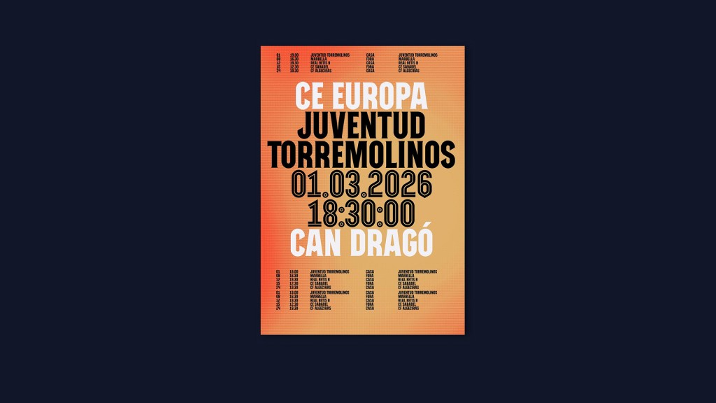
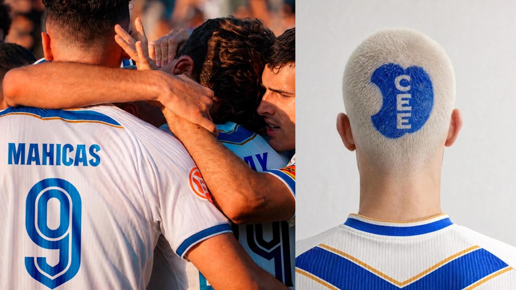
BOC Studio’s work for CE Europa is smaller, sharper, and more disciplined. Their framing was architectural: treat the century-old crest “like a protected façade,” changing the minimum needed.
Both projects are honest, well-made, and specific to their clubs. They’re also following the same structure we’ve now seen from Bureau Borsche, JKR, and SOCIETAS: protect the historic mark, build a heritage-led typeface, tighten the palette around a clear rule, and add an art direction or motion layer to make the system feel alive.
That doesn’t make them plagiaristic. It just shows what happens when a good methodology gets validated so often that it becomes the default. The harder question is whether “protect, distill, custom-type, activate” is now best practice, or simply the next uniform: a rehabilitation aesthetic worn as fluently, and interchangeably, as the monogram trend it replaced.
Open Questions
I don’t think there’s a clean verdict here, and I’d rather leave it open.
If “a year of listening” and a bespoke heritage typeface are now the standard moves in any serious football rebrand, are they still proof of real specificity? Or has specificity itself become the trend?
And who gets to play this game? Not every club can afford a custom type family, a full art direction system, and a season-by-season brand program. So does the new idea of “good football branding” quietly push smaller, stranger identities out of view?
And if the next disruption won’t come from typography or heritage research, because that toolkit now belongs to everyone, where does it come from? Fan-owned identity processes? Dynamic, generative systems? Or another Juventus-style rupture that looks wrong at first, until time proves otherwise?
None of this is unique to football. Every part of design has its own version of “that used to be disruptive, now it’s just the brief.” Football just makes the pattern easier to see, because its symbols are so tied to inherited belonging.
The real discipline comes before choosing whether to protect or break something. It’s in understanding what you’re looking at: what is load-bearing history, and what is just habit dressed up as history.
Most of these projects got that right on their own. The harder question is what happens when everyone gets it right the same way. Which is, I think, the honest answer to the question I opened with: not who moved first, but whether the rest of us can still tell the difference between disruption and its costume.
Additional Reading
- BUREAU BORSCHE – FC Internazionale Milano Visual Identity
- Bureau Borsche profile — Pangram Pangram Journal
- BUREAU BORSCHE – Athens Kallithea FC Visual Identity
- BUREAU BORSCHE – RC Deportivo Visual Identity
- Inter Milan removes letters FC from badge — Dezeen
- Inter Milan introduces stripped back ‘I am’ logo — Creative Review
- Behind Inter Milan’s New Logo with Bureau Borsche — Highsnobiety
- Behind the scenes of the Inter Milan rebranding — nss sports
- Bureau Borsche x Venezia FC: a bold rebranding that roars — TypeRoom
- Mirko Borsche on Bureau Borsche’s introduction to, and impact on, modern football culture — SoccerBible
- A Tour Inside Bureau Borsche — IGNANT
- Your next favourite club is Athens Kallithea FC — nss sports
- Repositioning Greek Football: The Culture Division meets Athens Kallithea FC
- Athens Kallithea FC present new visual identity and 22/23 shirts — official club release
- Athens Kallithea FC and Kappa Release 24/25 Home Kit — Versus
- Athens Kallithea and Kappa Drop a Blacked Out 24/25 Third Shirt — Versus
- Black Kallithea — Subversive Magazine
- Athens Kallithea F.C. — Wikipedia
- Juventus FC faces fan uprising after minimalist new logo — Dezeen
- Juventus rebranding: many will follow soon — glueglue
- These logo design trends will define 2026 — Creative Bloq
- Design vs devotion: why football club rebrands walk a finer line — Transform magazine
- The Best Football Rebrands Begin With What’s Already There — SoccerBible
- Over a year of listening shaped [Alkemy]+’s identity for Palermo FC — The Brand Identity
- Why Boc Studio rehabilitated CE Europa instead of redesigning it — The Brand Identity


Comments
https://shathayu.com/
This write‑up beautifully captures how design isn’t just about aesthetics, but about responsibility, empathy, and orientation. I like how Thing Magazine’s reminder that “fascist design often doesn’t look fascist” challenges us to think critically about the causes our craft serves, while Irene Pereyra’s insight that “policy can set direction, but it still needs an interface” reframes design as a bridge to complexity rather than a tool for oversimplification. The Good Grief Collective’s session adds a deeply human dimension, showing that design at the edges of life requires patience and care. Altogether, these lessons highlight design’s power to shape culture with both clarity and compassion.