
In May 2021, the WooCommerce design team started a project to redesign our visual language for all social media channels. Our aim was to improve our presence and communicate the brand as more fun and attractive to our followers.
It’s no news that social media channels are key platforms that allow brands to reach, nurture, and engage with their audiences. Due to the nature of these platforms, they evolve at a dizzying rate. We have a duty to always be updated and capture the audience’s interest while trying to fulfill desires for novelty, create meaning, and compete in an environment of ever-shortening attention spans. This brings us to a scenario where flexibility and freedom are essential to make good use of all the possibilities these channels offer us.
Studies revealed that the average attention span on the platform for video content is just about 2 seconds: On a desktop computer, the average attention span is 2.5 seconds, but on mobile, it is 1.7 seconds.
Facebook IQ: Digital Insights & Marketing Research
In the case of WooCommerce, we discovered that our social media channels were pretty consistent, following the brand’s visual identity, with purple as the main protagonist. And while consistency is usually a good thing, too much sameness can interrupt brand growth by removing the novelty that retains customer attention. It was time to move from consistency to flexibility.
Achieving flexibility
Our first step was to conduct detailed competitive research,, covering an extensive list of questions. How do other brands deploy their brand attributes across time and media channels? What type of content do they post? What is their tone of voice? But the most important question was: what level of flexibility do they have on these channels? We found a common denominator amongst the best brands in social media. They were, in fact, extremely flexible in terms of visual elements. They were not bound by the parameters of their brand guidelines but instead deployed their visual assets as needed while prioritizing adapting to the platform and context first. If there is a touchpoint where brands can experiment and push their brands forward, it’s social media.
In our case, flexibility was also an important concept linked to our essence and product. WooCommerce allows users to customize their stores however they want, but that was not communicated through our visual design. That’s why during this project we wanted to address concepts such as customization, flexibility, personalization, and multiple possibilities.
Building a visual language
The main goal was to communicate something fun, with enough flexibility to create varied content on our feeds. That’s why, instead of preparing a list of static templates that were ready to use, we found it more interesting to create a basic design language with elements that can be combined in different ways, generating a wide variety of compositions. The design language explored is based on two basic elements: colors and shapes.
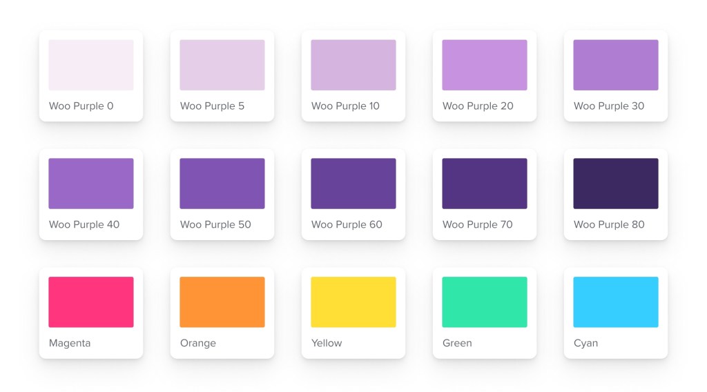
In terms of colors, we wanted to keep our essence, the purple, but at the same time, add some flexibility to it. So we generated a selection of ten different shades, in combination with five new highlight colors, that help us to break the purple monotony and add fun and vibrancy to our feeds.
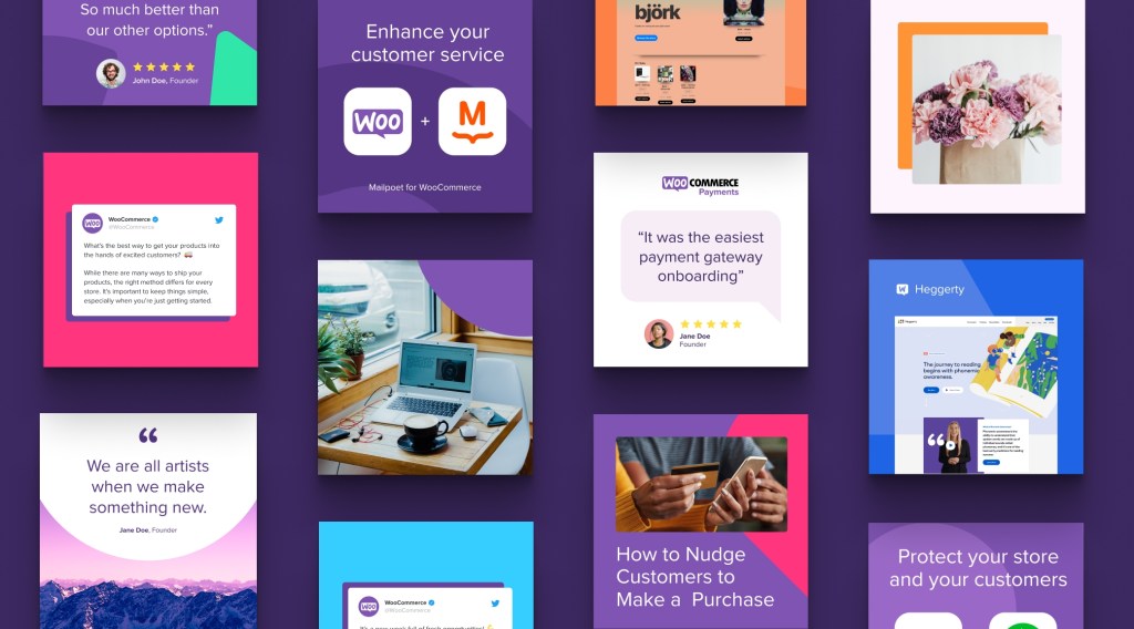
Along with this, we created a series of basic shapes inspired by the Woo speech bubble. All these geometric shapes will serve us as a supplemental element to add even more flexibility to the system. This combination of shapes and colors will offer enough visual tools to the social media team to create new and fresh compositions by mixing and matching colors and shapes.
Inspiring the team
With the visual language established, it was time to inspire the social media team through an extensive collection of examples that can be used in the future as prototypes for new posts. We identified different types of content that are aligned with our existing communications, such as quotes, showcases, tweets, or reviews. To highlight the possibilities of the new visual language, we created various examples for each type of content and shared them with the team.
Optimizing the process
An important goal for the project was to be able to generate a system optimized enough that the social media team can quickly create and edit social media posts and export them to the desired channels. After exploring options, we settled on Figma, since it was a platform already being used across the teams involved.
Thanks to Figma components, we were able to create a workflow where we can update all the collection formats (text & images) by making a change only once and seeing the updates live. Quick and easy. This way, our internal teams will optimize their time generating new social media content instead of creating new designs from scratch or boring followers with endless repetition of the same designs.
The result
The new social visual language launched in September and its implementation has been progressively incorporated across our social channels. The new style and tone—and above all, the new flexibility—do a great job of showing off Woo’s dynamic side, and give the social media team the tools they need to stay creative and engaging.


Stay tuned for all the new creative content on our social media channels. Thanks for reading! You can explore our social media channels and follow us: Twitter | Facebook | Instagram | Youtube.


Comments
[…] Redesigning WooCommerce’s social media presence […]