For the Automattic Special Projects team, the challenge was to give more than a decade of accumulated knowledge a clearer structure without removing the curiosity that made it worth exploring in the first place. Over time, that culture had become part of the site itself: product knowledge, technical detail, ride stories, photography, journal entries, and community wisdom had spread across product pages and unexpected corners of the experience. The information was there, but it was not always where riders needed it.
The problem was not the amount of information; it was that information’s proximity to the part of their journey where the reader would most need it. A sizing question, a component comparison, or a build decision should not send someone away from the moment of decision.
Thus the question we kept returning to throughout the redesign: how do you bring knowledge closer to the decisions riders are trying to make, while still leaving room for discovery?
Layers of Discovery
Not every rider comes to a site like Rodeo looking for the same depth of information. Some seek a quick answer before heading out for a ride. Others want to understand every detail of a component, compare build options, or spend time researching before making a purchase.
Designing for both audiences meant moving beyond the all-at-once product page. Completeness matters, but flooding the page with detail doesn’t create clarity. It creates noise. Our goal was never to confuse completeness with usefulness.
So we treated the page less like a spec sheet and more like a conversation. The experience was organized into layers, so each visitor could set their own tempo.
The hotspots (shown here) made that principle tangible. Riders can begin by exploring key features directly from the bike imagery. Selecting a hotspot reveals added context without interrupting the experience.
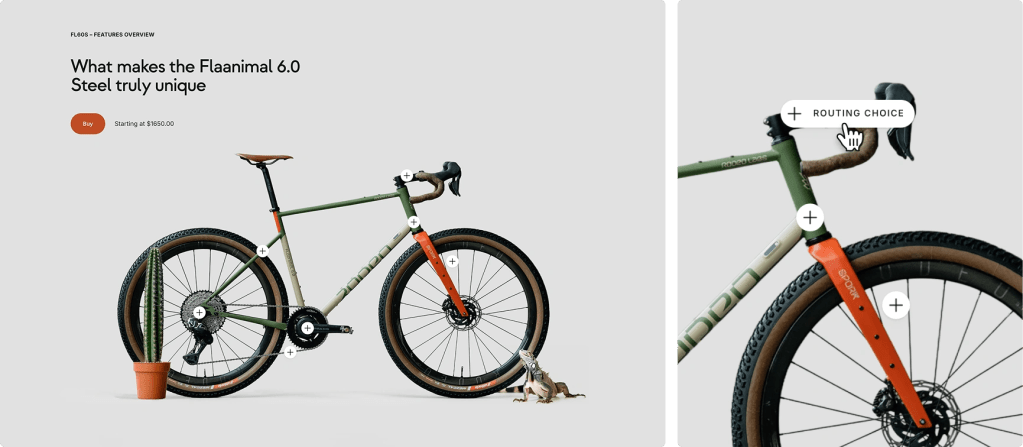
For riders who wanted more, the second layer created a path from seeing the feature to understanding why it mattered.
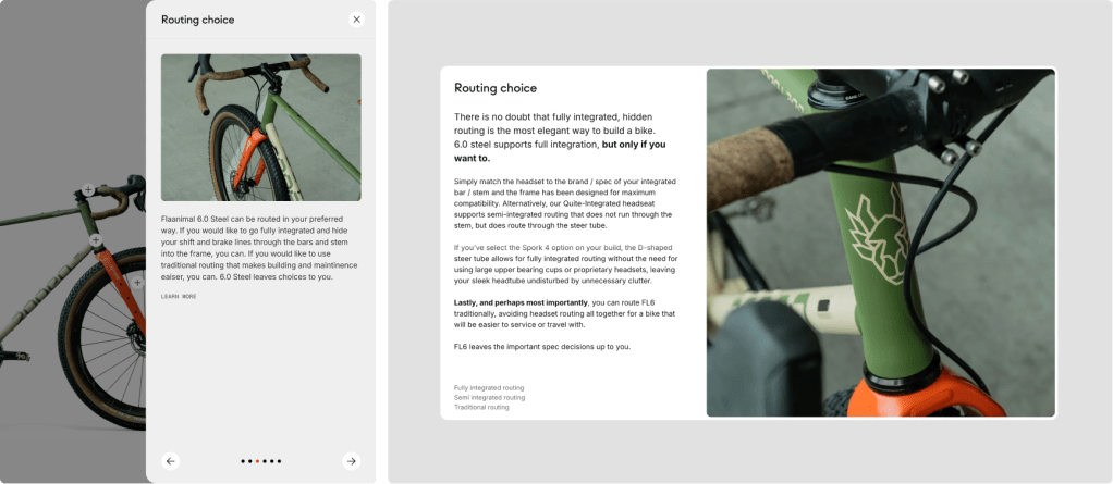
Depth was still there, just no longer competing for attention all at once.
Turning Questions Into Decisions
Building a custom bike is a series of decisions. Each one begins with a question.
Which frame size is right for me? What’s the difference between these build kits? Is this upgrade worth considering?
In most e-commerce flows, the moment someone has a real question, the interface effectively tells them to leave. Open another tab. Read supporting documentation. Compare specs somewhere else. Then come back and try to pick up where you left off.
We thought that was backward. The custom bike configurator was designed so education and decision-making happen together. WooCommerce laid the foundation, but the real work was keeping context close to every choice, so learning and action would stay linked.
The custom bike configurator was designed so education and decision-making happen together.
The goal was to answer the next obvious question before it became a reason to hesitate. Short descriptions provide immediate context, while deeper educational content is only a click away, through the same slide-in panels used throughout the site. Riders can compare options, explore upgrades, and understand the tradeoffs behind each decision without breaking their flow.
That balance is everything. Over-explain, and the configurator feels like homework. Under-explain, and riders make expensive decisions blindfolded. The configurator keeps focus where it belongs: building the right bike for each individual customer, not sending the customer searching for missing answers.
Since launch we’re seeing far more orders go through without customers needing to reach out for clarification. We’re also seeing that our products are easier to find, and that customer searches are ending in success more and more often now.
Stephen Fitzgerald, Founder, Rodeo Adventure Labs
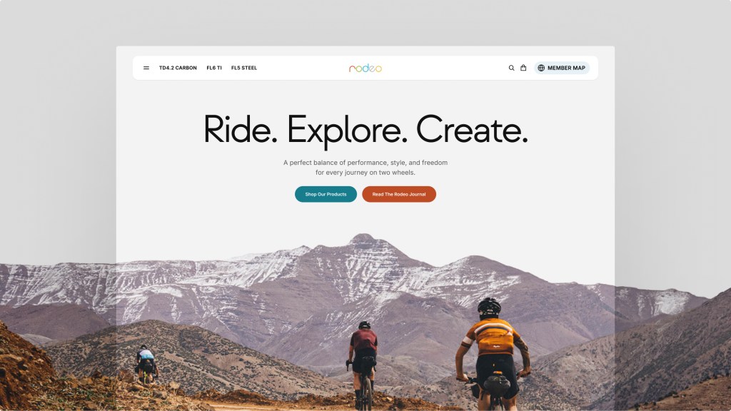
Designing for Adventure
Rodeo doesn’t treat bikes as isolated objects. The product makes the most sense in context: terrain, distance, weather, route, and the kinds of stories riders bring back. As we redesigned the site, we looked for ways to bring that spirit into the experience without turning it into theater.
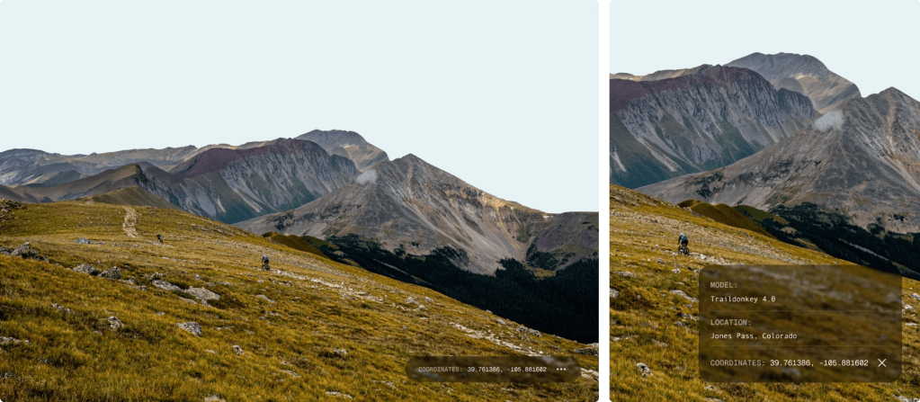
Photography was never just decoration for Rodeo. It carried product, route, and community context. When riders wanted to know where an image was taken or who captured it, that curiosity felt worth designing for. We created a system that allows images to reveal additional context, including photographer credits, location details, and geographic coordinates—all without pulling people off the page. That small layer of information helps connect the product to the surrounding landscape, rather than leaving it detached from the world it was built for.
That same spirit shaped the interactive company timeline. We didn’t want a corporate archive. Appropriately for a site about bikes, the timeline became a trail: Rodeo’s history as a path to travel, not a list to scan and forget. Visitors follow a winding route through milestones and stories that shaped the brand. History here feels navigable and lived-in, not merely documented.
Motion had to earn its place. Used too heavily, motion can turn a site like this into performance. Used carefully, it can reinforce rhythm, movement, and a sense of progression. Layered parallax imagery, animated hero entrances, and subtle transitions create a sense of motion throughout the experience. The parallax system echoes the feeling of moving through changing terrain, with new layers revealing themselves as you go.
These are just a few examples, but they reflect a larger idea that shaped the project. Experiences like this aren’t built through features alone. They emerge from a shared understanding of what makes a brand worth caring about in the first place.
That understanding came from working closely with the Rodeo team, not just on the big interactions, but on the small details where the brand’s character could come through.
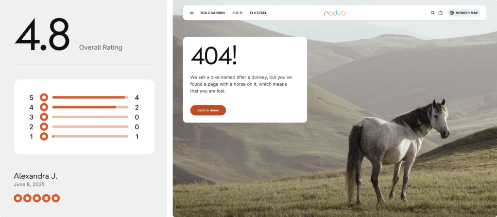
And for those willing to spend a little more time exploring, there are still a few surprises waiting to be discovered.
Structure Serves the Story
As we worked through the redesign, one thing became clear: structure only matters if it supports the character of the thing being organized.
Making information easier to find was important, but it was never the entire challenge. Every decision also needed to protect what makes the experience unmistakably Rodeo.
In the end, redesigning Rodeo wasn’t about chasing simplicity for its own sake. It was about making the site more usable, without dulling the edges that make Rodeo worth the ride.


Leave a comment