Here was a community documenting Bedfordshire’s natural beauty with passion, but their outdated website couldn’t showcase the richness of their world. The old site reflected an earlier web era: complex navigation, buried content, and a structure that made their beautiful photography and local expertise difficult to discover. Behind that tired interface lay a treasure trove of birding knowledge waiting for the right digital platform.
That’s where we came in to help. The Automattic Special Projects team partnered with the Bedfordshire Bird Club, migrated them to WordPress, and together we focused on reimagining their online presence and bringing their vision to life.
The result? A website that not only met their needs, but exceeded all expectations and created quite the buzz in their corner of England.
A brand rooted in Bedfordshire
While our team doesn’t offer brand design services, the Bedfordshire Bird Club’s team needed to refine their logo and make it suitable for modern web applications.
The design direction was clear early on: explore and amplify Bedfordshire county’s richness and character. After being brought in to help refine the club’s visual identity, I began researching nature illustration. I discovered the work of Vanessa Luback and Rob Barnes, two British artists whose linocut depictions of the Norfolk coast showed how traditional printmaking techniques can live in a digital, contemporary space.
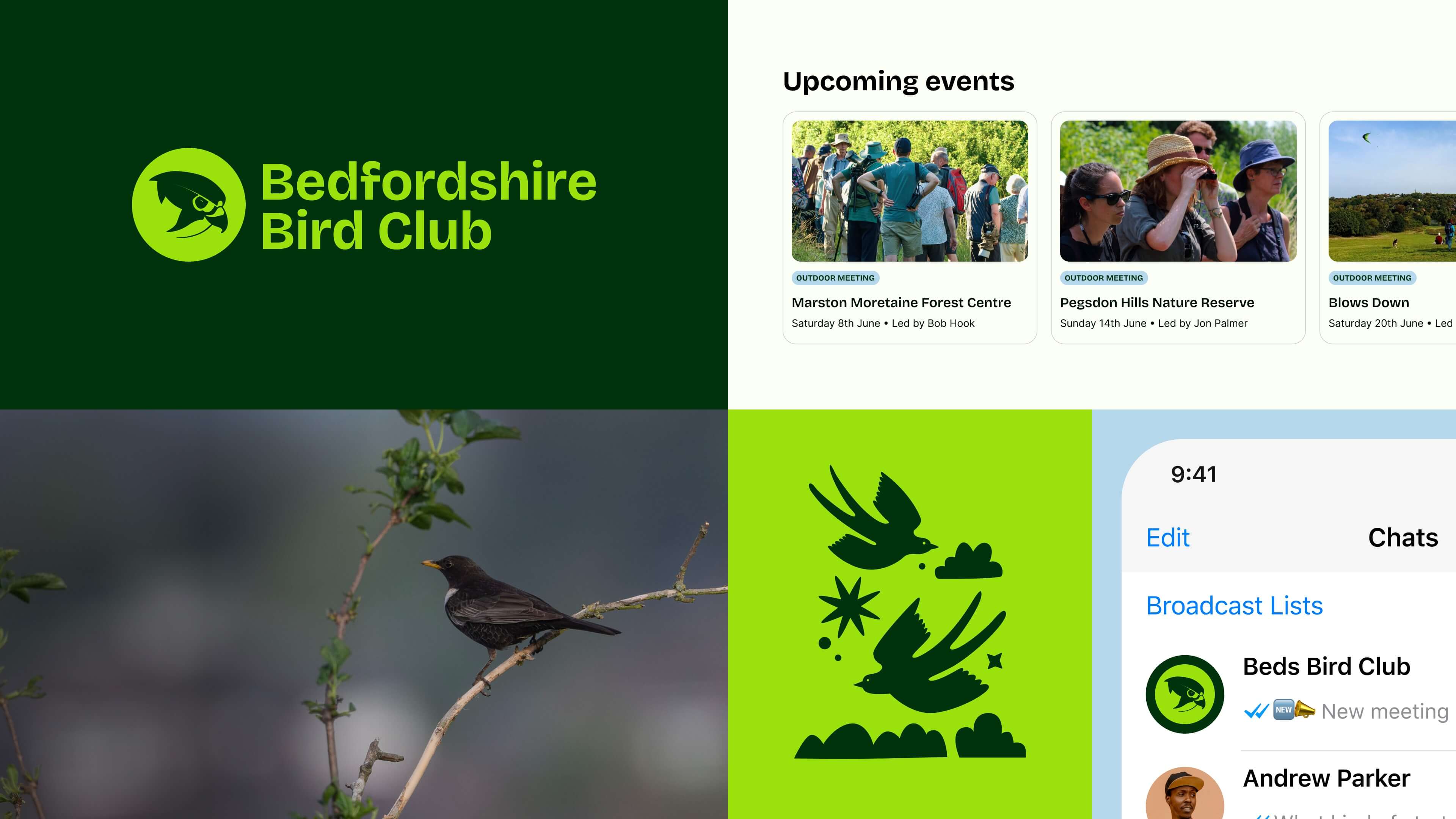
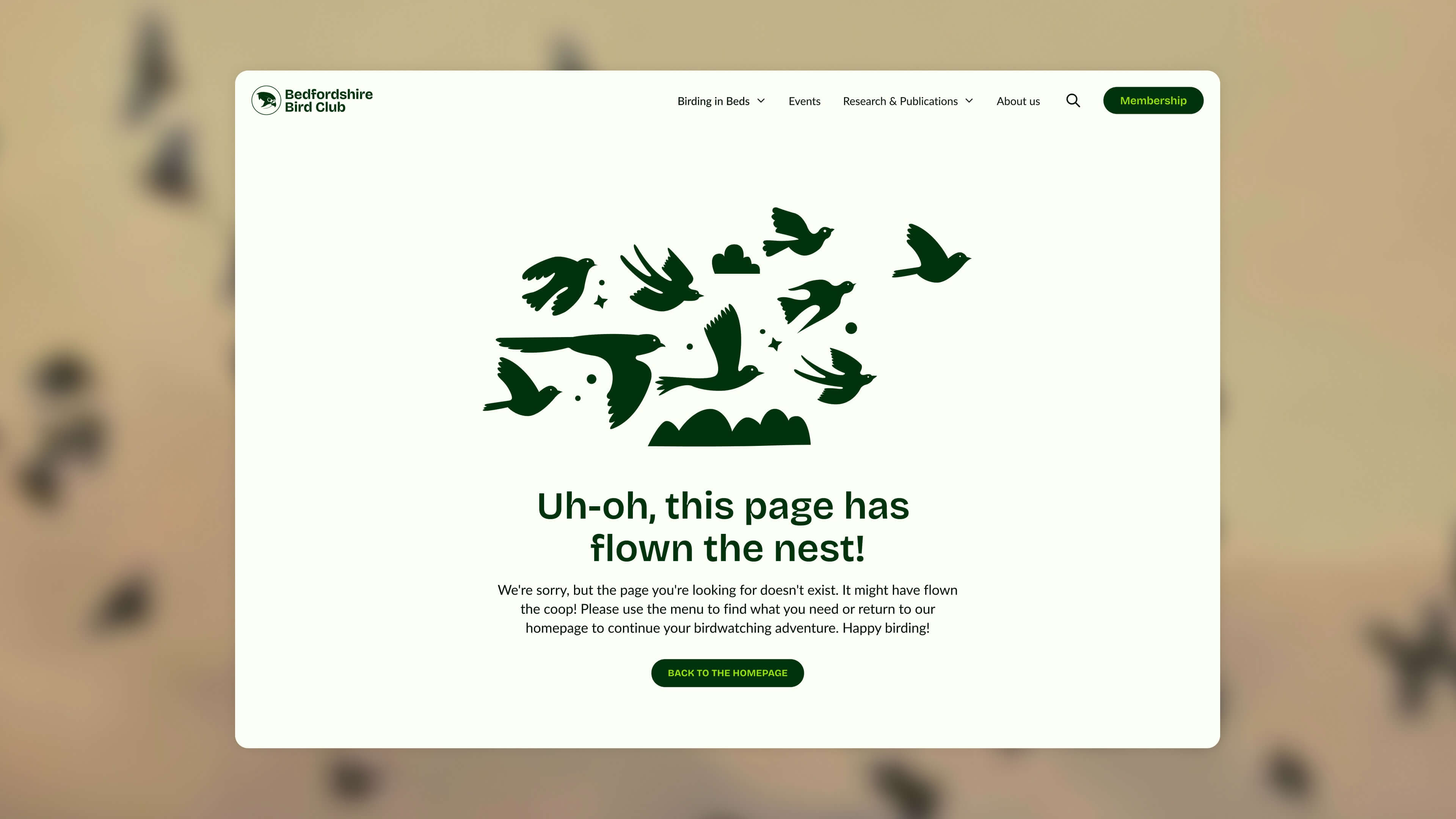
Embracing the linocut-inspired aesthetic, I developed a series of bespoke illustrations and refined the club’s logo. Each element, whether it was the Hobby bird as the symbol or the illustrations, drew from the organic lines of Bedfordshire’s landscape.
The typographic selection was a deliberate choice to balance readability with a distinctive and opinionated character to set the site apart from other birding clubs. After testing several options, I chose Bricolage Grotesque as the heading typeface.
This Open Source font works in combination with the photography, creating a visual hierarchy that guides users naturally through complex information structures. Additionally, what makes this typeface particularly fitting are its sharp angular lines and smooth curves–qualities that subtly echo the precise shape of a bird’s beak.
This natural connection reinforces the site’s subject without being heavy-handed, while the letterforms’ organic flow complements the handcrafted aesthetic of the linocut-inspired illustrations.
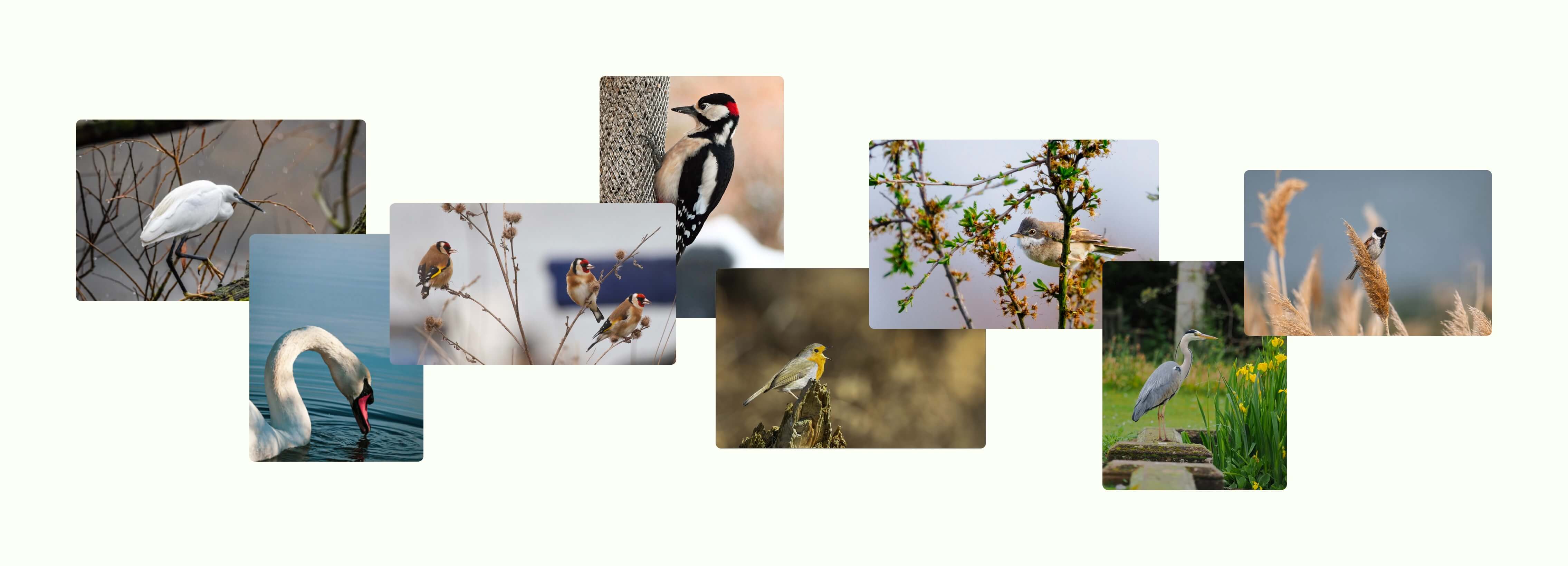
The color palette also needed to reflect the county’s biodiversity, so I drew inspiration directly from the photography the club members had captured across Bedfordshire. Their images revealed the county’s true character: the marsh greens of wetland vegetation, the soft blues of English skies, and the deep forest greens of the landscape. At every point, there was a focus on ensuring the website’s design felt connected to the place it represented—the actual landscape these birdwatchers know well.
Working with the Bedfordshire Bird Club reinforced several principles about designing for passionate communities.
Designing for discovery, community, and connection
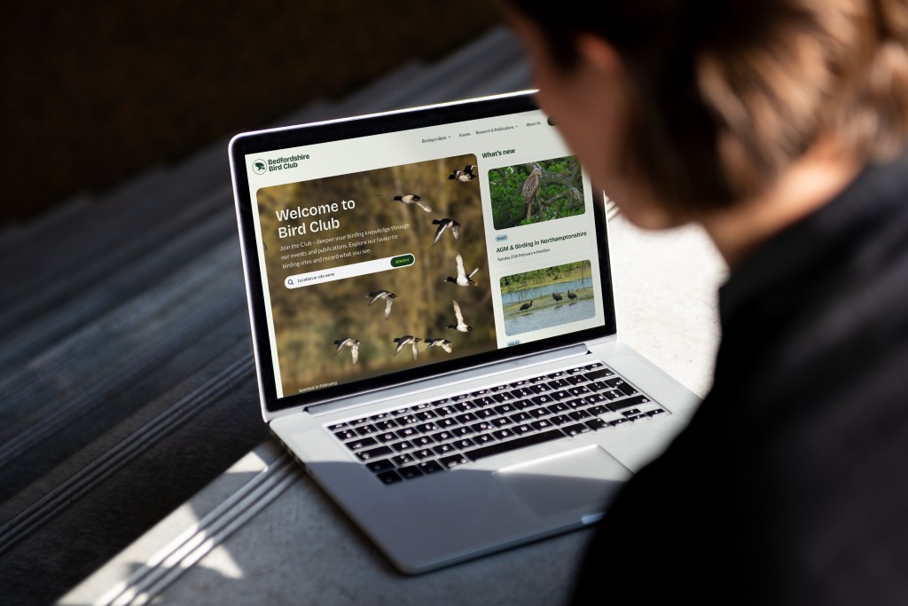
With the visual identity setting the foundation, the challenge lay in creating a website that served the practical needs of experienced birdwatchers and curious newcomers. The committee had identified their core problem: essential information about birding locations was buried, making it frustrating for members to plan their visits.
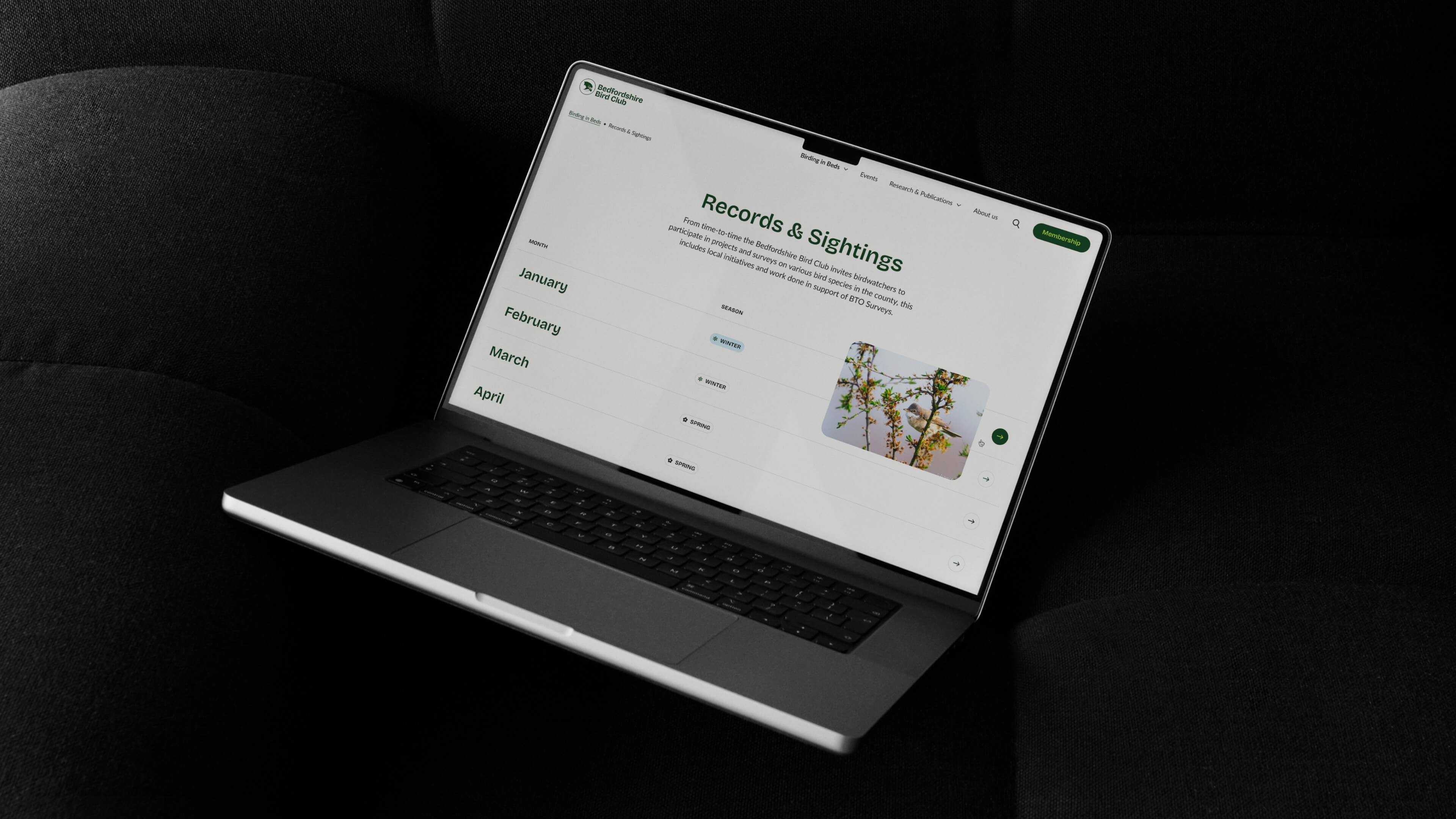
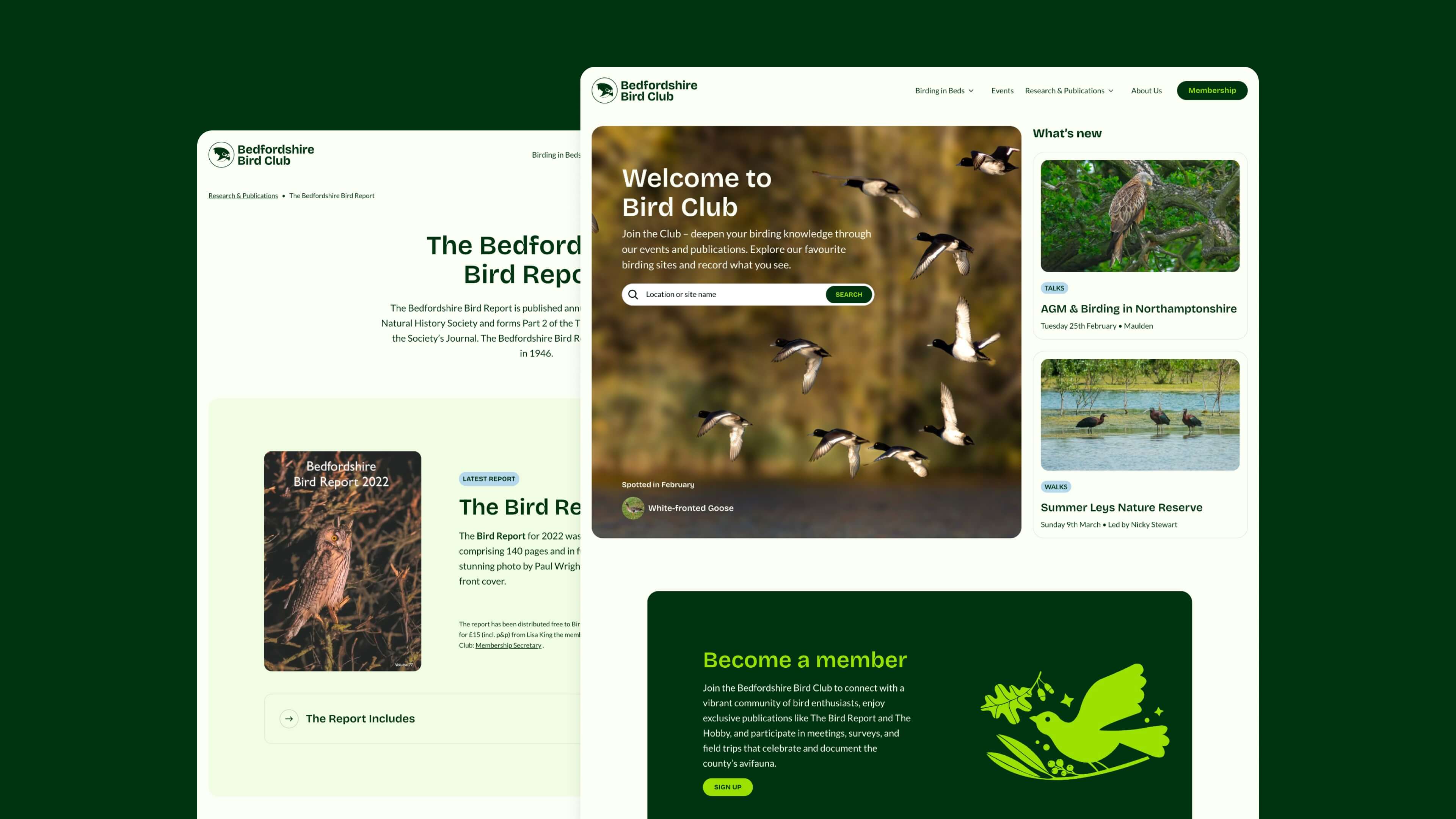
The site’s architecture was rebuilt around the birding sites feature, the natural centerpiece. The interactive map allowed members to explore the county, with each birding site now having its own dedicated page with clear access to information, including parking details and seasonal highlights.
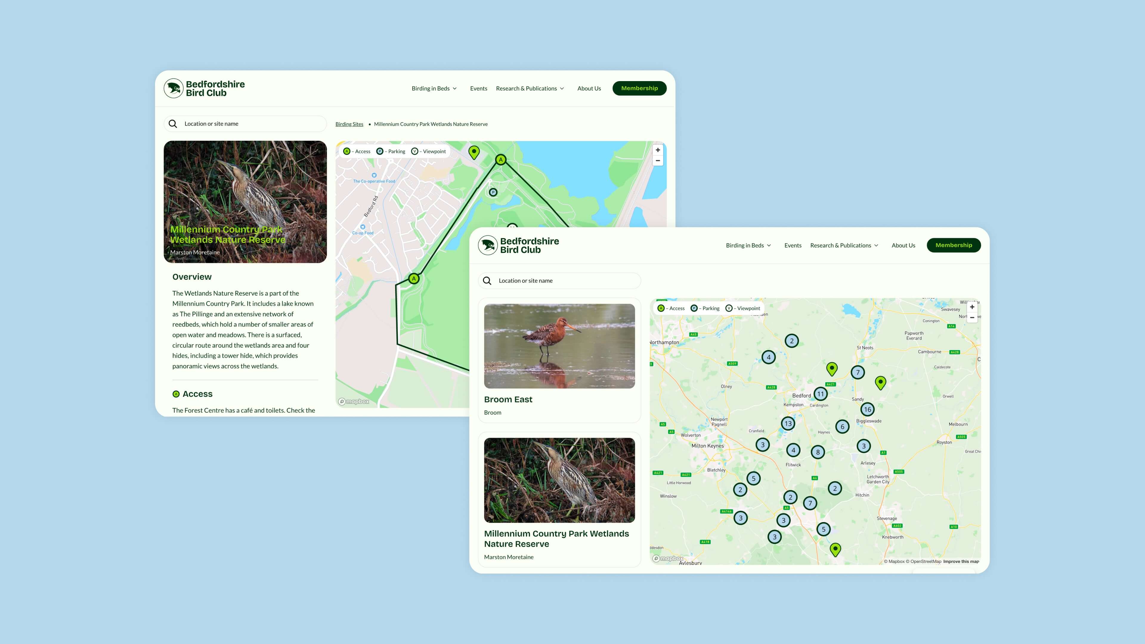
Navigation was streamlined to support the way birdwatchers actually seek information, while still displaying everything else the club is involved with (events, newsletters, research projects, and membership). The mobile experience received particular attention, recognizing that many members would access site information while actively birding in the field.
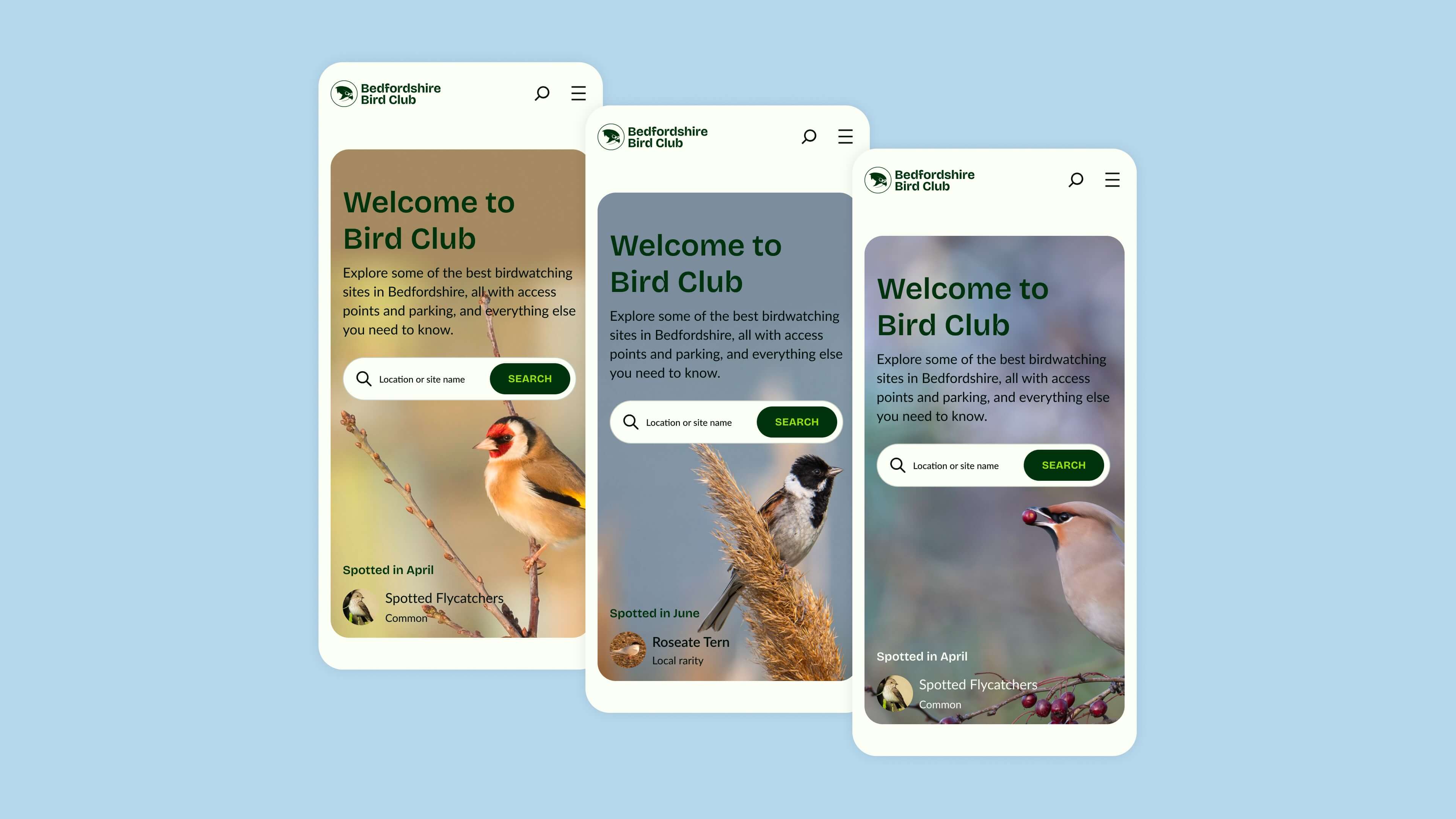
The homepage automatically adapts its seasonal content, which allows for the site to remain timely without requiring constant manual updates from the volunteer committee.
Equally important to the site’s functionality was honoring the community’s prolific photography contributions. I designed a credit system that displays photographer names and bird species identification on hover for desktop users and long-press for mobile devices—guaranteeing that attribution appears seamlessly across all image blocks without cluttering the visual experience.
By elevating member photography from anonymous decoration into celebrated community assets, I hoped to give photographers a sense of pride and ownership and motivate them to further engage with the site.
This system also had an educational purpose, helping visitors identify species while exploring different birding locations. Together with the rich photography collection, the custom illustrations help bridge the gap between realism and artistic interpretation, maintaining visual consistency and emphasizing the handcrafted aesthetic running throughout the site’s identity.
“Wow — fantastic website to visit… The Bedfordshire birding sites page is superb — clear, dynamic, with key info presented well.”
Bedfordshire Bird Club Committee Member
From vision to impact: collaborative success
Working with the Bedfordshire Bird Club reinforced several principles about designing for passionate communities. First, authentic inspiration trumps imposed visual trends: anchoring color palettes in the landscape and referencing traditional craft techniques created more meaningful visual connections than any out-of-the-box approach could have achieved.
Second, when partners deeply understand their audience but need help translating that knowledge into digital experiences, designers can focus on creative problem solving rather than stakeholder education. The club’s committee’s trust in our process, built via clear communication and a shared vision, contributed to the site’s success.
Finally, technical sophistication serves community connection. The interactive mapping, seasonal content automation, and photography credit systems weren’t impressive for their complexity, but for how seamlessly they support the club’s mission of connecting people with Bedfordshire’s bird life.
Many designers dream of working on high-profile projects. But, to me, the Bedfordshire Bird Club project shows that the most impactful and rewarding work doesn’t depend on the fame or size of the campaign. Instead, it arises from careful attention to communities and causes that deserve better digital representation.