
In the competitive world of e-commerce platforms, brand perception impacts adoption. For the design team at WooCommerce—now simply “Woo”—addressing this challenge meant rethinking their visual identity from the ground up, while preserving the playful spirit that made them beloved by millions of merchants worldwide.
From Speech Bubble to Shopping Cart
When WooCommerce first launched in 2011, it entered the market with a peach-colored speech bubble logo that reflected the playful internet culture of the late 2000s. The platform grew exponentially—today it powers around three million online stores—but its visual identity hadn’t evolved at the same pace as its capabilities.
I noticed this anecdotally just after joining Woo. “Maybe try Woo instead of the usual options?” was my prompt to friends that run or work at design agencies that collaborate with some major merchants. Their response, reacting mostly from looking at the brand and site for a moment came as “It doesn’t feel very polished.”
Upon digging further, we realized that this first impression was in the way of merchants, builders, and agencies, and the disconnect between perception and reality became the catalyst for change.
Despite WooCommerce being one of the most powerful and flexible e-commerce solutions available, its visual branding was creating a barrier to adoption, particularly among larger merchants who questioned whether the platform was mature enough to handle their complex needs.
If the first impression of our brand was enough to make people hesitate, we were losing potential users before they even saw what the product could do.
The In-House Design Challenge
Unlike many enterprise-level rebrands that engage external agencies, Woo made the decision to handle the rebrand entirely in-house. This choice reflected the company’s open-source ethos, practical resource considerations, and the goal of making sure the whole team felt ownership around the process and deliverables.
The rebrand team consisted of five designers, including motion: Fernando Pérez, Marta Przeciszewska, Andrei Slobtsov, Meg Rosen, and Nebojsa Jurcic (motion designer). During the process, they collaborated with marketing team members like David Callaway, Randi Fields, Rachel Armstrong and other writers to develop the new brand identity, and tone of voice.
One of the biggest challenges of doing the rebrand in-house was finding the right balance between our regular work responsibilities and this special assignment. We couldn’t just pause all our day-to-day work to focus fully on the rebrand, and we never had, at any point, a designer who was solely engaged in rebrand work. Despite that challenge, and partly because of it, what we gained was the feeling of real ownership, along with plenty of opportunities to sharpen our communication and feedback skills.
Working remotely across multiple time zones, the team maintained momentum via asynchronous communication and rapid design cycles. The process began in April 2024, with initial explorations of various design directions and a review of past logo redesign attempts to understand what had and hadn’t worked. Following that, we quickly ramped up: within about three months, we had several solutions we were proud of.
A Strategic Framework: Update, Upgrade, or Change?
To bring structure to the design exploration, we agreed to divide our logo explorations according to a three-part framework:
Update
Keep most aspects of the current logo, focusing on technical and visual improvements, like fixing how the speech bubble scaled and the typography.
Upgrade
Pick a single, stronger element or concept from the original brand and build upon it, such as transforming the speech bubble into a call-to-action button.
Change
Start fresh while maintaining a conceptual link to the current brand, or looping it back into the product and what it does.
After exploring all three paths, the team determined that incremental changes wouldn’t deliver the significant shift needed to reposition the brand. We needed something bolder that would justify the time and emotional investment required for a rebrand on this scale.
Finding the Hidden Cart
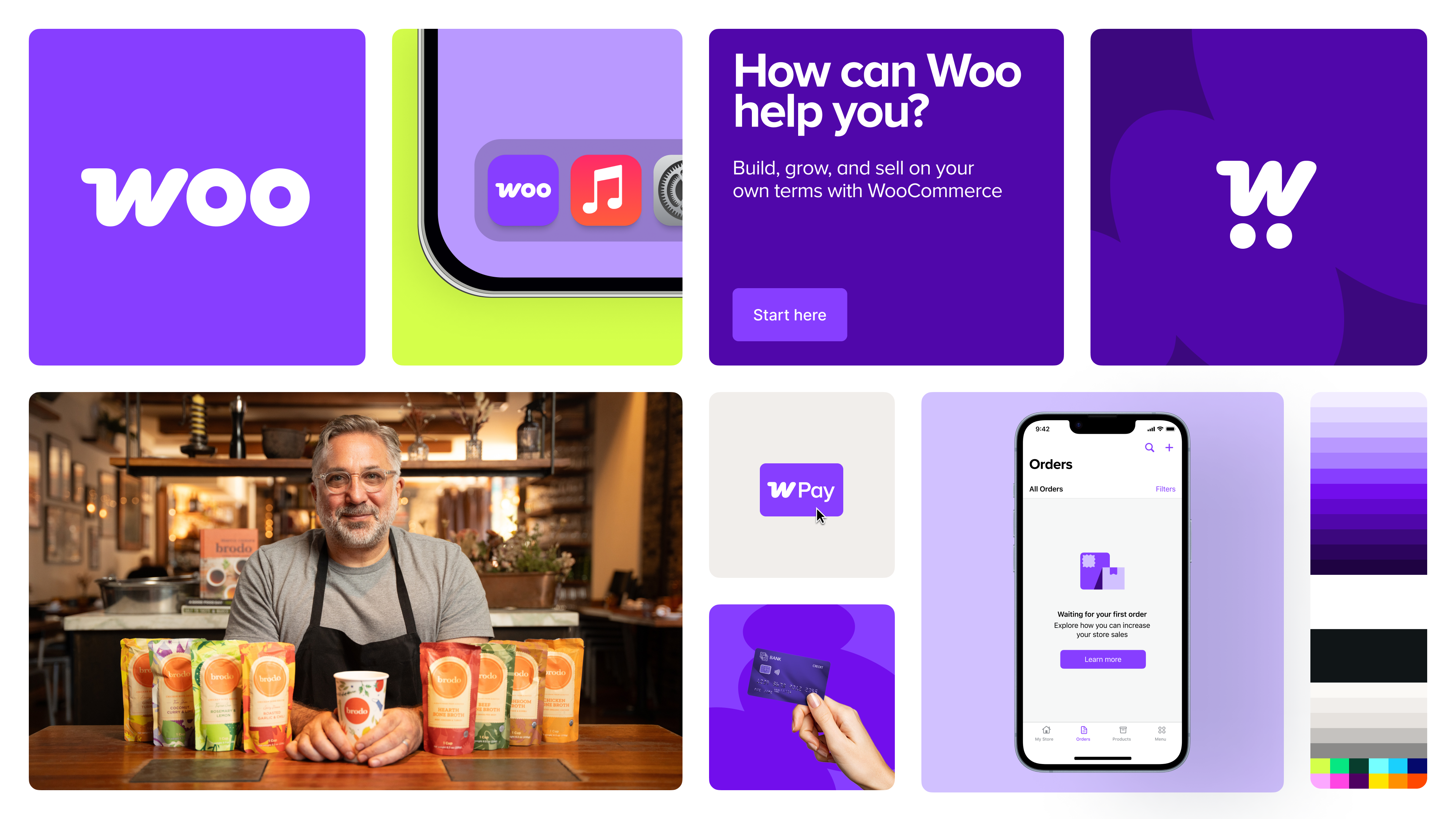
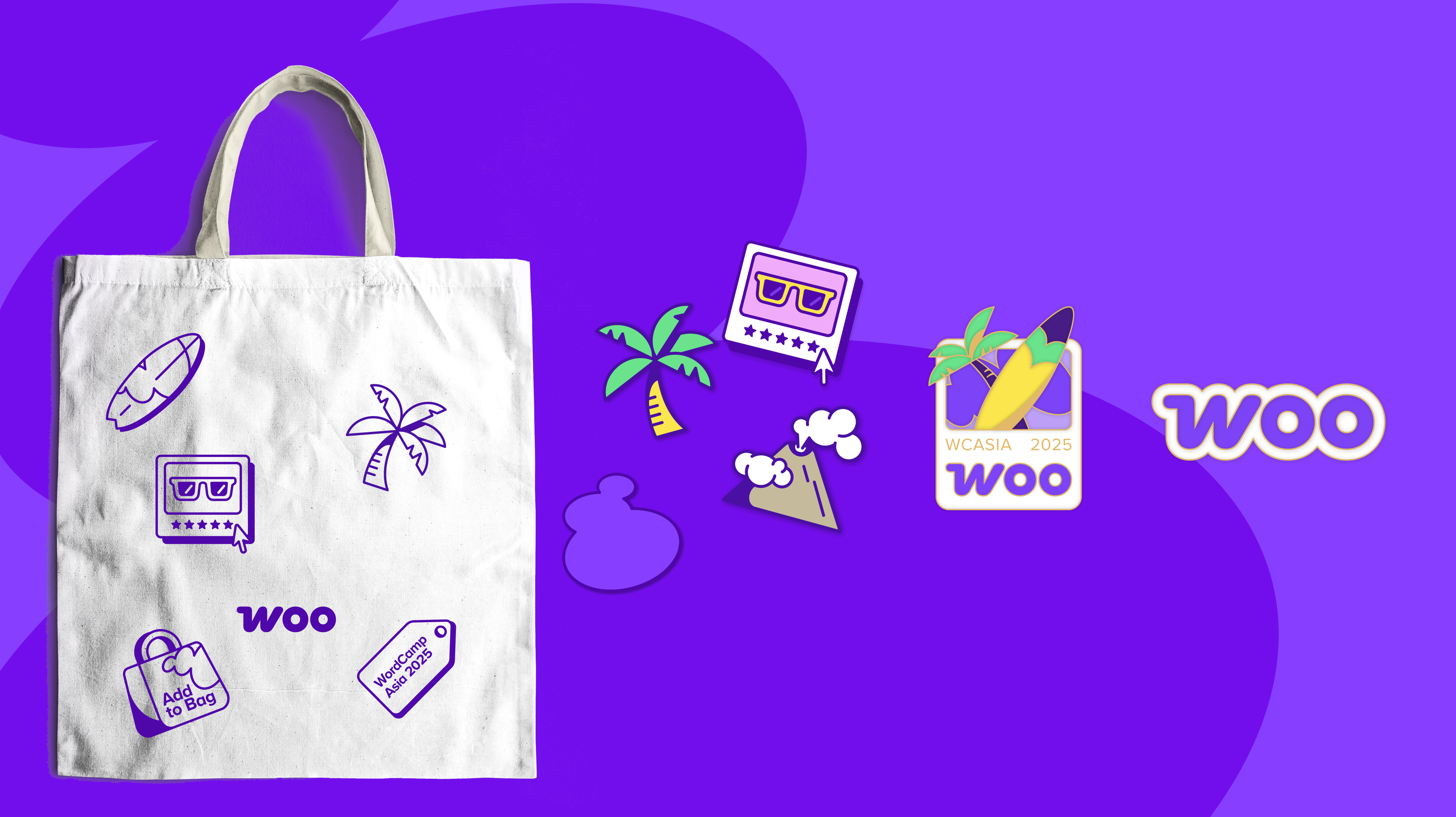
The breakthrough came almost by accident, as we shaped Change versions of the logo that related to product, such as price tags, baskets, shopping carts and so on. By shaping the letter W in different forms, the team discovered that the letter “W” in Woo could naturally form a shopping cart—even without wheels. The added bonus there was that the letters “o” in Woo could also morph into wheels. The cart was in the logo all along—and it all clicked together.
Using a cart, bag, or basket to signify commerce is a simple idea, and not a statement. But what I love about that is that while it’s simple, the execution is flavorful.. One of the parts of the design process I enjoy the most is when I see something that is really obvious for the first time.
This elegant solution checked all the boxes: it directly communicated commerce, retained brand recognition through the “W,” and could scale cleanly across different applications. Most importantly, it felt mature and true to our brand, but not corporate—playful without being cartoonish.

Keeping the Purple
With so many brand elements changing—the logo mark, the typeface, and shortening the name from WooCommerce to Woo—we agreed to keep the signature purple color as an anchor for brand recognition, together with other visual devices we had been using for the last few years.
But, reusing the existing purple wasn’t ideal for our goals, as the old purple just didn’t feel like a strong call to action. “Would you use this purple on a button?” was our prompt when experimenting, and if the answer was no, then we knew we needed to make more adjustments.
The new purple is bolder and more vibrant, carefully calibrated to work effectively for calls-to-action and to provide sufficient contrast with white text. For an e-commerce platform where the “add to cart” button is fundamental to the user experience, having a color that resonated well for CTAs was essential.

Beyond the Logo: A Complete Brand System
The rebrand extended far beyond just the logo—it encompassed a complete brand system including typography, photography guidelines, messaging frameworks, and positioning strategies. These tools were designed not just for Woo’s internal use but to be shared with the community of developers and partners who bring WooCommerce to clients.
A great brand makes you feel proud to use it—like how people feel about owning an Apple product. I think the new Woo gets us closer to delivering on those feelings.
Aligning with Product Evolution
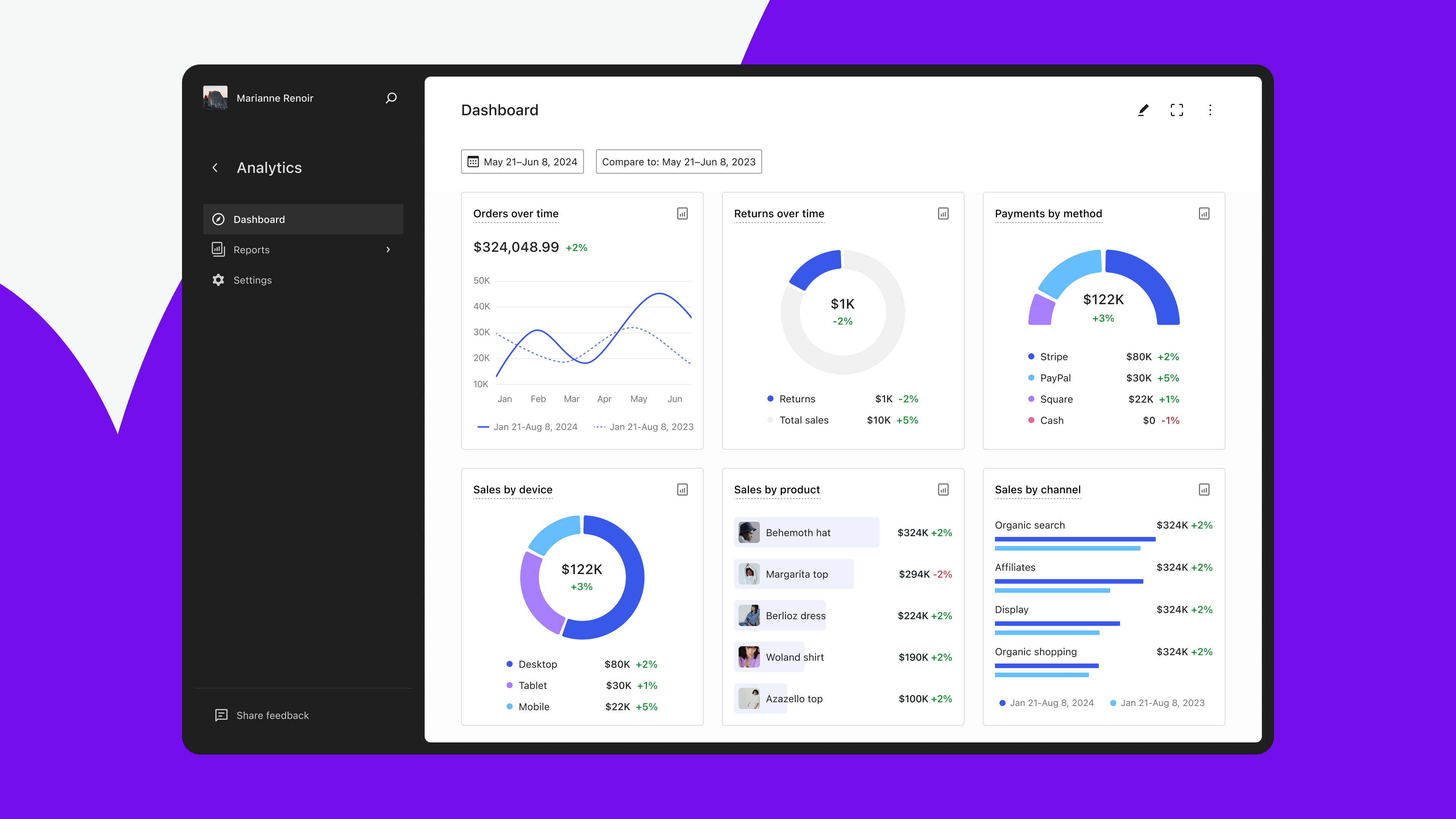
The timing of the rebrand was strategic, coinciding with significant improvements to the platform itself. Woo has traditionally been highly modular—a small core with extensive customization via plugins. While this approach provides flexibility, it can be overwhelming for new merchants.
In parallel with the rebrand, our product teams have been working to enhance Woo Core with more built-in functionality, including brand management features, an Analytics beta, and upcoming point-of-sale capabilities. We also have completely new WooCommerce-first block themes expected to launch in Q2 of 2025, and we’re planning a set of improvements our customers have been asking for.
The Moment of Truth
For a company whose product enables entrepreneurs worldwide to pursue their dreams, instilling that same sense of pride and ownership internally and externally represents the ultimate success.
After months of development and refinement, including sharing each phase with community members to validate our approach, we previewed the new brand at Woo’s company meetup in October, 2024, and followed with a controlled rollout in February, 2025—a timeline specifically chosen to avoid disrupting merchants during their busiest season from Black Friday through the holidays.
The response validated the team’s intentions: community members were more engaged to work with and recommend Woo, and even former founders reached out to express their appreciation for the refreshed identity.
Perhaps most rewarding was the internal response: team members shared how the new brand increased their pride in working here.
Design is 80% really hard work and 20% reward. This is one of those 20% moments.
Lessons learned
The Woo rebrand offers several valuable lessons for design teams considering similar transformations:
- Perception matters: Even the best product can be undermined by branding that doesn’t reflect its quality and capabilities.
- In-house rebrands require balance: Maintaining day-to-day responsibilities while undertaking a major rebrand demands clear priorities and flexible workflows.
- Strategic frameworks help: Breaking exploration into distinct approaches (Update, Upgrade, Change) provided clarity and direction, helping feedback and iterations.
- Retain recognition anchors: When changing multiple brand elements, maintaining some continuity helps preserve brand equity.
- Align visual change with product evolution: Most importantly, timing a rebrand to coincide with product improvements creates a more compelling narrative.
For Woo, the rebrand represents not just a visual refresh but a coming-of-age story—the maturation of a platform that has grown from a WordPress plugin to one of the world’s most widely used e-commerce solutions. With its new identity firmly established, Woo is positioned to continue empowering merchants with the freedom and flexibility to build their dream stores for years to come.


