
Recently, Day One embarked on an exciting project to expand the writing experience into the realm of physical journaling books. The design team leapt into action to bring this vision to life while ensuring that Day One’s brand seamlessly translated into the offline world. Join us as we delve into the journey of how we created a new brand asset for Day One, now being applied across multiple touchpoints.
Your brand is a story unfolding across all customer touchpoints.
Jonah Sachs
As we embarked on this journey, our first task was to identify the tools at our disposal. Day One’s brand has always been characterized by a clean and minimalistic aesthetic and assets. Exploring further, we realized the need for a visual language that could effectively communicate Day One’s essence while expanding their brand world, online or offline.
Building a visual language
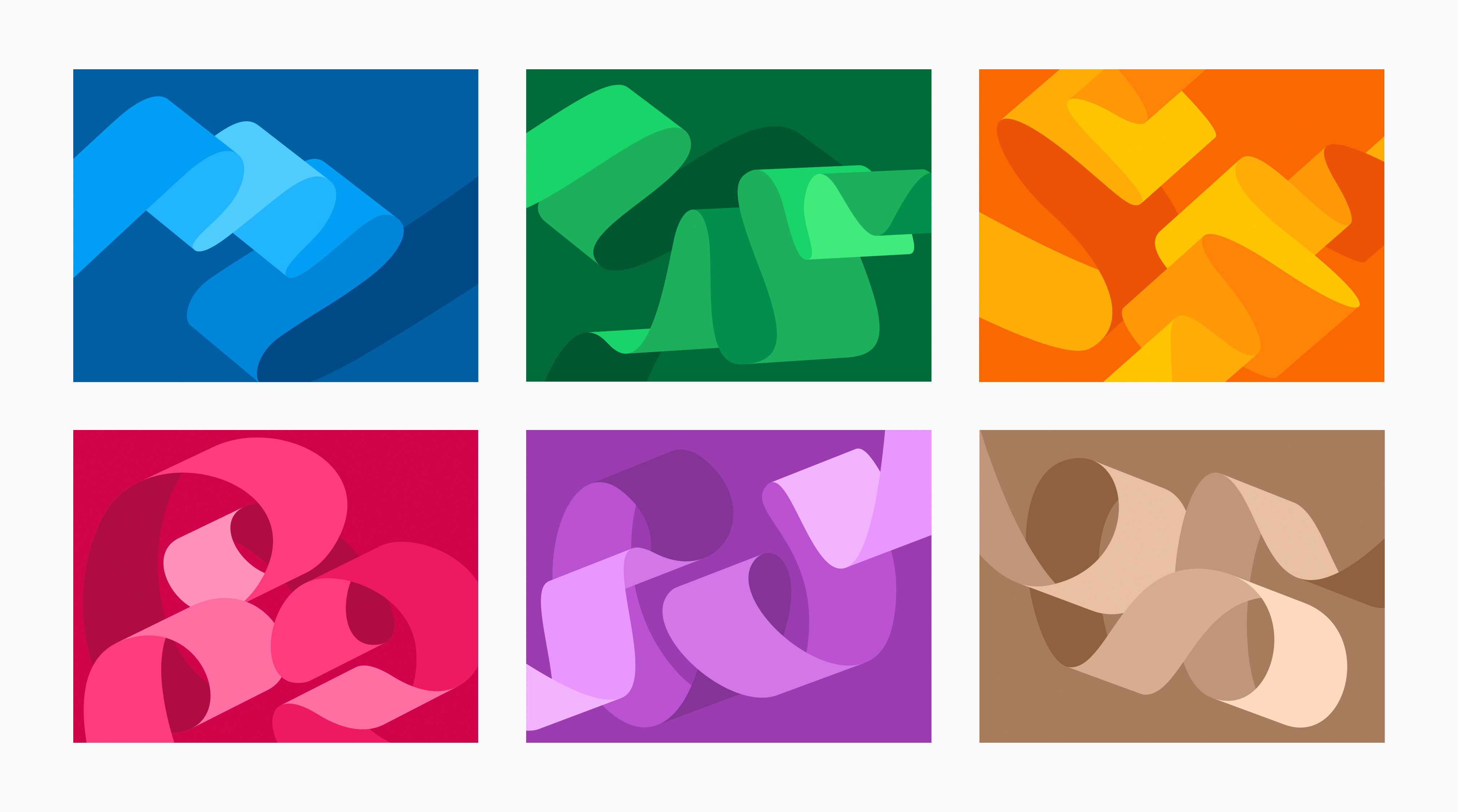
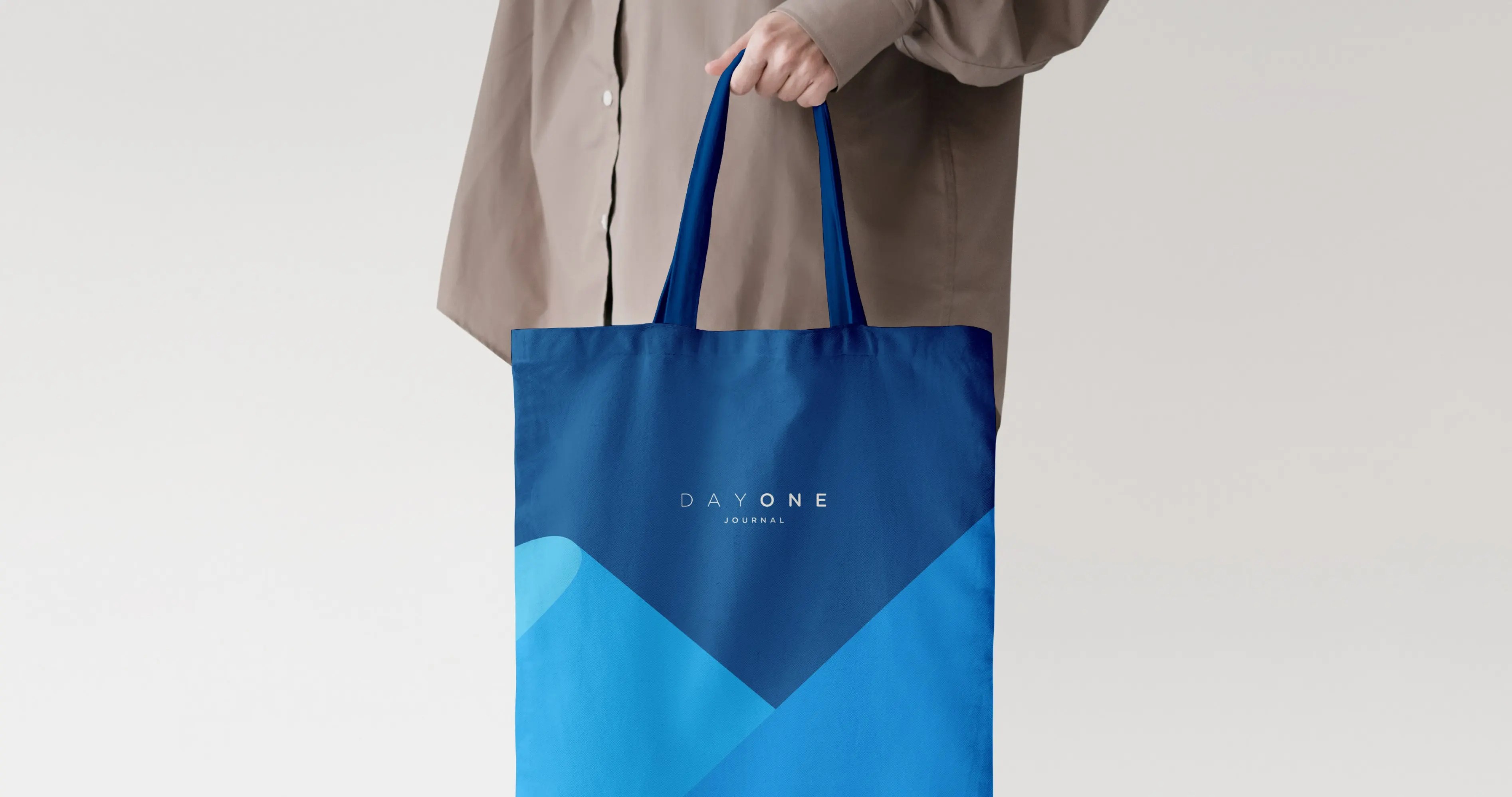
The ribbon emerged as Day One’s most distinctive and recognizable element. We sought to explore this concept further and used the ribbon as a starting point for our illustrations, envisioning how it could be stretched and transformed.

Once the concept was defined, the next step was to determine how to create these illustrations. After careful consideration, we decided to design them in 3D to ensure each curve had a natural finish, creating a fluid and organic visual flow. We collaborated with Studio Capicua, a 3D company that, under our art direction, created a family of ribbon illustrations with different shapes and folds.

This collaboration yielded six unique ribbon illustrations, offering a wide variety of shapes for use across different touchpoints. In terms of color, we chose to develop them using our main brand color, Day One Blue. However, to expand the versatility of our product, we also modified these illustrations to encompass a broader spectrum of colors, drawing inspiration from the Day One palette: Green, Honey, Hot Pink, Lavender, and Tortilla.

Zooming in to more possibilities
We understood that for a key visual to be successful, it must be versatile. This became a primary goal for us. We played with the concept of zooming in to expand the possibilities. By focusing on specific areas, we created the possibility for an array of abstract compositions. This approach amplifies the versatility of each texture, enabling extensive use of these assets without too much repetition.

Bringing the ribbons to life
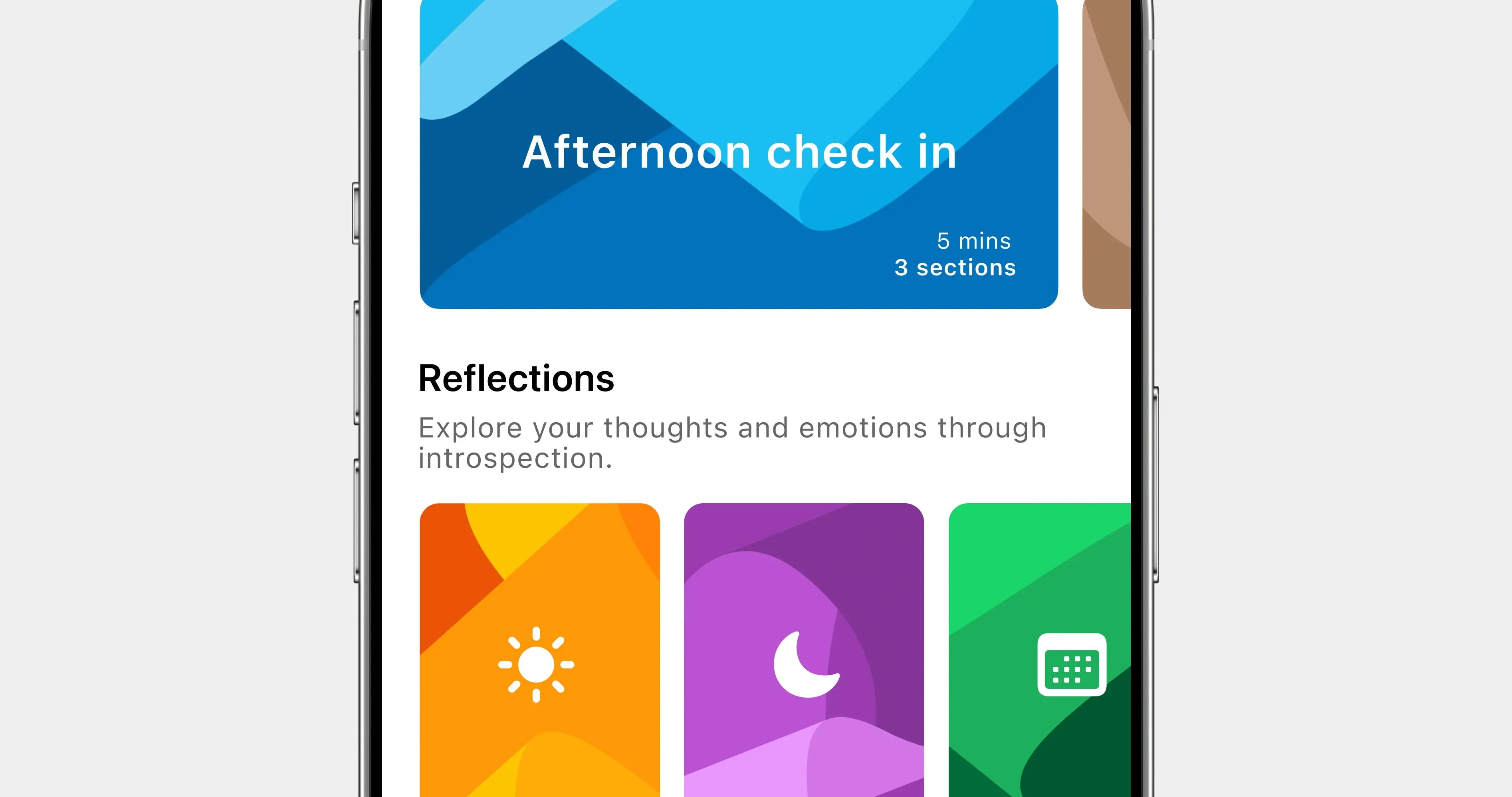
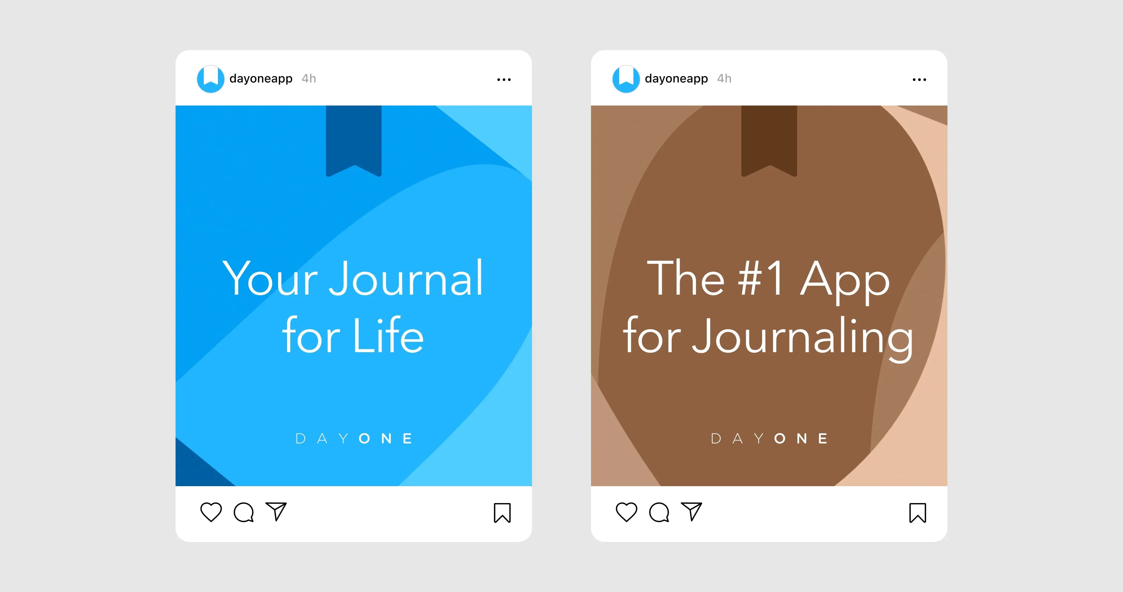
Once we shared these assets internally, they were immediately embraced and utilized by different teams, becoming influential and inspiring brand assets for Day One. They seamlessly integrate with our existing brand style and adapt to a wide range of applications from in-product screens to swag items.

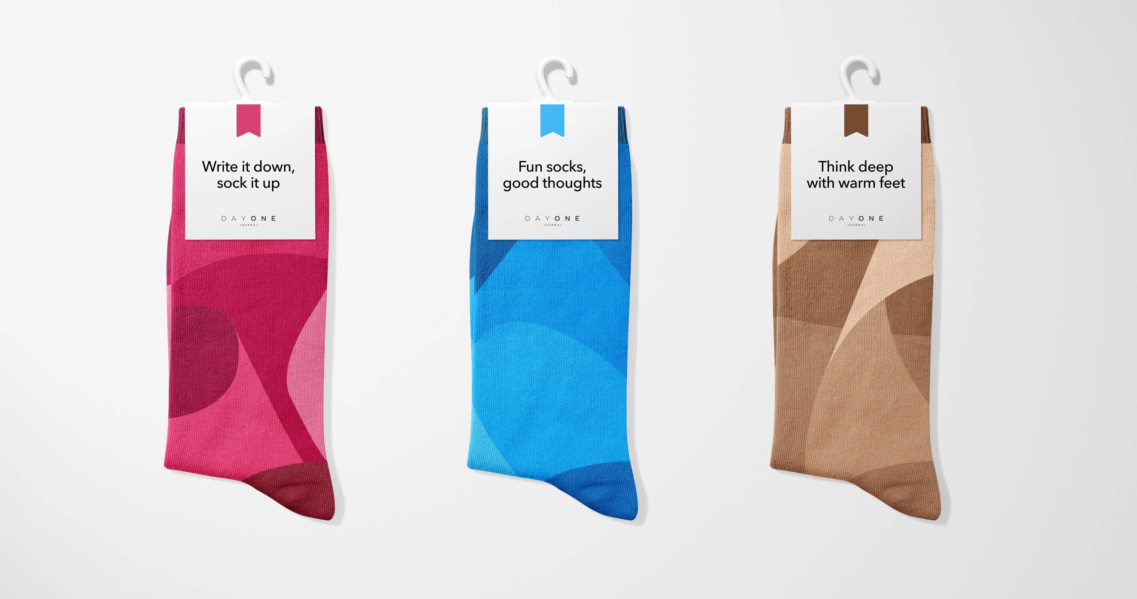
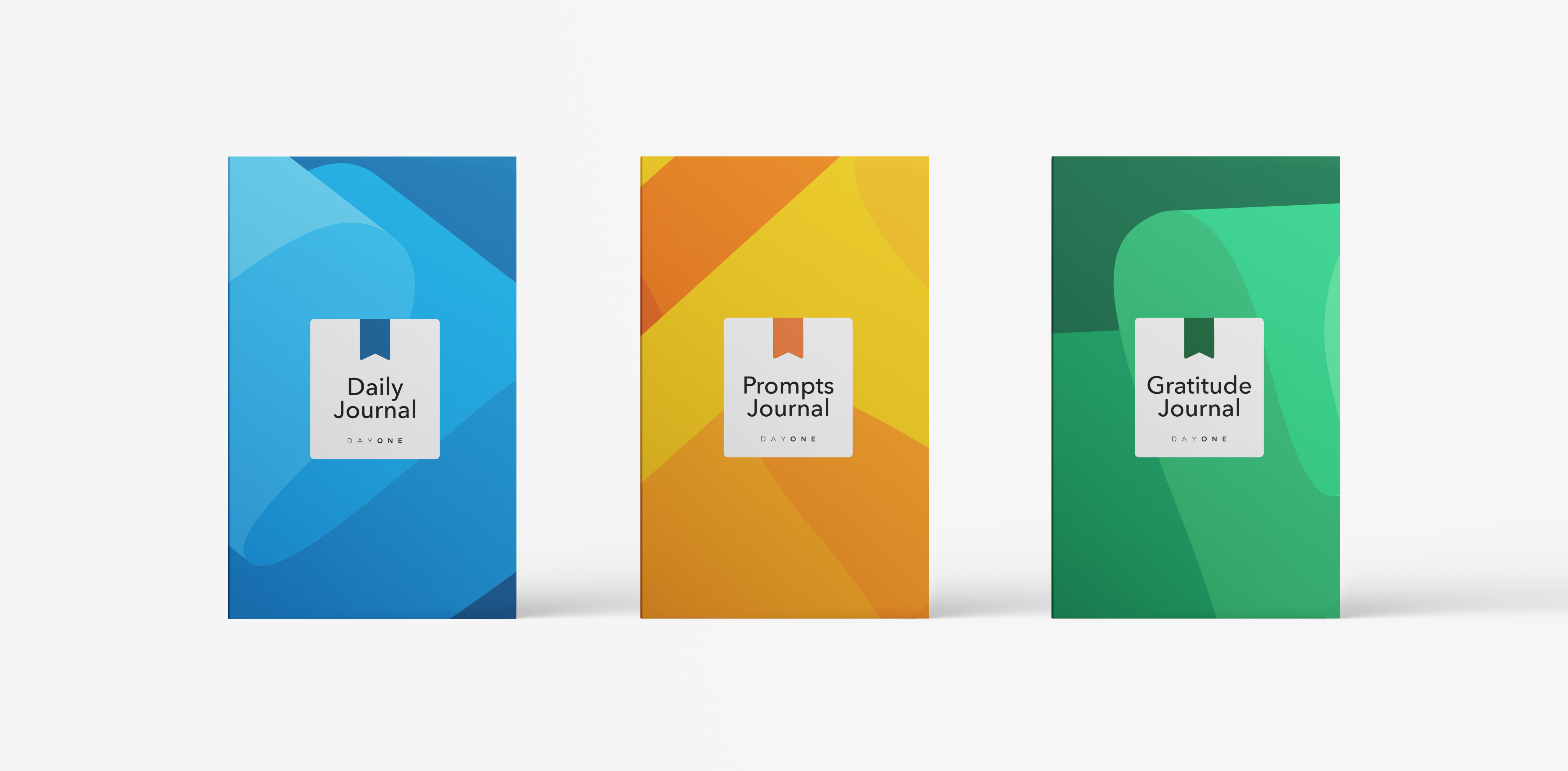
Introducing Day One Paper Journals
These graphics are featured in the cover of the new Day One collection of paper journals we recently launched. Day One Paper Journals are designed to be yet another way for you to build a lasting journaling habit. Pre-order the Day One Gratitude Journal now! Coming in 2024, we’ll offer a Daily Journal and a Prompts Journal, so be sure to sign up for updates.


The outcome of this project is a dynamic visual language that effectively communicates the brand’s identity. These ribbons, with their fluid shapes and diverse color palette, embody Day One’s ethos of creativity, flexibility, and innovation. Not only do they enhance the look and feel of our brand, but they also forge a deeper connection with our audience by infusing a sense of movement and energy into our brand narrative. Whether offline, on the pages of a physical journal, or online, via the app interface, these ribbons are transforming the way we express our brand to the world.


