Every year since 2011, the WordPress project’s co-founder, Matt Mullenweg, gets in front of an audience to share his thoughts about the project’s progress, celebrate the community’s amazing wins, and discuss the future of Open Source.
And every year, several weeks ahead of that very moment, Matt and a diverse group of people at Automattic get together and start preparations so that when he goes on stage and the cameras start recording, everything works perfectly and the message he delivers reaches the audience loud and clear. We call this event the State of the Word.
From a designer’s perspective, the State of the Word is a great opportunity to create a presentation that is watched by thousands of people around the world. But it’s also an intense task that requires a lot of coordination because, as the date of the talk draws near, the work becomes more hectic with last-minute changes and requests.
In December 2021, Beatriz Fialho and I paired together to design the State of the Word keynote. In this post, we’ll share how that process came about, from the very beginning up until the moment that Matt jumped on stage.
The announcement
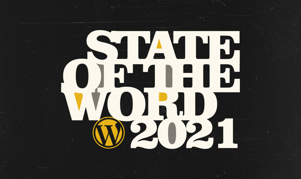
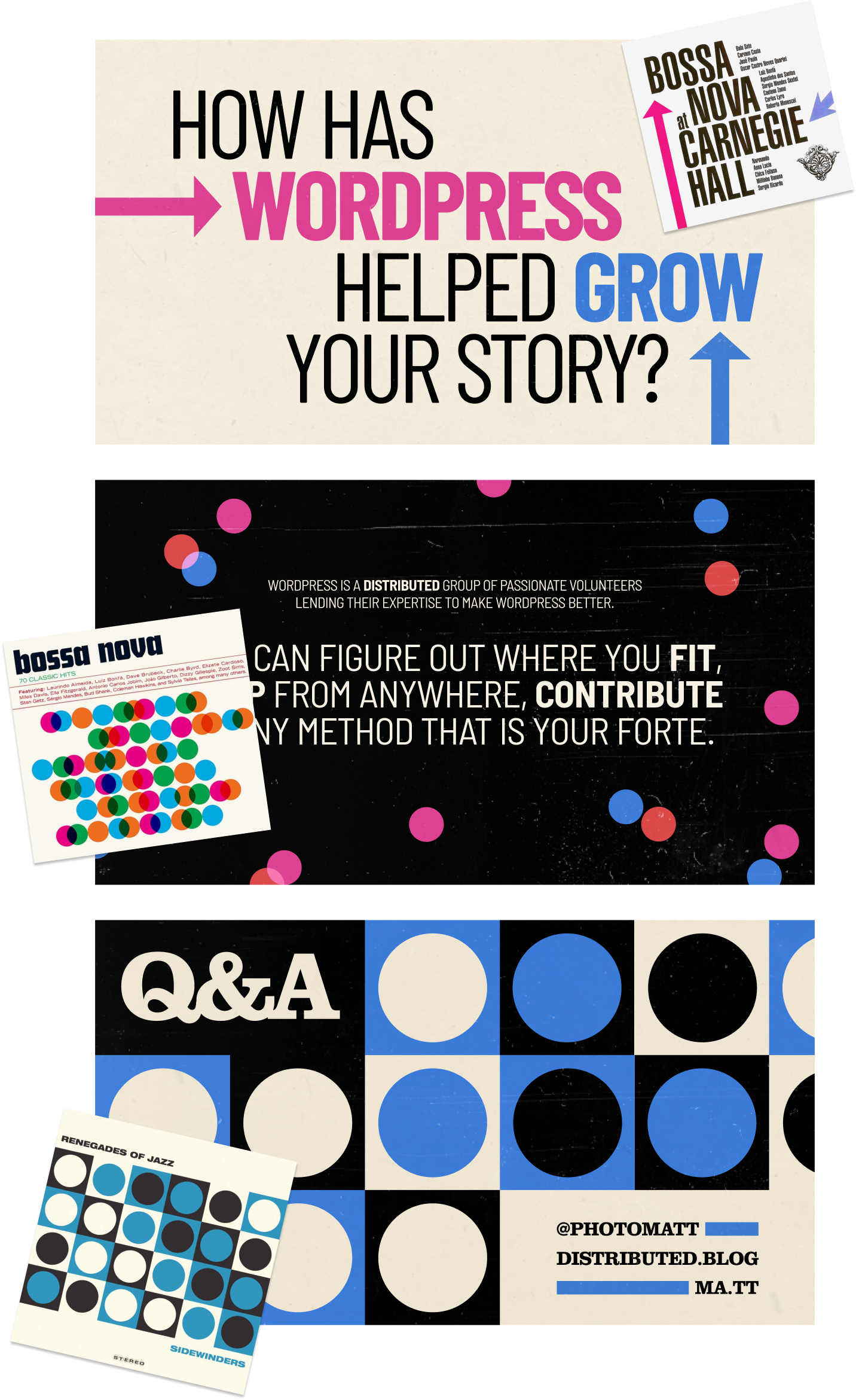
Before we even started to compile a list of references for the presentation, we were tasked to create a banner to announce the event.
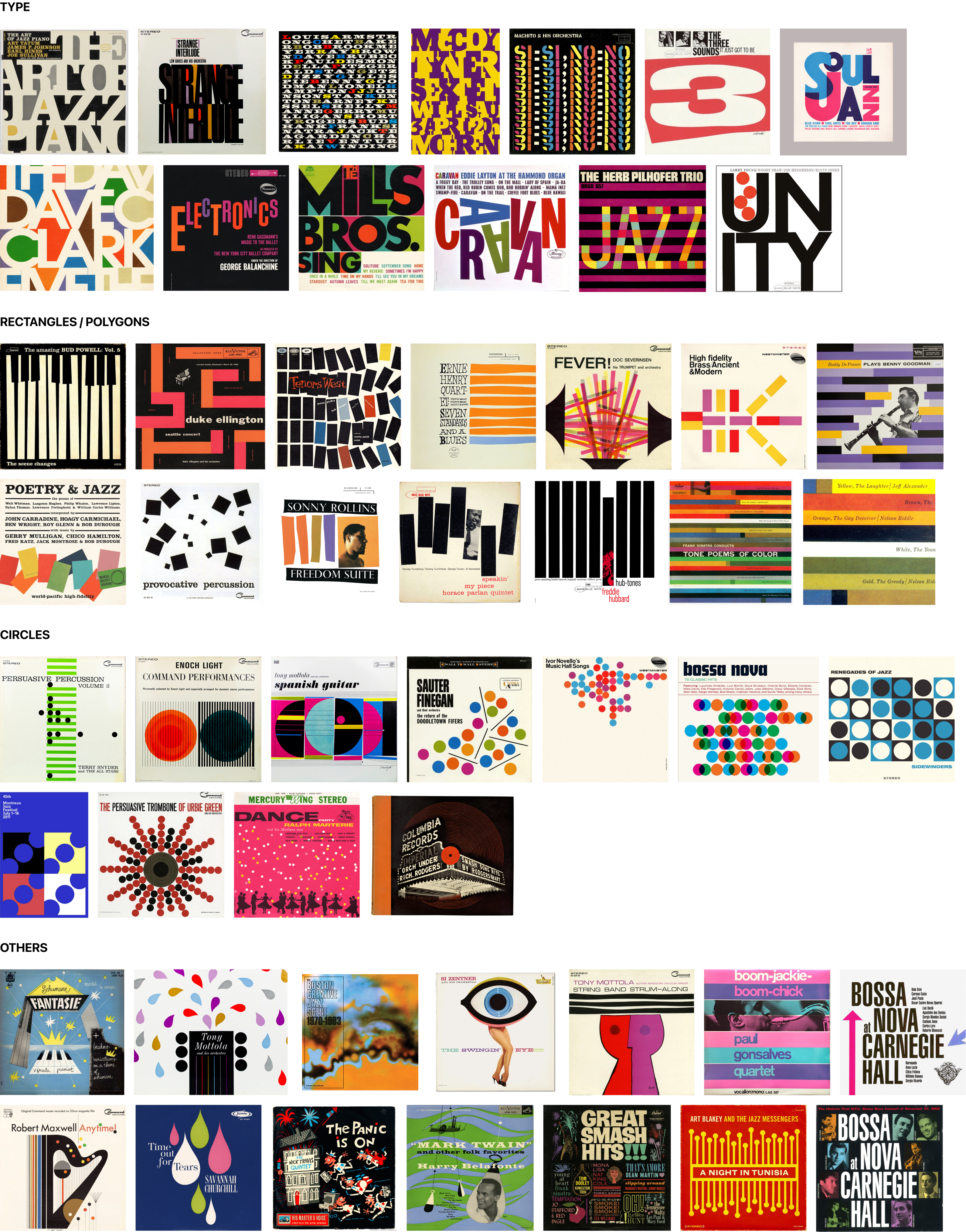
Our idea for the keynote design was to continue looking into the rich world of classic jazz album covers that had been explored in the previous State of the Word presentation. Not only because of the historical relationship between jazz and WordPress, but also because the values that those album covers express (playfulness, optimism, diversity, and creativity) are qualities that we wanted the presentation (and WordPress!) to be associated with.
With that in mind, Bea produced a composition drawing inspiration from The Art of Jazz Piano by Art Tatum.
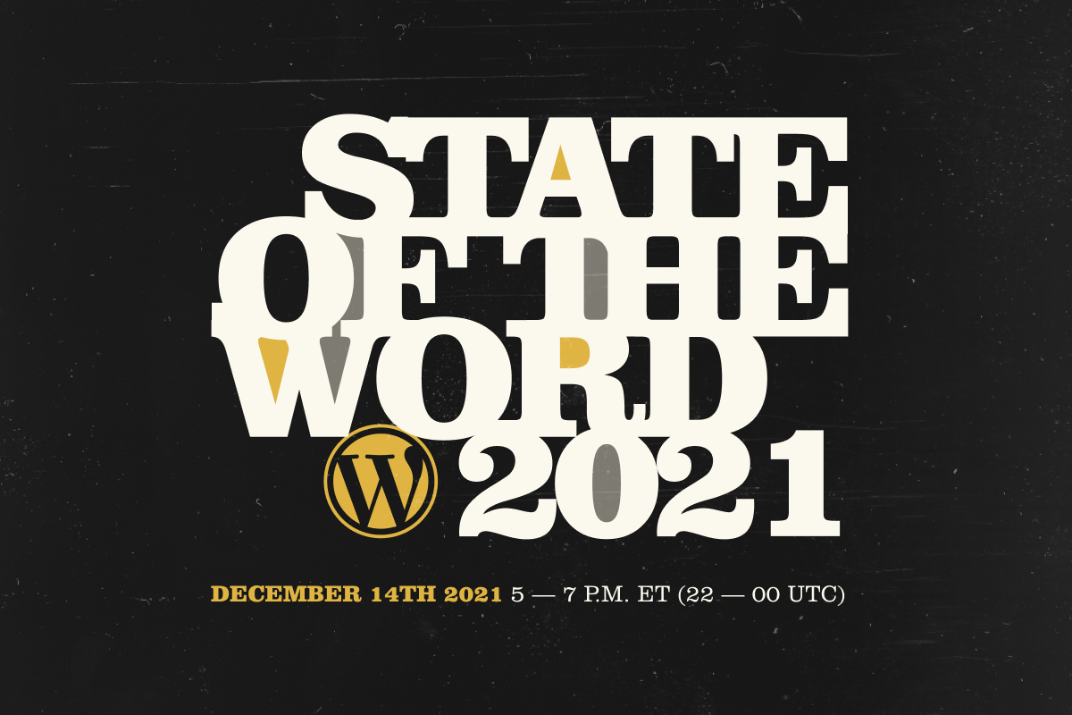
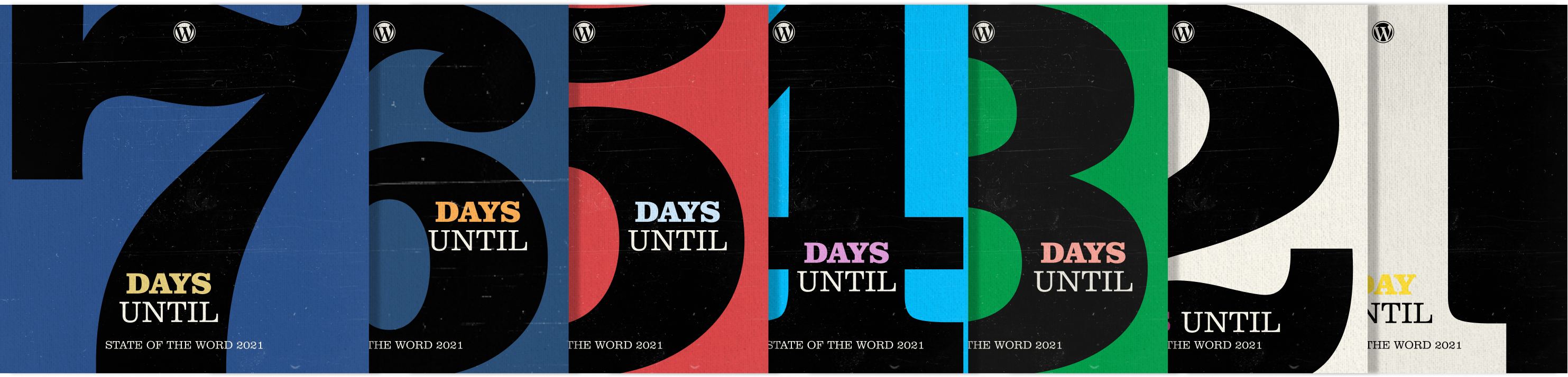
Using the typography of the announcement banner and a basic color palette, we then created several pieces (an ad, some banners, and a countdown) to announce the event on the different platforms and create excitement.
The presentation
Building on the jazzy slides designed for the State of the Word 2020 we decided to add a couple of twists to the formula.
The first one was adding motion to the presentation, which opened the question of how the elements would move and what kind of animation could pair well with the graphic universe we were going to explore.
Since the album covers we have selected span several decades (from the 40s to the 60s, and also the 70s), we dug for some classic animation references from those same periods.
We first arrived at Saul Bass and his incredible work for directors like Preminger (Anatomy of a Murder), Hitchcock (North by Northwest), and Hamilton (The Man with the Golden Gun). Another work we considered was the title sequence for Charade, created by Maurice Binder and Robert Ellis. And more recent incarnations, like this title sequence for Steven Spielberg’s 2002 movie, Catch Me If You Can.
These movie titles would inform future design decisions like the rhythm of the animation, the arrangement of the elements on the screen, the tone of the transitions, or the general texture of each piece.
Using those titles as inspiration, we produced some raw test footage to explore and play with several of these concepts.
The second twist we introduced to the previous year’s slides was to distance ourselves from the recreation of the jazz album covers and instead just use some of its elements and arrangements to inspire the design of the new slides. That second idea allowed us to avoid repeating ourselves and explore concepts more freely in a pure jazz fashion.
The design process itself ended up resembling a jazz session, where one of us would riff on the other’s concepts and designs for a while and hand it back to the other to finish it. That back and forth was very smooth and fun, allowing us to work asynchronously for most of the time and letting us build on each other’s ideas.
The result
The result of our collaboration is a 1GB keynote file made up of 59 slides, many of them animated, that covers a big array of topics: from diversity stats and news about acquisitions to information about past and future releases, the decentralized web, or the future of Gutenberg.
Closing thoughts
Through this process, we came across a number of lessons and discoveries. Here are our main three takeaways:
- Reduce the chaos by adding processes
We were able to ship the presentation in time, respond to all petitions and last-minute changes, and sleep well at night because of the simple systems we established early on to manage the design requests and expectations. - Use the time zones to your advantage
Because both of us were in a different time zone (Portugal and Spain) than the rest of the team (primarily the US), we could have most of the work ready before everyone logged in. And our teammates in other time zones got our backs and helped us while we were sleeping. - Embrace the jazz philosophy
The project was a good reminder for both of us not to get too attached to our own ideas and designs and truly adopt a collaborative mindset. Not only did this make the end result better, but the whole process was fun.
See you in the next State of the Word!


Comments
[…] and @beafialho wrote a blog post about the design of the State of the Word […]