In July 2020, we embarked on a series of experiments, reskinning a version of the WordPress.com onboarding flow. Our aim was to test if a newer, more minimalist aesthetic would positively affect conversion rates. While the test didn’t necessarily move the needle, we did notice that the account creation (signup) page slightly outperformed its counterpart.
But why did it perform better? This was the only page where we purposefully made a slight variation from the existing design, shifting the email and social signup form from a vertical to horizontal orientation. This trivial change now put both email and social signup options on the same level of the hierarchy, provided more real estate for shorter viewports, and more air for the content to breathe.


With this finding, we began a new project where we set out to iterate the remaining onboarding pages in a similar fashion, to address some of our more glaring usability issues while simultaneously increasing conversion rates. We also began evolving the design language to be friendlier, more coherent, and more deserving of its stature as the front door of our great product.
Fast-forward twelve months: dozens of design explorations, experiments, a shift from working in separate teams to collaborating in cross-functional pods, and one global pandemic later, the latest version of the WordPress.com onboarding flow has just launched for all users.

While we didn’t exactly reinvent onboarding at WordPress.com, we did take a pragmatic approach to improve the flow—an approach that we know works well. We did it by discovering and acting on insights, incorporating feedback, and using a gut feeling obtained via trial and error.
As we now take time to iron out small bugs and digest additional feedback, this year-long process has served as a learning experience in perseverance and reflection. Below are a few lessons of what I’ve personally taken away from the journey.
Time and trust
Where digital products are concerned, making a great product boils down to two key ingredients; time and trust. The time it takes to develop and refine a quality experience (in the case of WordPress.com), and the trust it takes to deliver when the stakes are high.
When any division, team, or pod, comes together intending to achieve a desired outcome, with the integrity to adhere to a set of commonly agreed-upon design principles, and a spirit of benevolence toward end-users, great things happen.
Thankfully, at Automattic, we’re afforded the time to bring these types of projects to fruition, and the trust to gather feedback and learnings to iterate our way to a better place. After all, iteration is the foundation of modern product development—but it is too often something that can be overlooked or deemed unimportant as new priorities arise. Automattic’s process prevents us from overlooking iteration as a necessary component of good design.
While we still have a way to go to deem our revamped onboarding project a complete success, I have no doubt that between the support we are given here, and our own patient perseverance, we will get where we need to go.
Persistence
Often an experiment is launched, results are measured, and it’s perceived to have no real impact. But what if the proposed change provides a better experience to our users? How can we measure the long-tail benefits in such a short amount of time? What if they can’t be quantifiably measured at all?
A recent example of this can be seen with the latest iteration of the account creation page. By simply moving the “login” link to a more standardized and visible location (top of the page), we saw a slight decrease in users successfully signing up to WordPress.com.
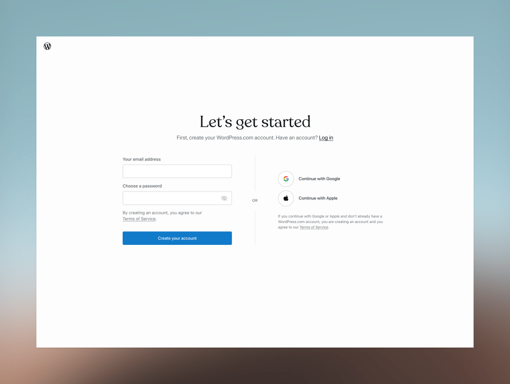
But how could this small change possibly affect the intent of a motivated user who is eager to write their first blog post, create their portfolio, or start selling online?
It would have been easy to add this iteration of this page to the pile of experiments that weren’t successful, but after analysis, my colleagues Nicholas Garofalo, Niranjan Uma Shankar, and Razvan Papadopol, uncovered an interesting fact: the shift in login placement led to more users logging into their existing account instead of signing up again by mistake. (We learned that we had been counting accidental sign-ups as conversions!)
While we saw a slight decline in signups as a result of no longer miscounting usability errors as conversions, we’ll surely see an improvement in the user’s overall experience with the product.
If we apply this type of thinking, or even the act of removal, to the work we produce every day, I’m convinced that we’ll see positive compounding effects sooner.
Cross-functional collaboration
In our new world of working in pods, we bring together experts from across the product to work towards the same goal. Cross-collaboration has created teams made up of both product and marketing experts, bringing their different points of view to the product development process. Two divergent ways of thinking about the product; two ways of shipping; and two different methods of communicating: this diversity of thought yields new strengths.
While we have by no means perfected our collaborative process, without the sum of all the minds coming together to pore over insights, analytics, theories, and outcomes, we would surely still be only halfway to our goal.
After only a few short months, I’m excited to see where this can take us.
“Nothing is ever so good that it can’t stand a little revision, and nothing is ever so impossible and broken down that a try at fixing it is out of the question.”
Rebecca Solnit, Hope in the Dark


