
Automattic contributes to a number of non-profit and open source projects, including WordPress, which powers more than 30% of websites, including WordPress.com. As part of WordPress’ five for the future program, Automattic has a number of sponsored contributors who work alongside community members to further the project. In this post, Joen shares his perspective as one of many contributors in the community.
One of the most important aspects of WordPress is the editor that lets you write and publish posts and pages. In WordPress 5.5, this editor received a substantial update and a visual refresh, the result of many months of work. Having been part of this effort, in this post I’d like to go over some of those improvements that I had the opportunity to work on alongside many others in the community.
Designing In The Open
In WordPress, posts and pages are made of “blocks”, snippets of content which, when put together, make up a rich post or page.
In late November of 2019, lead architect of the block editor project, Matías Ventura, outlined an effort to advance the block interface, to enable it to scale to future challenges. The ticket, Advancing the Block Interface, discussed how the block UI (as it appeared in WordPress 5.4 and earlier versions) had grown organically, with the need for additional features, but how the user experience had not caught up. The resulting visual complexity contributed to cognitive overload, and the overall goal of the effort was to address that complexity through visual reduction and interface simplification. Subsequent work was spread over a dozen Github issues and public Figma files, with many different contributors chiming in to move this work forward. A number of the resulting high level improvements are now part of WordPress 5.5, further to be refined in WordPress 5.6.
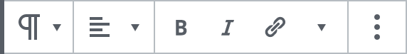
A Unified Block Toolbar
Every block you edit has a contextual block toolbar, which holds just the primary actions you can take on a block.
In the previous WordPress 5.4 UI, there were a number of challenges with how the toolbar and block UI was designed and behaved.
The toolbar had a different look depending on mobile vs. desktop, or even with blocks that span the width of the viewport.


The toolbar was attached to the top left of a block, making it possible to crop it in nested contexts:

The tap targets were small, and although the contrast was sufficient, there was a variety of grays that risked blending into the theme itself:
For all those reasons, the toolbar did not easily scale to accommodate plugins which might want to add additional buttons or features. As one of the key strengths of WordPress is its extensibility, this was important to solve.
A solution presented itself: a single unified toolbar, detached from the blocks. This enables it to offset against viewport boundaries — avoiding an unfortunate cropping situation, even when plugins add additional buttons:

The detachment in turn allowed us to increase the tap target size. Along with simplified icons and an increase in contrast, this helped the block toolbar look distinctly like editor UI with less risk of blending into the theme:

The position above and to the left of the block enables the same UI to work across mobile, desktop and any positioning of blocks:

… and on any background:

A Contextual Toolbar
The toolbar of the block editor was contextual from the start; there’s no reason to show a “Bold” button in context of an Image block, but there is in context of a caption. However the contextuality did not go that much farther than being block-specific.
One of the opportunities now present in the more scalable unified toolbar, is to revisit that contextuality, and expand it. The chief benefit is the ability to do more from the same interface, while not endlessly expanding the toolbar with more buttons. A specific context, or modal choice, lets you see necessary controls when you need them.
The recently added image tools feature is an example that leverages this: select any image, and you can rotate, zoom, and crop images, right from the block toolbar. Click the initial crop button to surface these additional controls:
The Cover block uses its container context to present alignment controls that affect any block you add inside:
As developers of custom blocks expand and explore additional features in their plugins, hopefully leveraging contextuality in the toolbar can help balance powerful features with intuitive UI. It will be exciting to see what people do with it!
Block Library
The block library, as accessed from the top left “Add block” button, has expanded to take up the full height of the screen so you can conveniently see the content and blocks available at the same time. There’s also a new new “Patterns” tab:
A block pattern is a pre-configured set of multiple blocks you insert at once. It’s a shortcut to great layouts in a few clicks. Blocks inserted from patterns are easily editable — just as if you’d inserted them one by one.
Tip: if you want to re-use a particular layout of blocks, you can turn them into a “reusable block,” blocks that stay the same across pages on your site. Select the blocks, click the More (ellipsis) button and choose “Add to reusable blocks.” In doing so, you’ll also get a brand new tab in the block library just for your saved reusable blocks.
Icons
One lesson learned from advancing the block editor was that more legible (bigger) icons were needed – and a lot of them: the proliferation of different blocks, each needing a unique icon, made it clear that access to a wider variety of icons for developers to use would be helpful.
The realization spawned an effort to create a new set of icons that could address those growing needs, and at the same time fit right into the block editor as it was.
Choosing a distinct icon to use for a block should be easy for a developer, to avoid the same icon being used to represent two different blocks. To enable this clear ease of use, a set of design principles was adopted that made the new icon set both visually simple and stylistically compatible with a range of freely available icon libraries. A baseline grid of 24×24 furthered that compatibility, as those same dimensions are used by big open sets such as Material, Streamline, and Zwicon.
A new Icon component was built to house both the core icon set, and to enable the use of your choice of icons. The component enables developers to easily insert their own custom SVG, and have it treated just like any other icon in the system:
<Icon
	className="my-icon"
	icon={
		<svg
			xmlns="http://www.w3.org/2000/svg"
			viewBox="0 0 24 24"
		>
			<circle cx="12" cy="12" r="5" />
		</svg>
	}
/>
Let’s Iterate
A massive effort went into ensuring a toolbar that scales to accommodate growth — with a simplified icon set and new patterns for contextuality. But the work is never over, and there are numerous challenges still to be faced, notably around enabling the editing of any aspect of your website directly inside the block editor. But hopefully, now, the block interface is better equipped to handle the upgrade.
As for what happens next, you could be part of that. Every change outlined in this post was discussed and worked on in the public repository on GitHub. There’s also a WordPress core Slack you can join. Outside of the asynchronous chats there, we meet every Wednesday at 14:00 UTC in #core-editor to discuss what’s next. See you there?


 Automattic Design