
Part of my job as a designer is to search for inspiration. That’s one of the many ways I get to hone my craft and that’s why I usually cringe when looking back at projects from four or five years ago: I realize my aesthetic has evolved.
I work as a Theme Designer at Automattic, where anticipating customers’ new business use cases is a prime driver, and keeping the work fresh is a value add. Thus, an initial mood board with good web design examples is vital. This is where personal taste and perspective jump in, but overall, I believe there are a few undeniable characteristics of good websites.
Typography
A key differentiator. Typography is so important because the quality of the fonts used in a website (or those available in a theme) set the website’s mood and tone. Depending on the purpose of the website, it’s good to pick one, two or even three fonts and create harmony through combinations: that will give coherence to the website.
I usually try to pick complete font families with all the necessary characters, instead of a font that has only one weight, because of the number of options it gives me (or the user). When making combinations, I keep the quirkiness in titles, and opt for more classical, readable fonts on long texts. That way, the website will be balanced and it’ll maintain readability.
Good usage of color
I’ve met designers who were color averse, and I almost fell in that trap myself, but a designer shouldn’t be scared of color, just like they shouldn’t be scared of white space. Everything plays an important part in the layout, which I’ll talk about next. Color should be used when it adds something to the website. Personality, presence, symbolism (for certain cultures) and impact. Here are two examples of good use of color:


Layout
When designing a website’s layout, I focus on balance, responsiveness and edginess. A website has to be clear, and I want to make sure the symbols are clear enough.
But one thing that distinguishes an ok layout from a great one is the unexpected usage of elements, like you can see on the example below. Many can design a layout, but it takes a little extra sauce to go beyond what’s conventional.
Graphics
Perhaps I wouldn’t have picked these sites if it wasn’t for the quality of some graphics. Photography and illustration play an important part in the tone of the website, and that usually takes us in the creative direction field.

Search Criteria
It’s also as important to know where to look. I might have found these examples on Pinterest, but it wouldn’t be so spot on. It would be the same as looking for quality sample sounds on Youtube. I usually stick to platforms like Awwwards, Thegallery.io, Site Inspire and Best Website Gallery. Mobbin’ is also a great resource more focused on mobile apps.
When I first started out as a designer, a common mistake was to focus too much on trends, ending up with many different paths, unsure which one I’d take. I have replaced that search criteria with my own personal values and taste. While trends are fleeting, good design is timeless. To narrow your inspiration search, it usually helps having other designers (or creatives from other fields) who you admire.
Personally, I don’t have so called design “heroes”. It takes more than visuals for me to admire someone’s work. Most times, I identify with their creative direction or philosophy, like with Yeezy and its founder Kanye West who introduced me to the concept of wabi sabi, or Rosa Park, founder of Cereal Magazine whose background is in marketing and fashion, or Tobias Van Schneider, designer and maker from Berlin who writes in his blog DESK Magazine.
I not only admire their work, but their philosophies and values as well. And that is of major help when looking for inspiration and influences.
Here’s a list of some great web design examples. Feel free to get inspired!
Axel Vervoordt
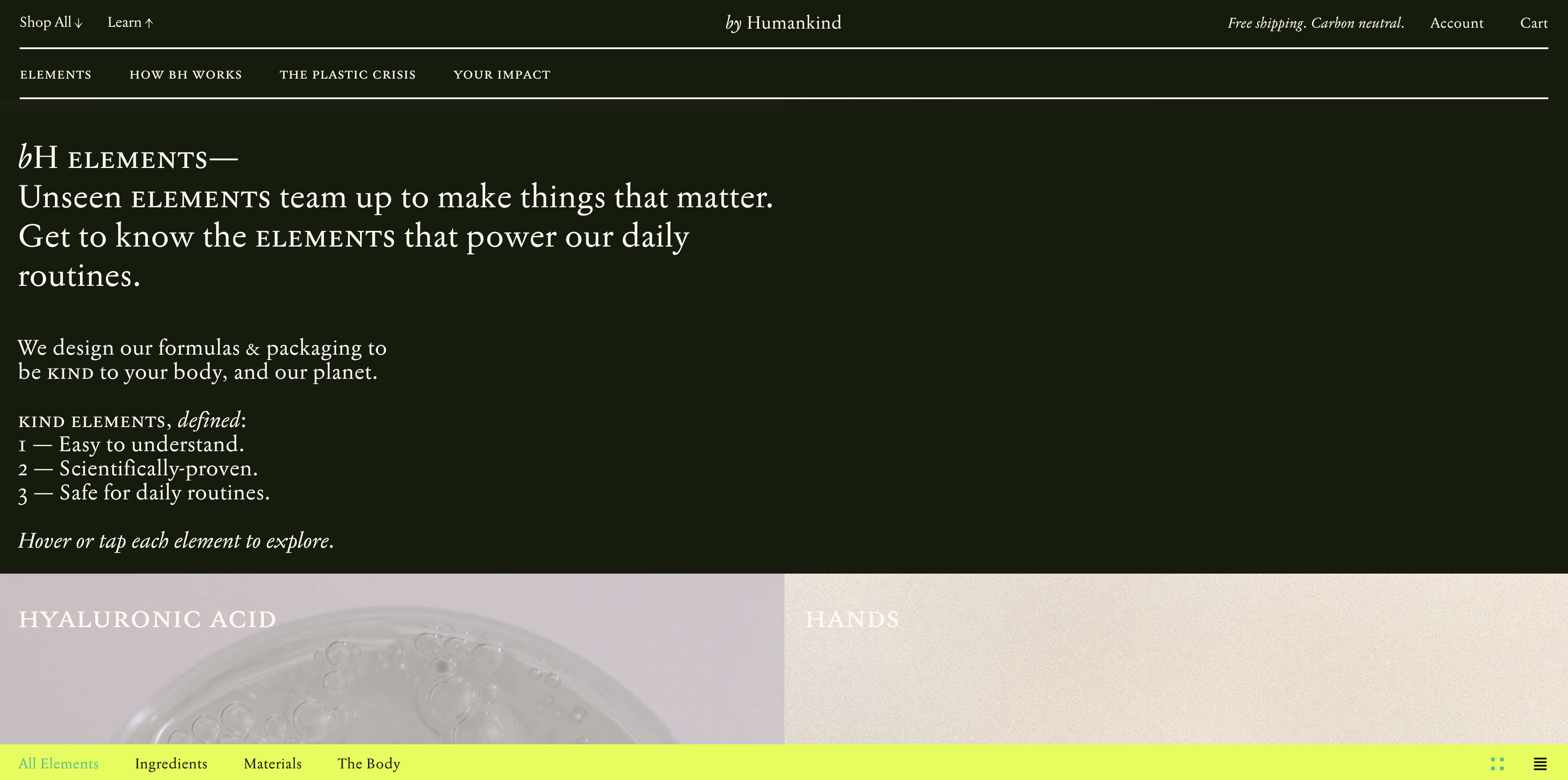
By Human Kind
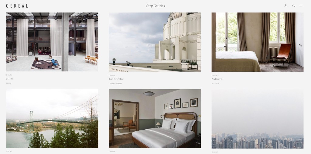
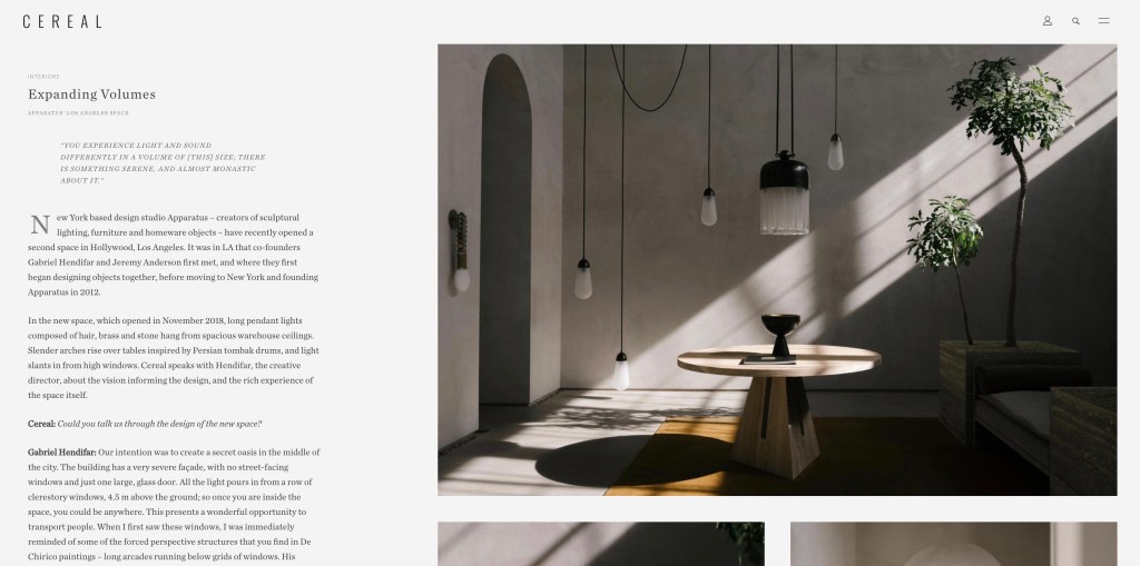
Cereal Magazine
Cream Co.
Doing Bird Magazine
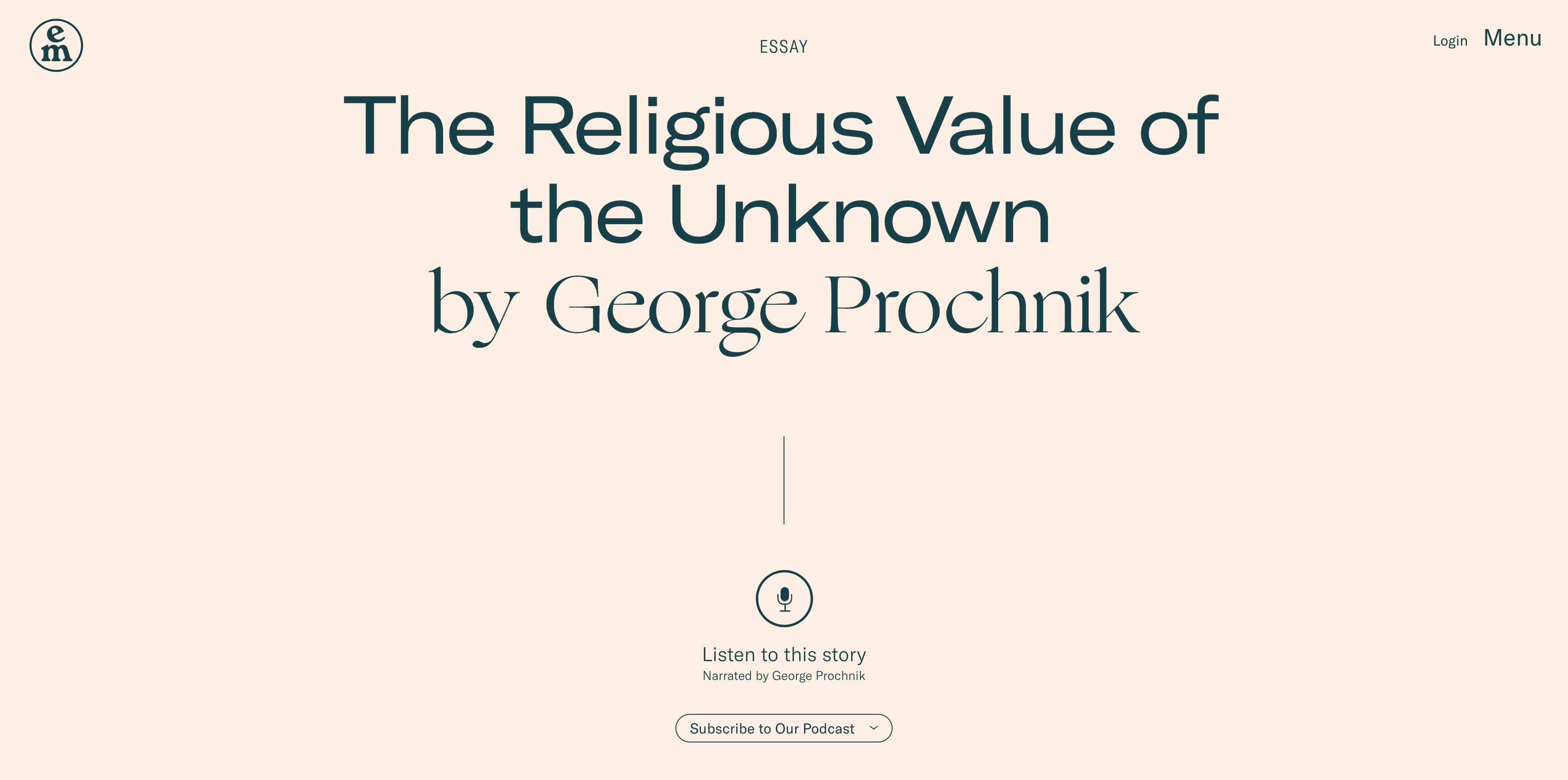
Emergence Magazine
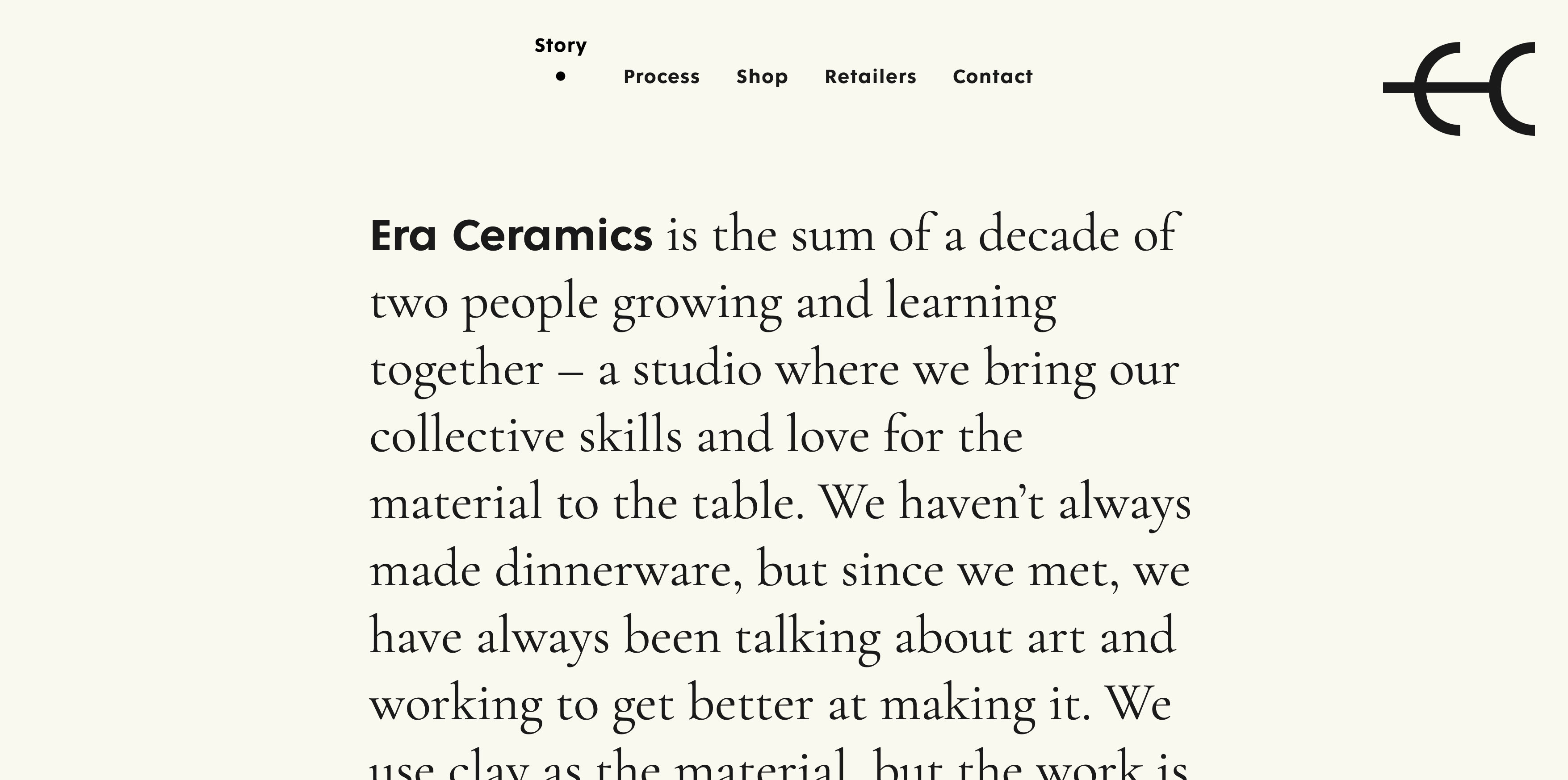
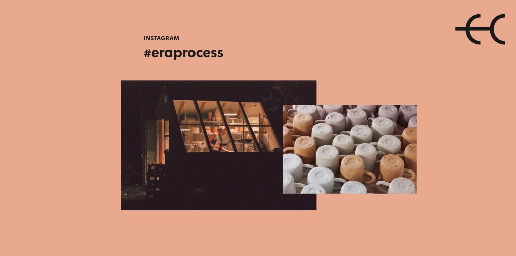
Era Ceramics
Goodbooks.io
Hey Cusp
Honext Material
JMWL Studio
Minimalissimo
Mouthwash
Only Studio
Plant 22
We Occupy


