
For the past few months we’ve been converting WooCommerce widgets in WordPress to blocks. Widgets allow you to add a small feature, such as a paragraph of text, onto your website.
I recently did a talk at WooSesh where I went over the work we’ve been doing. You can checkout the video, and also read the article I shared below.
Widget
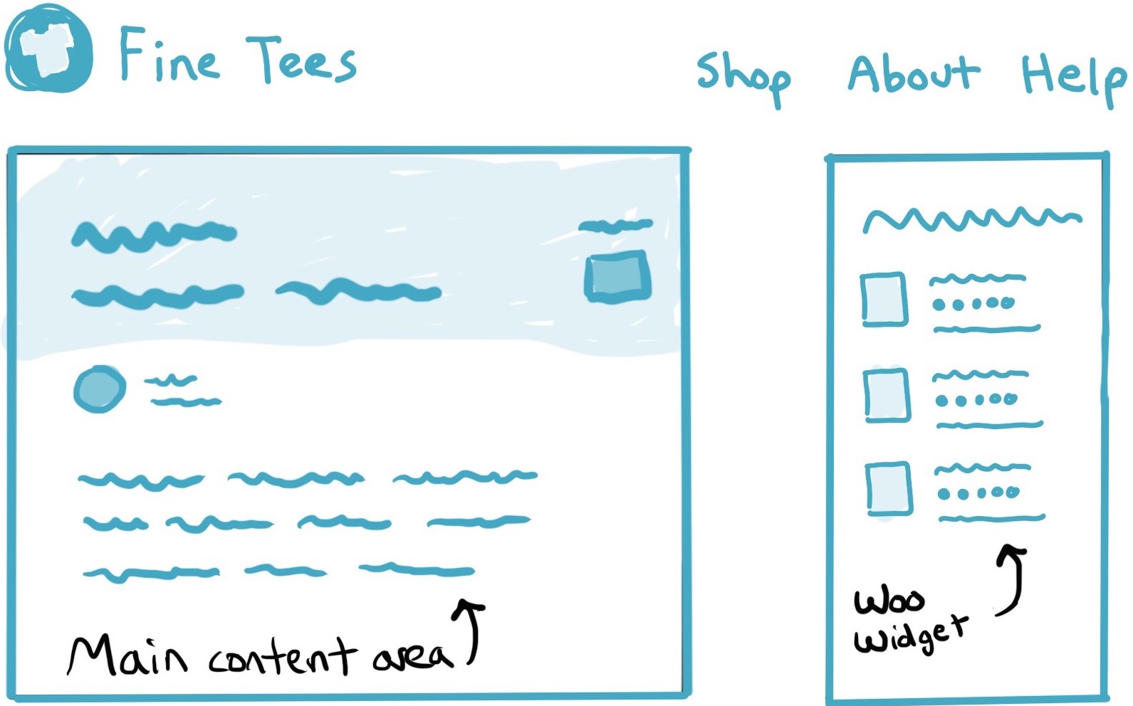
Block
On the left we have an example of where a widget can be placed on a website, in this example in a sidebar. Beside it is an example of where a block could be placed. At the moment they can only go in the content area, but the WordPress team is working on ways that they can be placed anywhere on a site.
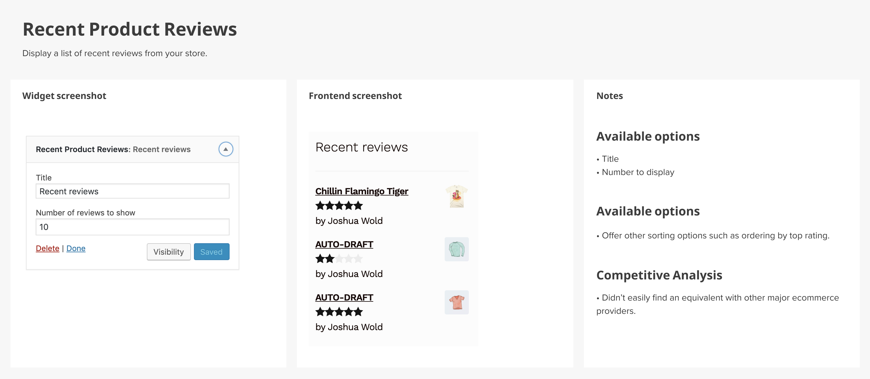
The widget
The Recent Product Reviews widget shows reviews that customers have left on a store’s products. In digging into the block I wanted to first make sure I understood what it did.
I started by taking a few screenshots and listing out what I knew to be true about the existing widget:
Collaboration and communication are essential throughout the process, both with developers for technical decisions and other designers. From there I was able to chat with the team and get some ideas about how the block could be more useful.
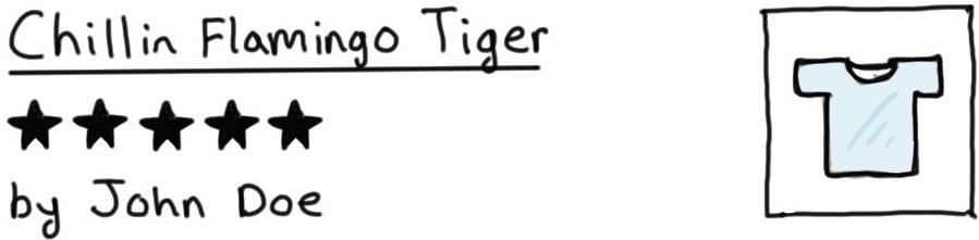
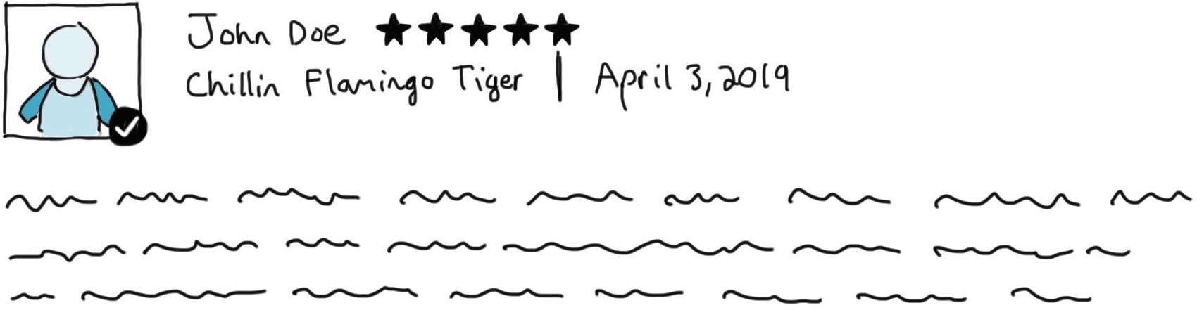
For instance, this widget only shows a summary of a review. It doesn’t have the full review content. That works just fine for a sidebar. However, we discussed whether we could design the block to be multipurpose.
On each product page there’s a full review section. What if we could create a single block to handle both use cases?
Mini review
Full review
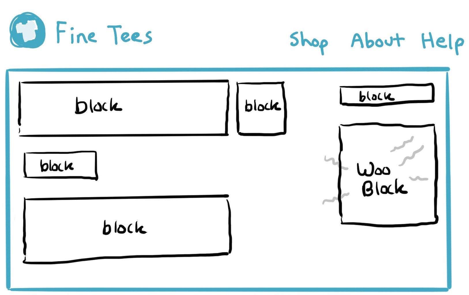
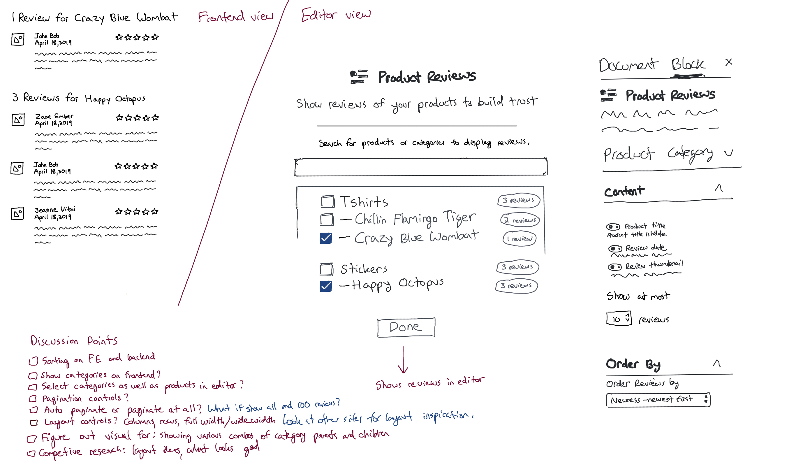
With that thought process, of thinking all that functionality could fit into a single block, I started sketching out some ideas about how that block could get made.
This sketch shows part of that thought process, of trying to figure out how someone would add a block into WordPress, and how it would be edited and shown on the frontend of their website:
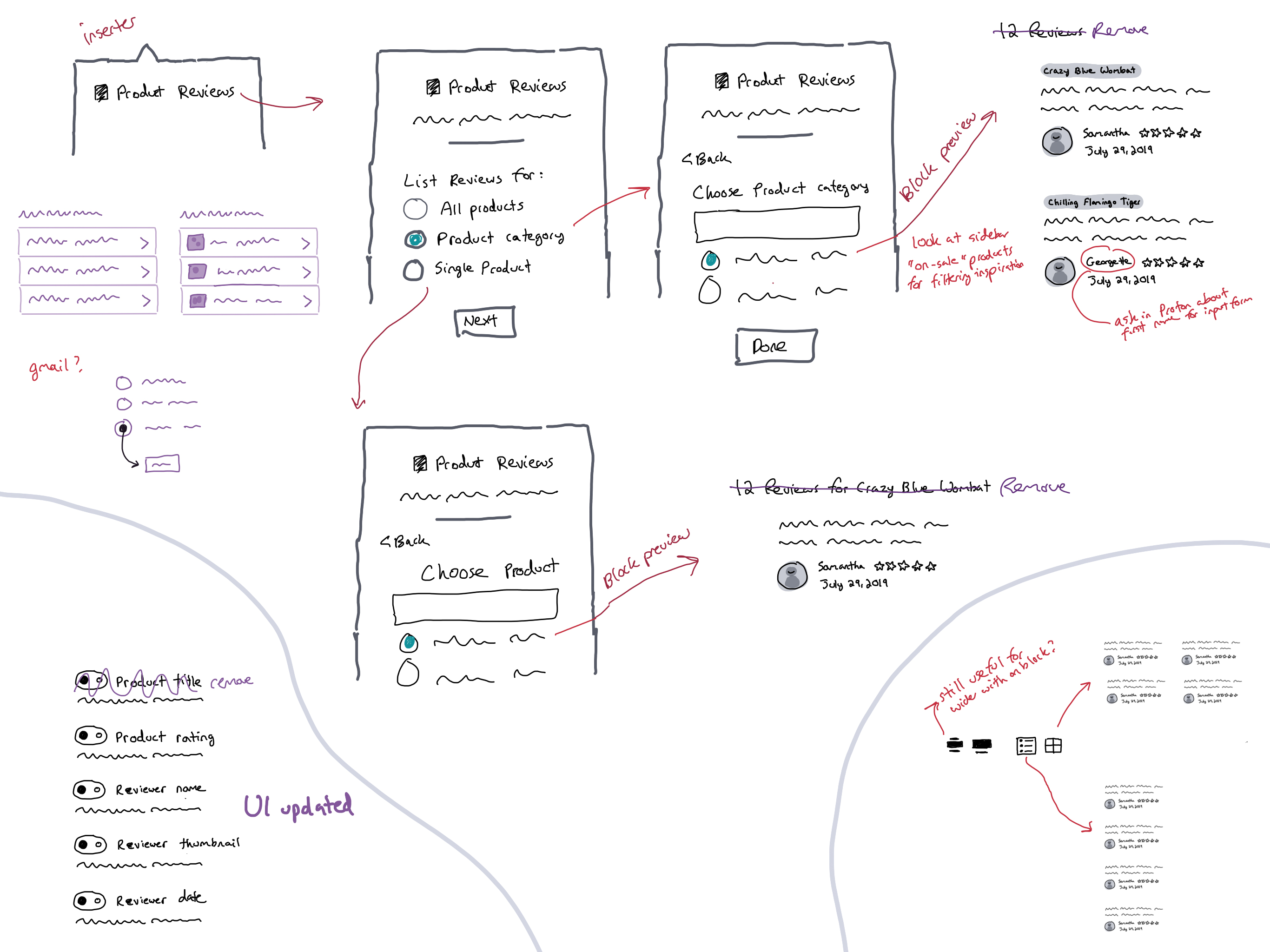
We were trying to make one block do a few things, showing all the reviews from a site, as well as reviews from a specific product.
That all-in-one approach ended up causing some technical issues with developing the block, and also seemed to increase cognitive load for users trying to get the block to work.
We decided to simplify things and make two blocks instead of one.
The making of a block
So, how did we arrive at a solution?
I started by trying to get context about what the widget did already. This meant discussions among the team, looking up a bunch of stuff, reviewing how other eCommerce do this, and more. Here’s some thoughts that came up:
- What does the widget do today, what should we try to replicate in a block? What can we add, what can we leave out?
- Product reviews have a star rating, a description, an author, and maybe some other stuff, let’s look into that
- A product can have a bunch of ratings, how would we handle that?
- Product reviews probably need to be physically close to the product, they’re usually on the same page
- The current software already has product reviews, we just want to put it in a different place now, are there any differences we should be considering?
Then I start sketching.
That’s often enough for me to get a handle on the problem, or at least know where I need to keep exploring. Sometimes I’ll just share a sketch like that with a teammate and get feedback on whether I’m missing something. Once I know where I want to go, I’ll often spend time making the sketch feel more like a wireframe, to ensure I have the smaller details flushed out.
We also explored a number of ways that the reviews can be displayed, trying to figure out if some design changes should be made on the frontend:
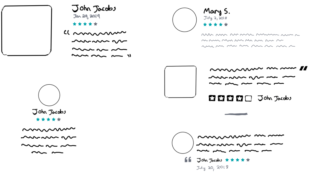
This meant also exploring how much flexibility we could offer store owners in tweaking the visual design.
There’s always a tradeoff in designing software. You can increase functionality, which usually involves increasing complexity. Or you can make tradeoffs ahead of time and test to see if they were the right ones with your users. For example, what level of design flexibility we could offer in the admin:
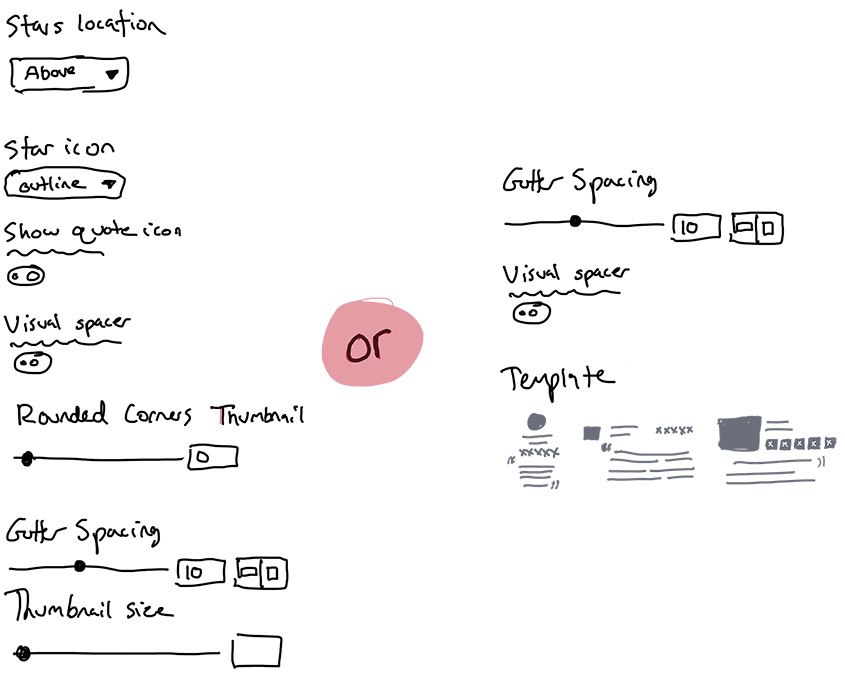
Ultimately we simplified this part of the block design, deciding to backlog this feature and try and ship a simpler block with a single design.
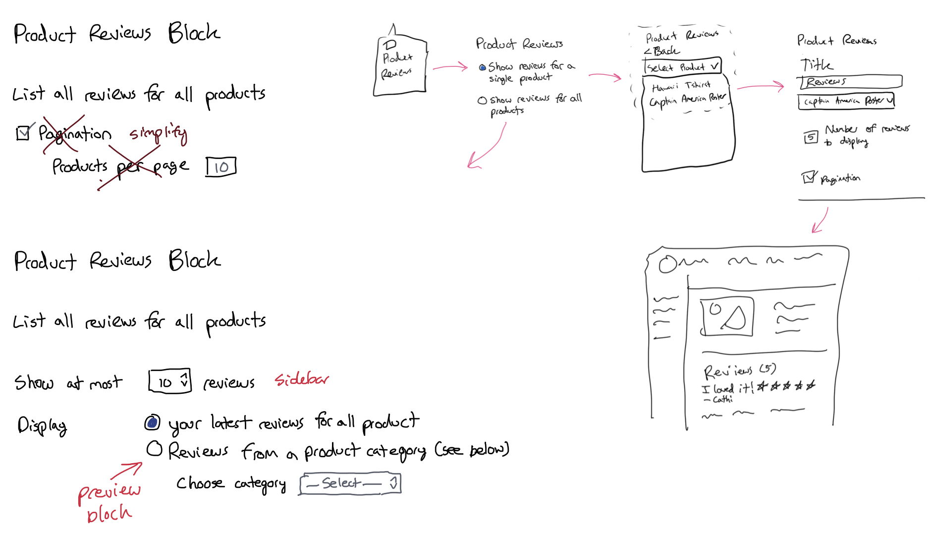
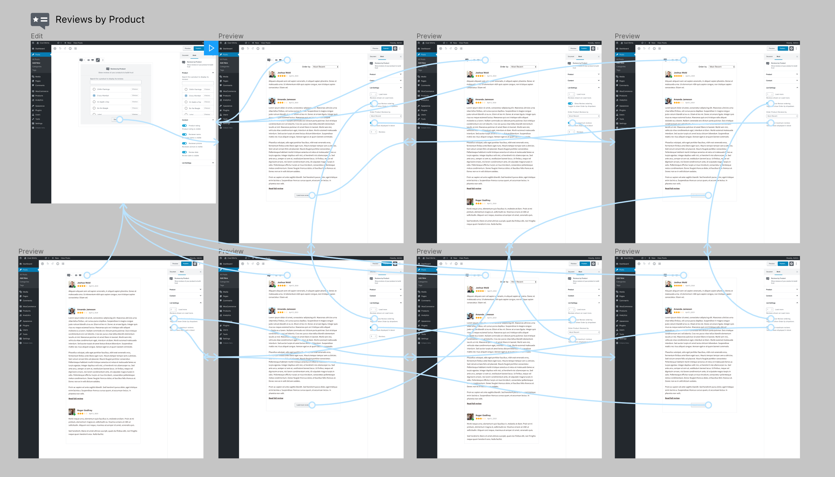
After all of that, I landed with two blocks. One allows users to see all reviews by a single product. The other allows users to see all reviews from a single category of products, or from all categories of products at once.
The first block is Reviews by Product:

And the second block is Reviews by Category:

Latest iteration
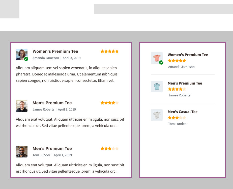
The designs above ended up being a bit limiting in a few ways, and at this point we also realized what I shared in the beginning of the article, that the Recent Product Reviews widget offered a way to only see a summary of the review, these blocks didn’t account for that.
Remember how messy I mentioned it getting? Well this called for some changes to the design, along with an attempt to make the Reviews by Category block cover one extra use case, that of the original widget we were attempting to replace.
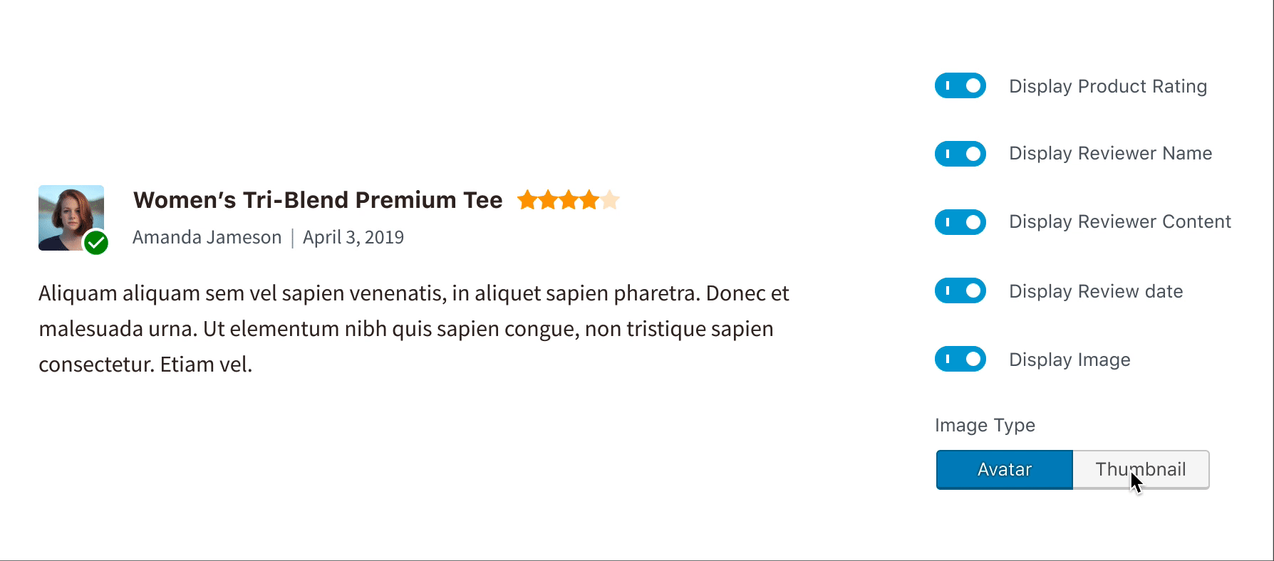
Here’s a quick GIF, capturing the setting changes in Gutenberg that allow you to convert from the full review to the mini version of the review:
So far we think this will work, but until we can take this into development, and test out the idea further, we may have to still make some changes.
The latest decisions need to make are:
- What’s the best way to control how many reviews are shown on the page. How can we make the controls as simple as possible to allow store owners control over that? We’ve tried a few ideas already, but haven’t completely landed on the best solution yet.
- The use case of allowing someone to see all reviews from all product categories is hidden. It’s not obvious where you can do that. How could we make that simpler?
- Converting the review image from a thumbnail of the product to a thumbnail of the reviewer’s avatar is a bit confusing. Is this the best way to handle that?
Along with this block we also have over a dozen other blocks that are in development, in design, or already developed with planned enhancements. You can play with the plugin yourself if you’re interested and follow the work our team is doing.
Before and After


Comments
Thanks for sharing your design process! Exciting work.