Like many other companies with expansive digital products, Automattic (makers of WordPress.com) has recently dedicated a significant amount of energy into creating a design language system that we call Muriel. This new design system is ambitious and could reach a wide range of products, potentially transforming our process at Automattic. With only a small team, it’s been overwhelming to say the least.
Around the same time, our marketing team was developing a new visual language and a campaign for WordPress.com. New creative guidelines, photography, typography, color, and more. Thankfully, the heavy lifting around choosing brand colors was done for us — our main objective was to update the product. Integrating the new color changes was a great opportunity to work on our color system and get our feet wet as a design system team.

Why was it important to update the colors?
Simply updating the product with the new brand colors was obvious, but there were other benefits. We recognized that our product experience was jarringly different than the new marketing materials. Color helped to align them. As a design system team, we also saw the opportunity to change the way we applied color and make it more meaningful.
Goals
Before we got started, we made a list of goals with three guiding principles in mind: color should focus attention, color should be accessible, and color should communicate.
- Make accessibility easy and achieve WCAG Level AA text contrast everywhere.
- A consistent experience as the customer flows through a landing page, account creation, and the product.
- A color system that could be applied to all of our products.
- Limiting the use of arbitrary color decisions and instead apply color purposefully.
- Add a new feature so that customers can change their dashboard theme, including a dark mode.
Opportunities
Our current color system was already in good shape with a lot of the basics in place. Our colors used variables, making maintenance easy. We had a standard color palette with some basic accessibility information. We even had a consistent color palette across web and our native mobile apps!

Mobile web 
Android 
iOS
But we still had room for improvement.
- Most of our colors didn’t meet the AA level text contrast standard, forcing designers and developers to manually alter them.
- We had very little guidance on when, where, and how to use color.
- Alert colors for success, warning, and errors were used outside their intended purpose.
- We didn’t use a secondary color, so it was hard to focus attention.
- People created their own one-off shades, using transparency and Sass functions (
lighten,darken, etc.). - Colors were named by hue (e.g.
blue-wordpressandgray-light), so it was hard to reference colors semantically.
Design process
Research
After defining our goals and opportunities, we researched other design systems to get a sense of what we could achieve. Our main source of inspiration came from Material, especially their concept of a primary and secondary color. The primary color is used most frequently within the app, and the secondary color is used sparingly for accents to draw attention.

We also discovered that almost every design system has color basics in place, but lacks deeper reasoning that answers the “why?”. We aimed to do better.
Writing documentation
Next, we took inventory of our colors, how they were used, and what documentation we had. Our first reaction was to prioritize documentation updates — putting guidelines into place first seems to make sense right? After all, how can you update the colors in the product if you don’t know what the standards are? But guidelines defined in a vacuum will always have problems. We learned this lesson quickly.
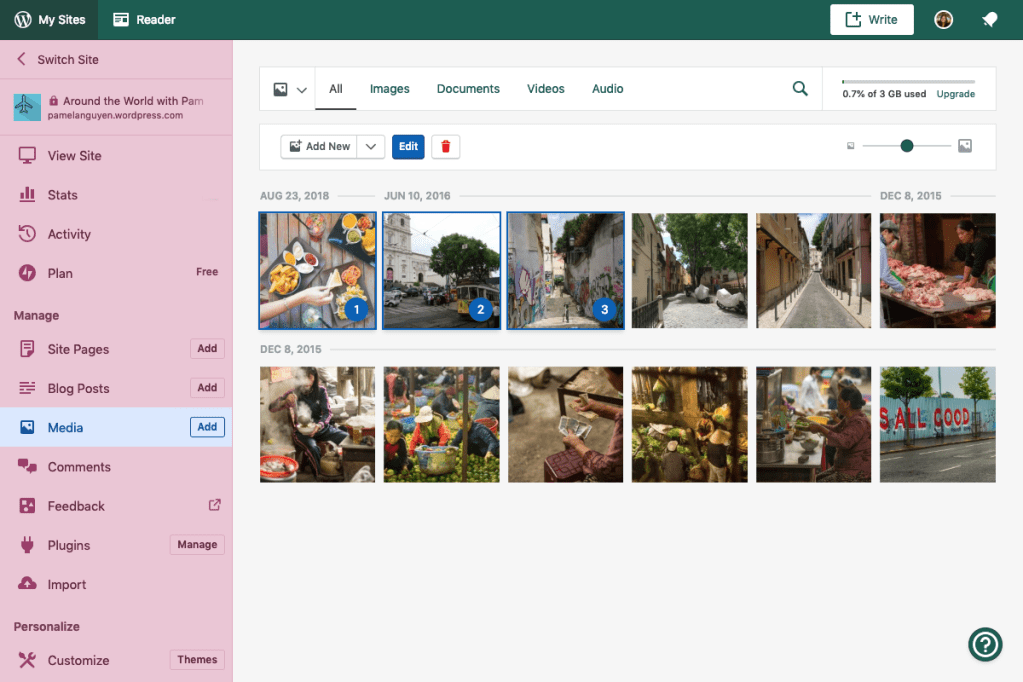
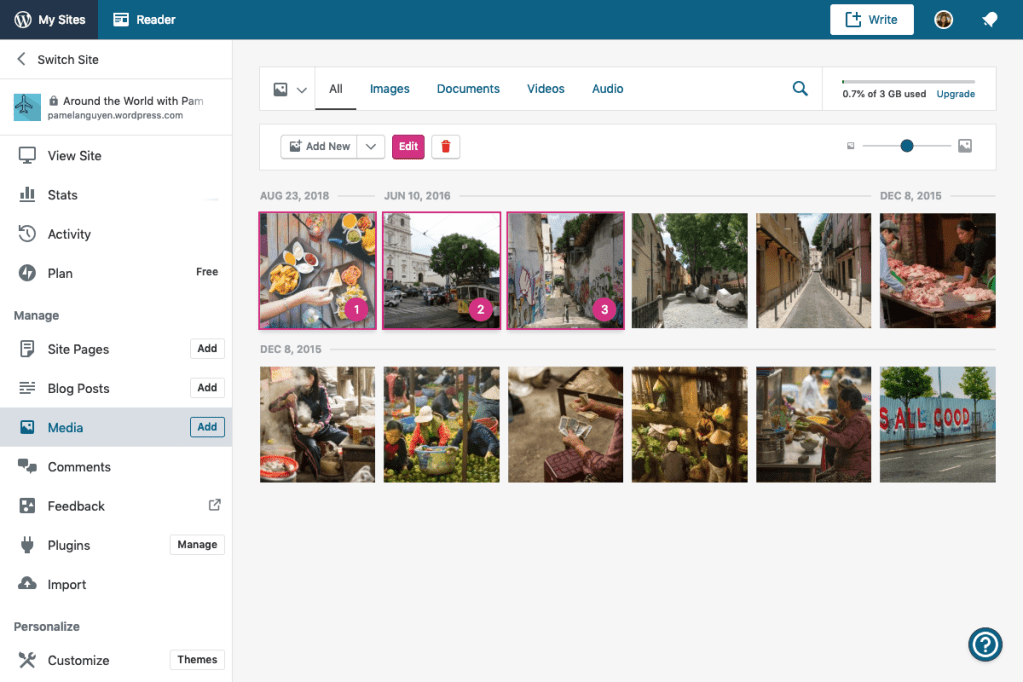
One particular challenge was determining the color of our selection controls (checkbox, radio, switch, input, etc.). Should they use the primary (blue) or secondary (pink) color? Should certain controls use different colors?
Selection controls with primary color 
Selection controls with secondary color
If we followed Material exactly, then all selection controls would use the secondary color. After some exploration, we realized that using the secondary color for the selection controls would dilute its impact. For our product, the secondary color is reserved for focusing the customer’s attention on the most important information. In the examples above, the save button is the most important action.
This challenge is one of many we bumped into. We iterated on the guidelines real time and then worked to immediately codify the updates. Rather than making guidelines that get tested, broken, and then re-written, why not define the guidelines as you’re iterating on the system? By testing and implementing as soon as possible, we uncovered more questions and made the guidelines stronger.
Implementation
Color Studio, our new palette generator
Our amazing marketing designers created Color Studio, a color tool that can generate a range of shades for any color. By using this tool, they were able to create a standard color palette with the same number of shades for each color. With a single source of truth, our products can visually connect and use the same color system.

One of my favorite features is how easy it is to check text contrast. If white or black in combination with the color achieves level AA, it’ll show “AA” next to “W” or “B” respectively. It’ll even show the contrast ratio if it doesn’t pass.
Equivalent shades across all hues
Ideally, all hues have the same range of lightness to darkness. This means that all hues with the same brightness level (0 – 900) will have the same contrast ratio against white or black. In other words, if you opened Photoshop and converted the color palette to grayscale, then every hue would look the same. This makes accessibility easy — if you choose any hue between 500 – 900 then you can assume that it passes level AA on a white background. You don’t even have to look at the color to see if it meets contrast standards.
The caveat is that not all of our selected hues follow this pattern. Oranges and yellows are problematic because they are naturally bright, and darkening them to pass level AA would either make them muddy or shift their hue. The Mineral UI design system solved this by using a “bronze” color instead of yellow or orange. In Lyft’s color system, every color between 60 – 100 is accessible on white, but the brightness levels aren’t exactly the same. How your color system approaches this problem should meet the specific needs of your team and product.
Having equivalent shades is great because it helps our goal of making color accessible, but it also makes color theming much easier. For example, if you want the primary color of a theme to use green instead of blue then you can rest easy knowing that all text will still pass the same level of contrast. I’ll expand on this a bit later.
CSS custom properties
There are many advantages to using CSS custom properties (aka CSS variables) over preprocessor variables like SCSS, which is what we were using before. Even small quality of life improvements like this make them more enjoyable to work with:

Dev tools will autocomplete all of the variables you’ve defined. No more copy/pasting hex codes! This is a nice bonus, but the main advantage for our product is that CSS variables are dynamic and can be changed at runtime in the browser. This opens the door for custom dashboard themes and provides value to the customer.
Disadvantages
A big disadvantage to CSS variables is that all of those Sass color functions you know and love can’t be used. This was a hard pill to swallow, but we realized that we didn’t need most of them if you have a full range of shades available. Previously we used lighten, darken, and transparentize to create different shades of a color, but this led to a lot of one-off variations:
lighten( $gray-dark, 1%) // ಠ_ಠ
By providing enough shades in your color system, the designer or developer won’t need to create new colors.
In some cases you need transparency though, like shadows and overlays. To add transparency to a color, we created a -rgb suffix on all our variables to work with the rgba() CSS color function:
.my-selector { border-color: rgba( var( --color-primary-rgb ), 0.5 );}
By using this variable with rgba() you can apply transparency to a color. Here’s how we convert the color to use rgb:
@function hex-to-rgb( $color ) {
  @return round( red( $color ) ), round( green( $color ) ), round( blue( $color ) );
} // Returns the individual RGB values of a given hexadecimal color value

:root {
  --color-primary: #{ $blue }; // The normal hex version
  --color-primary-rgb: #{ hex-to-rgb( $blue ) }; // Converted to a rgb triple
}
So, for now we don’t use Sass color functions with our variables, but we’re hopeful that a better solution comes along.
Naming is hard
We knew early on that our colors should be named semantically to align with one of our core principles — color should communicate. Naming colors by function clearly identifies what the color should communicate to the customer. For example, we chose “Secondary Color” instead of “Jazzy Orange” and “Error Color” instead of “Alert Red”. “Alert Red” is particularly problematic because it assumes that it can only be used for alerts and it can only be red.
If you take a look at our color palette in Color Studio, you’ll notice that each color is named by its hue (e.g. Blue, Hot Pink, and Green). Other projects use these colors so it makes sense to name them this way. The teams working on advertising and landing pages probably wouldn’t benefit from semantic names. But once we import the colors into the WordPress.com application, they are assigned to semantic variables.
In order to accommodate a large number of light and dark variations for each hue, we had to use a scalable naming system. Several years ago we tried to give a unique name to each shade (Gray Light, Gray Lighter, Gray Lightest, etc.), but this got out of hand quickly (Gray Ultra Light?, Gray Lighterer?). Instead, we settled on naming them based on how much darker or lighter the color was. For example, the light grays were named Gray Lighten 10, Gray Lighten 20, and so on because they were 10% and 20% lighter than our base gray. For our new color system, we simplified the naming so that each hue has 11 shades, on a scale from 0 to 900. 500 is the base color from which the light and dark shades are generated.

What does our naming strategy look like in practice?
We have a base set of common variables:
| CSS variable | Description |
--color-primary | Primary color |
--color-accent | Accent (aka secondary) color used to focus attention |
--color-neutral | Gray color |
--color-success | Success status color |
--color-warning | Warning status color |
--color-error | Error status color |
The colors above can be suffixed with -light or -dark to quickly get a variation of the color. They are helper aliases to make picking shades easier (e.g. –color-primary-light or –color-primary-dark). These suffixes correspond to the 300 and 700 value of that color. For example, Blue 300 is equal to –color-primary-light, and Blue 700 is equal to –color-primary-dark.
The variables listed above can also be suffixed with the corresponding value number as shown on Color Studio. If you need a specific shade that is not covered by the light or dark helper aliases, then you can append the specific value number to the end of the variable. For example, you can use –color-accent-100 or –color-neutral-900 to get a specific shade.
We also have an extended set of variables:
| CSS variable | Description |
--color-text | Default text color |
--color-text-subtle | Less prominent text color (minimum value that still meets level AA standards) |
--color-border | Border for interactive UI elements |
--color-border-subtle | Less prominent border for cards and layout |
--color-link | Hyperlink color |
--color-surface | Backgrounds |
These can be thought of as “second-tier” variables and are more tied to specific elements. They minimize the chance of someone using an inconsistent color and make maintenance much easier.
Dashboard theme challenges
I won’t get into the details since there are other theming articles that go deeper into the subject. Honestly, it’s not easy to add theming to an app, and I suggest you take the time to evaluate if you really need theming in your product. It’s probably easier if your theme has a limited scope, where only a single color propagates the UI. In our case, we wanted themes that changed the primary, secondary, navigation drawer, and top app bar colors. We also wanted to do a total inversion of our colors for a dark theme.
The bulk of the work was done upfront by thinking about how color should be applied and implementing those colors using CSS variables. It was a lot of effort, but by converting every color to use CSS variables we made maintenance easier and scalable. It wasn’t a simple find and replace though. We had to remove any color variations augmented with rgba, transparentize, lighten, darken, mix, etc. Each one of those replacements was done manually because there wasn’t an exact 1:1 equivalent color in the new color palette.

Most of the theming can be done easily if you just need to swap out the primary and secondary colors, but you’ll notice in the image above that the navigation drawer drastically changes. The neutral colors (white, black, gray) may be colored differently, depending on the theme. We had to add additional variables for anything that could change color, specifically for the navigation drawer and top app bar (e.g. --sidebar-background, --sidebar-text-color, etc.).
This doesn’t apply to the main content area because the neutral colors are always the same across themes. In dark mode every neutral color is flipped, so how do you make a dark theme?
How to make a dark mode
Dark mode was a goal from the start, so it was a consideration throughout the whole project. We’ve hit a few roadblocks, and we’re still trying to figure out if it’s possible with our product. If your product has a small scope, or if the codebase is contained, then you’ll have an easier time. Here are some challenges and techniques we discovered while working on it.
Invert (almost) everything
You can tell that some products with a dark mode option don’t invert every color. Button text may remain white or an element may have its color removed. The more exceptions you have, the harder it will be to maintain. To keep maintenance at a minimum, you should invert as many colors as possible.
Pete Woodhouse describes three steps for inverting your color palette:
- Split each hue range in half. Swap the equivalent color from the opposite half of the hue range.
- Make sure you have enough shades for each hue. Once you pick your primary, secondary, and status colors, add shades and tints for each one (easy to do with Color Studio ).
- Make accessibility easier by giving both themes the same amount of contrast. If the default theme achieves level AA, so will the dark theme.

By having an even number of shades for each hue, you can split the range in half and swap colors from the opposite side.

Using this method, you can make a simple dark theme. If you have equivalent shades across all of your hues, you don’t have to worry about text contrast as long as your default theme is accessible.
Here’s an example of what could happen if you don’t have equivalent shades:

Our yellow is much lighter than the rest of our hues, so inverting doesn’t work. This doesn’t mean we can’t use yellow, but it means we have to be careful how we use it.
Inverting exceptions
We discovered that inverting every color doesn’t quite work if you have elevation or shadow applied in the UI. A dialog, for example, needs to retain it’s dark drop shadow in dark mode so that it appears on top of the view underneath. We haven’t come up with a good way to make note of these exceptions in a maintainable way yet.

What we’re still working on
So far, we’ve only applied this new color system to WordPress.com, so we don’t know how it’ll work with our other products and brands. Our native mobile apps will be updated next with the new colors, and we’ve already found ways to make the documentation better. We expect that our guidelines will be revised as more and more teams use the system.
How has your product approached color? Please let me know in the comments or on Twitter!


