
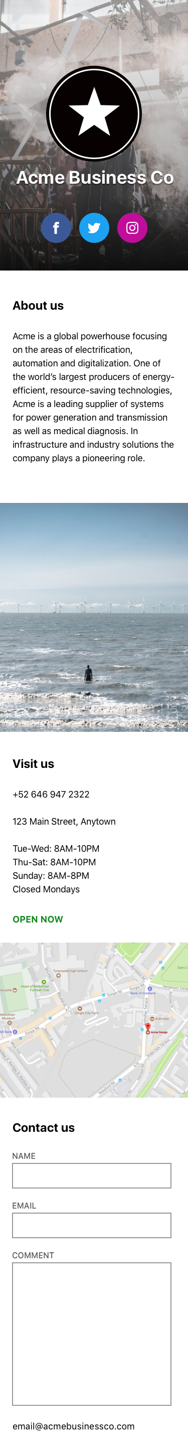
I went a bit off-script for my empathy challenge. I’ve been spending a lot of time thinking about how to build small businesses sites using WordPress, so I tried to replicate a pattern I see a lot—one that’s often rather hard to achieve using vanilla WordPress as it currently exists. Something along these lines:


I also tried to do it from my phone whilst on my extremely late train, because I like to stress-test things. Before I even got out of the gate, various forms of screen recording techniques were crashing on me, so it seems like stress test was, indeed, the best choice of words here. You can see in the video that I finally managed to make that this is my ninth attempt at recording myself.
There were definitely some things that threw me, and there were some things I was surprised to see missing, but after fifteen minutes, I was able to more or less replicate the pattern I was looking for. 🎉 That’s really encouraging, and promising for the future of WordPress. That said, I struggled a bit to get there.
What made me 😖:
I’ll be honest, though, the experience felt like it wasn’t quite ready yet. A lot of things floated off-screen or overlapped one another, the focus jumped all over the place, and I really struggled to access some parts of the UI.
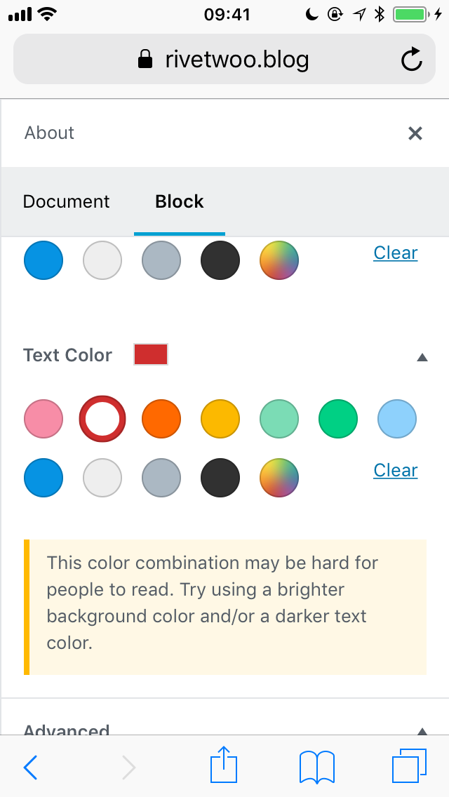
I struggled with text formatting basics, like bolding or italicising text, because the iPhone’s text select menu would overlap Gutenberg’s contextual text formatting menu. Adding a link to a list item was super painful. Changing the colour of a button text to white required fancy finger-work, followed by eventually just giving up on the colour picker and typing in #fff.
Overall, Gutenberg feels as though it’s been designed for larger screens first, then compressed into a smaller space. On an admittedly small screen like mine, that can make elements appear in a whole lot of unexpected places, and the resulting experience is disjointed.
What made me 😻:
I saw this pop up and nearly gasped in delight. This is such a lovely touch, and it bodes so well for the future of content editing on WordPress.
Can we build a new editor that gives our users more flexibility and power to build the sort of sites they’re trying to build, whilst still considering the needs of the users who visit those sites? What if we can provide contextual help and feedback on users’ design decisions, and help them build better websites?
That’s the sort of future I’d like to see for the web—one that affords a better experience for everyone. ❤️


Comments
Thanks for taking the time to do this challenge and also the interesting format. You’ll be pleased to know you can follow mobile label here: https://github.com/WordPress/gutenberg/issues?q=is%3Aopen+is%3Aissue+label%3A%22%5BComponent%5D+Mobile%22 – lots being worked through.