
Having spent a good chunk of the past couple months working on envisioning what Gutenberg might look like in the context or our native mobile apps, I found the newest design team Empathy Challenge an interesting one that got me thinking differently.
Up until now, I’ve been mostly focused on the starts and ends of a post in Gutenberg – the starting of a new post or writing of new content, and a completed post. This exercise had us do something in between – we were challenged with taking an existing post and re-creating it inside of Gutenberg.
Naturally, I used a mobile device – my iPad for most of the exercise. I’ve been using the desktop web Gutenberg for quite some time, but the iPad (mobile web) was even more challenging to work with, even though I have the advantage of already knowing the UI and how most things work.
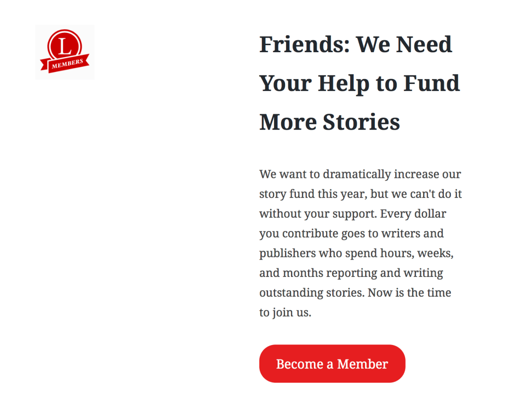
Longreads Post vs. My Attempt
I should preface by saying I’m using a super barebones (but wonderful) theme that is geared specifically towards writing with Gutenberg. I’m betting that if I were using the theme that Longreads uses, the results would be much closer to what I was attempting to replicate.
With that said, here is the results of my quick first pass at replicating this post. I didn’t attempt every bit of content (for example, I tried to replicate the first few inline images, but then gave up by the time I got to the footer.


The main things that I struggled to reproduce:
- Inline images
- Full-width buttons
- Column widths (experimental columns block is experimental 😎)
- List styling
Things that worked automagically:
- Copy/pasting worked pretty well out of the box
- Baseline styles are solid – got me about 80% of the way there
- Writing flow
Inline Images
The biggest thing that I found to be difficult was inline images. At the moment, it’s really tricky (nearly impossible) to add an image inline with some text – a common pattern.
The gravatar/author block was a bit of a challenge. When attempting to replicate any type of inline image, I couldn’t wrangle them into the same block. This was my first attempt:

Versus what I was attempting to visualize:

I ended up settling on just leaving out the gravatar. This wouldn’t really be an issue if the theme were putting this on the page dynamically.
An experimental block type – Columns – made this type of thing sort of possible, but not in the way I’d like it to. For example, while I was technically able to create a two-column layout for this email signup CTA, you’re limited to two half-width columns, so it ends up looking like this (my attempt vs. desired layout…close but not quite):
Copy & Paste
Copy & paste at the moment is pretty smooth, particularly for text and block-level images. For whatever reason, instead of copying/pasting the entire doc, I started w/ the title, image, and then the post body, trailing elements, and so on. This worked pretty well for the most part other than a couple issues specific to the theme – for example, I couldn’t easily highlight the text of the title. Body text was super easy and translated to blocks accurately.
Buttons
One thing I thought would be handy was full-width buttons. I wasn’t able to do this (unless the theme I just happened to know a css class that my theme provided – which I didn’t).

Visual Inconsistencies
There were also a couple minor sizing/spacing issues, especially in the situation of columns (again, an experimental block type) and mixing content like headings/paragraphs/buttons. These looked better inside the editor vs. on-site, so could be that the theme wasn’t ready for this.
Closing Thoughts
My biggest takeaway from the exercise is that there has been massive amounts of progress made in the past 6-12 months – it’s unreal, really – but there are still some rough edges to be smoothed over (I’m sure this is not news to the team working on it in core). Also, a lot of this depends on how the theme displays the content. Some of the issues were clearly because the theme wasn’t expecting a certain type of content or layout.
With that said, it’s important to keep in mind, most users of Gutenberg will be comparing against the Classic Editor, not our idea of perfection. If you were to try to replicate this with the classic editor (or on mobile…. :homer-disappear: ), I doubt the experience would be any better – probably worse.
Cheers to the team that’s been working hard on Gutenberg, getting WordPress ready for the future! <3


 Automattic Design
Comments
Thanks for doing this challenge, just to let you know, responsive columns came up a few times and the issue to follow on this is here: https://github.com/WordPress/gutenberg/issues/6048.