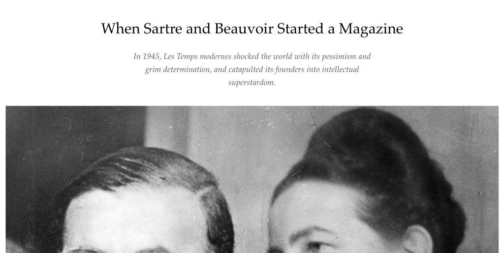
I’ve played with Gutenberg but I haven’t actually used it to do something complex, yet. So I set off to re-create this story used in Longreads to see how far I could get.

My overall read of the 30-minute fast sprint experience was:
- Creating spatial relationships is how I see the world — so I kept looking for how to do that. The vertical dimension is covered fully in how Gutenberg behaves as a series of blocks, but the horizontal dimension is not as obvious.
- Image handling is something that blocks set high expectations for — and there’s a rigid boundary between text and images. At times when I think I can copy and paste an image, it doesn’t behave the way that I expect.
- The many controls that pop up and hide are one thing — I noted that some of the controls changed (i.e. they use recency). By being adaptive, it’s good in that you can work faster; but it also makes it harder to learn when you don’t know what to expect.
- Creating a table or columns and moving between cells and frames is still nascent — the way that you expect to move between items (like with tabs) nets out to unfamiliar patterns. One could argue that the patterns I know are simply wrong, or I need to learn new ones.
A few immediate suggestions:
- Reconsider how default in-place text is used or 1/ lighten it more, or 2/ make it clear it’s a form you’re filling out (i.e. make the default text like a tax form where it’s smaller and floating to the top). My inclination was always to select the well-pronounced default text and try to remove it. The light gray placeholder veil that goes over an image block might be a good way to always start so you know that the block is still untouched.
- Reconsider how many type of visual controls are being used. My ability to read all of the controls often failed (like H / H2 / H3 — where’s H1?), the idea of “transforming” blocks is cool but I don’t know what it gives me, and the naming of blocks as being read out in the upper left corner makes me think there are buttons everywhere I need to press. Some controls are square, some are round, some are on the side, some are on the top — there’s a great deal of variety at play. As your mouse moves around and drags or hovers, buttons appear and disappear; and new blocks are easily made by accident. Also on a minor note, the “Subheading” block didn’t make sense to me.
- Being able to place images and text in relation to each other is desirable. Gutenberg gives you the impression that it’s easy, or at least possible, to place elements in relation to each other in a predictable way. But it isn’t clear what element/block will give you that kind of control. Perhaps borrowing ideas directly from Flexbox and Grid might be a way to teach a different kind of spatial relationships (beyond “float”) that leverage the underlying browser technology, too.
It’s a work in progress, and it’s definitely a needed experience to enter the WP universe right now. There’s lots of raw materials and great stuff in it with loads of potential. I’ve been inspired to get way more involved in Gutenberg from this experience. —JM


Comments
Just closing the loop a little here with information, Flexbox and grid is being experimented on already. One link to follow to see this explored is: https://github.com/WordPress/gutenberg/pull/4314, it’s exciting where this can take us.
With regards to reconsidering the default in-place text to be lighter is already part of this issue: https://github.com/WordPress/gutenberg/issues/5591.