
Like my fellow designers at Automattic, this quarter I spent some time trying to recreate a Longreads story using Gutenberg, the new block-based editor for WordPress.
I’ve already had some experience with Gutenberg, but primarily on the theming end of things. I haven’t used it to set up “real” content yet — all the Gutenberg posts I’ve written so far have been test posts that don’t need to look a particular way. Trying to get a post to look a specific way was new to me.
I picked the Longreads story, “We Should Be Talking About the Effect of Climate Change on Cities”, an excerpt from the book Extreme Cities: The Peril and Promise of Urban Life in the Age of Climate Change, by Ashley Dawson. It took me 18 minutes to set up the post, and I didn’t nail everything. Here’s a video, sped up, to show how things went:
Overall, the bulk of the article was easy to recreate. Copy-pasting into Gutenberg was super-satisfying, and I found adding the wide-width images a breeze.
Recreating some of the details in the page layout were harder. While you can change the styles on some blocks, like the Paragraph blocks (font size, alignment, colour, and background), you can’t change them for all. That meant I couldn’t make the Quote blocks larger, or centre-align the Subhead or Post Title. At this stage of Gutenberg, it’s hard to know what the editor will let you control, and what it defer to the theme on. It makes sense in that you wouldn’t want to manually style every quote — why not set up a universal style in the theme? — but the ability to change only some text elements made me feel like I should be able to change them all.
The bit I struggled with the most was the “This story was funded by…” part right near the top of the article.

Copy-pasting this text straight over carried over the markup, which in turn adding some unexpected styles. I couldn’t find a way to paste without that markup:
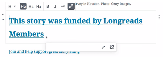
When I clicked the link to try to select it, it actually followed the link rather than highlighting the block (you can see my frantic back-button hit in the video).
In the end, I managed to add a grey background (looking at the screenshots now, I clearly didn’t think to check the actual hex value, though!). There wasn’t an option to add borders, and I tried a few times before realizing I couldn’t override the colour of the link. It’s also not possible to change the colour of only part of a block — trying to make the link red resulted in the regular text all turning red:

I finally got the logo left-aligned by floating it, but compared to the original post, the spacing was way off:

Attempting to fix the spacing resulted in my deleting the text right out of the block more than once, something I was unable to fix with an undo. In the video, you can see me retyping it a few times.
When I finally published the post, this section also wandered furthest away from what I expected it to look like:
This last bit really hammered home the importance of well-executed editor styles in themes that support Gutenberg. I found I relied a lot more on what I was seeing in the Gutenberg editor than I do the standard WordPress editor, and I did expect that once I published, the post would look exactly the same.
 Another area I had trouble recreating was the ‘Buy the book’ promo, about halfway down the post. I admit, I didn’t even try to add a button block, knowing that floating it and the image would just have them sitting side by side. In the original post, the book also “sticks out” from the post content, but in my post, the right-align styles leave the image flush to the right edge of the post content. I know that the right-alignment style, like in the regular editor, is more determined by the theme than the editor, but seeing this style made me long for something like a wide-right alignment in Gutenberg.
Despite the hiccups, it was exciting to see what I could do with Gutenberg, and how well it worked overall. It made me excited to to experiment with it even more!
Photo by Iker Urteaga on Unsplash.


Comments
Thanks for taking time with this, I have a few insights with regards to things you discovered:
– Text coloring: https://github.com/WordPress/gutenberg/issues/6080
– This is a phase two issue but logged under that project, changing a link color is something people want – 9 challenges reported this as desirable.
I have also reported one new issue: https://github.com/WordPress/gutenberg/issues/6252 regarding the color picking of any element in editor.