Gutenberg, the new WordPress editing experience is coming soon. While a lot of work is happening from every perspective — design, development, testing, plugins, etc — it’s always worth to do a test run ourselves to measure the current state.
The test
To run this test I followed these criteria:
- Use the latest version of Gutenberg — currently 2.3.0.
- Pick a post from Longreads. I chose “We’re Not Done Here” by Laurie Penny.
- Try to reproduce as closely as possible the content of the page.
What went well?
I was surprised by how copy pasting the entire page was clean and effective. This is something I’m always worried about, but Gutenberg handled it very well, generating quite clean code when I checked – maybe with a few exceptions, but were easy to fix.
The block then provided an easy and structured way to go through one by one and change them to make them look and behave closer to the original. It behaved almost like a checklist.
Most of the functional pieces I needed to create the articles were available – even if sometimes there was some minor difference in the style.
I feel the button block is going to be very popular. 😉
Overall it took 18 minutes to do the conversion. Given the length of the article, and the fact that I had to discover, take decisions, and adapt on the spot some bits and pieces, seems a good timing — I also expect to get faster the more I do something like this.
What were the stumbles?
I’m going to use a somehow whimsical tone here, partially to communicate the user frustration at what happened, partially to avoid being just a boring list of items.

Themes! — ok I know, nobody is surprised here. As usual, the incredible power and flexibility of themes comes at a cost of limiting the expressive power of what can be done. While Gutenberg does a great job bere, it’s also clear that there are limits the styling, layout and structure of themes impose. I haven’t cross checked all the things the theme can provide to Gutenberg, but apart from basic ones like colors, one jumped out: edge-to-edge images.
Click on blank… get Empty Block. I kept clicking on blank spaces to deselect the active block in order to get a readable preview of the article without all the admin debris visible… and ended up creating a new empty block. A ton of empty blocks. Watch the video for this, because I fail to a spectacular level. At some point I end up adding a blank block while trying to get rid of a blank block.

Drag an Image for – Blank. I tried to drag and drop an image, and I ended up with a blank uploader. Apparently the upload was still happening in the background, so “all was good”… except the blank interface on top.

One Block, Two Blocks. The above in my head would be one block. Yet, with the image and the two lines, I didn’t manage to have it as I wanted. I tried with two blocks, then I tried to use a soft line break. To no avail. At some point I just accepted the compromised limitations of what I had, and moved on.

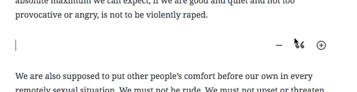
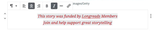
Color Just This Word… Just… ok, Paragraph. I tried to color single words. Single links. To no avail. It’s either changing the color of the full block, or nothing. I mean, I get why, yet seeing all the nice colors right there on the side and not being able to use them is disappointing. Check the video if you want a laugh in the attempt I make at it.
One Shade Of Grey. Why is the background of that text grey? I tried to look under the covers at the code, I tried hit some settings… but I’ve no idea what’s going on. If I deselect the box it goes away, so uh, ok?
Want To Select The Block Above? Nah, You Want Italic. This is a pet peeve of mine, and as such don’t take it too seriously, you can skip to the next one — but it frustrates me, so there it is. The toolbar that covers the content I’m working on means that while I try to click to select the block above quickly… I end up adding italic to the block below. I also ended up a couple of time looking inside the sidebar for controls that instead were in the toolbar. I know I already said this, but I wonder if when the sidebar is visible the toolbar could be a control inside it.

Just the Article. I’ve to say that once I checked what were the pieces other than the article… I didn’t even try. It seemed too complex to try to mimic the existing extra-article pieces of the theme.
While this might seem a long list of problems, overall the result I obtained at the end was quite good, and in a relatively short time. Given it lives in the context of the specific style of the theme I chose, I think it’s quite well aligned to it, it’s readable, and functional.
If you want to follow along me doing it and doing some freestyle talking on top — you’ve been warned! — here’s the full video:
Want to see more challenges? Here’s Mel Choyce’s doing the same challenge, and here you can see the first challenge of 2018 about techniques to increase page views.
Image courtesy of CSA Images/Getty.


Comments
[…] more: Mel Choyce and Davide ‘Folletto’ Casali tackle this […]
[…] low, I carefully copied my content paragraph by paragraph, but when I saw my co-worker, Davide, being able to copy large blocks of text and images all together, I was quite impressed! This cut the time down significantly using my normal […]
OK. Your narration totally made it +1000000!!!
[…] to see more? Here’s Mel Choyce and Davide ‘Folletto’ Casali doing the same […]
Thanks for this post.
Text coloring has been reported here: https://github.com/WordPress/gutenberg/issues/6080
I see you say that on copy and pasting there was italic and grey background. Could you give me more details on this please?
You said that clicking on blank area gave you an extra block, I would love to dig a little into how this happened as was unable to replicate.
“I see you say that on copy and pasting there was italic and grey background. Could you give me more details on this please?”
See at 7:22 — when I select that block, there’s a gray thing under the text I’m working on. I’m not sure what that is about. I even check the source around 6:30 but there doesn’t seem to be any background color.
“You said that clicking on blank area gave you an extra block, I would love to dig a little into how this happened as was unable to replicate.”
This happens multiple times in the full video, one instance at 8:58. It’s me keeping clicking on blank areas trying to unselect blocks to remove clutter, and getting new blocks with more clutter instead. :D
Thanks for the extra insights. Super interesting how there’s nothing in the source but it’s showing. I’ll dig some more.