WordPress is set to receive a new block-based editor in the future, and I’ve spent the better part of this year working on the design. The driving force is that instead of looking at the document as the unit to edit, we are now looking at piecing together this document from a sequence of blocks, each block with its own properties, features and options.
There are a number of benefits to this, chief among them that we can unify multiple interfaces into one. We mean to eliminate the need to know what a widget is, how to insert or edit a shortcode, and make it easier to add your own custom HTML without the risk of breaking your entire document with a stray tag that shouldn’t have been there. Other benefits include a more powerful API to extend the editor with custom content from plugins, as well as some very cool future opportunites around page building.
Because the block has been the most important unit of the entire project, this was the component we had to get right first, because without that, a block editor was not going to work. In the past many releases, notably the most recently released 1.5 release, we’ve gotten closer and closer by steadily improving the interactions around this.
I’m excited for 1.5 (just released!), but I’m even more excited for 1.6, which is scheduled to have still more improvements around this, and because of all these changes and improvements, we’ve made some changes to how the block itself looks, visually. As such, we’re updating the block blueprint. Let’s talk a bit about that today.
The Current Block
This is the current blueprint for a block:
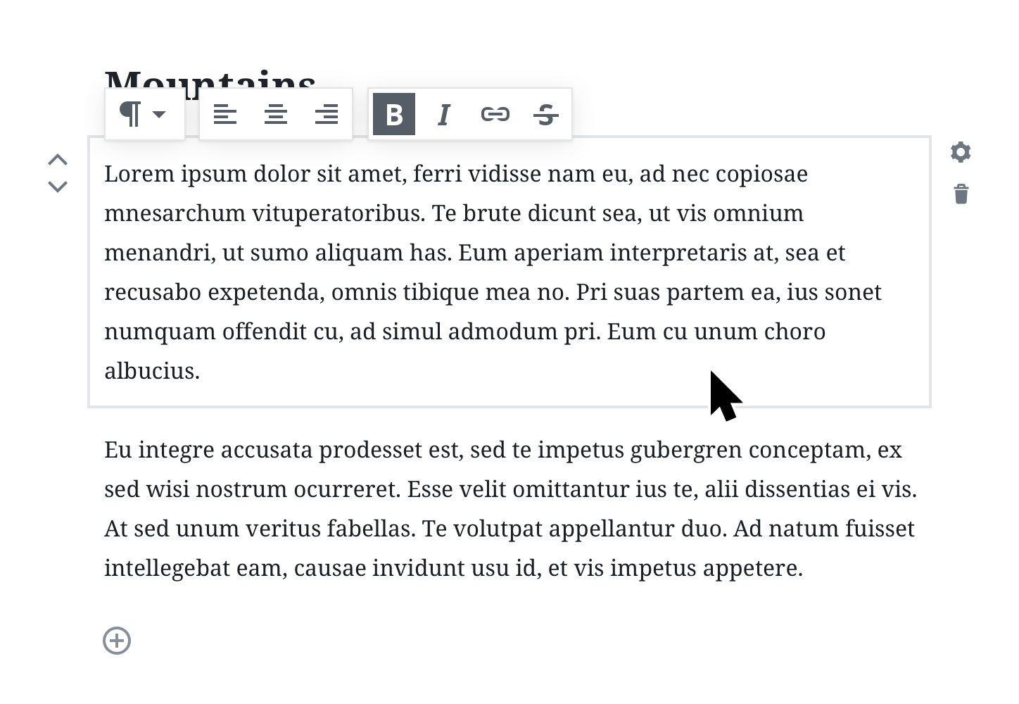
You can read more about it here, but the short of it is that every block is created equal and has a quick toolbar containing the most commonly used actions. A selected block shows clear boundaries indicating where it starts and ends, and quick commands for manipulating the block. As you type, all of these fade away, appearing only when you shift-select or move your mouse, so you can make formatting changes.
There were concerns around this UI feeling visually heavy, when you just meant to write. The boundaries and controls could feel distracting, and the quick toolbar would sometimes cover content you’d like to see.
The New Block
One of the benefits of working on a design in an open space is that you can react to feedback, tweak, iterate and trim. (Sure, sometimes we’d wish we could react faster, but such it is with software, it usually takes π times longer than you think it does). Regardless, things are in motion, and the following is what we intend to try next.
When you are explicitly selecting a block with the mouse, thin borders indicating the boundaries and layout of the block are visible:
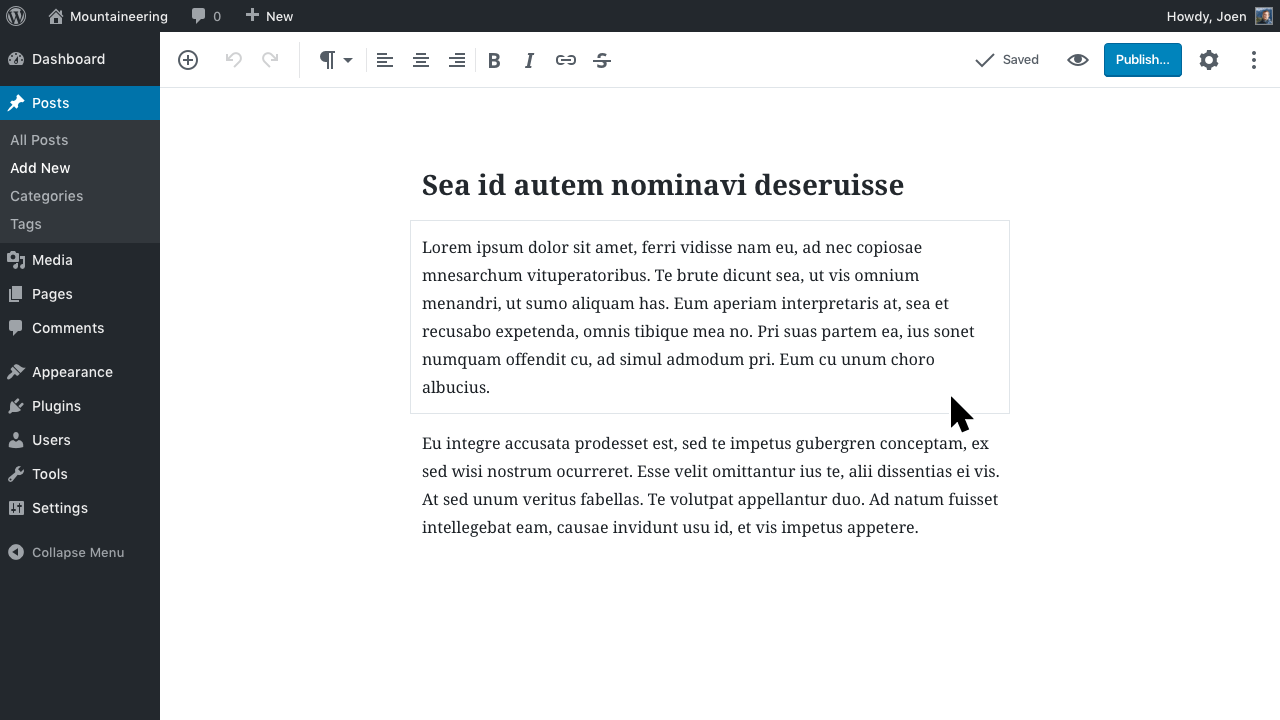
The quick toolbar is still contextual, but it’s now docked at the top of the screen. Select a paragraph to see text formatting as expected, but you won’t see a “Bold” button when you select an image.

When you are just editing text, you won’t see any boundaries at all. Shift + arrow keys now also select across blocks:

Selecting across blocks selects at the block level, allowing quick transformations and manipulations. Want to make a list? Select multiple paragraphs and transform them. Want to make a gallery? Select multiple images.
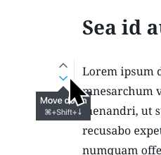
Hover near the edge of a block, or use the Tab key, to show the individual block manipulation tools such as the mover and the block settings menu:
Our goal is to make sure the end result is as powerful as it needs to be in a modern block editor, but without getting in the way of your writing flow.
Iterate
Aside from getting lots of feedback, another benefit of working in the open and shipping often, is that we can learn what UI elements are the most important, and when. This has helped inform the new block blueprint, where we’ve tried to prioritize and balance those factors:
- The boundaries are important to indicate the block-based nature of the editor, but they are unimportant when you’re typing.
- The block manipulation tools, the movers and the settings menu are valuable tools when you need them, but perhaps it’s okay to show them on hover since you can do perfectly well without ever discovering them. On mobile, these will live in an overflow menu.
- Although the block editor contains multiple textfields by nature, we can mimic the shift/select behavior of single-textfield editors, and tap into already learned behavior.
These ideas are likely to be challenged, refined, and honed as we try them, and they were all born from iterating on what came before, and so our cycle of experimenting, testing and refining continues. You can follow along on this work in this Github ticket, and look for the first ingredients to hit Gutenberg in version 1.6.
Gutenberg
We’re calling this editor project “Gutenberg”, and we are working on it every day in GitHub. Feel free to join us in the development. You’re also welcome to give feedback, the easiest is to join us in our Slack channel, #core-editor. Gutenberg is available as a beta version plugin, and you can try it now.


