What do you see? What can’t you see? What does it feel like? Can you see any colors? Is everything just black and white?
These are some of the questions I get asked when I tell someone I am color blind, or if they finally figure it out :)
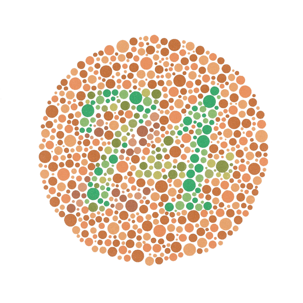
Being color blind is something I have grown up with, it’s hereditary – so you are born with it – it does not develop (at least I’ve never heard of that happening), so I don’t know of the ‘world’ as the other 92% of the population sees it.
I was recently asked these questions again – mostly around what colors I could see versus what colors I could not see – and it got me thinking – there must be some tool out there that would allow the next person to see the world as I see it – so to Google I went.
And there is – the best I found to-date (today) is Sim Daltonism – a window to color blindness for your Mac, or Color Oracle if you work on a PC. I downloaded Sim Daltonism – and it looks like it might be great (if you can see the normal view normally – hah!). Basically, it will allow anyone to look at their design and overlay a window and then replicate various levels/forms of color blindness to see what a specific part of a design looks like to someone who is color blind – it’s really easy to use.

It got me thinking though – as designers who can see in full color – the 92% – should we be using tools like these to ensure that the colors we use, the contrast of CTA buttons etc work for the 8 and 12% (men and women) of the population who are color blind? Perhaps we could build some sort of open source tool that you could put your designs through that would show you how a color blind person would see it and/or generate an error report?
On a daily basis I deal with things that are not color blind friendly – even internal tools (Trello does a good job here of being inclusive of color blindness) – but I have just come to accept that I am one of the minority – and try my best to figure things out, or ask my wife. Maybe, collectively, as a group of designers – and specifically within Automattic, we can look to make colorblind tests part of our workflow?
Although the 8/12% statistic is small – in Britain, for instance, this would mean that about 2.7 million people might not see your designs as you intended – food for thought.


Comments
I don’t think 8-12% is a small percentage at all! I also think we should go the extra mile and make sure our products work well with the tools blind people use to navigate the web.