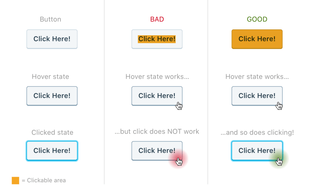
One thing that I commonly see on websites that really gets under my skin is links that don’t have a enough padding to making them reasonably clickable. Here’s an example of what I mean:
In the GOOD column, you can see how since the clickable area spans the entire width and height of the button, it makes it much easier to interact with. Usually you’ll notice this in a list of links like a navigation menu where the link is wrapped in an < li > element. The common mistake made here is adding the padding to the list-item element instead of the actual < a > anchor elements. Take a look at the following markup and styles:

HTML:
<ul class="navigation-menu">
	<li class="menu-item menu-item-1"><a href="#">Link 1</a></li>
	<li class="menu-item menu-item-2"><a href="#">Link 2</a></li>
	<li class="menu-item menu-item-3"><a href="#">Link 3</a></li>
</ul>
BAD CSS:
.menu-item-2 { padding: 1em 3em;}
GOOD CSS:
.menu-item-3 a { padding: 1em 3em;}
On Desktop, this can be slightly less of a concern because like I mentioned in my previous post, a mouse cursor gives you a more precise click response. However on mobile, the BAD scenario can render a button un-clickable because finger tips are much larger when touching a small screen directly. And since hover states are mostly irrelevant on mobile, this may create the appearance of a broken link. Having a good amount of padding on button links makes the experience much more easy and intuitive for users on small devices where their fingers may block their view of the element they’re attempting to touch.
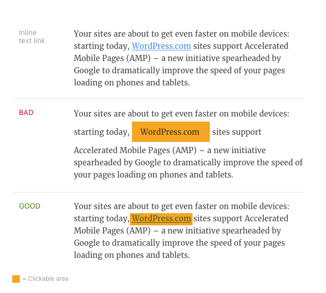
I should note that this only applies to clearly defined buttons and listed links. In-line text links are less “button-like” and can’t have the extra padding without breaking the typographic harmony of the paragraph. You can sometimes get away with padding and some negative margins, but because the link doesn’t exist within a contained area (like a button), users will be less likely to expect the larger click area and may lead to accidental clicks while scrolling or performing other touch interactions.
Lastly, when you factor in responsive design, following this practice in almost any case where a link or button appears to have a specified clickable area beyond its link text can greatly increase usability for both Desktop and Mobile links with very little effort. When it comes to WordPress themes, I recommend using this kind of padding on just about everything including: next/previous post links, lists of links in widgets, toggle buttons, linked post titles, etc. If this technique isn’t already a standard for you, I highly recommend adopting it—your users will thank you with more clicks and successful conversions.


 Automattic Design