Earlier this year, a project squad in our mobile division set out to work on a surprisingly tricky task: creating a simple login flow for our mobile apps that works with any WordPress site.
Why would that be hard? Because there isn’t just one flavor of WordPress. Endless hosting configurations, an almost infinite number of plugin combinations, and competing APIs make it challenging to create a single login experience that works for everyone. There are users with multiple sites, and users with no sites at all. Users who are accustomed to desktop computer interfaces, and those who have never used WordPress on anything other than their mobile phone. As a result, our existing login flow was complex, to say the least.
The insights provided by Rachel, a Happiness Engineer, were a crucial resource for the team. Before we started designing, Rachel mapped out every possible login flow in the app.  The green boxes represent successful logins. Yellow are errors that can be resolved. Red boxes are dead ends. Because of the way the login flow had evolved over time, there were screens on which some users could never successfully log in, usually because they’d chosen the wrong option on a previous screen. These were our dead ends, and they were our enemy in redesigning the flow.
We had six principles driving us as we worked:
- Break down multi-line forms into step-by-step flows.
- Make sure that the user understands what they’re being asked for before they see a text input.
- Don’t ask for information that’s hard to remember if there’s a better option.
- Don’t be overly clever trying to interpret the user’s input, because people make mistakes.
- Give them the opportunity to correct mistakes!
- Don’t make it possible to get into a flow that there’s no successful way out of.
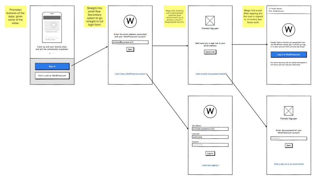
 We knew that magic links (passwordless, email-based logins) could be a part of the solution — we’d implemented them in the apps several months previously, but without much fanfare, and most users probably didn’t know they were even available. We knew we wanted to help as many users as possible get a magic link, since it can make the process so much smoother. A round of pencil sketching on iPad helped me begin to visualize my ideas.
Using Balsamiq and Mural, I began wireframing screens and putting them together in potential flows. We weighed all the options: e-mail first, site address first, even presenting the user with a kind of wizard to help them determine what kind of WordPress site they have. With the help of feedback from our peers, focused user tests of our Invision prototype that we conducted on Usertesting.com, and insights from our data scientist Charles, we narrowed down our options to a single flow.
At this point, I reached out to our Editorial team, because I knew that understandable, actionable instructions and error messages would be key to helping users succeed in logging in. Michelle, a member of our editorial staff, took the job, translating our giant spreadsheet of technical error messages into ones that sounded like the same friendly, helpful voice the user interacts with elsewhere in WordPress.
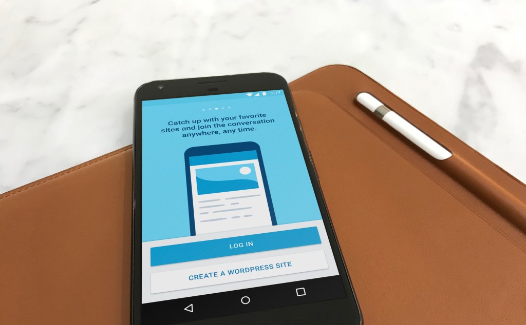
As part of our work, I wanted to create a more engaging first-run experience for users who have just downloaded the app. In the old app, the first thing you saw was a login form. It wasn’t the most interesting or welcoming experience. We added a simple promotional screen that helps the user know they’re in the right app, and gives them an idea of what they’d be able to do with it once signing up or logging in. The animations you see on these screens were crafted by my colleague Filipe, building on a previous set that were created for the apps.wordpress.com website by our fellow designer Joen. Because the animations were created in After Effects, I was able to adapt them to work natively in the apps using Airbnb’s Lottie open-source animation library.

Over the next few weeks, I continued adapting our set of wireframes into native visual designs, with customizations made where appropriate for Material Design on Android and the Human Interface Guidelines on iOS. My Sketch docs grew and grew as they came to support all the possible success, error, and help states that the user might encounter as they logged in. We paid special attention to places where we could help the user learn more about what information we were asking for — you might be surprised by the number of users who don’t know their website’s address, or what a “URL” is.
With help from Cristel, a Marketing Designer at Automattic, we finished things off with a few visuals in our new brand illustration style.


We were almost home! All that was left at this point was to create annotated mockups for our engineers to use during development. By keeping our typographical choices consistent with the standards on Android and iOS, we make life easier for developers since we can refer to type styles like “Body” and “Caption,” which have specific attributes defined by the operating system. This makes life easier for users too, since this lets us support accessibility features like dynamic font sizing.

After lots of hard work by engineers Eric, Nate, and Stefanos, and lots of help from our mobile lead Cate, we were ready to announce it to the world! And so, on August 15th, we let the world know that our latest apps featuring the new login flow were available on the app store.

We think it’s a pretty substantial improvement, but we haven’t stopped there. The authentication team continues to work to make logging in and signing up even easier, and we’re looking forward to announcing more improvements to the apps in the weeks to come.


Comments
Nice writeup Matt!
I can easily say that all this time working on the project, the flow of information, the iterations and the design details were very approachable and easy to understand/grasp. I don’t think I remember any point I was feeling lost or missing crucial info/detail. I particularly am grateful for the list of principles you laid down from the start which not only made sense, but helped my life as a collaborator as well. Then, by the time I started implementing on Android, I felt I had all the pieces available. Let’s do this again! ❤️ 👏