One design technique that I’ve heard casually mentioned here at Automattic is to design the product or feature you’re working on “native first”, or better yet, “mobile native first“. Mobile has been a priority at Automattic for several years now, and the mobile first approach has helped WordPress.com immensely. In addition to mobile first, we also think about how new features translate to the WordPress.com iOS and Android apps. I usually design for both web and mobile native in parallel, but on a recent project, I decided to design for iOS and Android first, and later scaling that to the web for mobile and large screens.
Designing mobile native first has helped me focus on users’ needs and organizing information, without being distracted by pure aesthetics or consistency with the platform. Both iOS and Android have well-established UI patterns that can be used to explore interface ideas, even if you’re solely designing a web product. Designing within those constraints can help in the early stages of design, and it will inform the design for larger screens later on. Simply thinking about the product in the context of a native app helps too. Ask yourself, “How would this work on iOS and Android?”.
Getting overwhelmed
Our team’s task was to bring the WP Admin Comments interface to WordPress.com. I quickly got overwhelmed early in the design phase.

My initial sketches had large screens in mind, and I was mostly concerned with how to best utilize the extra screen space. I explored a few different layouts but none of them felt right. Even after some user research, I wasn’t confident in my ideas. I needed to create prototypes and see real people use the interface, but my ideas were too broad to narrow down.
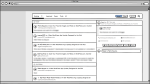

A few layout ideas for large screens
Getting unstuck
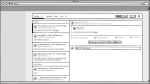
To get myself moving, I needed a change of pace. Instead of large screens, I started designing for mobile native within the constraints of the Material guidelines. I asked myself, “How would this feature work in the WordPress.com native apps?”. The Material guidelines have plenty of examples and it’s very well documented. This enabled me to focus on the users’ goals and produce visuals for the team to discuss. Another benefit of designing within these patterns, is the focused conversation around the user instead of the visual details.

Using Material to mockup comment management on Android
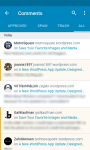
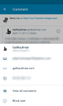
After some feedback and iteration, the team was able to make a quick prototype that worked well for both small and large screens. Here’s a preview:


It’s still missing many features, but being aggressive with our minimum viable product (our cupcake) will allow us to gather user feedback as soon as possible.
If you’d like early access to new features, check out our public testing site, Horizon.


 Automattic Design
Comments
I’m a big fan of mobile first – a great starting point to expand designs to desktop. Thank you for your blog!