I had a recent conversation with our Head of Design John Maeda about how entrepreneurs get things done. They don’t decide to make an omelette, open the fridge to find there are no eggs and give up. Instead they open the fridge, see what they can make — and from there find the solution that works.
Using stock photography in creative campaigns can follow a similar principle. Sometimes you have an unlimited budget, a professional photographer, and a few producers to ensure your ad campaign gets the exact images it needs to meet the original creative idea. You can decide what you want to make ahead of time. You can decide on an omelet.
But sometimes, especially when it comes to smaller campaigns and smaller businesses, you’re not going to have the ability to create exactly what you need from scratch. You’re going to have the open the fridge — or in this case the stock photography site — and work with what’s already there. Which raises the question, how do you make a campaign that feels original, while using imagery that wasn’t expressly made for it.
A Little on Stock Photography
There are so many sites that offer stock photography at varying degrees of cost and quality. At this point, most people seem to understand what constitutes a “bad” stock image. Some examples of actual photographs available for purchase:


In general, using images that have natural lighting, authentic expressions, don’t feel posed, and aren’t a man at a desk wearing a scuba mask, will you get you much better results.
But what can be harder to figure out, is how to make even the best looking stock photography feel unique to your campaign. I spent the beginning of my career working with a lot of small businesses and startups, where time and budget limitations forced me to get super creative with stock. This basically meant approaching campaign ideas with flexibility, to let them form and evolve around photography that already existed.
As a marketing designer for WordPress.com, I got to apply that same process to a small display and social campaign we did for our new domains offering.
Initial Exploration
After a few brainstorming sessions and putting together a creative brief, my team decided we wanted to focus the message of our campaign around identity and ownership. The key idea being that your domain is an extension of your personal brand and a way to “own” the ideas/aspirations that motivate the site you’ll eventually build.
From research, we knew that domain names were one of the first things people consider when starting to create a website. So, we felt this could be a really effective moment to engage with potential users.
To start, I put together mood boards using a combination of inspirational existing design, and photographs that we’d actually be able to purchase.


After some feedback, it really seemed like the closeup portraiture could deliver on the idea of personal ownership. There was also a really great range of authentic, professionally done images in that genre.


In the next round of work, I started testing out the actual photographs we might be able to use for the campaign, combined with the copy that we’d also been developing.


There was a definite draw to the bright background and expression of the man in blue. But we still wanted to push the idea further. How could we make this feel more expansive and have each image present itself as though it was part of a much larger campaign?
Expanding the Campaign
The image had been taken from Stocksy. It’s one of my favorite stock sites because it’s super affordable and full of high-quality images. Frequently, if you find one image you like, the photographer has included a bunch of additional photographs from that shoot.
So in the case of the man on the blue background above, there were also all these photographs:
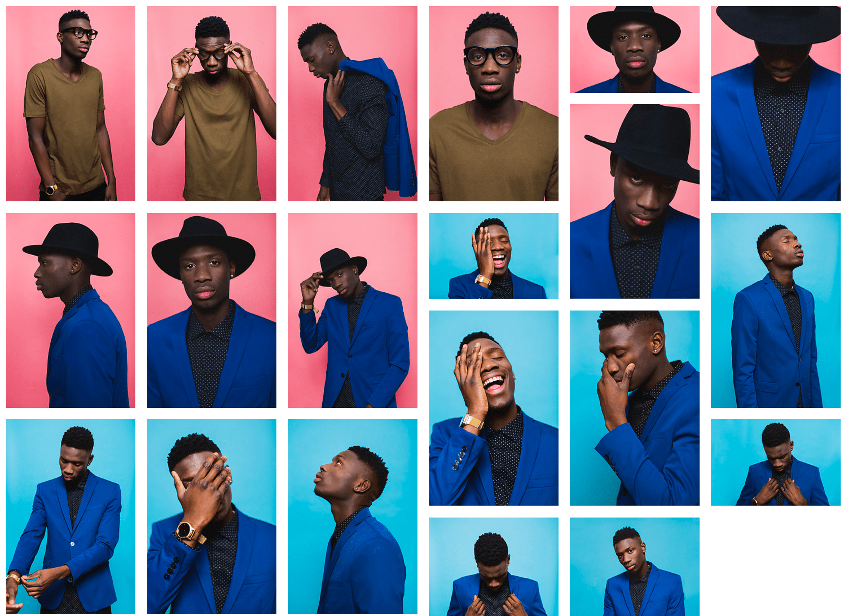
Once we dug a bit further, we realized that the photographer had done a whole series of photographs in that same style:

At that point, we knew we could build a cohesive campaign using a set of different models with bright backgrounds and similar facial expressions. We landed on these three images from the same photographer:


We needed one more to round out the series, but couldn’t find the right expression in the remaining selection. So with a little Photoshop magic, we grabbed an image from an entirely different site and edited it to match:


This resulted is us having a set of four images that came together to look like creative we’d specifically made for this campaign.
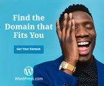
For Facebook:


For Display:


So in some ways this did mean we didn’t work in a traditional, linear fashion: brief > brainstorm > mood boards > drafts > execution. The availability of media ended up guiding the concept. But I think letting your initial idea evolve with the resources you have available is key to getting stock images that looks like they were made just for you.
While creating campaigns with stock photography might not win any advertising awards, it can still get your message across with polish and creativity (and the occasional businessman on a beach, talking into a banana).


