Same same, but different is a phrase I came across after talking to friends who had recently been on a holiday to Thailand. They told me that, when vendors in the local marketplaces don’t have the exact item a customer asks for, they will often use the phrase, “same, same but different” to try and sell them an item that, on the surface, seems to be similar, but is not quite the same as what they had asked for.
For me, working as a marketing designer for WooCommerce, this phrase also brought to mind some of the challenges designers can face when creating graphics for social media. If you’re a print or UI designer roped into doing the occasional graphic or two for your company’s Facebook or Twitter account, this may not seem like a big deal. However, it’s these little touches that can set you apart on the platforms that millions of people spend much of their time on each day.
One size doesn’t fit all
Design for social media isn’t “one and done”. You can’t simply create one concept for a campaign, slap that same design verbatim across Facebook, Twitter, and Instagram and call it a day.
Well, technically you can – but you’d be missing the point, and potentially shooting yourself in the foot at the same time. That’s no good, especially if you’re rather fond of your feet or you/your company is putting money into boosting these posts or tweets. This is especially pertinent if you’re a newer brand looking to make a good first impression.
I often see brands push the same post to each social site without much thought given to how it might appear across each platform. Each of them is different, not only in terms of visual design, but also in terms of how people use them and consume information on them. Messaging may also need to be tweaked per platform, which naturally affects the design of your campaign.
Here’s an example: recently, I saw a tweet advertising a stand-up comedy show. The image preview displayed in this tweet showed the comedian’s name as well as the ticket price. The cost seemed a bit steep, and I was hesitant about attending until I clicked on the tweeted image to expand it, revealing the full image and seeing that, not only were there three other comedians on the bill that night, there was also a drink included in the ticket price.
Because the image hadn’t been sized correctly for Twitter (due to it most likely being the show’s print flyer layout), I would have missed these important details had I just scanned the tweet and carried on scrolling down my timeline, as most people tend to do on their phones. Keep on swipin’, keep on swipin’.
Added to these kind of considerations are factors such as Facebook’s text overlay rule for images used in promoted posts, which discourages a high text-to-image ratio in your graphic. Their image optimization algorithm on uploads can also leave your beautifully-crafted images looking blurry and of a lower quality than you’d like too.
There’s also no point in including call-to-action buttons on your Instagram images, as users can’t click through on image or video posts (even on Instagram ads), nor can they click on URLs contained in the text copy of your posts. Auto-posting the same copy and graphics across Facebook, Twitter, and Instagram may seem convenient, but it can make you look extremely lazy when viewed in real life situations on each different social platform.
Let’s get visual
As an example, here’s what we did for a recent campaign around the new Facebook for WooCommerce extension.
For Facebook (image 1), we put the engaging copy in the post itself rather than on the image itself in order to comply with the text overlay rule mentioned above. It also made it easy for someone to see what was being spoken about at a glance when scanning their newsfeed.
When it came to Instagram (image 2), we knew that we didn’t want too much text in order to keep the image readable for someone on a mobile device. Bearing in mind that folks wouldn’t be able to click through to the product from a link, we showed the URL in the graphic itself to make it more prominent than it would have been in the text copy of the post. The shorter vanity URL helped make it more memorable as well.
The Twitter version (image 3) had more text on it to compensate for the 140 character limit placed on tweets, and also had a CTA button to encourage folks to click on it (as it was linked).
Tools of the trade
Keeping track of these near-constant sizing changes for social media graphics is important, but it can also be tricky. I like to use the lengthily-named but super helpful Always Up-To-Date Social Media Image Sizes Cheat Sheet from Sprout to keep up-to-date with this. It hasn’t let me down yet.
All of WooCommerce’s social media images are created in Sketch; one of its many benefits is the ability to add useful plugins such as Craft to enhance your processes. Created by the fine folks at Invision, Craft Library in particular lets our team pull in synced assets from a centralized location: logos, text styles and, of course, social media sizing templates.
I can pull in a template for each social media platform (in the correct sizing) and get going right away without having to constantly revert back to Google to remind myself as to what size a group’s cover image should be, or whether I need to leave 10 pixels’ worth of padding on a Twitter graphic.
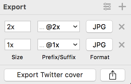
Sketch also lets me easily export @2x (or even @3x) versions of these designs, handy for combating heavy compression on uploaded images in Facebook and looking sharp on screens that support retina.
A little goes a long way
Having a clear intent and purpose for each social media campaign, paid or not, is always important. Being aware of the subtle differences between each platform and adding that into the mix can give you (and your company) the best chance to maximize your designs’ potential and engage your customers.
If you’d like to read more about designing for social media, this is a helpful article to continue on with.
Thanks for reading!


