WordPress.com in 2014 had a big problem.
It had grown organically over the years across multiple tools and platforms and was periodically influenced with changes coming from the open source community. As a result, it came to have a complicated navigation system across all its pages.
One day Shaun Andrews, one of our product designers, wrote a telling post on our internal design blog titled “There’s something about our navigation” that included the following screenshot of our many disparate navigation options:
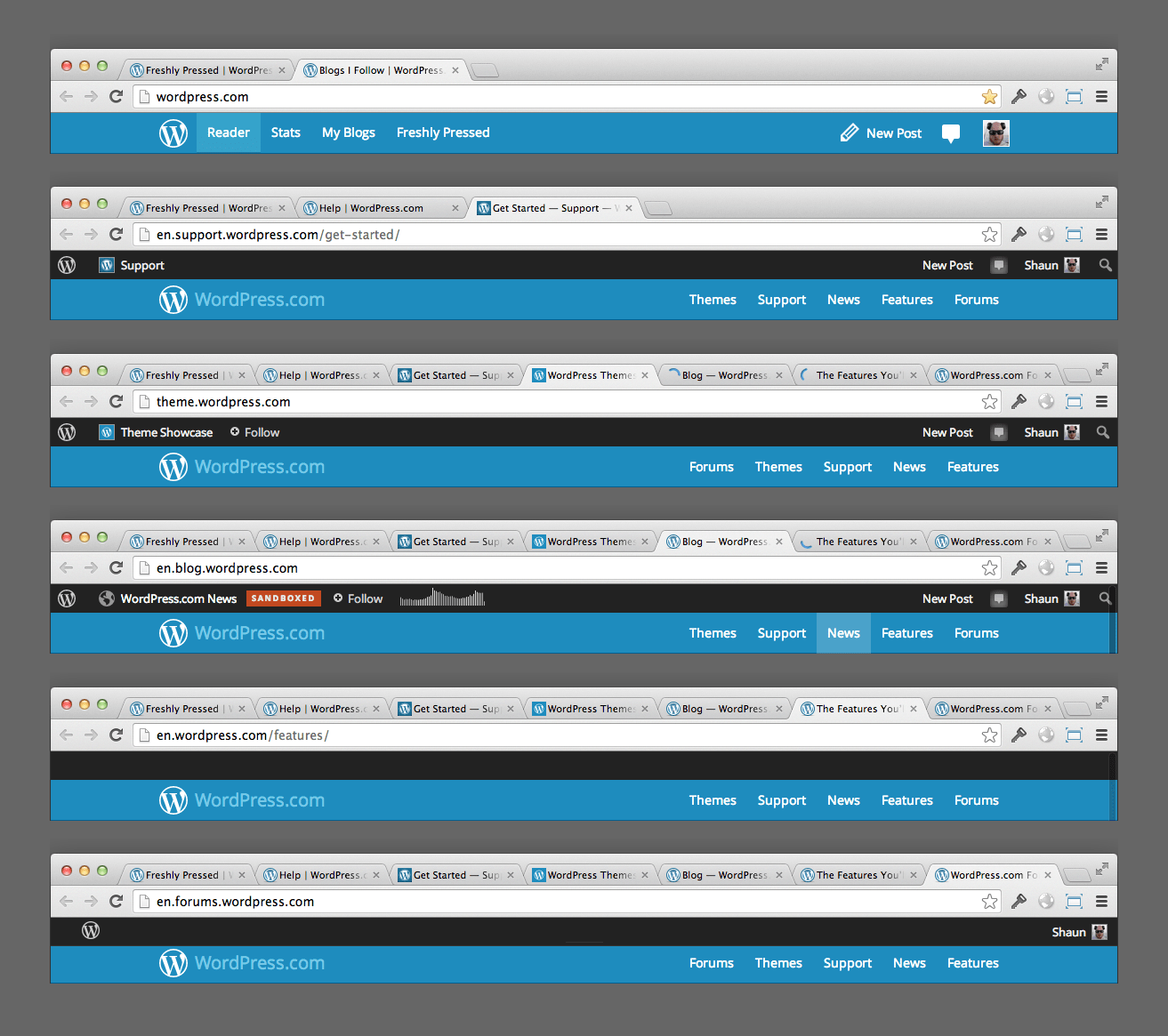
Nobody “owned” the navigation bar, as we were divided in different teams with different goals, so each one of these evolved independently. On iOS and Android, we had a similar situation.
Automattic welcomes new hires with a clear message: “Welcome to the chaos”. How do we tackle problems like this? We traditionally create ad-hoc task forces where designers and product teams coordinate over time, aligning within the timeframes and scope of each part of the product they own. Shaun’s post acted as our call to arms. Our CEO, Matt, commended our coordination effort.
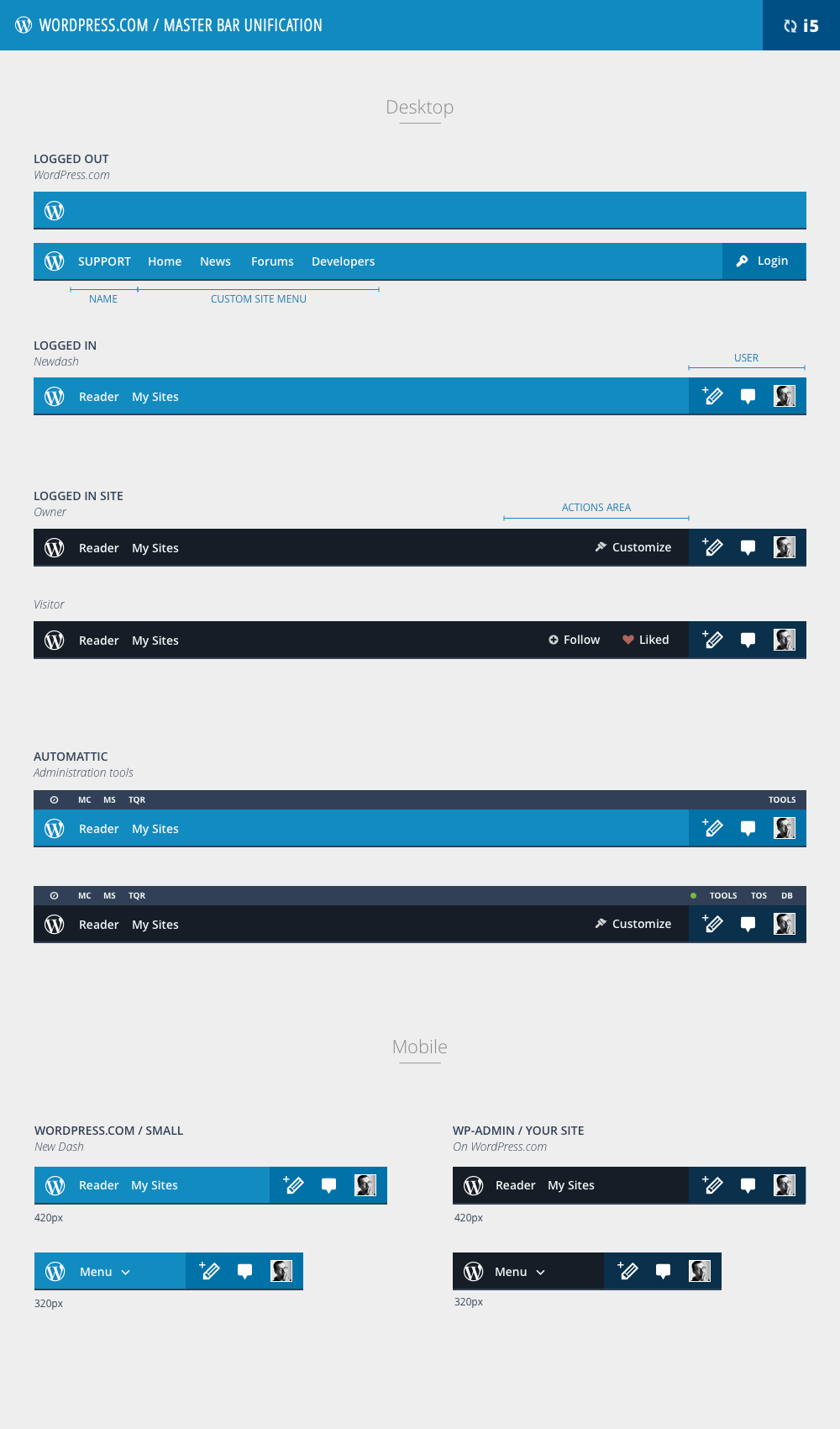
That initial discussion received more than 50 comments with feedback across the company and almost every designer contributed with mockups on everything from small to large details to create what was then called masterbar – the top menu bar that appears consistently across all site pages.
In two days we made thee more iterations on the initial blueprint. Here’s the blueprint of the fifth iteration:
However this was just the initial design — the huge effort was to find all the instances and replace all of them, starting from the one with the highest traffic. Coincidentally, what happened around that time was also the inception of what later became Calypso: our new experience and architecture for WordPress.com.
We thus focused on four implementations to start with:
- Calypso — as that would become the most used administration interface.
- The front-end user experience — to provide access to all our users from their own site.
- iOS and Android — trying to converge them to create a unified navigation across all our platforms.
We iterated with five more major blueprints, doing research with live prototypes, live code, paper prototyping and reviewing the data we had.
During the WordPress Summit in San Francisco, three of our team members prepared paper prototypes and asked people, “What would you click to write a new post?”, “What would you click to check your stats?”, and so on. The feedback we received led us to the design that shipped with Calypso, iOS and Android in November 2014 — the tenth iteration:
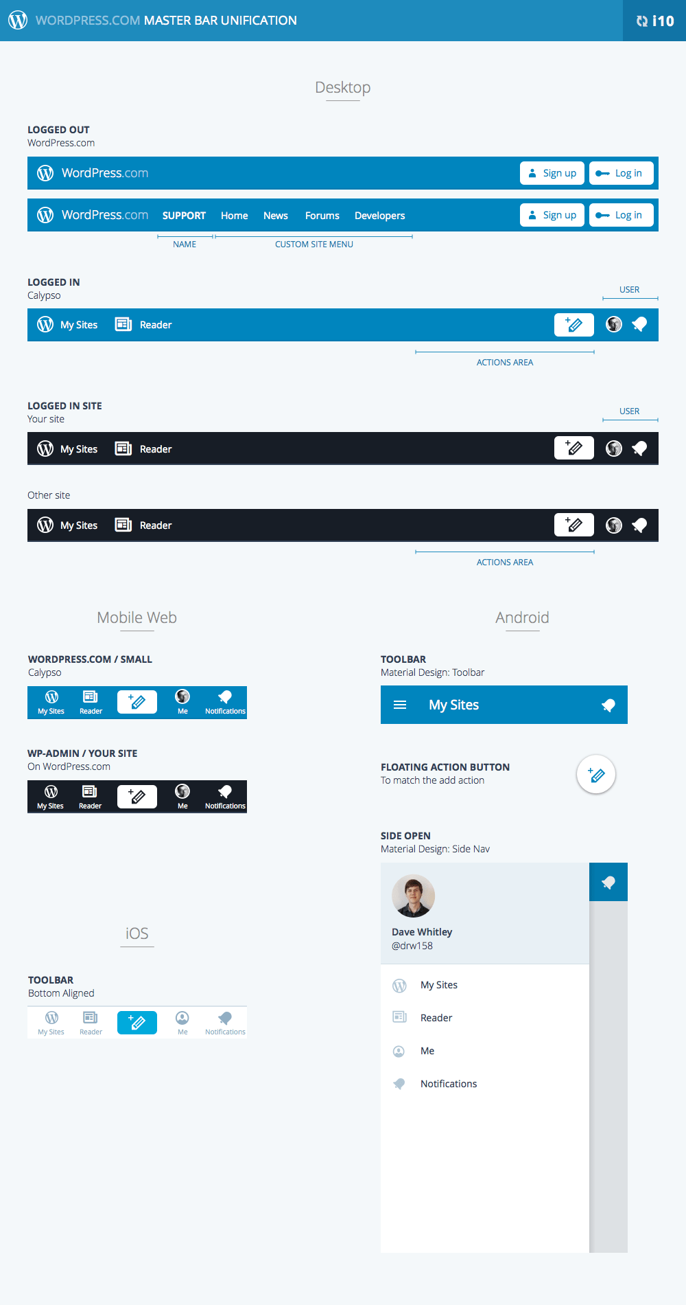
This was a very interesting challenge as it didn’t just set the foundation for the information architecture of Calypso, but also defined the underlying principles we used to translate the Calypso design language in active development to iOS and Android.
We had to study in detail both iOS HIG and Android Design Guidelines. As you can see from the screenshot above while the general structure is kept the same, the navigation especially on Android adapted to the platform design patterns. This created enough consistency for users moving across any of the three platforms to feel at home anywhere, without having to re-learn how the interface worked since the patterns were familiar and consistent with the operating system standards.
By the tenth iteration, the foundation was laid — now it was a matter of smoothing all the rough edges: we did deep dives into our codebases and tried out different flows across our site pages. We identified 12 different variations from support forums to documentation, and from our blog to the current pricing page. We made great improvements in all of these areas, aligned the underlying structure across the board.
The work didn’t stop there as the evolution of both our design patterns and others – iOS 7 was released, as well as Google Material Design – kept our design evolving. We did some further full blueprint iterations later, reaching iteration number 14 in 2016.
Right now, we have reached a point where the architecture is solid enough to not require anymore blueprints that cover all the platforms. New changes happen directly on GitHub, such as when we added a label for the Write icon on large screens, or when we added a dropdown to show draft posts.
Of course, at least until the next redesign… 😉


 Automattic Design