Speed is extremely important on the web these days, largely because mobile devices are becoming (and in some cases already are) the primary entry point for websites. This will increase in the future. With that in mind, building websites in a way that allows for rapid loading becomes an essential for every one.
Succeeding on mobile starts with getting the basics right. People choose brands that meet their needs instantly and seamlessly. That means no matter how great your site looks, if it loads slowly, users will leave and you’ll miss out.

(Source: Google’s Inside AdWords Blog by Jerry Dischler, Vice President, Product Management, Google.)
There are of course a ton of different ways to improve speed and performance with websites. One of the simplest ways is to add AMP support to your site. AMP (which stands for Accelerated Mobile Pages) is an open source project spearheaded by Google that aims to make the web faster and more performant for the future of the internet. To explain how it works simply, AMP delivers a separate and speed-optimized version of your site specifically for mobile devices. To see a live example, simply add /amp to the end of this post’s URL (or click here).
History
We originally introduced AMP as a plugin for WordPress in early 2016 and it included a very simple design based on the Minileven mobile theme we had already been using in JetPack. A little under a year ago, I had the opportunity to work on a re-design of the plugin along with Simon Dickson, Mo Jangda, and a few other folks from Google’s team. The purpose of the re-design was to modernize the layout and introduce some customization features to allow users to make their AMP templates more closely fit their branding, without touching code. Most of the “heavy lifting” in the speed acceleration happens under the hood ( i.e.: the AMP markup spec ), however the actual design of the AMP template also considers speed in various ways.
System Fonts
Custom fonts are often one of the biggest culprits in slowing down loading speeds. Ages ago (in internet years) system fonts were the only ones available which meant designers had the not-so-fun task of making fonts like Arial and Georgia look convincingly good. However in current times, mobile operating systems come with much nicer native fonts that we can access locally instead of having to download an external font file over the web. We used this technique for all of the sans-serif fonts in the AMP plugin.
Branding
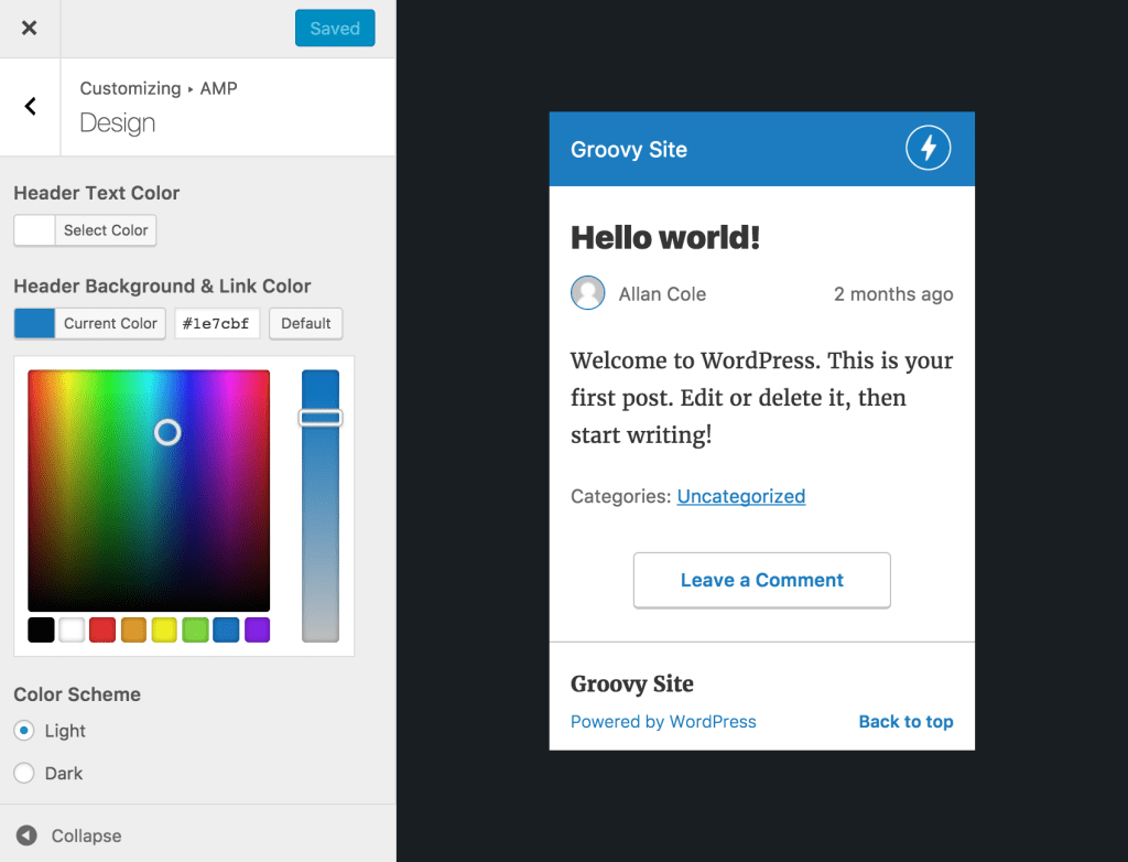
The standard AMP plugin template design uses colors from the WordPress.com brand, however in the update, we added support for custom header colors and header text colors. There’s also a light or dark color scheme option that you can use to offer a light or dark background. The options here appear limited compared to the level of detail you have with normal theme options. With both speed and mobile devices in mind, providing more finely tuned options simply wasn’t necessary here. Also for sites using Jetpack, a site icon appears in the header to further instill the branding.
Layout
The layout follows a fairly common pattern found in most AMP templates. We didn’t want to go too far against the grain here since adding too many bells and whistles is both bad for speed and goes against the AMP markup spec.

Get AMP’ed!
AMP already comes prepackaged with every website on WordPress.com and you can follow this link to learn how to get started. If you have a self-hosted WordPress site, you can download our free AMP plugin by clicking here.
If you’d like to find out more about AMP, check out some of the resources below:


 Automattic Design