Understanding users is of paramount importance, that is clear to any product designer. But sometimes creating an accurate persona to test against can be tricky. Sometimes it might even be impossible. In these situations it’s good to have some fundamental rules to fall back on. For me, one of those rules is to always focus on crafting efficiency.
I’d consider myself to be quite lazy, which definitely helps with this approach! That doesn’t mean I don’t work hard, just that I prefer to work smart. I’m crazy about optimizing my time / effort, or about tools that allow me to do so. All the hallmarks are there. I’m in and out of Alfred all day long, I use Craft to create Invision prototypes from my Sketch mockups in 1 or 2 clicks. I’m so ‘lazy’ that I’ve created aliases like git cm so that I don’t have to type git checkout master in Terminal all the time!
Being efficient feels really good. Ensuring users feel efficient when they use a product is a very effective way to provide a positive experience.
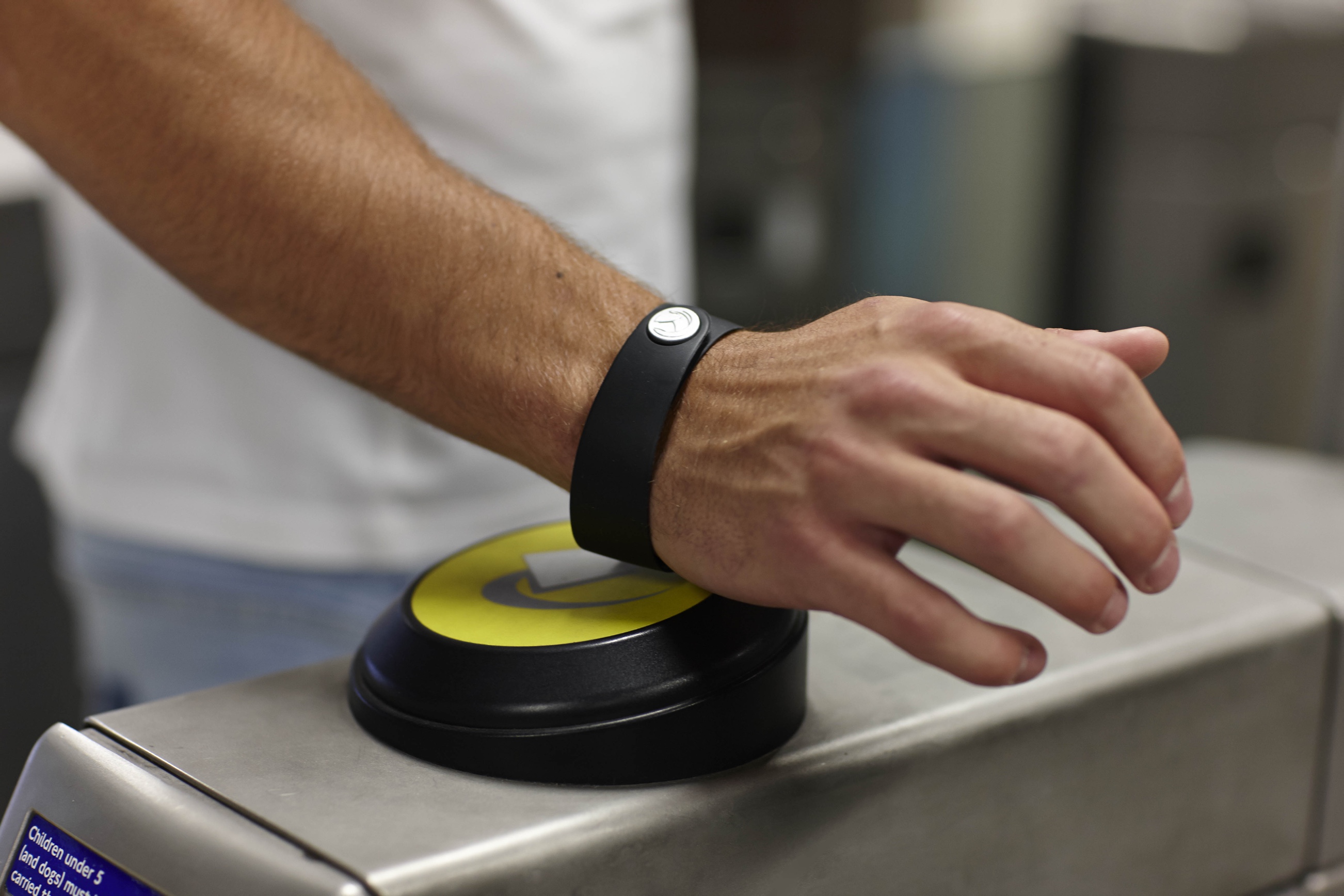
On a recent weekend trip to London I had a delightfully efficient design experience. I rarely visit London unless I’m flying somewhere so it’s been a while since I’ve spent any time in the city. I was pleasantly surprised to see how quickly and how extensively the public transport system has adopted contactless payment technology. In the past, the thought of getting a bus seemed a real pain – I’d need to figure out exactly how much it would cost and most likely visit an ATM to get cash to pay for it (I very rarely carry cash). Not efficient at all! The same goes for the tube (subway). Imagine my joy when I learned that you can now simply tap your contactless debit/credit card when you board / exit the vehicle and everything is taken care of automatically! No cash, no ticket, no awkward human interactions… It’s so efficient. It’s so easy. I can even use Apple Pay on my phone if I happen to have forgotten my wallet. When potentially complicated situations are made to seem this simple it feels great.
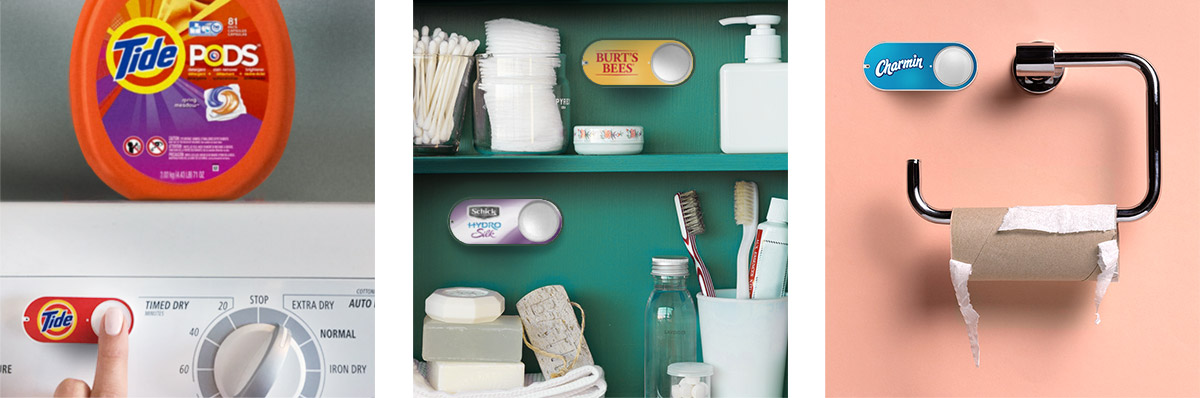
You don’t have to look far to find other examples of modern implementations of this philosophy. I love my Amazon Dash Buttons for example, but you could argue that even they seem a little crude now when you consider I could just ask an Echo to perform the same task without leaving the comfort of my armchair.
Whenever I enjoy one of these experiences I’m reminded of the famous Antoine de Saint-Exupéry quote;
perfection is finally attained not when there is no longer anything to add, but when there is no longer anything to take away
To put it another way; design is successful when processes are refined to a point that they feel entirely effortless. When they make the user feel efficient. At this level of refinement small things can make a difference. Especially on the web where folks are so easily distracted or disillusioned with a service.
I know all of this seems obvious, but it can be very easy for designers to get distracted by details and spend too much time making widgets look good without deciding whether the widget is necessary in the first place.
This philosophy has been employed a great deal in a UI design we’re working on that plugs WooCommerce into WordPress.com. Historically WooCommerce has a highly tech-savvy user-base and the current UI reflects this. Once deployed on WordPress.com we expect this to change. So many of the flows and design components needed a rethink. One key tactic we’re employing here which aligns with the ‘designing efficiency’ philosophy is smart defaults. eCommerce software can be complicated to configure but we can help a great deal by applying intelligent defaults to settings based on information the customer has already given us.
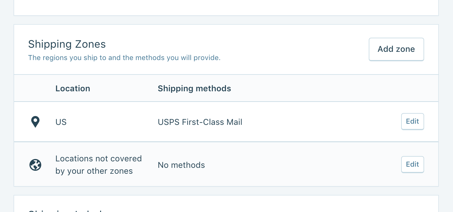
For example, once a user has signed up we know their email address and their location. We can use this information to automatically set things like store currency (including currency settings like symbol position, decimal points, thousands separator, etc.), measurement units, basic shipping rules… even payment and shipping method setup. We can very easily save users 5-10 minutes of time and funnel them into the more rewarding set up tasks such as adding their products or customising their store appearance.
It’s all too easy to get bogged down in the minutiae of design – striving for pixel perfection and works of digital art. But if you ask anyone why they enjoy their Amazon Dash Buttons, they certainly won’t tell it’s because it looks so good! It’s because of how it makes them feel. In product design it’s vitally important to remember that it’s almost always more important how something works and the emotion it evokes, rather than how it looks.


