For the past 6 months or so, I’ve dreamt of blocks.
Jan 1st I started work on designing the WordPress core editor focus for 2017. That is, with the ultimate goal of creating a new editing experience that makes it easy for anyone to create rich post layouts. This was the kickoff goal:
The editor will endeavour to create a new page and post building experience that makes writing rich posts effortless, and has “blocks” to make it easy what today might take shortcodes, custom HTML, or “mystery meat” embed discovery.
Though only a single paragraph, it summarizes quite a bit;
- Authoring richly laid out posts is a key strength of WordPress.
- By embracing “the block”, we can potentially unify multiple different interfaces into one. Instead of learning how to write shortcodes, custom HTML or paste URLs to embed, you should do with just learning the block, and all the pieces should fall in place.
- “Mystery meat” refers to hidden features in software, features that you have to discover. WordPress already supports a large amount of blocks and 30+ embeds, so let’s surface them.
How do you address this, in an editor that’s already heavy on UI? How do you simplify the UI while adding new features? How can you ensure a workflow that is not hostile to basic users, while still ensuring the features advanced users rely on are still discoverable?
Everything starts with the block.
The Block
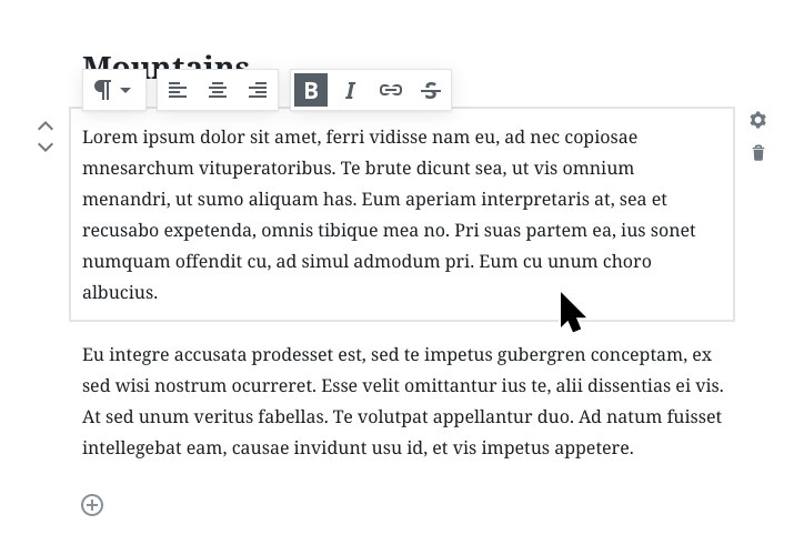
The block itself is the most basic unit of the editor. Everything is a block, and you build them together mimicking the vertical flow of the underlying HTML markup.
Not all blocks need the same controls; bold has no effect on images, and perhaps you don’t need an explicit button to create quotes inside of captions. By surfacing each section of the document as a block we can manipulate, we can attach features that are unique to each block, contextually. Inspired by desktop layout apps, it’s a way to add a breadth of advanced features without weighing down the UI.
We call this the “quick toolbar”. As you scroll down a page on long blocks, the quick toolbar unsticks from the block, and sticks to the top of the screen. The quick toolbar holds basic actions. Through ensuring good defaults, and only the most common actions, you should be able to get all your writing and layouting done.
If you need access to more advanced block configuration, you can toggle an advanced block settings interface by clicking the cog on the side.

In this case, if you insert the Gallery block without changing a thing, it defaults to 3 columns and cropped images. But you can customize this if you like. Other examples of advanced UI could include drop cap for text, or number of posts, or category, of the Latest Posts block.
Gutenberg
We’re calling this editor project “Gutenberg”, and we are working on it every day in GitHub. Feel free to join us in the development. You’re also welcome to give feedback, the easiest is to join us in our Slack channel, #core-editor.
Although it’s a difficult challenge and we’re far from done yet, we are moving fast, and amazing things are happening every day.
Gutenberg is available as a beta version plugin, and you can try it now.


Comments
[…] month, my colleague Joen wrote a great post about blocks and the Editor Focus for WordPress in 2017. Joen designed a fantastic blueprint for blocks in WordPress that the Customization Focus will […]
[…] concept was summed up well in Joen’s post last […]
[…] WordPress editor focus has had my full attention. I’ve written about it in the past, but the all-encompassing goal is to bring a new post and page building experience to WordPress, […]
[…] shortly thereafter in June 2017, there was a post by designer Joen Asmussen that started to describe the “Blueprint of a […]