Recently, over 70 designers from Automattic met in person in Italy for an all design meetup. Half of us participated in the Patterns Design Atelier: a focused four-day project where our goal was to create block patterns for a variety of purposes and use cases.
👉🏻 Block patterns are predefined collections of one or more blocks that you can easily insert into your WordPress posts, pages and block themes. Once you insert a pattern, you can fully customize it with your own content to make it unique. Patterns make it more simple to create complex layouts and designs in any WordPress site without having to start from scratch every time.
As a designer who works with WordPress on a daily basis building websites and themes, I quickly realized the importance of well-crafted patterns. They’re the backbone of a seamless user experience. But before diving into pattern creation, having clear guidelines on what makes a good pattern and how to ensure seamless integration into any WordPress theme is helpful for designers.
So let me share with you some of the practices that Rich Tabor and I put together for our meetup atelier which can benefit anyone crafting patterns.
Structure
There is some flexibility when it comes to a pattern’s structure, but generally a structure like the one below helps encourage consistency in the application of patterns, for users applying a pattern anywhere on a site:
- A top-level Group block.
- Spans the full width of the page.
- Makes it easier to change the background color of an entire section of a page.
- Makes it easier to reorder the sections of a page, as each pattern is contained within a Group block.
- Typically has the left and right padding values mapped to the site’s global styles layout settings, so that the pattern adapts to the theme (and users’ preferences).
- A container block (Group, Columns, etc.) nested directly within the top-level block.
- Set to the theme’s “wide” width value, allowing for the pattern’s contents to have a max-width, as defined by the theme.
- Two Spacer blocks, above and below the container block.
- Allows for users to select and manipulate the space between patterns, without having to find the block’s relevant padding controls.

A few tips for optimized pattern structure:
- Make patterns as simple as possible by avoiding excessive block nesting.
- Use the Columns and Group blocks—and its Row, Stack and Grid variations—liberally for layout.
- Consider naming blocks within your pattern. It is currently possible to name blocks such as groups, rows or stacks. You can opt to name different sections after their contents or functionality, like “Title Area” or “Image Area” vs. just “Group”. This can help users wrap their heads around patterns and make it easier to navigate their structure. To rename a block you can either use the List View and click on the block you wish to rename or you can see the block name field in the Inspector > Advanced.
- Ensure that you’ve accounted for the mobile behavior of the pattern. For instance, if using the Columns block, you can add additional vertical block spacing to add more breathing room between blocks as they reflow on mobile.
- The Cover block is great for placing content above media.
- Ensure that there are no empty paragraphs appended to the pattern.
Styles
Color
When designing patterns—particularly those that are intended to be site-agnostic—colors should almost never be applied directly to blocks within the pattern.
Site-agnostic patterns are designed to inherit styling from any site’s active WordPress theme rather than render arbitrary “hard-coded” color values. The result is that these patterns have a clearer sense of belonging when added to a site.
Typography
There is a bit more flexibility when it comes to typographic design choices. While a font family should not be applied to specific blocks (as the fonts may very well not be installed on every site), you may add character using any of the other typography controls in the Editor (Line height, Letter spacing, etc).
Generally, it’s best to use the font size presets—rather than arbitrary values—but there may be cases where fixing a size is appropriate.
Content
The content of a pattern refers to the text, images, or video utilized in it.
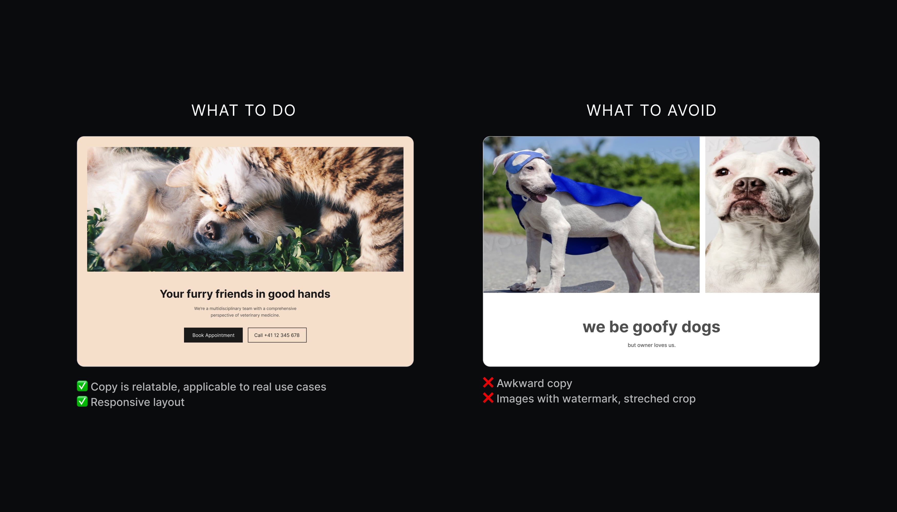
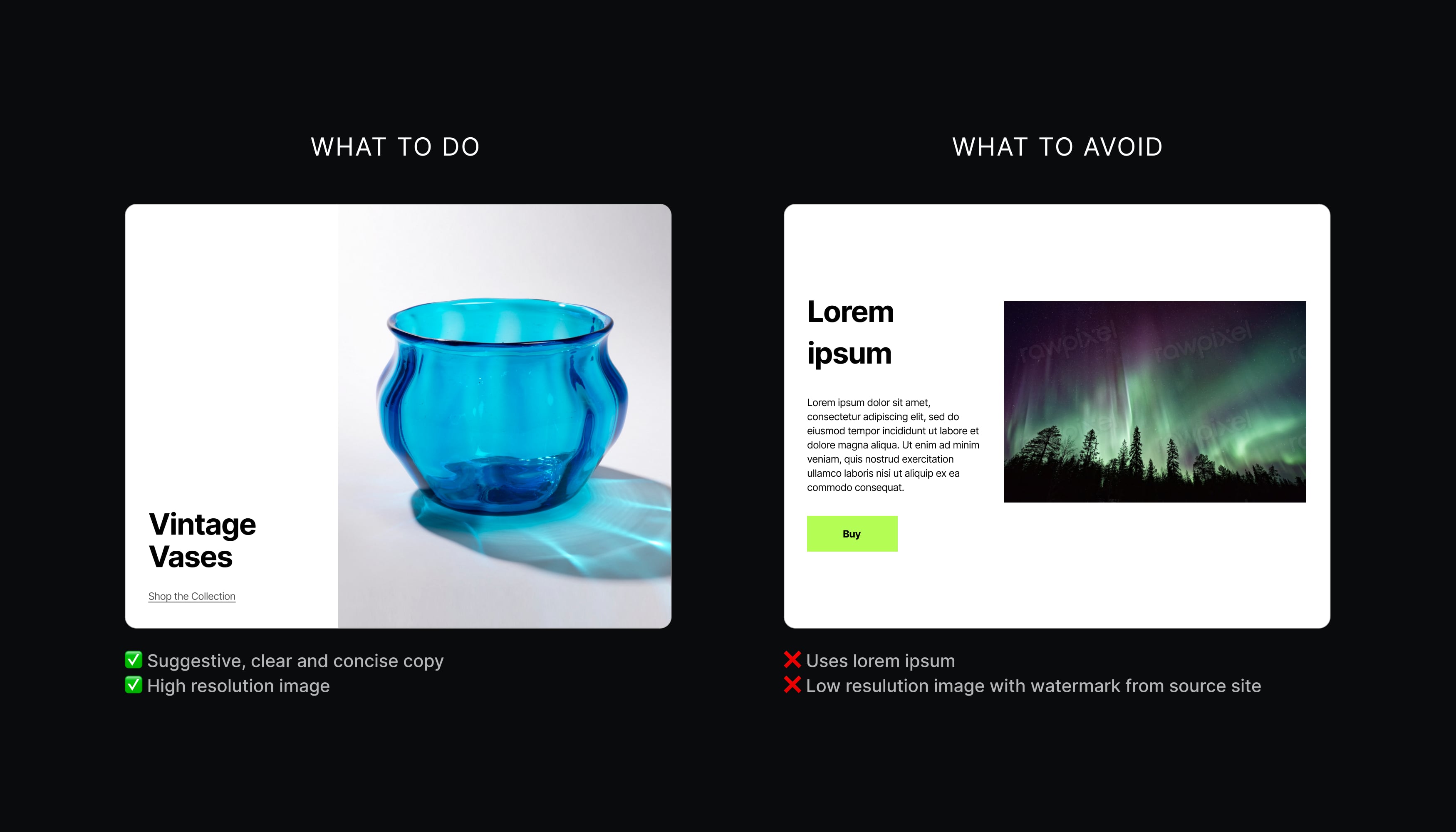
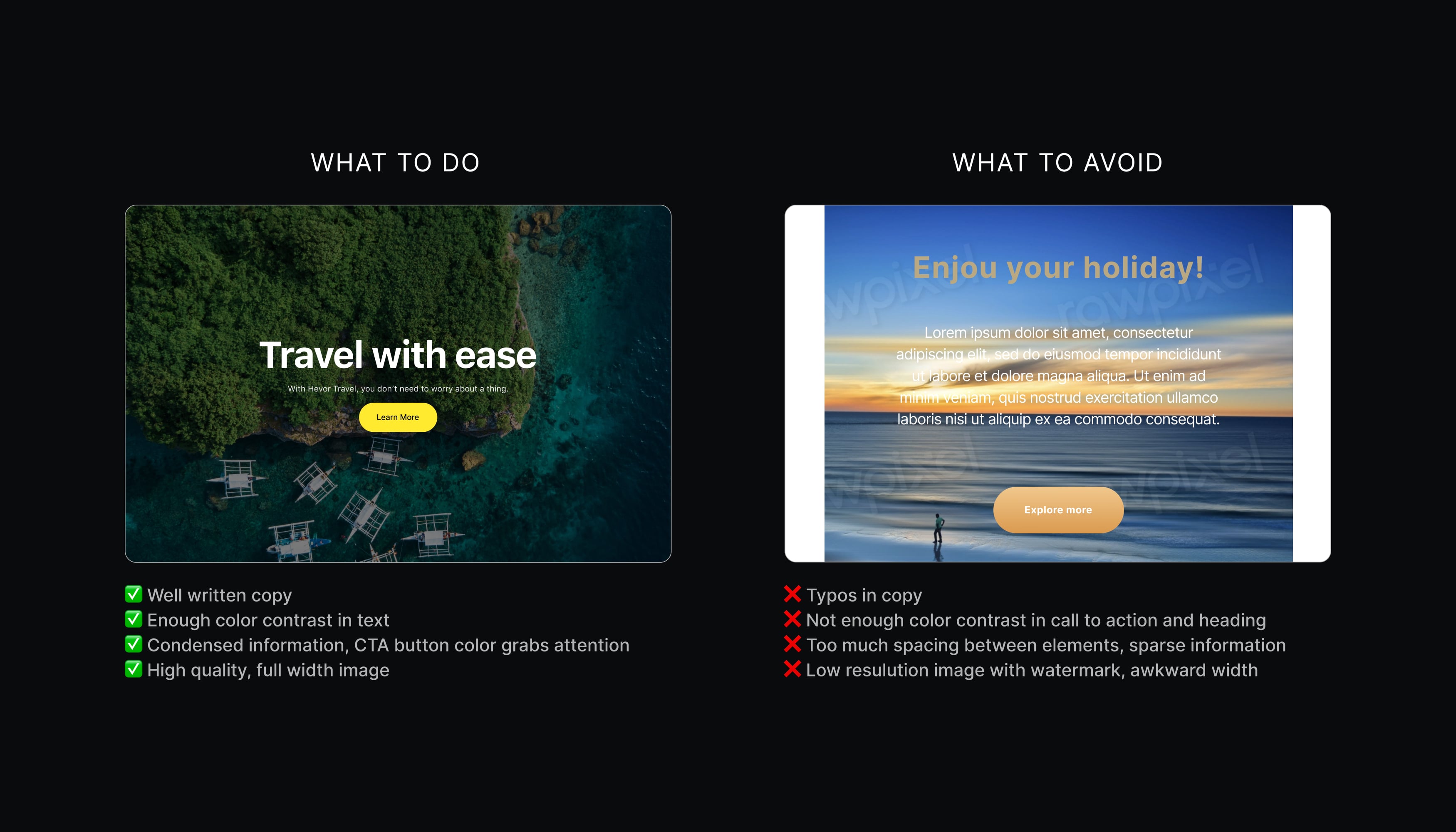
- Make it feel real and avoid using dummy text. Make sure images and text work well together to make a coherent piece of content.
- Names should be descriptive and precise enough to distinguish the pattern while avoiding terms that might be confusing. Good examples are “Hero section with image & CTA – Right” or “Three column section with icons”. Do not include the site/theme name in the pattern name and use sentence case.
- Be generally mindful of orphans and widows on text.
- Avoid overly artificial, stocky feeling media. Instead, opt for a more emotionally resonant and tangible selection of images, video and audio.
- It’s good to double-check the license of any media assets you plan to use to make sure they’re still suitable for your purpose. Good sources for these are:
- Images should be no bigger than 350kb with max dimensions 2000px (width or height, whichever is bigger). Consider using performance-friendly formats, such as WebP or AVIF.
- Optimize images. For Mac, I recommend ImageOptim. Enable lossy minification if need be; 80% quality for JPEGs should work fine. For Windows, you can try ImageMagick or browse other alternatives.
- Images are required to be added to the media library on the pattern source site.
- Add alt text to the images you add to your pattern. It is read by screen readers in place of images, allowing them to be accessed by people who can’t see the images. See how to write good alt text.
Below is a condensed cheat sheet highlighting the key disparities between good and not-so-good patterns.


A good pattern:
✔ Feels real.
✔ Is a coherent piece of content.
✔ Has optimized images/media.
✔ Has a descriptive and precise enough name.
✔ Is simple, without excessive block nesting.
✔ Looks good on all screen sizes.
✔ Respects licensing restrictions.
✔ Can be used in almost every website/theme.
✨ Is visually appealing.
A not so good pattern:
✖️ Feels fake or artificial (e.g. stocky, AI).
✖️ Is random, incoherent, and unpolished.
✖️ Images aren’t optimized.
✖️ Has a vague name (e.g. “Newsletter”).
✖️ Uses excessive block nesting.
✖️ Doesn’t look good on all screen sizes.
✖️ Uses media with licensing restrictions.
✖️ Doesn’t work well with other patterns/themes.
😬 Is visually awkward.
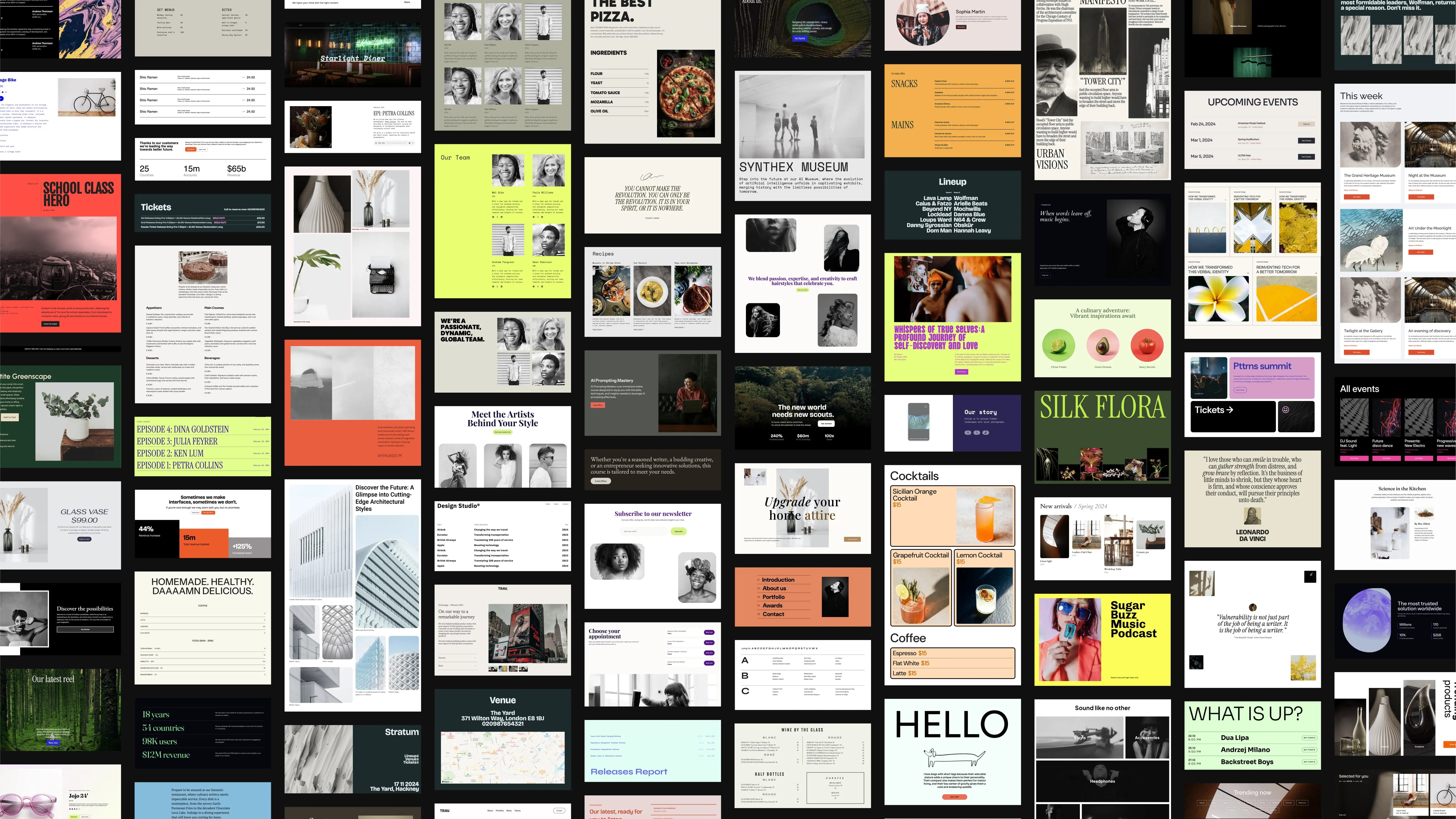
Our meetup not only resulted in the creation of an impressive 185 block patterns but also emphasized the importance of adopting a systematic approach to pattern design. By adhering to clear guidelines, designers can strike the balance between expressive creativity and seamless integration, ensuring that patterns harmonize effortlessly with each other and with any WordPress website.


 Automattic Design