Information Architects was founded in 2005 in Tokyo by Oliver Reichenstein. They’ve worked remotely since 2007, and are currently distributed between Tokyo, Zurich, Helsinki, Lyon, Amsterdam, and Berlin.
Some of their learnings from this remotely distributed asynchronous setup are similar to ours in Automattic: you need to communicate more carefully, and meeting in person from time to time is key. Most of the team works from home most of the time, but they all meet once or twice a year as a whole team somewhere nice for a week to work together. The team in Japan meets once or twice a year in their Tokyo office.

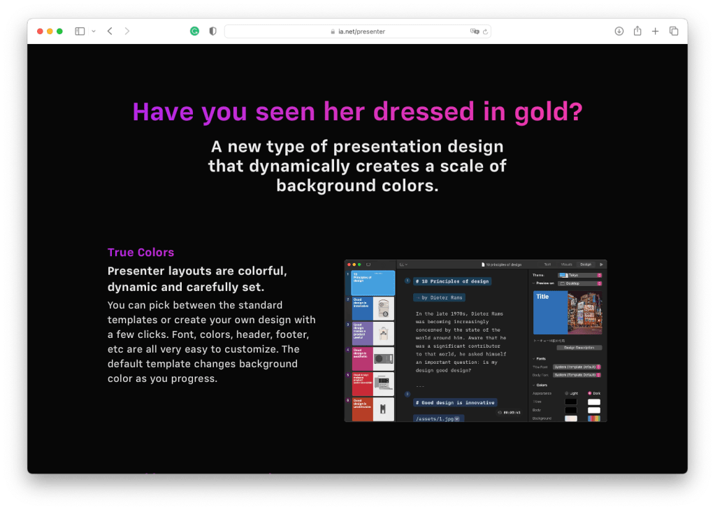
They were a design studio for years, working on projects for clients where the design quality was always top-notch with a pragmatic approach. In 2010 they launched iA Writer: for many, the best writing editor available for Mac and iOS, and rewarded as the AppStore App of the Year three times.Their new offering is iA Presenter, a Mac App to build presentations focusing on a text interface. It combines the expertise from iA Writer and their exceptional design skills, and they’ve chosen WordPress to build its website.
Where did the inspiration for this design come from?
We always try to have as few decorative elements as possible and make the content speak for itself. You can probably feel the struggle trying to reduce any sort of lines and dividers. We use tiles with shadows for teasers and elements where you change context, like videos, newsletter signups, teasers that link to different parts of the site. Over the years, our design has evolved in a back and forth between more and less minimal. We keep making it more minimal and then again more visual. When we added iA Presenter to our portfolio, we knew from the start that we had to be more colorful and vivid than we used to. The website reflects that. So, due to the addition of a visual app to our offer, we are again on the more visual side. The inspiration for our site usually comes from our own apps. But there is no denying that we have studied Apple’s website.
Why did you choose WordPress to build the site?
We have been using WordPress since 2005. We know it pretty well. We tried different platforms, but we have always come back to WordPress. WordPress has its upsides and downsides, but it’s still one of the most pragmatic choices. WordPress is easy to handle and flexible when you make minor mistakes, and it always makes it easy to quickly try new things with the plethora of plugins available.
How has using WordPress enabled you to design and build your site?
When I started in 2005 as a one-person company, I was able to do everything from coding, to designing to writing to SEO and marketing myself. At the time, that was far from obvious. I had been designing websites for a year, but I had only little coding experience. I learned the basics of front and backend web development with WordPress in a short amount of time. Front end development has become much more complex since then, and I am happy that I don’t need to do everything myself anymore. As far as I can see, WordPress still scales pretty well from 1 to n people.
What was the most challenging part of this design?
Conceptually, we’d like to always put our content at the center of everything. In the past, selling a text editor, we struggled with the noise that comes from showing images of text surrounded by text. It just always looks boring and cold. This didn’t do justice to the pleasant experience you get from using iA Writer. iA Presenter with its colorful UI and vivid theming made it much easier to express the joy and please you get using the app. Creating a unified design that does justice to both apps was a struggle. iA Writer’s default is bright and colorless, except the cursor, iA Presenter is dark and full of vivid colors. The hardest part though is always the information architecture. We’re called “Information Architects” and we have been doing information architecture for over 20 years. But, especially if you do it for yourself, it becomes harder and harder to get it right. Information architecture unifies the view from inside and the view from outside. After 17 years, it’s mind bendingly hard to see yourself from outside.
Regarding design, what are you most satisfied with on this site?
It’s a never-ending process, but I like how in the last few iterations we didn’t change everything anymore, but we evolved it bit by bit. Personally, I really like how well the Presenter site communicates the look and feel of the app. But I always see a thousand ways to improve it. I am currently working on a couple of changes that we deploy next week.


